Checkout Optimization: A Data-Driven Playbook for 2026
Boost your revenue with our end-to-end checkout optimization playbook. Learn to audit your funnel, A/B test fixes, and measure impact to stop losing customers.
About 70.19% of shoppers in the UK and wider European market abandon checkout, based on analysis across 4,500+ stores by Baymard Institute, with 47% citing unexpected costs as the reason they leave, as reported in Mollie's checkout optimisation guide. That's the number that should reset how you think about checkout optimization.
Many teams still treat checkout as a redesign project. Audit it once, tidy the form, add a wallet button, move on. That approach misses the full opportunity. Checkout is not a page. It's a sequence of decisions, anxieties, interruptions, and micro-failures. If you want more completed purchases, you need a repeatable operating system for finding friction, testing fixes, and scaling what wins.
The teams that improve checkout consistently don't rely on a static checklist. They run a loop. Diagnose the leak. Prioritise the fix. Test the change. Measure the commercial effect. Keep the winners. Feed the backlog. Repeat.
Why Most Checkout Flows Are Leaking Revenue
A checkout can look polished and still underperform badly. Revenue leaks rarely come from one dramatic mistake. They come from stacked friction. A hidden delivery fee. A field that feels unnecessary. A payment option that isn't visible soon enough. A mobile keyboard obscuring the guest path. A validation error that appears too late.
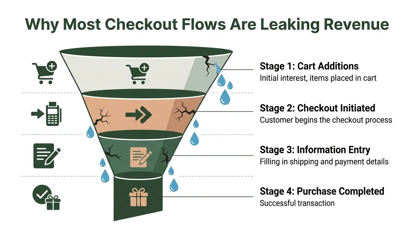
Leakage starts before the payment step
The mistake I see most often is assuming abandonment happens at the final click. It usually starts earlier. Shoppers begin to doubt the purchase the moment the experience feels heavier than expected. That's why checkout optimization is less about visual polish and more about reducing decision load.
A practical way to frame it is this:
- Find where users hesitate: Look for the step where intent drops fastest.
- Identify the likely friction source: Cost surprise, too much typing, trust concerns, unclear progress, or payment mismatch.
- Test the smallest meaningful fix: Don't rebuild the whole flow if a sharper intervention will answer the question.
- Roll out winners and document the lesson: Good checkout teams build institutional memory, not just isolated tests.
Practical rule: Don't call it a checkout problem until you can point to the exact moment users stop moving forward.
Teams that already work on wider conversion programmes often benefit from revisiting broader CRO fundamentals before touching checkout. If you want a useful companion read, Yassine Malti's conversion tips are a good reminder that conversion gains usually come from disciplined testing, not guesswork.
Checkout optimization is a continuous process
One reason static checklists disappoint is that every checkout has different constraints. A Shopify store with low-consideration products doesn't face the same trade-offs as a WooCommerce site selling regulated goods or a Webflow storefront with custom fulfilment logic. The principles travel. The implementation doesn't.
That's why we treat checkout as an ongoing experimentation lane, just like pricing, product pages, or acquisition landing pages. The immediate task is reducing friction. The larger discipline is building a system that keeps finding and removing it. If your team needs a simple framework for spotting unnecessary effort across journeys, this guide to friction reduction is a useful extension of the same thinking.
Auditing Your Checkout Funnel to Find the Leaks
Start with evidence, not opinions. If two stakeholders describe the same checkout, one will say it's clean and the other will say it's confusing. User behaviour settles the argument quickly.
Begin with funnel data
Build a checkout funnel report in GA4 or your analytics stack that mirrors the actual sequence users follow. Don't stop at “checkout started” and “purchase completed”. Break the flow into meaningful stages such as cart, account step, shipping details, shipping method, payment, and review.
What you're looking for isn't just the biggest drop. You want the most actionable drop. A large exit on a step that already contains several sub-tasks usually needs deeper inspection before anyone starts redesigning it.
Use the funnel to answer questions like:
- Where is the sharpest exit point: Is it account selection, address entry, payment, or order review?
- Which device type struggles most: Mobile friction often looks different from desktop friction.
- Do returning users behave differently from new users: That usually signals account, trust, or payment issues.
- Are exits clustered around one payment or delivery path: That points to a local problem, not a global checkout issue.
Inspect forms with a sceptical eye
The average UK checkout has 19 mandatory fields, while Baymard's benchmark for an optimised UK flow is 12 fields, according to Baymard's checkout flow benchmark. The same source notes that 24% of carts are abandoned because users distrust pre-filled address data. That point matters in the UK more than many generic guides admit.
If your audit only asks “can we auto-fill more?”, you'll miss the privacy trade-off. Some users want speed. Others want control and clarity.
Review every field and ask:
- Is it operationally necessary: If fulfilment, fraud, and support don't need it, remove it.
- Is it mandatory for everyone: Many fields can be optional or conditional.
- Is the label unambiguous: “Address line 2” works. “Additional information” often creates uncertainty.
- Does auto-fill create trust concerns: If you use address lookup, explain what's happening and keep editing easy.
Good audit work is uncomfortable because it forces teams to admit that “required by the business” often means “left over from an old internal preference”.
For a broader view of how friction maps to revenue, strategies to convert website visitors into sales from Pait Digital gives useful context around how bottlenecks inside the funnel affect the end result.
Watch real sessions, not just reports
Heatmaps are good for spotting patterns. Session recordings are better for understanding intent. Use both.
Heatmaps can show whether users ignore a promo code field until it becomes a distraction, whether trust badges sit outside natural attention zones, or whether shoppers try to click non-clickable summary elements. Session recordings reveal the behaviour behind that pattern. Rage clicks, repeated edits, long pauses, and backtracking usually tell you more than a dashboard ever will.
A good recording review checklist includes:
- Long hesitations before a field
- Repeated opening and closing of payment options
- Manual correction after pre-fill
- Dead clicks on delivery information
- Back-and-forth movement between basket and checkout
- Form abandonment after an error state
Pair behaviour with user feedback
Exit surveys can help when the signal is unclear, but keep them short. Ask what stopped the purchase, not for a full product interview. The best use of qualitative feedback is confirming the friction you already suspect from analytics and recordings.
When you combine funnel drop-off, field-level hesitation, and real session evidence, the “leaks” stop being abstract. They become specific problems you can rank and test.
Prioritising Fixes for Maximum Impact
Once you've audited the funnel, the backlog gets crowded fast. Remove a field. Move the guest option. Show delivery cost earlier. Rework the wallet layout. Improve validation. Add trust messaging. Compress scripts. Fix mobile spacing. All of these may be valid. Only some deserve to go first.
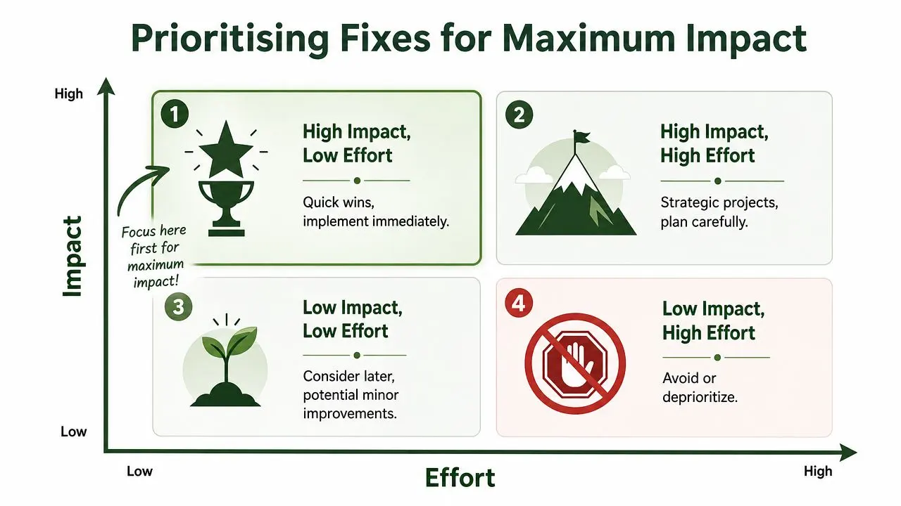
Use a simple scoring model
I like PIE because it keeps teams honest. Score each idea on Potential, Importance, and Ease. The exact scoring scale matters less than consistency.
- Potential: How much improvement is realistically available if this issue is real?
- Importance: How much traffic and revenue does this part of the checkout influence?
- Ease: How difficult is it to design, build, QA, and ship safely?
A hidden-cost fix usually scores high across all three. A redesign of an already stable review page usually doesn't.
One strong example comes from cost transparency. UK data shows 60% of shoppers abandon carts due to unexpected total costs, making early display of postage and VAT one of the highest-priority fixes for most stores, as noted in this checkout conversion analysis.
Compare two realistic backlog items
Take these two common ideas:
| Fix | Potential | Importance | Ease | Likely priority |
|---|---|---|---|---|
| Show full shipping and VAT estimate earlier | High | High | Medium | Do first |
| Redesign the review page iconography | Low | Medium | Medium | Push down backlog |
Why the first one wins is straightforward. It attacks a known abandonment driver with broad reach. The second might improve clarity a little, but it usually won't achieve the same commercial impact.
Decision standard: Prioritise fixes that remove friction for many users at a critical moment, not changes that simply make the interface feel nicer.
Quick wins and strategic projects
Not every high-impact item is easy. Some need platform work, payment coordination, or template changes. That's fine. Split your backlog into two groups:
- Quick wins: Copy changes, clearer totals, default selections, field removal, better error text.
- Strategic work: Structural checkout changes, payment routing, new wallet integrations, template-level mobile rebuilds.
If your team wants a lightweight way to score ideas before building a roadmap, a test prioritization calculator can help turn a messy list into a sensible order of operations.
The key is discipline. Teams lose months chasing visible but low-value improvements because they never force themselves to rank effort against commercial upside.
Core UX and Technical Fixes That Always Win
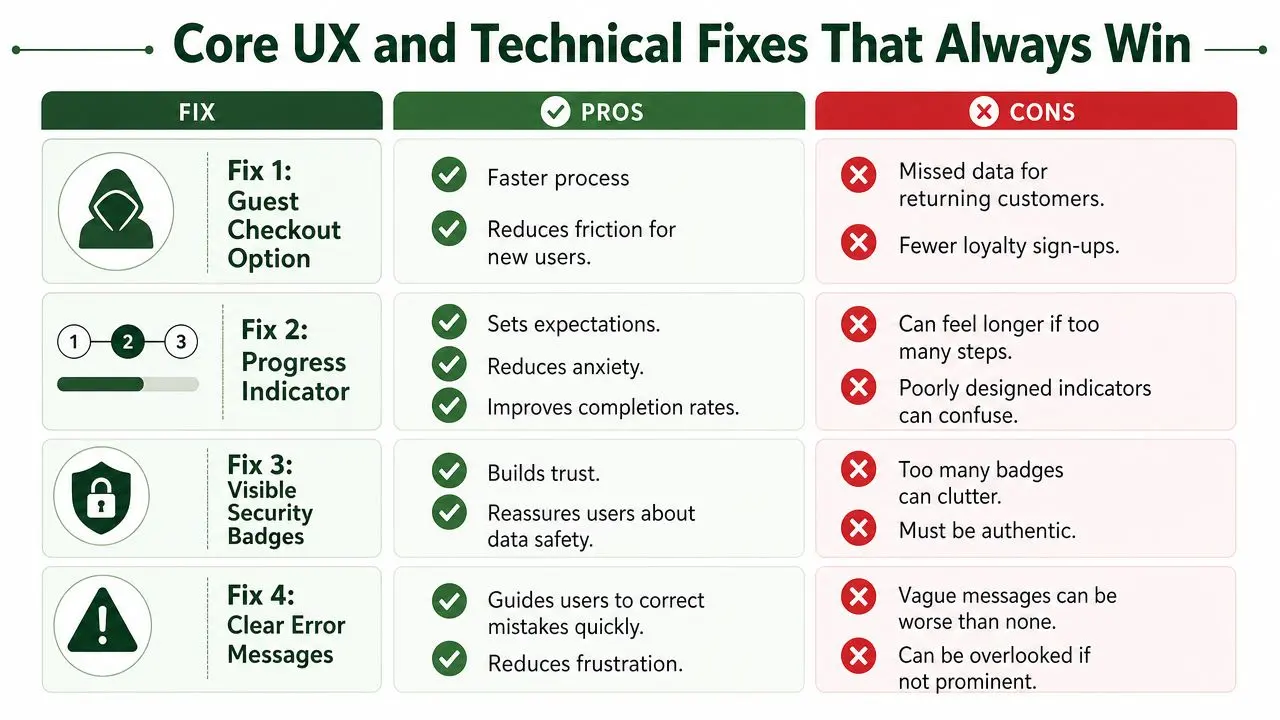
Some checkout changes are worth testing almost everywhere because they solve recurring forms of friction. They don't remove the need for experimentation, but they give you a strong default starting point.
Forms that reduce work instead of describing it
Bad checkouts make users do admin. Good ones help users complete a purchase.
Start with the obvious friction reducers:
- Make guest checkout the default path: Ask for account creation after purchase, not before it.
- Trim the form aggressively: Keep only what fulfilment and payment require.
- Use inline validation: Don't wait until submit to reveal a preventable error.
- Add address lookup carefully: Make it helpful, editable, and transparent.
- Use proper mobile inputs: Numeric keyboards for card and phone fields, email keyboard for email, and large tap targets.
If your platform allows it, customise the checkout UI so those basics are built into the experience instead of patched on later. For teams on Shopstar, this guide on how to personalize your Shopstar checkout is a practical reference for adapting the flow to match user behaviour rather than accepting defaults.
Trust that appears at the moment users need it
Trust signals only work when they answer an active concern. A generic footer badge doesn't do much if the shopper is anxious while entering payment details.
Put reassurance close to the point of risk:
- Display security messaging near payment fields: Keep it visible where card details are entered.
- Keep returns and delivery information accessible: Users shouldn't have to leave checkout to re-check basics.
- Show complete costs before final commitment: Order summary, shipping, taxes, and any fees should feel settled early.
- Use authentic badges only: Cluttered or dubious trust elements can backfire.
A useful rule here is proximity. If the reassurance sits too far from the anxiety, it won't help.
Shoppers don't need more persuasion in checkout. They need fewer reasons to hesitate.
Performance still decides outcomes
A fast checkout feels easier, even when the fields haven't changed. Slow pages magnify every other UX problem. UK-focused guidance points out that 60%+ of UK ecommerce transactions happen on mobile, and recommends loading times under 2 seconds because each 1-second delay can cut conversion by 7% in checkout flows, according to Alexander Jarvis's checkout completion benchmarks.
That changes the priority list for technical work. Don't let large scripts, slow third-party widgets, or unstable layout shifts sit in the “engineering backlog” while marketing tweaks button copy.
Performance fixes worth checking first
- Trim third-party scripts: Every extra tag can delay rendering or interaction.
- Stabilise layout on mobile: Don't let wallets, banners, or summaries jump after load.
- Optimise the order summary component: It often carries more payload than teams realise.
- Test on real devices: Especially older Android phones on ordinary mobile connections.
Payment choices need curation, not clutter
The right payment options reduce friction. Too many options can create it. In practice, the job isn't just adding methods. It's deciding which methods deserve prominence, in what order, and on which devices.
What tends to work:
- Show the most relevant wallet options early on mobile
- Keep card entry as a stable fallback
- Prioritise the payment methods your audience already prefers
- Avoid turning the payment step into a menu of competing paths
Good checkout optimization balances speed, trust, and clarity. Great checkout optimization keeps those three aligned without making the interface feel busy.
Building Your A/B Test Library and Hypotheses
Once the obvious friction is mapped and the first fixes are prioritised, don't jump straight to implementation by instinct. Build a test library. That means a backlog of experiment ideas with a reason behind each one, a clear success metric, and a place in the wider learning agenda.
A proper hypothesis has four parts. The change, the expected user behaviour, the reason it should happen, and the metric that will validate it. If any one of those is missing, you don't have a test. You have an opinion.
One structural test deserves a place near the top of many checkout roadmaps. A 2026 Dynamic Yield study found that reducing checkout steps from five or more to two or fewer produced an average conversion lift of 41.3%, as cited in these mobile checkout optimisation statistics. That doesn't mean every site should collapse to a minimal two-step flow immediately. It does mean the architecture of the flow is often worth testing before polishing smaller interface details.
What belongs in the test library
Your backlog should mix structural, copy, behavioural, and reassurance tests. If every experiment is a button-colour idea, your programme will stall.
Typical checkout candidates include:
- Step structure: Fewer steps, single-page variants, or tighter grouping of related inputs
- Guest path visibility: Prominence, wording, and placement
- Order summary presentation: Expanded versus collapsed, especially on mobile
- Field labels and help text: Shorter labels, clearer examples, better error copy
- Payment layout: Wallet placement, default method, method order
- Trust placement: Security, returns, and delivery reassurance near the point of concern
- Promo code treatment: Visible by default versus collapsed behind a link
Checkout A/B Test Idea Library
| Test Element | Hypothesis | Primary Metric |
|---|---|---|
| Guest checkout CTA placement | If we move the guest option above sign-in and give it equal visual weight, more new users will continue because the non-account path becomes obvious at the moment of decision. | Checkout progression rate |
| Shipping cost visibility | If we show total expected cost earlier in the flow, fewer users will abandon because the purchase feels transparent before commitment. | Checkout completion rate |
| Single-page versus multi-step layout | If we reduce the perceived number of steps, more users will finish because the process feels shorter and easier to predict. | Purchase completion |
| Inline validation copy | If we replace generic errors with specific field guidance, more users will recover from mistakes because the fix is immediate and clear. | Form completion rate |
| Address lookup microcopy | If we explain why address suggestions appear and keep manual editing visible, more users will trust the tool because it feels assistive rather than intrusive. | Address step completion |
| Payment method order | If we place the most-used payment method first for the relevant device context, more users will progress because they won't need to search for their preferred option. | Payment step completion |
| Promo code field visibility | If we collapse the promo code field behind a text link, fewer users will pause to hunt for discounts because the field no longer interrupts the main path. | Revenue per visitor |
A strong hypothesis explains user psychology. It doesn't just describe a design change.
The best test libraries also record what you learned. Even a losing test can save your team from revisiting the same bad idea six months later.
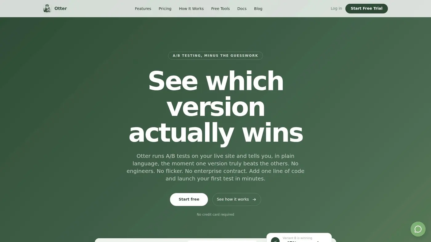
Implementing and Measuring Tests with Otter A/B
The hardest part of experimentation usually isn't ideation. It's getting from “we should test that” to a live experiment with clean measurement.
Start with one concrete hypothesis. For example: moving the guest checkout option higher on mobile will increase progression into the next step because new users will see a clear route that doesn't require account commitment.
Set up the test cleanly
The workflow is straightforward when the underlying question is clear:
- Define the control: Your existing checkout entry state.
- Create the variant: Change only what the hypothesis requires. In this case, guest path placement and presentation.
- Split traffic deliberately: Keep allocation simple unless there's a strong reason not to.
- QA on real devices: Especially mobile browsers, wallet flows, and validation states.
- Launch with a named objective: Don't use vague test names like “checkout tweak v2”.
The most common implementation mistake is bundling too many edits into one variant. If you change guest checkout placement, trust badges, and button text at the same time, you won't know what caused the result.
Choose business metrics, not just interface metrics
A checkout test should always track the main commercial outcome. Purchase completion is usually the core goal, but it shouldn't be the only one. Add supporting metrics that reveal whether the apparent winner is actually healthy for the business.
Useful goal layers include:
- Primary goal: Completed purchase
- Secondary behavioural goal: Progression to payment or completion of a specific form step
- Commercial outcomes: Average order value, revenue per variant, and revenue trends
- Guardrail checks: Error rate, wallet usage, or any issue that would indicate harm
That's where teams often get tripped up. A variant can increase completion while lowering order value or introducing a technical issue for a subset of users. You need both conversion and commercial context to judge a result properly.
For a practical reference on what to look for once a test is live, this guide to reading experiment results covers the key interpretation points.
Keep the implementation lightweight
Experimentation fails when teams believe every test needs a sprint. The fastest programmes reduce setup overhead and keep the path from hypothesis to launch short. That matters even more in checkout, where every extra dependency delays learning.
This short walkthrough shows the sort of lightweight setup teams aim for when they want tests running quickly without turning the process into a development project:
A good rule is simple. If a test takes far longer to launch than to analyse, the workflow needs tightening.
Analysing Results and Scaling Your Winners
Don't stop at “variant B won”. That's how weak programmes produce noisy conclusions.
Start with significance and sample adequacy, then look at the full result set. A checkout test that lifts purchase rate but drags down revenue quality isn't a clean win. The reverse can also happen. Sometimes a variant converts a touch less often but produces stronger order quality or fewer support-triggering issues. You need the whole picture.
What a proper result review includes
- Primary outcome: Did completed purchases improve meaningfully?
- Secondary behaviour: Did users move more smoothly through the intended step?
- Commercial impact: Did revenue per variant hold up or improve?
- Operational side effects: Did errors, support friction, or payment problems rise?
Winning tests deserve documentation, not just deployment. Record what changed, why it likely worked, and where the lesson might transfer.
Once a result is credible, ship it to full traffic, monitor it after rollout, and move straight to the next item in the backlog. That's the habit that separates occasional wins from a real checkout optimization programme.
The strongest teams don't celebrate one successful test as the finish line. They treat it as proof that the system works, then they run the next experiment while the learning is still fresh.
If you want to run checkout experiments without turning them into a heavyweight engineering project, Otter A/B gives teams a fast way to test checkout copy, layout, and flow changes, measure purchase completion and revenue by variant, and keep optimisation moving as an ongoing practice instead of a one-off redesign.
Stop guessing
Ready to start testing?
Set up your first A/B test in under five minutes. No credit card required.
- 14-day free trial
- No credit card required
- Cancel anytime