Deciding What to A/B Test: Visualize Data & Boost CRO
Struggling with deciding what to A/B test? Create powerful Excel heat maps to visualize data, spot opportunities, and build a data-driven CRO roadmap.

A lot of UK teams still treat deciding what to a/b test as a creative exercise. It isn’t. It’s a sorting problem.
A 2023 UK Department for Business and Trade survey reported by VWO found that only 42% of UK e-commerce businesses actively use A/B testing for optimisation, and 65% of non-users cite a lack of clear prioritisation frameworks as the main barrier. That number matters because the hardest part of experimentation usually isn’t launching a test. It’s choosing the next one with enough confidence that the work is worth the traffic, time, and stakeholder attention.
The fix is usually less glamorous than people expect. You don’t need a new framework deck. You need to look at your own result data properly. Excel is enough for that.
When marketers get stuck, they often ask whether they should test the headline, the CTA, the layout, the form, or the offer. My answer is always the same. Start with the pain point, then look into the data. If you can turn past test results into simple visual patterns, the next priority becomes much easier to defend.
The Data-Driven Answer to Your Toughest CRO Question
65% of non-users in a UK Department for Business and Trade survey cited weak prioritisation frameworks as the reason they were not running A/B tests, as noted earlier. That is the CRO bottleneck for a lot of UK firms. The issue is rarely a shortage of ideas. It is deciding which idea deserves traffic first.
The question that improves test planning is simple: where is friction showing up often enough, and clearly enough, to justify a test?
That standard cuts through a lot of bad backlog thinking. A marketing manager wants a new hero. A founder wants the homepage to feel fresher. A designer wants to tidy the page. Those requests are common, but they are not prioritisation criteria. Good test roadmaps start with recurring problems in user behaviour, then rank possible fixes against impact, effort, and confidence.
Start with evidence, not ideas
I split every test candidate into three parts:
- Observed problem: a clear drop-off, weak conversion point, or repeated pattern in past test results
- Hypothesis: the change that might improve that problem
- Priority: whether this test should run before the others
Junior marketers often collapse those into one step. They spot a weak number and jump straight to copy or design changes. That is how teams end up testing whatever feels visible rather than whatever is most likely to improve revenue, lead quality, or completion rate.
If the hypothesis itself is still fuzzy, revisit the logic of hypothesis testing before adding another idea to the queue.
A good rule is blunt. If you cannot describe the user problem in one sentence, you are not ready to prioritise the test.
Why Excel is enough
Organizations typically already have the raw material. Test exports sit in the platform. Analytics data sits in GA4 or a dashboard. Someone has a slide deck with old winners and losers. The problem is not data access. The problem is that flat reporting makes patterns hard to spot.
Excel fixes that faster than another framework workshop.
Once you group past results by page type, tested element, audience segment, and business outcome, you start seeing where your testing programme is gaining traction. In UK e-commerce accounts, I often find that one area keeps producing useful wins while another soaks up traffic with little return. That is the trade-off many teams miss. A homepage test may be more visible internally, but basket, checkout, or lead form tests often produce clearer commercial upside.
This only works if the business agrees on what success means. Teams that celebrate uplift in clicks while average order value, lead quality, or completed purchases stay flat are not prioritising well. Get alignment first on how KPIs are measured, then review your test history against those metrics. That turns old A/B results into a practical feedback loop. You stop asking, "What should we test?" and start asking, "Where have we already seen evidence that another test is worth running?"
Gathering Your A/B Test Data for Analysis
A large share of test ideas never become useful tests because the team cannot trust its own past results enough to prioritise the next one. That problem usually starts in the export, not in the hypothesis.
I see the same pattern in UK firms. They have years of A/B tests sitting in a platform, but the records are messy, inconsistent, and hard to compare. One team logs tests by campaign name, another by page, and nobody can tell whether checkout copy tests have outperformed homepage layout tests over the last 12 months. Excel fixes that if the input is disciplined.
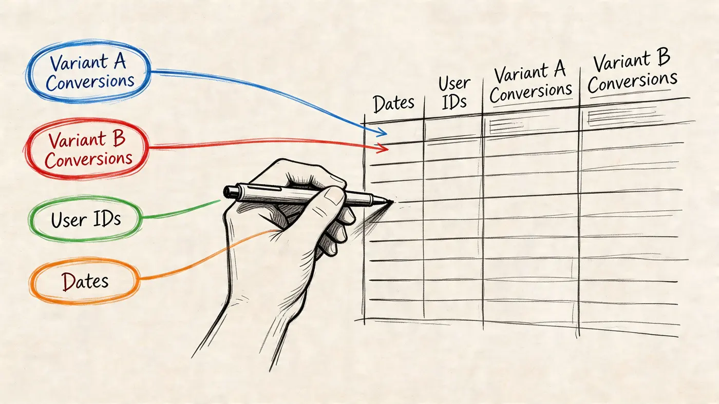
What to export from your testing platform
Export one row per variant if you want a clean historical record. Export one row per segment and variant if you already know segment analysis matters to your business. Pick one approach and keep it consistent. Mixing both in the same sheet creates avoidable cleanup work later.
The fields below are enough to build a usable testing history:
- Test name: a label your team will still recognise in six months
- Page or template: PDP, category page, basket, checkout, lead form, landing page
- Element tested: CTA, headline, trust block, form field, navigation label, image, pricing display
- Primary metric: the metric used to call the result
- Visitors per variant: needed to judge whether the result is worth acting on
- Conversions: raw counts help catch misleading rate changes
- Conversion rate: useful for scanning patterns across tests
- Result status: winner, loser, flat, inconclusive
- Confidence or significance status: keeps weak evidence from getting promoted into the roadmap
- Date range: helps explain seasonality, promotions, and traffic spikes
- Revenue or lead-quality metric: useful when a test improves clicks but hurts commercial value
Keep qualitative inputs separate from the raw export. I usually add a second tab for session replay notes, customer research, and analyst comments. That gives the team one place for hard outcomes and another for interpretation. If you use behaviour tools alongside testing, a short reference to what website heat maps are actually good for helps keep people from treating click patterns as proof.
Clean the sheet before you analyse anything
Bad labels ruin good analysis.
Standardise page names first. "PDP", "product detail", and "product page" should not live as three categories if they mean the same thing. Do the same for tested elements. If one marketer logs "CTA copy" and another logs "button text", Excel will split results that belong together.
Then check the business metric. Some old tests will be recorded against click-through rate, others against completed purchase, form completion, or revenue per session. Leave the original metric in place, but add a column that groups each test by business outcome type. That makes trade-offs visible. A test can improve a micro-conversion and still be a poor candidate for repetition if it never affects sales or lead quality.
Treat thin data with caution
Small tests create false confidence fast. A short-term uplift can look persuasive in the platform and still be too thin to guide next quarter's roadmap.
This is why I add a plain-language decision column in Excel: use for roadmap, watch, or archive. Tests with enough traffic, a clear metric, and a result that held up go into the first group. Tests with directional learning but weak evidence go into the second. Tests with tracking issues, broken setups, or unclear outcomes go into the third. Junior marketers often skip this step and end up giving equal weight to a clean basket-page win and a noisy homepage experiment that never really settled.
That distinction matters more than any chart you build afterwards.
Build a simple Excel master sheet
The master sheet should help you choose what to test next, not preserve every detail from the platform export. Keep the raw export on one tab. Build the decision sheet on another.
A practical structure looks like this:
| Column | Why it matters |
|---|---|
| Test ID | Keeps references consistent |
| Page type | Helps group similar tests |
| Element | Shows where wins cluster |
| Hypothesis summary | Preserves the reasoning |
| Variant traffic | Stops you overreading small tests |
| Primary result | Keeps the decision visible |
| Significance status | Filters out weak evidence |
| Business note | Connects result to action |
I also add two fields that improve prioritisation quickly: confidence in data quality and next test recommendation. The first stops broken or messy experiments from shaping future plans. The second turns a test log into a feedback loop. After a few months, Excel stops being a graveyard of past experiments and becomes a working list of where your UK team already has evidence to keep testing.
Visualising Winners with Basic Conditional Formatting
Many teams don’t need a complicated dashboard first. They need a view that makes the obvious obvious.
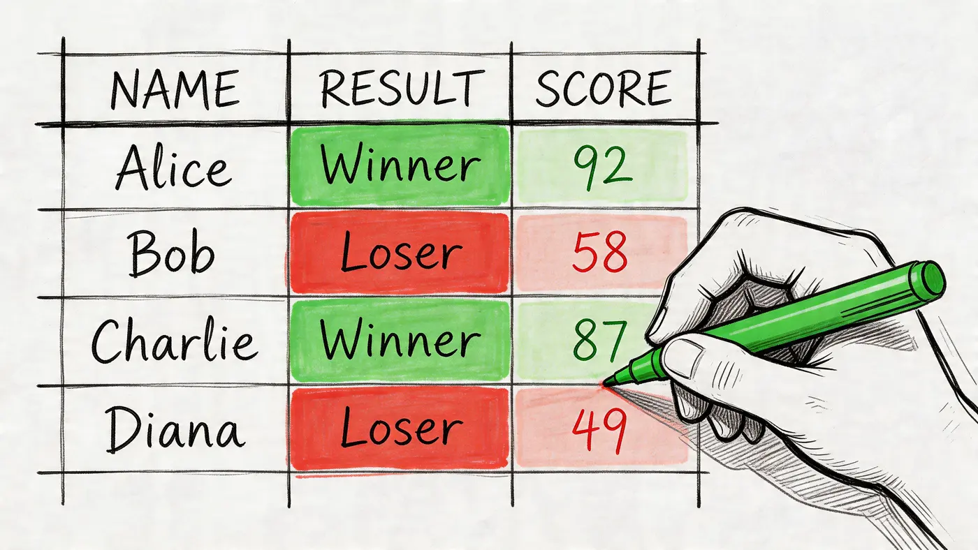
A simple conditional formatting table does that well. It’s the fastest way to turn a list of past A/B tests into a visual shortlist of where performance tends to move.
The sheet I’d build first
Set up a table where each row is a completed test and each column captures one decision variable. For example:
| Test | Page | Element | Lift or decline | Significance status | Business note |
|---|---|---|---|---|---|
| CTA test 1 | PDP | Add to basket CTA | positive | reached | messaging angle worked |
| Headline test 2 | Home | Hero headline | flat | not reached | weak hypothesis |
| Layout test 3 | Basket | Trust block placement | positive | reached | worth iterating |
Now select the “Lift or decline” column and apply a colour scale. Green for stronger outcomes, red for weaker ones. If you have a separate column for significance, don’t colour that with the same scale. Use a simple icon or text category instead.
A common pitfall is that many juniors accidentally create one blended heat map where a result looks strong just because the number is big. A big number without enough evidence is still fragile.
What this view tells you quickly
When you scan a table like that, you’re looking for patterns, not trophies.
Do CTA tests repeatedly show movement while headline tests stay flat? Do checkout changes produce clearer outcomes than homepage changes? Does a specific page type keep showing negative or inconclusive results? Those patterns are far more useful than one isolated “winner”.
The assigned benchmark for this section matters here. For UK CRO teams, AB Tasty reports that success rates climb to 35% when teams prioritise with quantitative data rather than qualitative guesses, and drop to below 10% without clear MDE thresholds. That is exactly why this simple Excel step works. It forces your backlog to reflect evidence, not enthusiasm.
If your last ten tests don’t reveal a pattern, the problem usually isn’t “we need more ideas”. It’s “we haven’t organised our evidence well enough”.
Use a second view by element type
A better version of the same idea is to create a mini-summary table:
- CTA-related tests
- Headline-related tests
- Form-related tests
- Layout-related tests
- Trust and reassurance elements
Then total up the number of clear wins, losses, and inconclusive outcomes by category. You don’t need fancy formulas. Even a manual count works if the dataset is still small.
This is also where deciding what to a/b test becomes less theoretical. If your Excel summary shows that CTA changes repeatedly move the needle while hero copy rarely does, stop defaulting to headline brainstorming sessions.
A short visual walkthrough can help if you want to see the mechanics in action:
Common mistakes with basic heat maps
Three errors show up again and again:
-
Mixing unlike metrics
Don’t colour conversion rate, revenue, and click-through in one shared scale. Keep separate views. -
Ignoring MDE and confidence context
A bright green cell can still represent a weak result if the test wasn’t set up well. -
Turning every small win into a strategy
Look for repeatability by page type or element category before committing roadmap time.
Basic conditional formatting is enough to get the first answer. Where did change matter most, and where did it mostly produce noise?
Analysing Segments with Pivot Table Heat Grids
Aggregate results are useful, but they often hide the reason a test worked. A variant can look average overall and still perform very differently by device, source, or audience type.
That’s where PivotTables earn their keep.
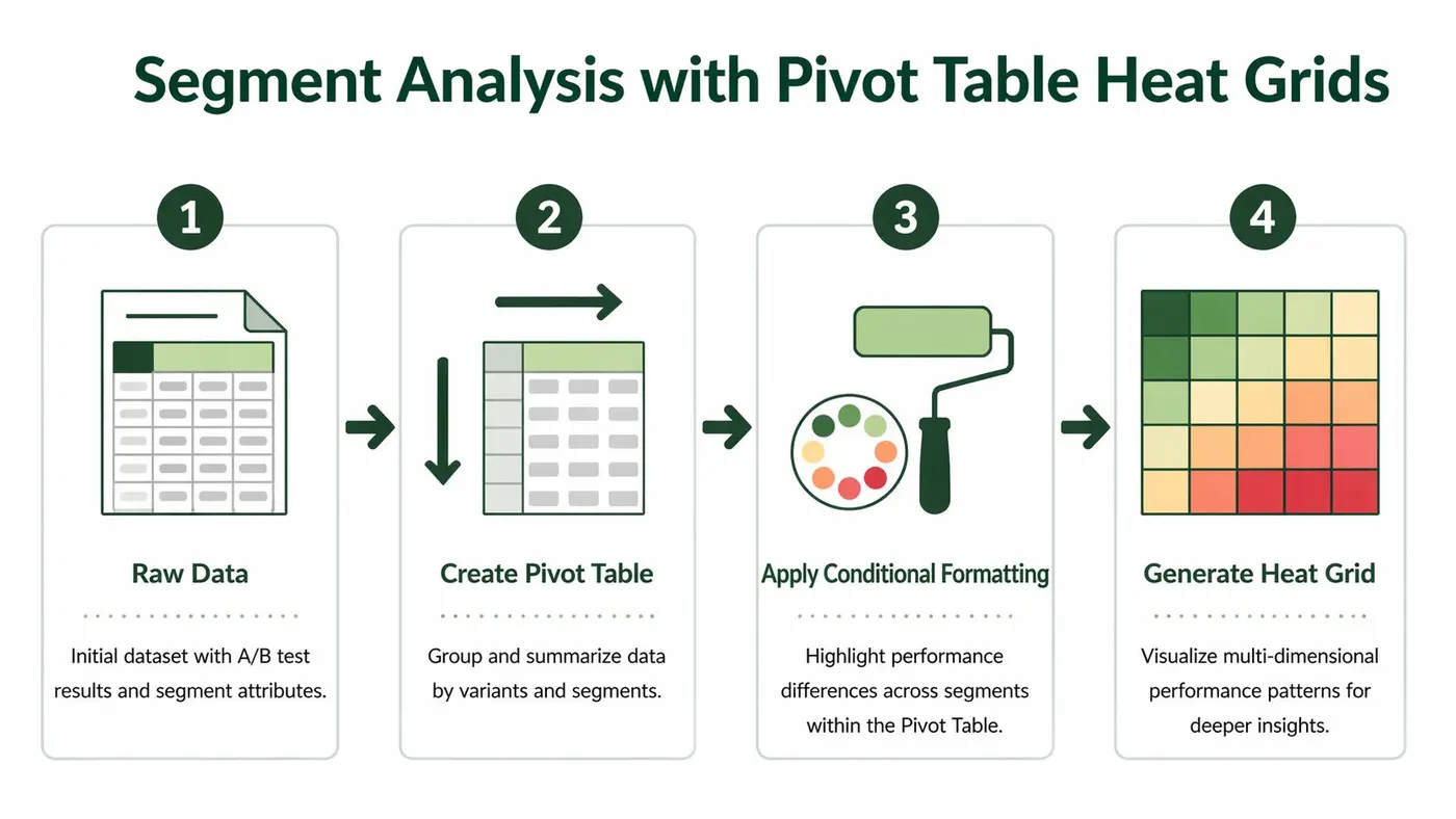
Structure the raw data properly
For segment analysis, your data needs to be more granular. Each row should represent a variant-segment result, not just a whole-test summary.
A simple raw structure might include:
- test name
- variant
- device type
- traffic source
- geography
- visitors
- conversions
- primary metric result
- significance status
Once that’s in Excel, insert a PivotTable. Put variant in rows, segment in columns, and your chosen performance metric in values. Then apply conditional formatting to the values area.
The result is a heat grid. Instead of asking “Which variant won?”, you’re asking “Which variant won for which audience?”
What segment heat grids often reveal
Here, practical prioritisation gets sharper.
A CTA variant may work well on paid social traffic but not on brand search. A layout shift may improve mobile engagement while creating friction on desktop. A shorter form may help cold traffic but underperform for returning users who wanted more context.
Those differences matter because future tests should build on the winning context, not just the winning average.
A useful way to interpret a grid is:
| Pattern | What it usually means |
|---|---|
| One variant wins across most segments | strong broad hypothesis |
| One variant wins only on mobile | likely UX or space-related issue |
| Segment split is inconsistent | hypothesis may be incomplete |
| All cells are flat | low leverage change or weak setup |
Broad averages are fine for reporting. They’re often poor for deciding the next experiment.
Choosing segments that deserve attention
Don’t build segment grids for everything. That creates noise. Pick segments that tie to real user differences or acquisition strategy.
Good first choices are:
- Device type: behaviour often changes because layout constraints change
- Traffic source: message match issues show up here
- New vs returning users: they often need different reassurance
- Key geographies: useful if offers, delivery expectations, or trust signals differ
What you’re looking for is not novelty. You’re looking for repeatable friction. If mobile users repeatedly react differently to CTA placement, that’s not a one-off insight. It’s a roadmap category.
How this changes what you test next
A normal backlog says, “Test homepage headline.” A segmented backlog says, “Test mobile CTA placement on high-intent landing pages for paid traffic first.”
That’s a much better brief.
It narrows the page, the user context, and the suspected friction. It also gives your team a cleaner hypothesis and a stronger readout when results come back. Excel won’t automate the thinking, but PivotTables make the pattern visible enough that the thinking gets better.
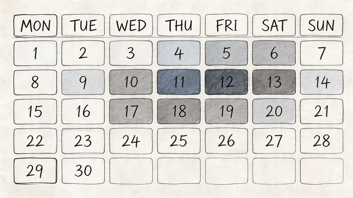
Tracking Performance Trends with Calendar Heat Maps
Some test decisions aren’t about which variant won. They’re about whether the result held up over time.
That’s a different question, and it needs a different visual.
Why time trends matter
A variant can surge early, flatten later, and still end the test looking respectable in the aggregate. Or the reverse can happen. Weekend traffic may behave differently. A promotion may distort intent. A payday pattern may change buying behaviour.
If you only read the final topline result, you miss those clues.
A calendar heat map helps you spot whether performance was stable, erratic, or shaped by timing effects. That makes it useful when you’re judging whether to roll out a variant, rerun a test, or follow up with something narrower.
How to build it in Excel
Use one row per date for the metric you care about most. Usually that’s daily conversion rate for the control and variant, or daily uplift if you’ve already calculated it.
Then arrange the dates into a calendar-like grid by week and weekday. It doesn’t need to be pretty. It just needs to place each day in sequence. Apply conditional formatting so stronger days appear darker or greener, and weaker days appear lighter or redder.
A basic workflow:
- Export daily results from your testing or analytics setup
- Create helper columns for month, week number, and weekday
- Lay out a calendar grid in Excel
- Link the daily metric into each date cell
- Apply a consistent colour scale
The first time you do this, it feels manual. After that, it becomes a reusable template.
What the calendar often shows
This view is good for diagnosing three common issues.
First, it reveals novelty effects. A fresh design sometimes gets early engagement because it’s new, not because it’s better.
Second, it surfaces weekly behaviour cycles. If weekdays and weekends behave differently, you don’t want to judge a test on a partial cycle.
Third, it shows anomalies. A single campaign burst, stock issue, or tracking problem can stand out visually in a way a normal table won’t reveal.
A stable winner looks boring on a calendar heat map. That’s usually good news.
How to use the pattern for prioritisation
Calendar heat maps aren’t just for post-test reporting. They help decide the next test too.
If a winning result was stable through the run, you can usually move on to the next related hypothesis with more confidence. If the result swung hard by day pattern or promotion period, your next test should probably isolate the condition that caused that swing.
For example, if a CTA change only looks strong on specific days, don’t blindly expand it into a sitewide redesign backlog. Treat it as a clue. The next test might focus on urgency framing, campaign traffic, or device-specific context rather than the CTA copy itself.
This is why deciding what to a/b test should include a time lens, not only an average-performance lens. Some ideas aren’t bad. They’re just situation-dependent.
Effective Analysis and Sharing Your Findings
A useful heat map changes one decision. If it does not help your team choose whether to roll out, rerun, or queue the next test, it is decoration.
That matters because UK marketing teams rarely struggle to come up with test ideas. They struggle to agree which idea deserves traffic next. Excel helps here because it forces the conversation back onto evidence you already have, instead of whoever argued most confidently in the meeting.
Read the visual in context
Colour highlights a pattern. It does not confirm a result.
The common mistake is treating a green cell as a winner before checking how the test was run. A segment can look strong because the sample was thin, because the test ended too early, or because one unusual traffic spike distorted the average. As noted earlier, false positives and premature stops are real risks. Mark any shaky result as directional so nobody mistakes it for a rollout decision.
Use three checks before you present a finding:
- Sample depth: was there enough traffic or enough conversions to treat the pattern seriously?
- Time coverage: did the test span a fair trading window, including normal weekday and weekend behaviour if that affects your site?
- Business relevance: did the lift show up in the KPI that matters, such as completed orders, qualified leads, or revenue per visitor?
If one of those checks fails, the heat map is still useful. It becomes a prompt for the next test design, not proof that the variation won.
Build a summary people can scan in 30 seconds
Poor reporting usually fails in a predictable way. The analyst exports charts, pastes them into slides, and leaves the commercial team to work out what happened.
A tighter format works better. Keep one short summary table at the top of the sheet or deck.
| Report element | What it should say |
|---|---|
| Main finding | the clearest outcome in one sentence |
| Confidence note | whether the result looks decision-ready or directional |
| Segment insight | where performance changed in a meaningful way |
| Time pattern | whether the result stayed stable through the run |
| Next action | rollout, rerun, or follow-up hypothesis |
That structure keeps the discussion practical. Founders want the decision. Channel managers want to know whether the result applies to their traffic. UX teams want to know what behaviour changed and where to examine next.
Use colour with restraint
Excel makes it easy to over-style a report. Resist that.
Analysis colours should make differences easier to spot, not make the sheet look on-brand. If mid-range values are hard to separate, change the scale. If red and green are your only cues, add labels so nobody has to infer meaning from colour alone.
A few rules hold up well in practice:
- Use one colour scale per metric
- Highlight only meaningful differences
- Label the range clearly
- Choose colours that stay readable for colour-blind viewers
Clear notes beat prettier formatting every time.
Turn every result into a backlog decision
Junior marketers often get stuck. They finish the test, share the chart, and stop before updating the roadmap.
Every finished experiment should earn one clear place in your Excel testing log. In practice, I sort outcomes into four buckets:
-
Angle to iterate
The hypothesis showed promise. Test a tighter version of the same idea. -
Segment-specific opportunity
The change worked for a particular audience, device, or traffic source. Prioritise a follow-up test that isolates that condition. -
Assumption to retire
The idea did not improve the target KPI. Remove similar weak concepts from the queue and free up space for better bets. -
Measurement fix needed
The setup was unclear, the tracking was messy, or the result was too noisy to call. Rerun only after fixing the design.
That is the feedback loop. Past test results shape the next round of priorities, and Excel becomes more valuable every month because the file stops being a report archive and starts acting like a decision system.
If your team still argues over whether a result is ready to share, keep a practical reference on testing statistical significance for A/B tests in the same workbook or reporting pack.
The best testing files do not just record winners. They help you choose the next test with less guesswork, less internal debate, and a much clearer reason for putting one hypothesis ahead of another.
Ready to start testing?
Set up your first A/B test in under 5 minutes. No credit card required.