Landing Page Optimization: Playbook for Higher Conversions
Learn landing page optimization with our step-by-step playbook for 2026. Go from data analysis to A/B testing & iteration to drive higher conversions and
A lot of teams are in the same spot right now. The campaign is live, the page looks polished, the designer likes it, the ad copy is strong, and the numbers still feel flat. Traffic arrives, some people scroll, a few click around, and very few do the thing the page was built to get.
That gap is where landing page optimization either becomes a disciplined practice or turns into random acts of redesign. The teams that improve steadily don't chase cosmetic tweaks in isolation. They build a system for diagnosing friction, forming hypotheses, running clean tests, and deciding what to keep.
Beyond Pretty Pages That Do Not Convert
A campaign can look ready for scale and still waste paid traffic. The ads are tight. The page looks polished in review. Then visitors click through, hesitate, and leave because the page asks for trust before it has explained the offer.
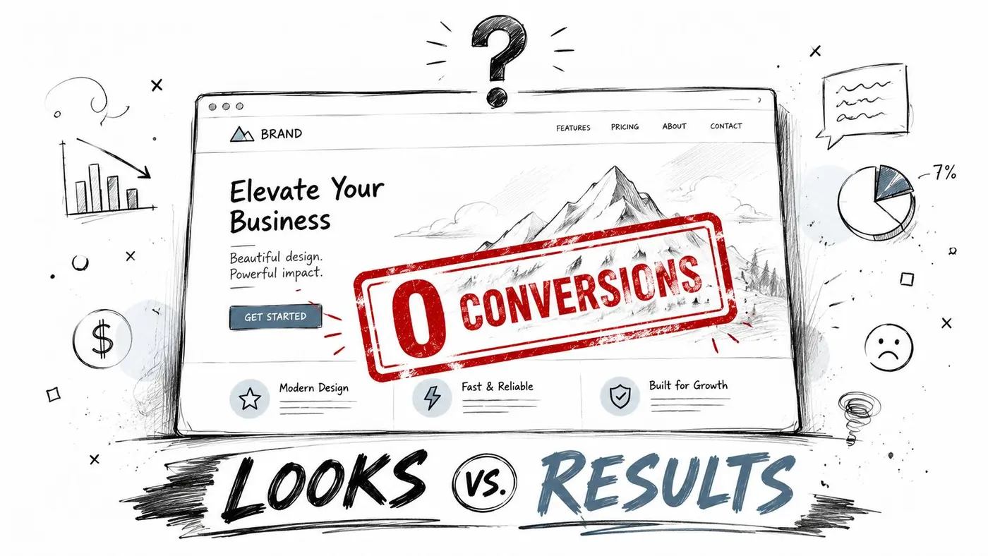
I see the same failure pattern in audits. Teams respond to weak conversion rates with a redesign discussion because design is visible and easy to debate. These blockers are usually less glamorous: weak message match between ad and headline, a form that asks for too much too early, competing navigation paths, slow load time, or a call to action that demands commitment before value is clear.
Good landing page optimization starts by treating the page as part of a conversion system. A landing page has one job. Continue the intent created before the click and remove enough friction for the visitor to act. If that system breaks at any point, a cleaner layout will not fix it by itself.
That distinction matters because conversion problems rarely come from one dramatic mistake. They come from a stack of smaller issues that compound. A slightly vague headline. A proof section buried too low. A CTA that reads like internal jargon. Four extra form fields. None of these always kills performance on its own. Together, they suppress it.
A practical way to evaluate the page is to separate three jobs it must do well:
- Earn attention: The page has to look credible and relevant within seconds.
- Explain the offer: Visitors should understand what they get, who it is for, and why it is worth the next step.
- Reduce resistance: Every extra field, delay, unanswered objection, or distracting exit lowers the odds of conversion.
This is why I push teams beyond checklist thinking. General landing page best practices are useful, but they do not tell you which problem is costing you conversions right now, on this page, with this traffic source. Optimisation work gets stronger when each change is tied to a diagnosed bottleneck instead of personal preference.
That is even more important on paid traffic. If you buy the click, post-click performance decides whether CAC stays workable. Teams running search or paid social should also review how to optimize your PPC landing pages, because the ad can create intent, but the landing page has to carry it through to revenue.
Pretty pages help with credibility. They do not create clarity, trust, or motivation on their own. High-growth teams improve landing pages by building a repeatable process for finding friction, deciding what matters, and testing changes that address a specific conversion problem.
The Foundation of Optimisation Research and Analytics
Before changing copy or layout, build a diagnostic view of the page. Most weak tests start too early. Someone spots a low conversion rate, proposes a new headline, and launches an experiment without knowing where the actual problem sits.
Start with the right baseline
A more reliable workflow starts in analytics. Apexure's landing page optimisation methodology recommends defining KPIs before launch in GA4, including conversion rate, form start and completion rate, bounce rate, and scroll depth. The same source notes that successful UK businesses achieve conversion rates of 21–50%, while the industry median is 6.6%.
That matters because a single headline metric can mislead you. If conversion rate is weak, you still need to know whether the issue is:
- Immediate exits: Bounce rate suggests weak message match or poor page experience.
- Shallow engagement: Scroll depth suggests visitors aren't finding enough reason to continue.
- Form friction: Strong starts but weak completions point to hesitation inside the form.
- Traffic mismatch: One campaign or audience segment may be dragging down the whole page.
I prefer to isolate the weakest metric first. If bounce rate is the outlier, I inspect message match and page speed before I touch form design. If users start the form but stop halfway through, I look at field order, perceived risk, and whether the value exchange is clear enough.
Pair quantitative with qualitative signals
Numbers tell you where to look. Behavioural tools tell you what people are struggling to do.
Use heatmaps to see whether visitors click dead elements or ignore the CTA. Use session recordings to watch where hesitation appears. Watch for cursor loops, repeated scrolling, or long pauses around pricing, proof, or form fields. Those patterns often reveal confusion faster than a dashboard does.
A simple working stack looks like this:
| Tool type | What it reveals | What you do with it |
|---|---|---|
| GA4 reports | Drop-off points in the funnel | Find the stage losing the most intent |
| Heatmaps | Attention and click concentration | Check whether key elements are being seen |
| Session recordings | Hesitation, confusion, abandonment moments | Identify specific friction on page |
| Form analytics | Start and completion behaviour | Diagnose where fields are causing resistance |
The point isn't to collect more data. It's to connect evidence. If GA4 shows high bounce, recordings show fast exits, and heatmaps show minimal engagement below the fold, you probably don't have a button problem. You have an expectation problem.
Practical rule: Never test a solution before you can describe the problem in one sentence.
For teams that need a sharper distinction between behavioural evidence and performance data, this breakdown of qualitative vs quantitative research is useful. The strongest optimisation work combines both. Quant tells you what happened. Qual explains why a visitor might have done it.
Build one hypothesis from one problem
At the end of research, you should be able to write something plain and testable. For example: visitors from paid search are bouncing because the page headline doesn't reflect the promise made in the ad. That diagnosis is usable. "The page could be better" isn't.
That's the difference between informed optimisation and expensive guessing.
Prioritising Ideas and Designing a Strong Hypothesis
Once research is done properly, the next problem appears fast. You suddenly have too many ideas. Remove nav. Rewrite headline. Shorten form. Add proof near the CTA. Cut sections. Add video. Personalise by campaign. Every one of them sounds plausible.
The job isn't to collect ideas. It's to decide which one deserves the next test.
Use a prioritisation filter that forces trade-offs
I like a simple three-part filter: potential, importance, ease.
- Potential: How much improvement could this change plausibly achieve?
- Importance: How much traffic or revenue touches this area?
- Ease: How difficult is it to build and launch cleanly?
This keeps teams from spending a week debating a minor visual treatment while a major friction point sits untouched. A button copy tweak may be easy, but if recordings show users abandoning at a long form, the form has more potential and more importance.
This is also where hard evidence should overrule taste. SellersCommerce's landing page statistics show that including multiple offers can decrease conversion rates by 266%, while focusing on a single offer can boost a 9% conversion rate to as high as 32.94%. The same source notes that A/B testing can increase landing page conversions by up to 30% in the UK market.
Those numbers don't mean every page needs the same treatment. They do mean some test ideas are structurally stronger than others. A page splitting attention across several offers is usually a better candidate than a debate over CTA colour.
Turn observations into hypotheses
A hypothesis should connect four things:
- The audience or context
- The proposed change
- The expected behaviour
- The reason it should work
For example:
We believe that replacing three competing offers with one clearly defined trial will increase form submissions because visitors currently have to choose before they fully understand the value.
That is much better than "test a new hero".
Another example:
We believe that moving trust signals closer to the primary CTA will increase form completions because visitors currently hesitate at the point of commitment.
A strong hypothesis is specific enough to be disproved. That's useful. If the test loses, you still learn something concrete.
Good hypotheses sound narrow on purpose
Weak teams often write broad, flattering assumptions. "A cleaner page will improve conversions." Maybe. But what does "cleaner" mean, and why should users respond?
A stronger version narrows the mechanism:
-
Instead of: test shorter copy
-
Use: test a shorter page that removes repeated benefit sections because users aren't scrolling far enough to consume them
-
Instead of: improve clarity
-
Use: rewrite the hero to match the ad promise because paid visitors are bouncing before engaging
That level of precision protects your backlog. It also makes review easier when stakeholders ask why a test matters.
Building and Launching Your A/B Test
A team can do the research, write a sharp hypothesis, and still waste two weeks on a test that never had a fair chance to answer the question. I see this happen in setup, not strategy. The variant loads late, the tracking is inconsistent, mobile gets a broken layout, and the result looks like user preference when it is really implementation noise.
Keep the experiment tighter than the idea behind it
The build phase is where discipline matters. A landing page test should isolate one decision. If the hypothesis is about message match, keep the layout, offer, and form flow stable. If the hypothesis is about reducing form friction, do not rewrite the whole page at the same time.
Set one primary outcome before anyone touches the builder. For a lead generation page, that is often qualified form submissions. For ecommerce, it may be completed purchases. Then add a small set of guardrail metrics such as average order value, revenue per visitor, lead quality, or completion rate. Those checks protect you from false wins, especially when a variant gets more clicks by attracting lower-intent users.
Page performance belongs in pre-launch QA, not in the post-test debate. If the test script causes visible flicker, shifts content, or delays the first useful view, the experiment is affecting behavior before the visitor evaluates the offer. That contaminates the result. Teams then argue about copy or design when the issue was delivery.
Build with rules the team can follow
I use a simple launch standard:
- One primary KPI: Everyone should know what decides the outcome.
- One core variable: Keep the test tied to the hypothesis instead of bundling several changes together.
- Clean traffic allocation: A 50/50 split is usually the safest starting point unless there is a clear reason to weight traffic differently.
- Device-specific QA: Review mobile, tablet, and desktop separately because small rendering issues can change intent or completion rate.
- Full-path checks: Click every CTA, submit every form state, confirm redirects, thank-you pages, and event tracking.
If a teammate needs shared language before review, this glossary of A/B testing terms is a useful reference.
For the mechanics, the Otter A/B guide to creating a test shows how to set up variants, traffic splits, and goals without a development-heavy workflow. Otter A/B is one option teams use to launch experiments while keeping implementation manageable.
Validate the live experience before you send volume
A test is not ready because the preview looks fine.
Open the live page in different browsers. Check it on a real phone, not only in responsive mode. Visit through paid ads, email links, and direct traffic if those sources are part of the experiment. Confirm that events fire once, not twice. Make sure the control and variant both preserve the same campaign promise so you are testing the intended change rather than introducing a mismatch upstream.
A short walkthrough can help teams sanity-check their setup before they send volume into the experiment:
Good test execution looks boring. That is the point. If the setup is clean, the result is far easier to trust, reuse, and turn into the next iteration of your optimisation system.
Interpreting Results and Making a Decision
A dashboard starts updating and everyone wants a verdict too early. That impulse is expensive. Early results are noisy, and teams regularly confuse movement with evidence.
Read the result like an operator, not a spectator
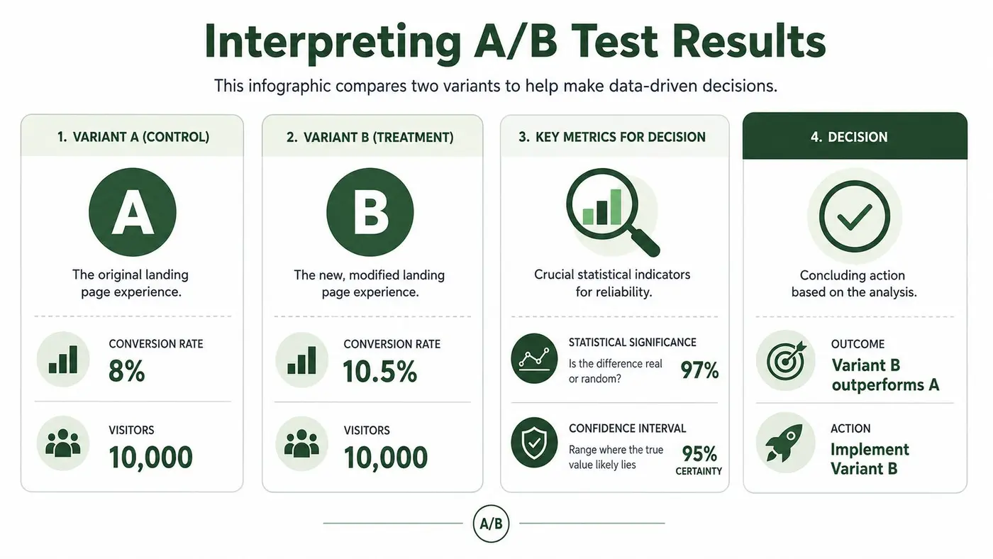
The first question isn't "which version is ahead today?" The first question is whether the result is reliable enough to support a decision.
In practical terms, confidence and significance are there to help you judge whether the observed gap is likely to be real rather than random variation. The exact threshold depends on your testing framework, but the habit matters more than the terminology. Don't declare a winner because the graph looks exciting after a short run.
A better review sequence looks like this:
| What to check | Why it matters |
|---|---|
| Primary conversion outcome | Confirms whether the main business action improved |
| Secondary metrics | Catches hidden trade-offs such as weaker downstream quality |
| Segment behaviour | Reveals if one device, campaign, or audience drove the effect |
| Technical anomalies | Flags tracking issues or broken user journeys |
Many "winning" tests often fail scrutiny. A variant can increase CTA clicks because the button is more prominent, but if lower-quality visitors submit forms or buyers abandon later, you haven't improved the business. You've moved the leak.
Context matters more than the scoreboard
Some page changes have stronger prior evidence than others. Salesgenie's UK landing page benchmarks report that removing navigation links increases conversions by approximately 100%, embedding video content lifts conversions by up to 80–86%, and businesses with 21–40 landing pages experience nearly a 300% conversion increase over those with fewer than 10.
Those benchmarks are useful context, not permission to skip analysis. If a navigation-removal test loses on your page, that doesn't make the benchmark false. It usually means your page has a different job, your audience needs more reassurance, or another friction point is dominating the outcome.
A result only becomes useful when you can explain it in behavioural terms.
That is the standard I use for decisions. If the variant wins, define why it likely won. If it loses, define what assumption failed. If the outcome is inconclusive, record the uncertainty. Inconclusive tests still narrow the search space.
Decide what happens next
Every result should end with a decision, not a debate loop.
- Implement: The variant improved the primary outcome without creating harmful side effects.
- Archive and learn: The variant lost, but the reason is now clearer.
- Refine and retest: The idea may still be sound, but execution or targeting was off.
- Investigate tracking: If the data is inconsistent, fix instrumentation before running again.
The worst habit is lingering in "interesting" territory. Interesting doesn't change revenue. A decision does.
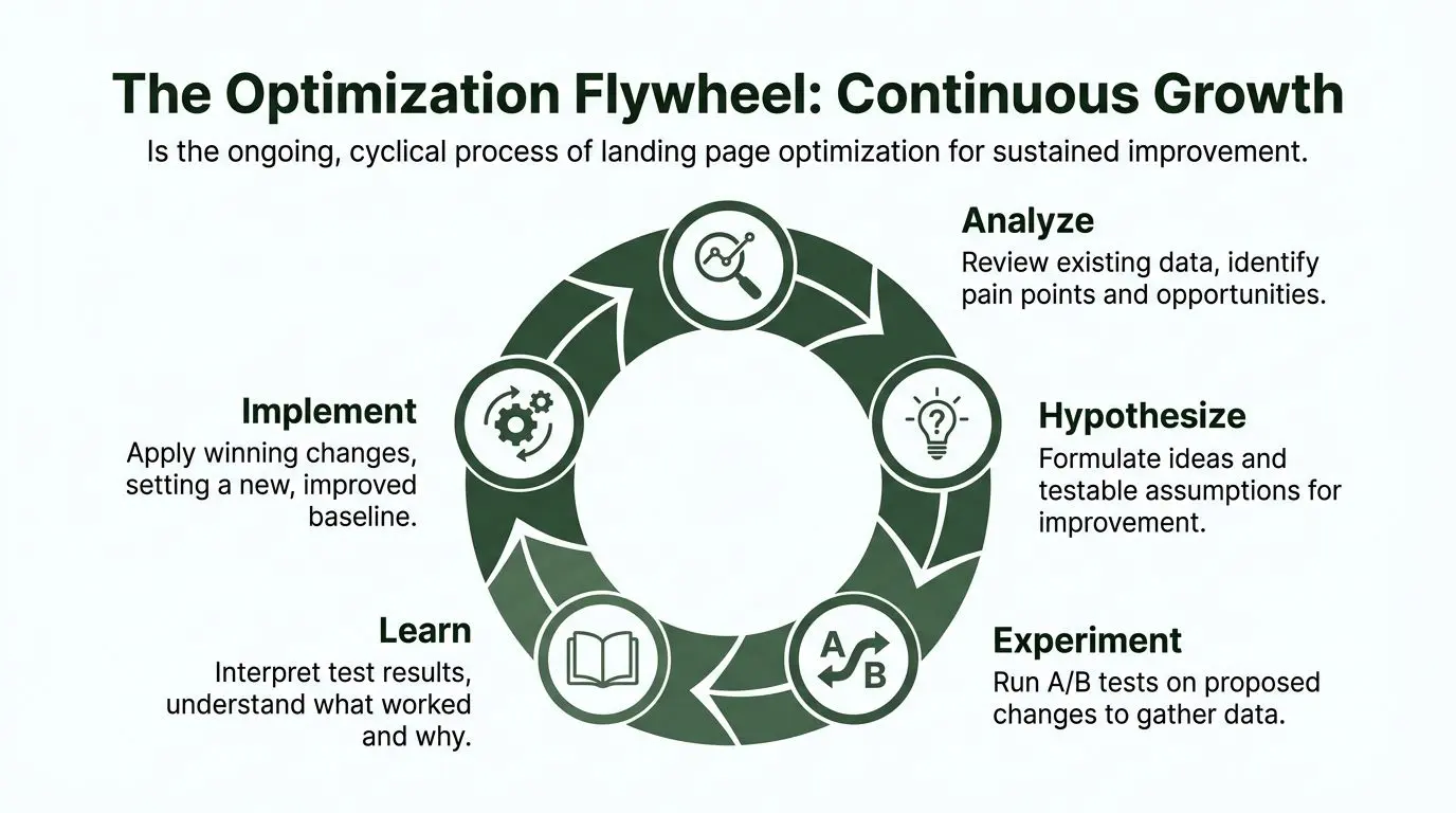
The Optimisation Flywheel Iterating for Continuous Growth
Organizations often treat landing page optimization like a repair job. The page underperforms, so they run a sprint, ship improvements, and move on. That approach can produce occasional wins, but it doesn't compound.
The better model is a flywheel. Research reveals friction. Friction produces hypotheses. Hypotheses become experiments. Experiments create evidence. Evidence sharpens the next round of research.
Why systems outperform isolated wins
The gap between average teams and mature optimisation programmes isn't effort. It's process discipline. According to Venture Harbour's 2026 UK study, cited here, 71% of UK optimisation efforts focus on minor cosmetic adjustments, while only 19% implement systematic testing frameworks that remove funnel friction. The same source says those process-driven approaches produce 3.2x higher conversion rates.
That lines up with what practitioners see in the field. Cosmetic edits feel productive because they're visible. Process work feels slower because it starts with diagnosis, not design. But diagnosis is where durable gains come from.
What the flywheel looks like in practice
When a test ends, the work doesn't stop.
- If the variant wins: It becomes the new control. The page is now better than it was, and future tests start from a stronger baseline.
- If the variant loses: The loss still teaches you something about your audience, your message, or your assumptions.
- If the result is mixed: You may have uncovered a segment-specific opportunity that deserves a more targeted follow-up.
- If the test was invalid: That is a process lesson. Tighten QA, instrumentation, or scope before the next launch.
A mature backlog reflects those outcomes. It doesn't become a graveyard of disconnected ideas. It becomes a learning log.
The real advantage is organisational memory
Teams often talk about winning tests. They should talk more about accumulated understanding.
Over time, a disciplined optimisation programme answers questions such as:
- Which audience segments need more reassurance before acting?
- Which offers convert cleanly versus attract low-intent leads?
- Which objections belong near the top of the page?
- Which layouts support fast action on mobile?
- Which pages need dedicated variants by traffic source or use case?
The page is never "done". The team just gets better at knowing what to change next.
That is why continuous optimisation compounds. Each cycle improves not just one page, but the decision quality behind the next page, the next campaign, and the next offer. The flywheel is valuable because it builds a repeatable way of working.
And that's the fundamental divide in landing page optimization. One team keeps redesigning. Another team keeps learning.
If you want a lightweight way to run that process, Otter A/B gives teams a practical setup for building variants, splitting traffic, and measuring conversion and revenue outcomes without turning experimentation into a development project.
Stop guessing
Ready to start testing?
Set up your first A/B test in under five minutes. No credit card required.
- 14-day free trial
- No credit card required
- Cancel anytime