Revenue Trend Analysis: A Guide to Actionable Insights
Learn to conduct effective revenue trend analysis. This guide covers metrics, data cleaning, segmentation, and how to link A/B test results to real growth.
You're probably looking at a dashboard that says revenue is down, flat, or up, and nobody agrees on why.
Marketing thinks traffic quality changed. Product thinks the checkout tweak helped. Finance says the numbers don't match Shopify. Someone points at conversion rate. Someone else points at average order value. By the time the meeting ends, you've got opinions, not analysis.
That's why good revenue trend analysis matters. Not the kind that stops at a monthly revenue line chart, but the kind that tells you which change moved money, which dip was external, and which “insight” was just a reporting problem. If you run growth, CRO, or e-commerce, that distinction decides where budget goes next.
Laying the Foundation for Meaningful Analysis
Monday's revenue meeting goes off the rails fast when every team is defending a different number. Growth is looking at net sales after discounts. Finance is looking at recognised revenue. Product is reading experiment lift from an analytics tool that does not account for refunds. Until those definitions line up, trend analysis is just organised disagreement.
Start with the drivers that can explain a change in revenue, not just describe it after the fact. For an e-commerce team, that usually means average order value, conversion rate, units per order, refund rate, and revenue per session or customer. For subscription businesses, recurring revenue, expansion, contraction, and churn deserve more attention. If the goal is to prove whether a product test or merchandising change made money, these inputs matter more than a single top-line chart.
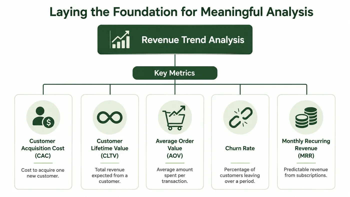
Define the metrics before you build the dashboard
I want one written definition for every metric the team plans to use. No exceptions. This sounds administrative, but it is usually the difference between a useful review and a 45-minute debate about whether a test improved revenue.
Write down the rules for each metric:
- Revenue: Choose gross sales, net sales, or recognised revenue, then stick to it.
- AOV: State whether tax, shipping, discounts, and refunds are included.
- Revenue per user: Define the denominator clearly. Visitor, lead, buyer, and active customer answer different questions.
- Lifetime value: Specify the time horizon and whether it is historical or modelled.
- Channel revenue: Set the attribution model before anyone starts comparing paid, email, and organic.
- Experiment revenue impact: Decide whether you will judge tests on conversion lift, incremental revenue per visitor, contribution margin, or payback after traffic costs.
That last one gets missed all the time. A/B tests rarely fail because the experiment was weak. They fail because the business never agreed on what counts as a win.
Build a single source of truth that can survive scrutiny
Revenue analysis usually pulls from the commerce platform, payment processor, CRM, analytics stack, and experiment tool. Those systems were built for different jobs, so the numbers will not match by default. Someone has to reconcile them.
Use one source for financial truth and map every supporting metric back to it. In practice, I prefer finance-owned revenue totals, then connect product, channel, and test data to that baseline so the team can trace a lift in conversion or AOV all the way through to booked revenue. If you skip that step, marketers can claim impact that never reaches the P&L, and finance will dismiss valid experiments because the reporting chain is broken.
A stable baseline also matters. You need enough history to recognise normal seasonality, promotion cycles, stock issues, pricing changes, and channel mix shifts before calling something a trend. Good analysis starts with disciplined inputs, which is why teams should document their data cleaning process for revenue reporting before they start interpreting movement in the chart.
Practical rule: If the team cannot trace a revenue number back to its source system and calculation logic, it is not ready for decision-making.
A simple validation checklist
Before anyone starts explaining why revenue moved, check the plumbing:
- Reconcile totals across systems. Payment, store, and finance totals should align for the same period, or the variance should be documented.
- Lock the date field. Order date, capture date, ship date, invoice date, and refund date can each create a different trend line.
- Standardise naming. Channel labels, product categories, and campaign names need one taxonomy.
- Flag one-off events. Promotions, stockouts, migrations, tracking failures, and pricing tests should be marked before analysis starts.
- Confirm report inputs. Marketplace teams often need a clear inventory of operational reports before they can trust revenue trends. Hopted's directory of essential reports for Amazon sellers is a useful example.
- Link experiment IDs to revenue records. If a checkout test, pricing test, or bundling experiment cannot be tied back to orders, you cannot prove commercial impact with confidence.
A reliable foundation feels slow the first time you set it up. After that, it speeds everything up because the team stops arguing about whose dashboard is right and starts asking which change led to improved revenue.
Preparing Your Data for Accurate Insights
Monday morning. Revenue is up 9% in the dashboard, paid spend is flat, and the product team wants to call last week's checkout test a win. Before anyone celebrates, clean the feed. I have seen the same pattern come from delayed captures, duplicated orders, late refunds, and a broken experiment tag.
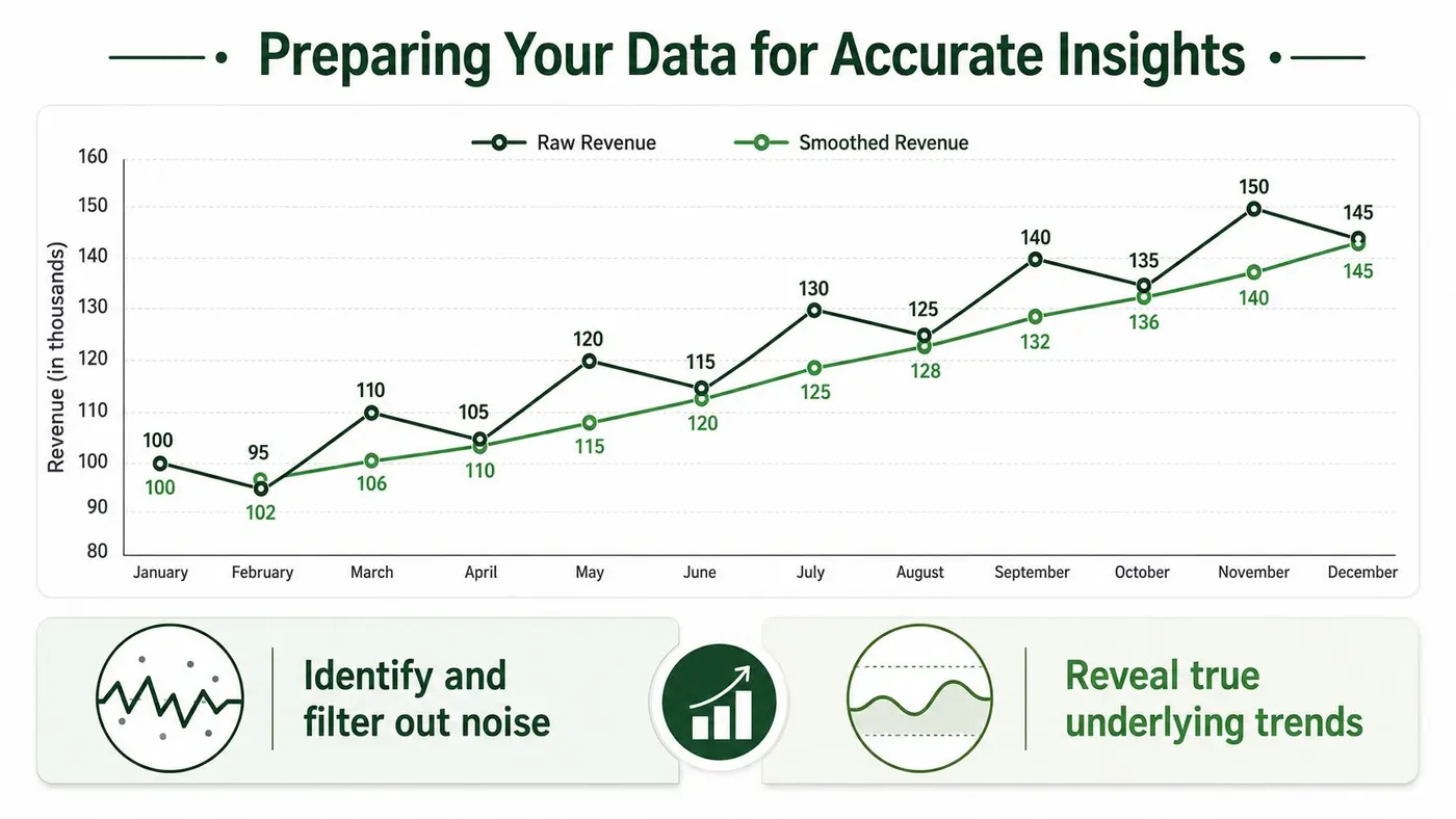
Revenue trend analysis gets unreliable fast when order data, finance data, and experiment data run on different clocks. The job here is not just to tidy a spreadsheet. It is to make sure a revenue movement can be tied back to a real customer action, a real product change, or a real market event.
Start with transaction hygiene, not charts
Smoothing methods help, but only after the base data is trustworthy. Fix the raw table first:
- remove duplicate orders and duplicate refund records
- standardise currency conversion rules and tax treatment
- align timestamps to one reporting timezone
- separate booked revenue from collected cash
- map every order to a stable customer ID and experiment ID where possible
That last point matters more than many marketing teams expect. If a pricing test changes average order value but half the orders are missing variant IDs, the trend line might look positive while the test readout stays inconclusive. Finance sees growth. Growth sees noise. Both teams lose time.
If your team needs a repeatable process, Otter A/B's guide to data cleaning best practices is a solid reference for cleaning event and revenue records before analysis.
Smooth the signal only after cleanup
Once the data is clean, use smoothing to answer a specific question.
A 3-month moving average is useful for reducing short-term swings. A 12-month moving average helps when seasonality is strong and leadership wants the longer direction. Exponential smoothing is better when recent changes should carry more weight, which is common after pricing changes, onboarding updates, or checkout experiments.
None of these methods is “best” on its own. They each hide something while clarifying something else. A 12-month view can make a meaningful conversion lift from a recent product test disappear. Exponential smoothing can make a short promotion look more durable than it is. Choose the method that matches the decision.
Compare periods that answer the business question
Bad comparisons create fake stories. December to January often says more about the calendar than performance. Year-on-year views usually give a fairer read on underlying revenue because they control for recurring seasonal patterns, but they still need context from promotions, stock issues, and pricing changes.
Use this as a working guide:
| Method | Best use | Common mistake |
|---|---|---|
| Month-on-month | Operational monitoring | Treating seasonality as a growth problem |
| Year-on-year | Performance review | Ignoring changes in channel mix or pricing |
| 3-month average | Short-term trend clarity | Calling a direction too early |
| 12-month average | Long-run movement | Missing a recent inflection point |
| Exponential smoothing | Fast-changing businesses | Overweighting temporary events |
Prepare the dataset so experiment impact can be proven
This is the step many teams skip. Revenue analysis should not stop at “sales went up” or “sales went down.” It should answer whether a product or marketing change caused the movement.
For that, build the analysis table at the order or customer level with fields for variant exposure, acquisition source, device, geography, first purchase date, and net revenue after refunds. Then analysts can test questions that matter in practice: Did the new checkout increase revenue per visitor or just shift conversion timing? Did the pricing experiment raise top-line revenue while hurting repeat rate? Did the landing page test improve new-customer revenue but lower revenue from returning users?
A trend line is only decision-ready when the team can separate operating noise from the commercial effect of real changes.
Clean data does not guarantee good decisions. It gives the team a fair shot at making them.
Segmenting Revenue to Uncover Hidden Stories
Aggregate revenue is where analysis starts. It's almost never where the answer lives.
A store can show stable top-line revenue while one acquisition channel is weakening, a returning-customer segment is carrying the month, and one product category is eroding margin quality. When you only look at the total, all three facts disappear.
Cut the revenue line into decision-ready segments
The most useful segment cuts are usually the least glamorous:
- Acquisition channel so you can see whether Paid Search, Organic Search, email, affiliates, or direct traffic generate different revenue quality
- New versus returning customers because conversion behaviour and order economics rarely match
- Geography when pricing, shipping, taxes, or local demand conditions differ
- Product category or tier so you can separate mix shifts from demand shifts
- Cohorts by first purchase or sign-up month to see whether customer value holds over time
Considering these factors often causes many false narratives to collapse. A homepage test might coincide with a revenue dip, but the dip may sit only in one region or one acquisition cohort. That changes the next action completely.
Cohorts explain whether the problem is demand, retention, or timing
Cohort analysis is the fastest way to stop blaming the wrong team. Group users by the month they first purchased or signed up, then watch how their spend develops. If newer cohorts convert well but spend less later, you may have a retention or product-value problem. If all cohorts weaken at the same point in time, external conditions may be the primary driver.
That distinction matters in the UK right now. It's important to separate external pressure from internal execution because 34% of UK households experienced income volatility in 2024-25, and 28% of UK consumers now prioritise payment flexibility over product features, according to the Resolution Foundation's analysis of unstable pay.
A revenue dip isn't automatically a conversion problem. Sometimes customers still want the product, but their cash flow changed.
What aggregate reporting hides
Here's a common pattern:
- Total revenue softens.
- The team assumes the latest landing page test hurt performance.
- Segment analysis shows returning customers held up, while new-customer revenue fell in a specific paid channel.
- Cohorts show the drop aligns with weaker purchasing power signals, not a broad on-site experience issue.
- The better response becomes payment messaging, offer structure, or financing visibility, not reversing a design test.
That's the difference between explanation and storytelling.
If you're setting this up inside an experimentation workflow, Otter A/B's documentation on analysing results by segments is useful because it mirrors how revenue questions surface in practice. You rarely need “the winner” in aggregate. You need to know who won, where, and whether that segment matters enough to act.
Integrating Experiment Data into Your Analysis
Many organizations still separate CRO reporting from revenue reporting. The experiment dashboard shows uplift in conversion rate. Finance shows the monthly revenue line. Nobody connects the two with confidence.
That split is why so many A/B testing programmes struggle to defend budget. If the test result ends at clicks, form fills, or checkout starts, you haven't shown commercial impact. You've shown movement in a proxy.

Stop reporting experiments in isolation
The better model is simple. Every experiment should feed back into your revenue trend analysis with the same structure:
| Experiment field | What to record |
|---|---|
| Test name | A plain-English summary of the change |
| Revenue metric affected | Revenue per visitor, AOV, checkout revenue, repeat purchase behaviour |
| Audience or segment | Which users saw it |
| Start and end dates | Needed to align with trend windows |
| Business context | Promotion, pricing change, stock issue, seasonality flag |
| Decision taken | Rolled out, iterated, or rejected |
Once that log exists, you can annotate the revenue timeline and stop pretending every inflection came from “market conditions”.
Revenue is the real success metric
A higher conversion rate doesn't automatically mean a better outcome. The variant might attract lower-intent buyers, reduce basket size, or increase low-value purchases. The opposite also happens. A variant with a flatter conversion rate can still produce stronger revenue if it improves order value or purchase quality.
That's why experimentation tools increasingly need revenue visibility built in. The wider UK market is moving the same way. The UK digital transformation market was valued at USD 35.11 billion in 2022 and is projected to reach USD 235.69 billion by 2030, a CAGR of 27.7%, according to Grand View Research's UK digital transformation market report. That projection supports what many teams already feel operationally. Analysis is moving from basic reporting to systems that tie actions directly to revenue.
A practical workflow that works
I'd train a new growth team member to handle this in four moves:
- Tag every experiment against a commercial metric. Don't let tests live only in conversion reporting.
- Annotate your revenue charts. Mark launch dates, rollout dates, and reversals.
- Review results by segment before rollout. Aggregate wins often hide weak revenue quality in important audiences.
- Keep finance in the loop early. If finance can't follow the test-to-revenue logic, the result won't survive planning season.
A reporting cadence matters too. If you want the experiment log and revenue view to stay useful, standardise how evidence is shared. Otter A/B's guide on reporting best practices is a solid reference for building reports that stakeholders can effectively use.
A short walkthrough helps if you're building this process from scratch:
When teams integrate experiment data this way, revenue trend analysis stops being historical commentary. It becomes proof of impact.
Visualising Trends and Interpreting Results
Bad charts create false confidence. They make weak analysis look polished and let people walk away with the wrong answer faster.
The safest dashboard is usually the simplest one. A line chart for revenue over time. A segmented bar chart for contribution by channel or cohort. A stacked chart when mix matters. Anything more complex needs a reason.
Choose the chart that matches the question
Use a line chart when the issue is direction over time. Use bars when you're comparing categories. Use stacked visuals when you want to show composition, not just totals.
What you shouldn't do is cram trend, mix, targets, forecast, and experiment outcomes into one visual. Stakeholders will pick the easiest pattern to notice, not the most important one.
A good dashboard answers three questions in order:
- What changed
- Where it changed
- Whether the change is likely operational, experimental, or external
Context stops overreaction
Internal numbers need external context. Otherwise, teams misread broad economic pressure as a company-specific failure.
For UK businesses, one reliable benchmark is household purchasing power. The ONS reported that real household disposable income per head increased by 1.2% in Q4 2025, as shown in the UK sector accounts data from the Office for National Statistics. That doesn't tell you what your business should have earned. It tells you whether your performance sits inside a wider consumer pattern or against it.
If your revenue line weakens while national consumer conditions also soften, don't rush to blame the last website change.
Read charts like an operator, not a spectator
The most useful habit is to interrogate every chart with the same set of questions:
- Is this trend raw or adjusted? If it's raw, noise may be driving the interpretation.
- What segment is carrying the result? Aggregate performance often flatters weak channels.
- What happened around the inflection point? Promotions, product launches, test rollouts, and stock problems matter.
- Is the axis exaggerating the movement? A tight scale can make small changes look dramatic.
- What comparator am I using? The wrong time comparison creates fake insight.
If you're building dashboards for direct-to-consumer teams, Clickstera's guide to D2C brand KPIs and data is a useful companion because it shows how to structure metrics around decisions rather than vanity reporting.
The best visualisation doesn't impress people. It shortens the path from chart to action.
Turning Insights into Actionable Growth Plays
Analysis earns its keep only when it changes what the team does next.
A surprising number of companies stop one step too early. They identify a revenue pattern, discuss it, maybe document it, then move on. Nothing is tested. Nothing is reallocated. No message changes, no pricing hypothesis gets validated, no low-quality channel gets challenged. That isn't a growth system. It's a reporting habit.
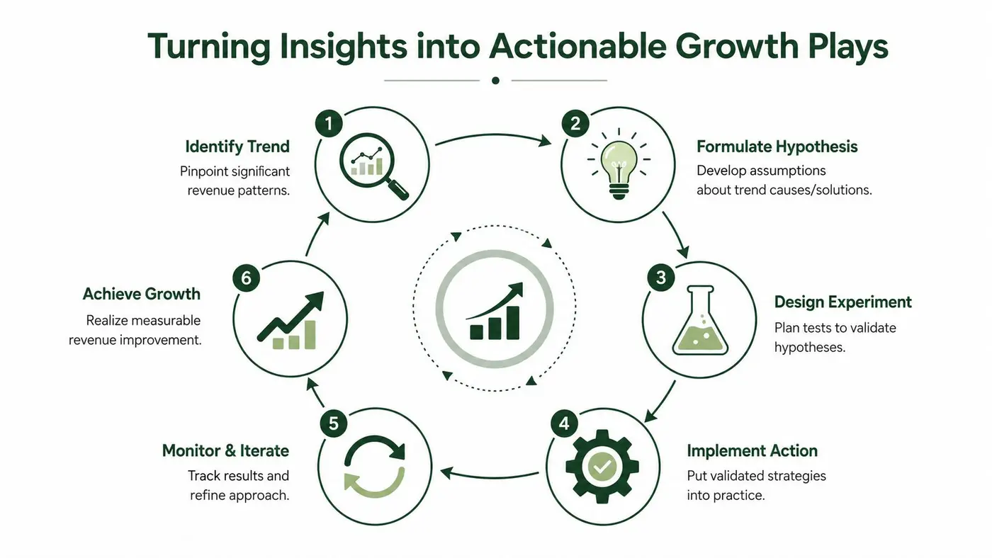
Use a closed-loop decision model
The best operating rhythm is a loop:
- Identify the trend. Find the movement that matters, not every wobble.
- Form a hypothesis. Decide what's most likely causing it.
- Design an experiment or intervention. Test copy, pricing, payment visibility, page layout, offer structure, or budget allocation.
- Implement the winner. Roll out what survives scrutiny.
- Monitor and iterate. Keep watching the revenue impact after deployment.
- Feed the result back into planning, turning trend analysis into strategy.
That loop is more disciplined than “optimise the funnel”. It forces every insight to become a decision.
Match action to the type of trend
Different trend types demand different plays.
| Trend pattern | Likely next move |
|---|---|
| Revenue down in one channel only | Audit targeting, landing page match, and offer quality for that source |
| Conversion stable, AOV softening | Test bundling, pricing presentation, and cart structure |
| New cohorts weaker than older cohorts | Review acquisition quality and onboarding promise |
| Demand softening across segments | Adjust payment messaging, promotion strategy, or inventory emphasis |
| Winning test improves one metric but hurts revenue quality | Reject the rollout or narrow it to the right audience |
This is also where ROI discipline matters. If you need a plain-language framework for tying actions back to outcomes, Netco Design's resource for smart business owners is useful because it keeps the conversation anchored to business return, not just channel activity.
The right next step isn't “do more testing”. It's “test the change most likely to alter the revenue line”.
What strong teams do differently
Strong teams don't celebrate insight. They operationalise it.
They treat trend analysis as a live input into experiment planning, merchandising, channel allocation, and pricing. They document decisions. They revisit assumptions. They're willing to learn that the cause wasn't the one they liked best.
That mindset is what turns revenue trend analysis into a growth engine. Not because the charts are better, but because the team gets faster at moving from evidence to action.
If you want to connect website experiments directly to purchases, average order value, revenue per variant, and long-term revenue trends, Otter A/B gives you a lightweight way to do it without slowing the site down. It's built for teams that need more than conversion-rate wins and want to prove impact on the bottom line.
Stop guessing
Ready to start testing?
Set up your first A/B test in under five minutes. No credit card required.
- 14-day free trial
- No credit card required
- Cancel anytime