How to Calculate Net Promoter Score Accurately
Learn to calculate Net Promoter Score (NPS) accurately. Our 2026 guide covers the formula, examples, confidence, and how to act on your score.

You've got a column of survey responses. They're all integers from 0 to 10. Someone on the team asks for the Net Promoter Score by end of day, and suddenly a simple export turns into a measurement problem.
That's where many teams get stuck. The arithmetic itself isn't hard. However, the primary friction begins after the export: which scores belong in which bucket, whether passives count, whether averaging is acceptable, whether a movement in score is meaningful, and how to use the result in actual optimisation work instead of dropping it into a slide deck and moving on.
If you're trying to calculate net promoter score properly, treat it as more than a formula. It's a standardised way to convert raw recommendation data into a loyalty signal you can compare over time, across segments, and alongside conversion metrics. It also has traps. Small samples can make the number wobble. Poor benchmarking can make a decent score look weak, or a weak score look fine. And if you're running experiments, a conversion lift that harms customer sentiment can cost you more than it earns.
A strong NPS workflow starts with clean collection, not clever reporting. If your survey design is shaky, the math won't save it. This is why teams often benefit from tightening the question set first, especially when they're already reviewing their broader survey question for customer satisfaction approach.
From Raw Survey Data to a Powerful Metric
A spreadsheet full of 0 to 10 responses doesn't tell you much on its own. You can scan it and get a rough feel for sentiment, but rough feel isn't enough when marketing, product, and support all want to know whether customer loyalty is improving.
Net Promoter Score, or NPS, gives that raw data a common structure. Instead of debating whether an average rating “looks good”, the team can use one standard classification and one standard calculation. That matters because loyalty measures become comparable across time periods and customer groups.
What makes NPS useful in practice is that it translates mixed individual responses into a single operating metric. A launch cohort can be compared with a renewal cohort. Users from paid acquisition can be compared with users from organic search. Support-heavy accounts can be compared with self-serve accounts. The score doesn't answer every customer-experience question, but it does create a shared language.
Why teams misread the raw numbers
The most common mistake happens before anyone opens Excel. People look at the distribution and instinctively average the scores, because averages are familiar. That produces a number, but not an NPS. It also hides the polarity that makes NPS useful.
A customer who gives you an 8 is not treated the same way as a customer who gives you a 10. In an average, those two answers sit fairly close together. In NPS, they sit in different strategic buckets. That difference is the point.
NPS isn't trying to estimate “general satisfaction” from a mean score. It's trying to separate advocates from critics using a fixed recommendation threshold.
Why this matters for growth work
If you work in CRO or lifecycle marketing, this isn't just a CX metric. It's a quality-control metric for growth. You can improve sign-up rate with a more aggressive message and still damage downstream loyalty. You can simplify onboarding and improve both activation and recommendation. NPS helps you see which kind of improvement you're creating.
Used properly, it becomes a bridge between voice-of-customer data and optimisation decisions. Used lazily, it becomes a decorative KPI.
The Core Net Promoter Score Formula
A marketing team launches a new onboarding flow, sees NPS move from 32 to 39, and starts calling the test a win. That conclusion is premature if the score was calculated loosely, or if the sample was too small to trust. The formula itself is simple. The discipline around it is where teams usually slip.
The standard method uses one recommendation question on a 0 to 10 scale. Responses are grouped into Promoters (9 to 10), Passives (7 to 8), and Detractors (0 to 6). NPS is the percentage of Promoters minus the percentage of Detractors, which keeps the metric on a -100 to +100 scale, as defined by the Net Promoter System.
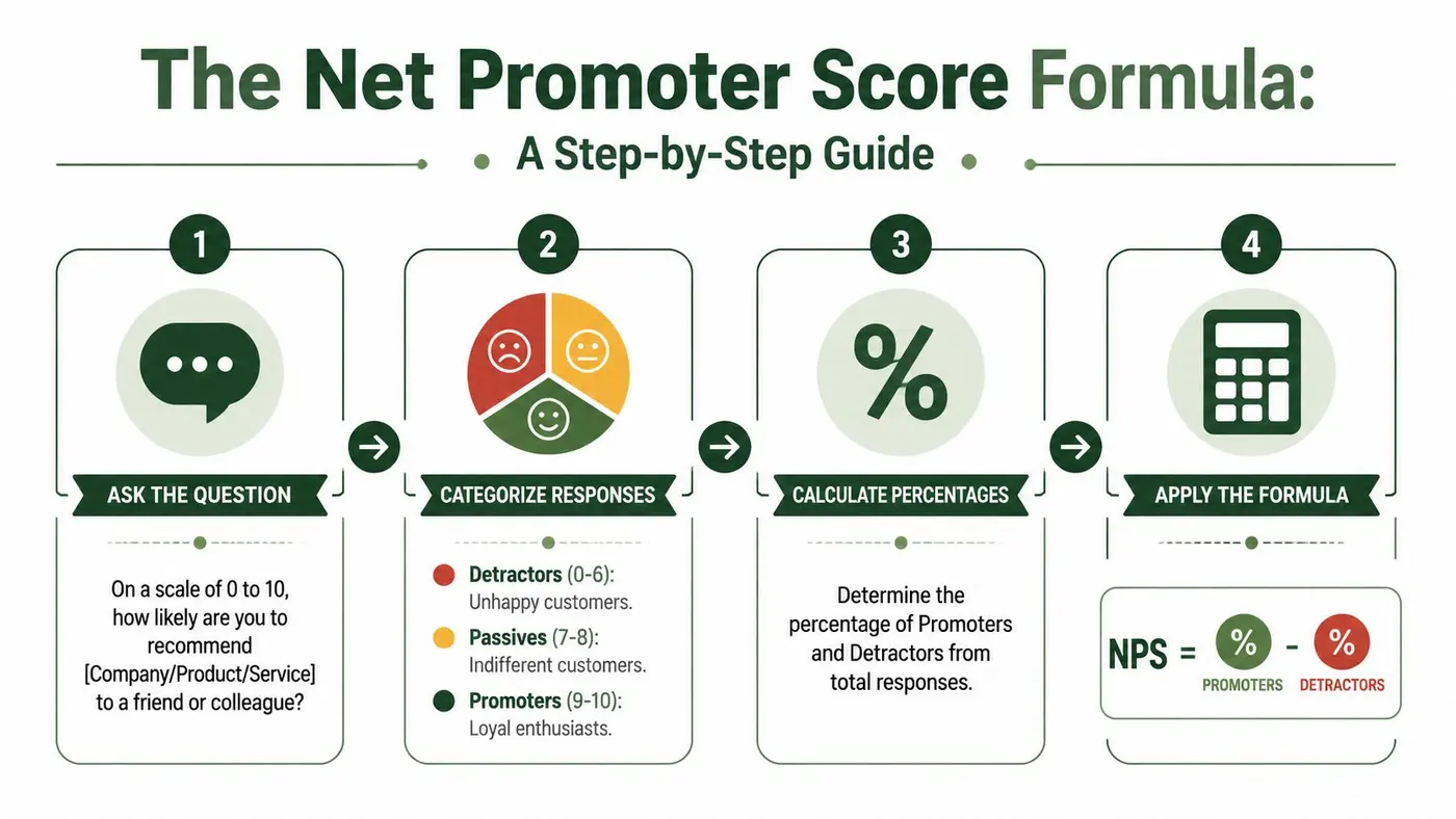
The three response categories
These buckets are fixed. If a team treats 8s as promoters or shifts the detractor line, it has created a custom loyalty score, not standard NPS.
| Category | Score Range | Description |
|---|---|---|
| Promoters | 9 to 10 | Customers who are most likely to recommend |
| Passives | 7 to 8 | Satisfied but unenthusiastic respondents who do not count in the formula |
| Detractors | 0 to 6 | Customers who are least likely to recommend |
The formula in plain English
Use percentages, not raw counts and not average ratings.
NPS = % Promoters - % Detractors
Passives still matter because they show how much of the base is neutral, but they are excluded from the subtraction. That design is what makes NPS useful for spotting polarity. A customer base with many 7s and 8s can look healthy in an average score and still produce a weak NPS, which is often the more honest read for retention and referral risk.
A quick reference helps here:
A worked example
Say you collect 200 valid responses:
- 120 respondents gave 9 or 10
- 50 respondents gave 7 or 8
- 30 respondents gave 0 to 6
The calculation is:
- Promoter % = 120 / 200 = 60%
- Detractor % = 30 / 200 = 15%
- NPS = 60% - 15% = +45
That is the right sequence. Count each group, divide by total valid responses, then subtract detractors from promoters.
For teams checking this in spreadsheets before pushing results into a dashboard, a short guide to running test calculations in Excel helps prevent formula drift. If you need the spreadsheet logic for bucket counts, these Excel COUNTIFS and SUMPRODUCT methods are a practical reference.
What the score range means in practice
The score can run from -100 to +100. A score of -100 means every valid respondent is a detractor. A score of +100 means every valid respondent is a promoter.
That range is tidy, but tidy numbers can create false confidence. An NPS of 40 from 40 responses is not as dependable as an NPS of 40 from 4,000 responses. For CRO work, that distinction matters more than the headline number. Before comparing cohorts or declaring an A/B variant better, check whether the change is large enough to rise above normal sampling noise. Confidence intervals belong in that conversation, especially when sample sizes are uneven.
Common calculation mistakes that distort decisions
The math errors are familiar, but the business consequences are usually bigger than they look.
- Averaging the raw 0 to 10 ratings. This turns NPS into a satisfaction mean and hides the split between advocates and critics.
- Subtracting counts instead of percentages. This breaks comparisons across segments with different response volumes.
- Including passives in the formula. That lowers or inflates the score depending on how the spreadsheet is built.
- Counting invalid responses in the denominator. Blanks, duplicate submissions, or answers outside 0 to 10 can skew the final percentage.
- Reading small movements as meaningful. A 3 point lift may be real, or it may be noise. Without sample context, nobody knows.
For experimentation teams, the last error causes the most damage. A variant can post a higher NPS because fewer people answered, or because one small cohort over-indexed in the sample. Calculate the score correctly first. Then test whether the change is reliable enough to act on.
Calculating NPS in Spreadsheets and Code
Many teams don't need specialised software to calculate net promoter score. They need a clean column of valid responses and a method that doesn't break under deadline pressure.
For UK-facing work, keep the implementation strict. Use the single 0 to 10 recommendation question, classify 9 to 10 as promoters, 7 to 8 as passives, and 0 to 6 as detractors, then calculate promoter percentage minus detractor percentage. Passives are excluded from the formula. That standard approach also helps you avoid the common mistake of averaging raw scores. It's also good practice to pair the score with an open-text “why?” follow-up, as explained in Qualtrics' NPS measurement guidance.

In Google Sheets or Excel
Assume your responses sit in cells A2:A101. The exact row count doesn't matter. The pattern does.
Start with three counts:
-
Promoters
=COUNTIF(A2:A101,">=9") -
Passives
=COUNTIFS(A2:A101,">=7",A2:A101,"<=8") -
Detractors
=COUNTIF(A2:A101,"<=6")
Then calculate total valid responses:
-
Valid total
=COUNT(A2:A101)
Then convert to percentages:
-
Promoter %
=COUNTIF(A2:A101,">=9")/COUNT(A2:A101) -
Detractor %
=COUNTIF(A2:A101,"<=6")/COUNT(A2:A101)
Finally calculate NPS:
-
NPS
=((COUNTIF(A2:A101,">=9")/COUNT(A2:A101))-(COUNTIF(A2:A101,"<=6")/COUNT(A2:A101)))*100
That last multiplication by 100 converts the result into the normal NPS scale.
Where spreadsheet setups usually go wrong
Two implementation errors show up repeatedly:
-
Mixed valid and invalid values Blank cells, text labels, or imported symbols can inadvertently alter your denominator.
-
Range drift
Someone adds new survey rows below the original range and the formula never updates.
If you want more advanced range logic, especially when score buckets become part of a larger analysis sheet, these Excel COUNTIFS and SUMPRODUCT methods are useful references.
Practical rule: Lock down the denominator first. Most NPS mistakes are denominator mistakes wearing a formula costume.
Building it in a reusable worksheet
If your team calculates NPS regularly, don't leave it as ad hoc arithmetic in one tab. Build a small template with:
- A raw data tab for pasted responses only
- A calculation tab with fixed formulas and labels
- A notes field for survey date, audience, channel, and any filtering applied
- A verbatim tab for open-text reasons behind the score
This is also where a testing mindset helps. If you already use spreadsheets to evaluate changes and compare outcomes, a disciplined worksheet structure saves time. Otter's guide to testing in Excel is a practical reference for that kind of repeatable setup.
In Python
If your marketers work closely with analysts or developers, code is often safer than a manual spreadsheet because the logic is explicit.
import pandas as pd

# responses is a pandas Series of integers from 0 to 10
responses = pd.Series([10, 9, 8, 6, 7, 10, 5, 9])

total = responses.dropna().shape[0]
promoters = responses[responses >= 9].shape[0]
detractors = responses[responses <= 6].shape[0]

nps = ((promoters / total) - (detractors / total)) * 100
print(round(nps, 2))
This does the same four things as the spreadsheet: count promoters, count detractors, divide by valid responses, subtract.
Code advantages in production workflows
Code becomes valuable when you need to:
- Automate recurring NPS reporting from CSV exports or data warehouses
- Segment scores programmatically by plan, region, source, or device
- Join score data with comments for text analysis and theme tagging
- Reduce manual errors when multiple people touch the same dataset
If you're calculating NPS weekly, not quarterly, reproducibility matters more than convenience.
Why Your NPS Might Be Misleading and How to Fix It
A lot of teams calculate NPS correctly and still interpret it badly. They treat one score as settled truth, when in reality it's an estimate shaped by who answered, how many answered, and whether the respondent mix changed.
That's the gap most “calculate net promoter” guides skip. They teach the buckets and the subtraction, then stop before the part that affects decision quality.
The score is not the whole story
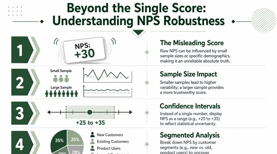
An NPS of +30 can mean very different things depending on the sample behind it. If the response pool is broad, representative, and consistent with prior waves, that score may be a useful operating signal. If it comes from a thin slice of users who happened to respond this week, it may be noise.
This matters in the UK because survey response rates are under pressure, and the Office for National Statistics has highlighted growing nonresponse bias and the need for caution when interpreting small-sample survey estimates in its guidance on the problem of nonresponse.
Confidence intervals matter more than most dashboards admit
A confidence interval gives you a range around the observed score. Instead of saying “our NPS is +X and therefore it improved”, you ask whether the new result is clearly different from the old one once uncertainty is considered.
You don't need to turn every marketer into a statistician. You do need to stop treating tiny movements as proof.
A score change is only useful when you can defend it as signal rather than response-mix drift.
What makes an NPS result unreliable
Watch for these warning signs:
-
Small respondent pools
A handful of extra promoters or detractors can swing the score sharply. -
Channel imbalance
If one wave leans heavily towards a single channel, the sample may no longer be comparable. -
Segment drift
A rise in one audience group can make the overall score look better even when another group worsened. -
Low context
Without comments, you know the score moved but not why.
How to make the score more trustworthy
You don't fix NPS reliability with a fancier chart. You fix it with better survey discipline.
Start with consistency:
- Keep the question wording unchanged
- Use the same collection points where possible
- Track who responded, not just how many
- Compare like with like, such as the same plan tier or lifecycle stage
Then add uncertainty to the reporting layer:
- Show a confidence interval or uncertainty band
- Flag low-volume segments
- Avoid presenting small week-to-week changes as decisive
A better way to read movement
Say your score rises slightly after a homepage change or onboarding update. Don't jump straight to “the change improved loyalty”. First ask:
- Did the sample composition stay stable?
- Did one customer segment dominate responses?
- Did open-text feedback improve in the same direction?
- Is the shift large enough to clear ordinary survey noise?
That last question is the one experienced teams ask first. The math of NPS is easy. Trusting the movement is harder.
Interpreting and Benchmarking Your Score
A team sees NPS move from 24 to 31 and treats it like a clear win. That reaction is common, and it is often too fast.
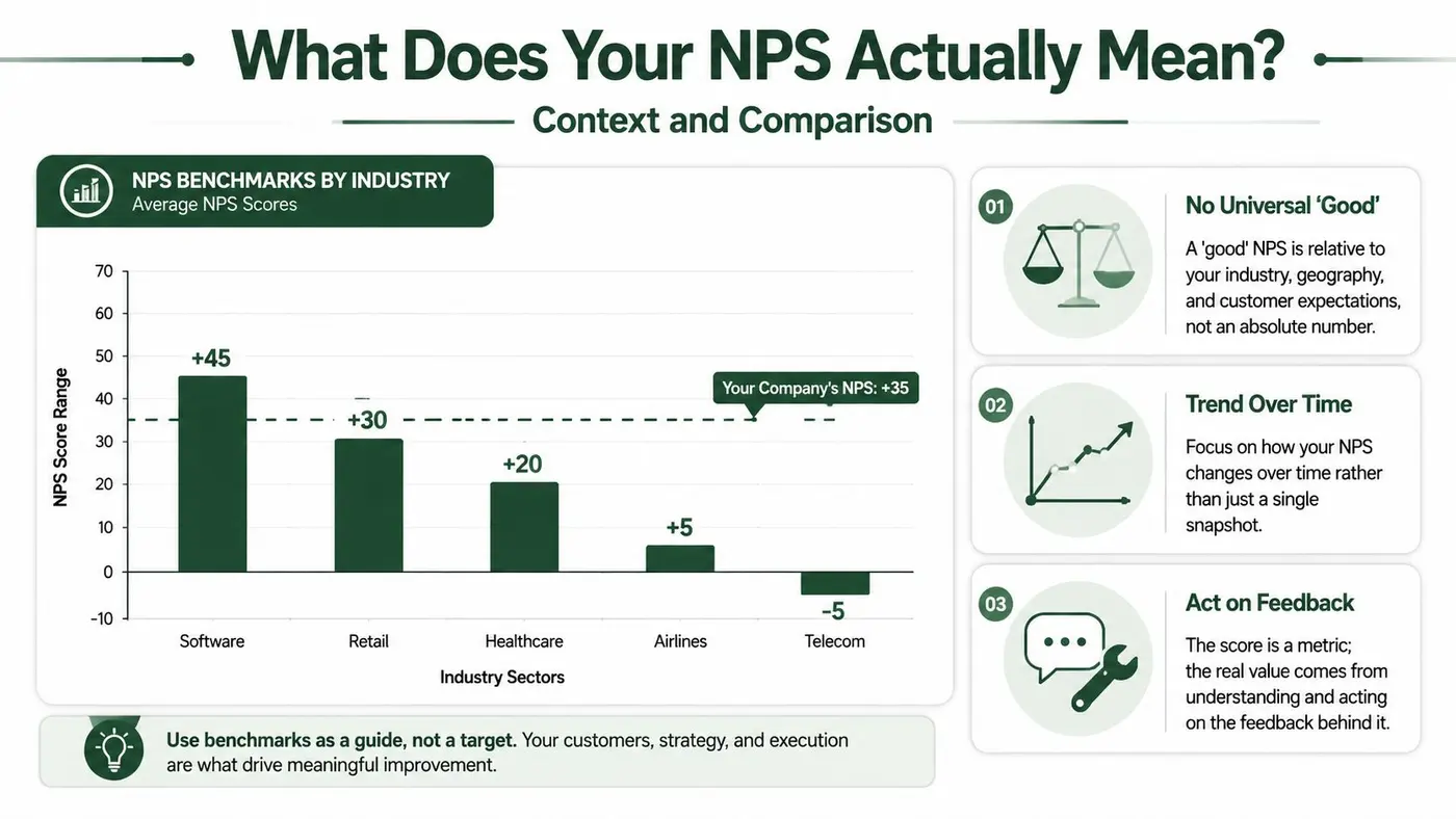
A score only means something in context. The same NPS can signal healthy customer sentiment in one category and underperformance in another. For experimentation teams, the bigger mistake is simpler. They compare a number that came from their own audience, timing, and survey method against a benchmark built from a different customer base and call it insight.
Start with your own baseline
Your first benchmark should be internal. If the survey question, sampling window, and audience stay consistent, your historical range is usually more useful than any industry average.
NPS is sensitive to expectations. A support-led SaaS product, a low-touch ecommerce brand, and a telecom provider can all earn the same score for very different reasons. A single benchmark table hides that.
The practical read is straightforward. If NPS rises alongside better retention, fewer complaint escalations, or smoother onboarding completion, the score is pointing in a believable direction. If NPS rises while churn, refund pressure, or support backlog gets worse, treat the score as a prompt to investigate, not a result to celebrate.
Use external benchmarks with tight filters
External benchmarks still have value. They are most useful when the comparison group matches your business on customer expectations, service model, geography, and purchase cycle.
The Institute of Customer Service makes this point in its UK Customer Satisfaction Index research. Sector differences are large enough that broad comparisons often create false confidence.
A retailer benchmark is not a useful target for a B2B SaaS product. A fast-cycle consumer brand and an enterprise software vendor train customers to evaluate very different experiences.
Use this rule. Benchmark against peers your buyers would see as substitutes, or against your own prior performance.
Read the score on three levels
A single NPS number is a summary. Interpretation gets better when you read it through three lenses:
- Trend: Is the score improving over a meaningful period, not just one survey wave?
- Comparable peer set: Are you measuring yourself against companies with similar customer expectations?
- Business signals: Does the score line up with retention, expansion, complaint patterns, and support outcomes?
That third lens is where good teams separate reporting from decision-making. An NPS of 40 is not automatically "good" if promoters are concentrated in one easy-to-serve segment while high-value accounts are slipping. The overall number can stay respectable while the commercial picture weakens.
Add statistical discipline before you call a score better or worse
Benchmarking without uncertainty creates overconfident decisions. If two scores are close, the key question is not which number is higher. The crucial question is whether the gap is large enough to survive ordinary sampling noise.
That is why confidence intervals matter. A five-point difference can be meaningful in a large, stable sample and meaningless in a small one. If your team needs a quick refresher, this guide to confidence intervals in statistics explains the logic clearly.
This is also where experimentation teams should be careful. If one onboarding variant produces a slightly higher NPS than another, do not treat that as a product truth until the interval is tight enough to support the claim. Otherwise you are benchmarking noise against noise.
Use comments to make the benchmark useful
Benchmarks tell you whether a score looks high, low, or ordinary. They do not explain why.
Open-text responses do. They show whether promoters mention speed, clarity, support quality, feature depth, or value for money. They also show whether detractors are reacting to a fixable journey issue or a deeper product-market mismatch.
For a simple reminder of how customer language sharpens interpretation, see Big Promoter's collected testimonials. The point is not to copy the format. It is to see how direct customer phrasing makes a score easier to act on.
A benchmark without comparability is weak. A benchmark without statistical context is hard to defend.
Acting on NPS with Segmentation and A/B Testing
The teams that get the most value from NPS don't stop at reporting it. They break it apart and use it to guide changes.
An overall score is a summary. A segmented score is a diagnostic tool.
Segment before you speculate
If your aggregate NPS looks flat, one segment may still be improving while another is slipping. Useful cuts often include:
- Lifecycle stage such as new customers versus established ones
- Acquisition source such as paid, organic, referral, or partner traffic
- Plan or product tier such as free, self-serve, or enterprise
- Journey touchpoint such as post-onboarding, post-purchase, or post-support
The “why?” responses are essential. The score tells you which segment has tension. The comments tell you whether the issue is pricing clarity, onboarding friction, support quality, fulfilment problems, or expectation mismatch.
Use NPS as a guardrail in experiments
In experimentation work, NPS is rarely the primary metric for a headline or CTA test. It is often the guardrail metric that prevents local conversion wins from damaging broader customer quality.
A variant can improve clicks by overselling. It can improve form completion by making the offer sound simpler than it is. It can increase trial starts while creating disappointment later. If recommendation intent drops after exposure to the winning variant, you've learned something important.
That makes NPS especially useful in experiments that affect promise-setting and early experience, such as:
- Homepage messaging tests
- Pricing page framing
- Trial or demo CTAs
- Onboarding flow changes
- Post-purchase and post-sign-up journeys
What works and what doesn't
What works is pairing behavioural metrics with customer sentiment. What doesn't work is asking NPS on every minor interaction and expecting stable insight.
Use NPS where the experience is broad enough to support a recommendation judgement. Then compare score movement alongside conversion, retention, or revenue outcomes. If those signals move together, you have a stronger basis for rollout. If they diverge, slow down and inspect the trade-off.
A disciplined team doesn't ask, “Did this variant win?” It asks, “What did this variant optimise, and what did it damage?”
If you want to run experiments without slowing the site down, Otter A/B gives marketing and CRO teams a lightweight way to test headlines, CTAs, and layouts while tracking the business metrics that matter. It's built for fast deployment, clean reporting, and decision-making you can defend.
Stop guessing
Ready to start testing?
Set up your first A/B test in under five minutes. No credit card required.
- 14-day free trial
- No credit card required
- Cancel anytime