What Is Conversion Rate Optimization: A Practical Guide
Learn what is conversion rate optimization (CRO) and why it matters. Our guide covers the process, tactics, KPIs, and how to start testing today.
Your analytics look busy. Traffic is coming in from search, ads, email, social, maybe even direct visits from people who already know your brand. Yet sales, demo requests, or form fills still feel lower than they should.
That gap is where many teams get stuck. They assume they need more traffic, more content, or a bigger ad budget. Sometimes they do. Often they don't. Often they need to make the existing journey easier, clearer, and more convincing for the people already arriving.
That's where conversion rate optimisation comes in. If you're new to CRO, think of it less as a specialist discipline with expensive tools and more as a habit of asking one practical question: what's stopping this visitor from taking the next step?
What Is Conversion Rate Optimisation and Why You Need It
If you run a website, you already have a shop front. CRO is the work of making that shop easier to buy from.
In a physical shop, you'd notice obvious friction fast. A confusing sign sends people to the wrong aisle. A till queue makes shoppers abandon baskets. A poor layout hides your best products. Online, the same problems exist, but they're easier to miss because they show up as clicks, hesitations, exits, and abandoned sessions instead of visible customer behaviour.
Conversion rate optimisation is the systematic process of improving the percentage of visitors who complete a desired action. That action might be a purchase, a quote request, a sign-up, or a booked demo. The point isn't to “make the site prettier”. The point is to remove friction and increase the chance that intent turns into action.
CRO is about efficiency, not just design
Most new marketers first meet CRO through surface-level examples. Change a button colour. Rewrite a headline. Shorten a form. Those things can matter, but this discipline runs deeper than page edits.
CRO asks questions such as:
- What is the page asking the visitor to do
- Is the value clear enough
- Does the visitor trust us enough to act
- Is the next step easy on mobile
- Are we measuring the right outcome
That's why CRO sits between marketing, UX, analytics, and commercial strategy. It helps you turn website visitors into customers by improving the journey, not by guessing harder.
If you need a plain-language refresher on the basic metric itself, this guide on what conversion rates are is useful before you start testing anything.
Why it matters so much in the UK
In the UK, online buying isn't a side channel. The Office for National Statistics reported that 26% of all retail sales were online in 2024 according to this UK CRO statistics summary. That means optimisation work affects a meaningful share of real retail revenue, not a niche corner of the business.
For a British ecommerce team, that changes the conversation. CRO isn't an optional experiment you run when there's spare time. It's part of how you compete in a market where digital purchasing is already normal behaviour.
Practical rule: If a quarter of retail activity happens online, every weak product page, unclear checkout step, or broken trust signal has real commercial consequences.
The beginner mistake
New teams often think CRO starts once they have a full testing programme, a dedicated analyst, and a roadmap of experiments. It doesn't.
It starts when someone notices a high-intent page is underperforming and says, “Let's find out why before we redesign anything.”
That mindset matters more than fancy tooling. A small team can make progress with analytics, user feedback, heatmaps, and one well-scoped test at a time. In many cases, the earliest wins come from fixing obvious friction that everyone felt but nobody had properly measured.
The Core Principles Driving Every Successful CRO Strategy
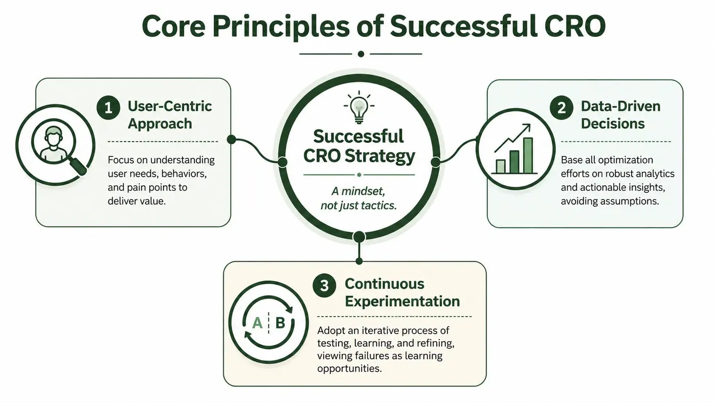
The teams that do CRO well don't treat it like a bag of tricks. They treat it like a way of thinking.
Start with the user, not the page
A weak CRO culture asks, “How do we get more clicks on this CTA?”
A stronger one asks, “What does the visitor need to feel confident enough to click?”
That shift changes everything. You stop optimising for internal preferences and start optimising for buyer understanding. On a product page, that might mean clearer delivery information. On a lead-gen page, it might mean explaining what happens after the form submit. On mobile, it might mean reducing thumb friction rather than rewriting the copy.
Replace opinions with evidence
Every company has opinions. Sales wants one message. Brand wants another. Product wants to highlight features. The founder has a strong instinct about the homepage.
CRO gives you a way to move from debate to evidence. Instead of arguing whether a page should be shorter or longer, you form a hypothesis and test it. Instead of assuming a form is “fine”, you check recordings, exit patterns, and submission quality.
For a practical look at the habits that support this way of working, this article on conversion rate optimisation best practices is a helpful companion.
Treat optimisation as a loop
CRO isn't a one-off redesign. It's a cycle of observation, testing, learning, and refinement.
Three habits matter most:
- User-centric thinking means your starting point is customer friction, not internal preference.
- Data-led judgement means you use evidence to shape your priorities and your hypotheses.
- Iteration means even an experiment that doesn't win can still teach you something valuable.
Failed tests still pay rent if they remove a bad assumption from your process.
That idea is freeing for new hires. You don't need to be “right” every time. You need to be organised enough to learn. Teams that keep learning build a real experimentation culture. Teams that chase isolated wins usually stall.
A Step-by-Step Guide to the CRO Process
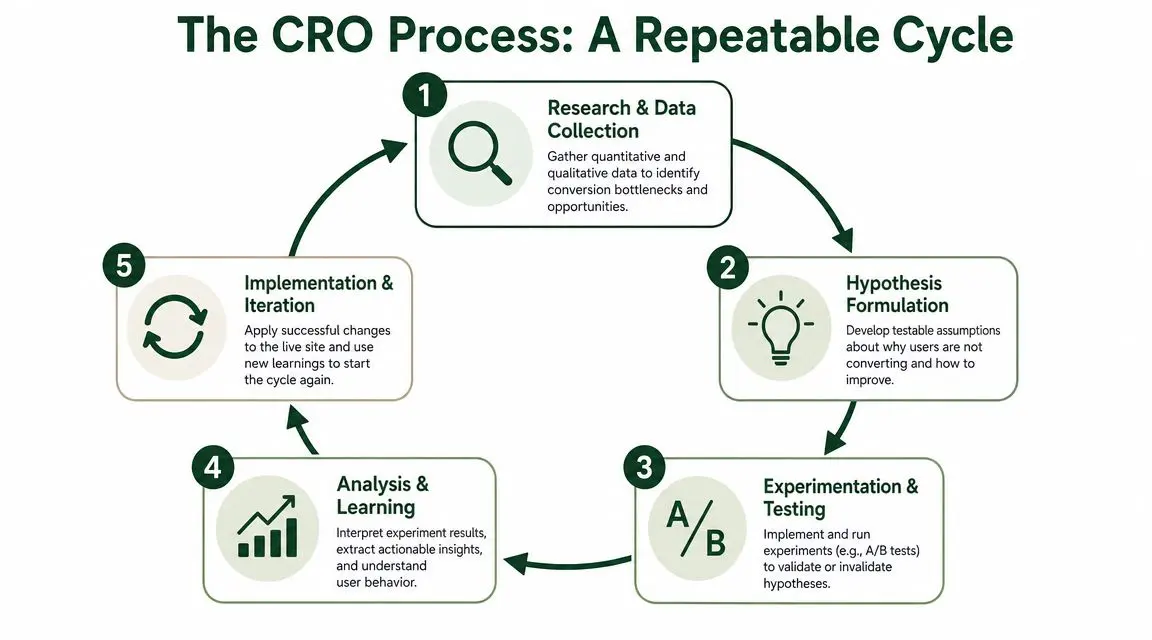
The best way to demystify CRO is to treat it like a repeatable operating routine.
Research before you change anything
Start with evidence. Look at analytics, funnels, page performance, heatmaps, recordings, survey responses, customer support notes, and sales objections. You're trying to spot friction, hesitation, or mismatch.
This stage is where many teams rush. They jump straight to redesign ideas because that feels productive. But strong CRO starts with diagnosis. If the problem is trust, changing layout won't fix it. If the problem is mobile usability, adding more copy might make it worse.
When you're reviewing interviews, survey comments, or support transcripts, these qualitative data analysis techniques can help you turn messy feedback into usable testing themes.
Write a real hypothesis
A good hypothesis is specific enough to test and simple enough to understand. A useful format is:
- If we change this element
- Then this user behaviour should improve
- Because we believe this friction or objection is being reduced
For example:
If we replace a vague hero headline with a benefit-led headline, more visitors will click through to pricing because they'll understand the offer faster.
That's much better than “test new homepage copy”.
Prioritise what's worth testing
You'll usually have more ideas than time. So don't start with the cleverest idea. Start with the clearest opportunity.
A simple prioritisation pass can look at:
- Impact and how important the page or funnel step is
- Confidence and whether the evidence supports the idea
- Ease and how quickly the team can launch it
If you're reviewing pages for where to begin, an A/B testing audit approach can help you spot practical testing opportunities without overcomplicating the process.
A quick visual summary helps if you're onboarding teammates into this cycle.
Run the experiment and learn from it
Once a test is live, avoid the temptation to keep changing things mid-flight. Document the variant, the audience, the success metric, and the reason you ran it. Then let the test do its job.
Afterwards, don't stop at “winner” or “loser”. Ask better questions:
- What changed in user behaviour
- Did the primary conversion improve
- Did any micro-conversion drop
- Did this work differently by device or source
- What did this teach us about motivation or friction
That final question is where CRO becomes valuable beyond one page. A strong learning can influence ad copy, email messaging, checkout UX, product positioning, and future tests.
Common CRO Tactics with Real-World Examples
Most CRO advice feels abstract until you can picture the test.
So here's what common optimisation work looks like in practice. These aren't grand redesigns. They're the sort of focused experiments a lean team can run when it knows what friction it's addressing.
Headline clarity
A landing page gets traffic, but visitors leave quickly. The team reviews the page and realises the main headline sounds polished but vague. It talks about innovation instead of the actual customer outcome.
The hypothesis is simple: if the headline states the benefit in plain language, more visitors will continue down the page or click the primary CTA. The test compares the original version against a sharper headline that says what the product helps the customer do.
CTA wording
A call-to-action often underperforms because it describes the action, not the value. “Submit” is technically accurate. It's also weak.
A stronger test might compare “Submit” with language that reflects the user's goal, such as getting a quote, starting a trial, or seeing pricing. If your business is exploring adjacent ways to streamline post-click journeys, this overview of e-commerce automation with AI agents is worth reading alongside CRO work because it shows how operational automation can support the buying experience after intent is captured.
Form friction
A lead form asks for too much too early. Users start, then drop off. Support and sales teams don't even use half the fields consistently.
The hypothesis is that removing or postponing low-value fields will increase completion without hurting lead quality. In some cases, adding a short note under a field can also reduce hesitation, especially when users are unsure why information is needed.
Layout and trust cues
Sometimes the issue isn't copy at all. The page may bury delivery details, guarantees, or contact information below the fold. Users hesitate because the reassuring information arrives too late.
The test might move trust signals closer to the CTA, simplify the layout, or reduce competing links that pull visitors away from the main action.
| Area to Test | Example Hypothesis | Primary Metric |
|---|---|---|
| Headline | A clearer benefit-led headline will help visitors understand the offer faster | CTA click-through |
| CTA copy | A value-focused button label will increase action compared with a generic label | Clicks to next step |
| Form design | Fewer required fields will reduce abandonment on the form | Form completion rate |
| Page layout | Moving trust information closer to the decision point will reduce hesitation | Purchase or lead submission |
| Product page content | Clearer delivery or returns information will help buyers commit | Add-to-basket or checkout starts |
Good CRO examples are usually small enough to describe in one sentence and important enough to affect a real business goal.
How to Measure Success in Conversion Rate Optimisation
A lot of confusion starts here. Teams say they're “improving conversion rate” without agreeing on what counts as a conversion or even which denominator they're using.
Start with the formula, then question the setup
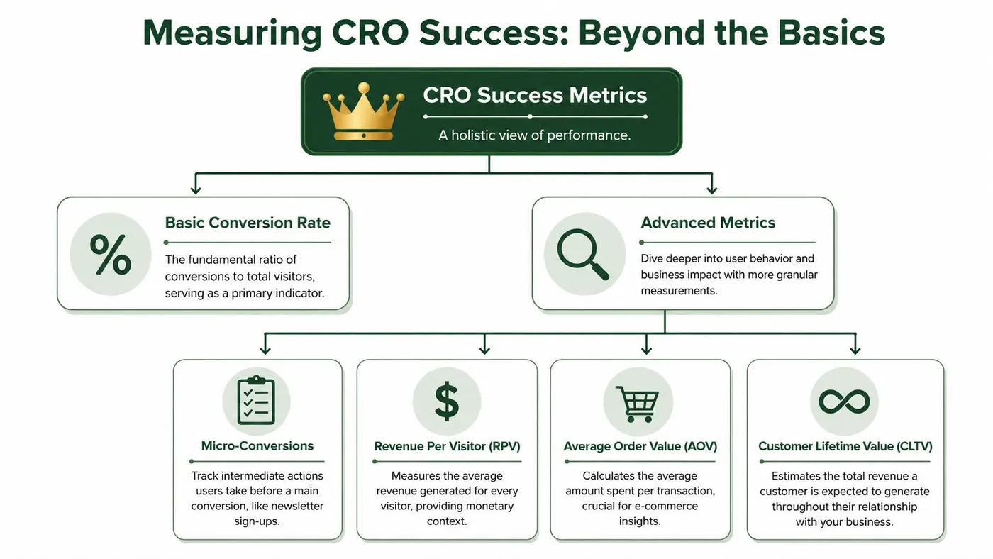
At its most basic, the formula is Conversion Rate = (Conversions ÷ Total Visitors) × 100 according to this guide to conversion metrics and denominators.
The formula is straightforward. The tricky part is choosing the right denominator. Some teams use unique visitors. Others use sessions or leads. Each can produce a different reported rate, so your method needs to match the business event you're optimising.
That's why “what is conversion rate optimization” isn't just a beginner definition question. It's also a measurement question. If your tracking model is loose, your reported improvement may not mean what you think it means.
Track macro and micro conversions
Not every useful action is the final sale.
A macro-conversion is the primary business outcome, such as a completed purchase or a qualified demo request. A micro-conversion is a smaller step that signals progress, such as adding to basket, starting checkout, viewing pricing, or reaching the second form step.
Tracking both helps in two ways:
- Diagnostic value because you can see where movement happens before the final outcome
- Decision quality because a test can look promising on clicks while hurting downstream quality
Don't ignore measurement quality
Many CRO definitions focus on A/B testing, UX fixes, and experimentation. Fewer talk about messy data. Yet measurement quality is often the issue that separates a useful programme from a misleading one.
This CRO glossary entry highlights the usual definition, but the more practical challenge for UK teams is deciding what should count as a trustworthy conversion when consent choices, attribution gaps, and cross-device behaviour make reporting incomplete.
A result isn't a win if nobody trusts the tracking behind it.
Look beyond the top-line rate
You also need supporting business metrics. Depending on the site, that may include revenue per visitor, average order value, or customer lifetime value. The purpose is simple. A test that raises more low-quality leads or lowers basket value may not be a real improvement.
Success in CRO means the business outcome gets better, not just the dashboard screenshot.
Common CRO Pitfalls That Sabotage Your Results
Some CRO mistakes are so common that nearly every new team makes them once.

Testing without a clear reason
Random testing feels active, but it wastes time. If you can't explain what friction you're addressing, you're probably just swapping page elements and hoping one looks better in the report.
The fix is simple. Write the hypothesis down before launch. If the team can't agree on the rationale, the test isn't ready.
Ending tests because the early numbers look exciting
It's tempting to peek at early results and call a winner. Don't. Early movement can be noise, especially if traffic quality varies across days or devices.
A disciplined team waits for a stable read and reviews the full context before shipping changes.
Ignoring why users behave the way they do
Analytics can tell you where people drop. They rarely tell you why. If you never review recordings, surveys, chat logs, or sales objections, your testing backlog will stay shallow.
That's why experienced teams balance quantitative data with qualitative insight. Numbers point to the problem. User evidence helps explain it.
Looking only at averages
A page can look healthy in aggregate while underperforming badly for one segment. A critical best practice is to segment performance by device before testing because mobile-first friction can depress overall conversion even when desktop performance looks strong, as noted in this guidance on device-level CRO analysis.
Here's the practical takeaway:
- Check device splits first because mobile issues often hide inside blended reports
- Review key funnel steps instead of only top-line conversion rate
- Compare intent by source because not all traffic behaves the same way
- Watch for quality drift if a test boosts clicks but weakens final outcomes
Copying competitor changes blindly
Competitors can inspire ideas, but copying their patterns without context is risky. Their audience, offer, pricing, traffic mix, and brand trust may be very different from yours.
Borrow the question, not the answer. If their checkout is shorter, ask whether your own checkout has unnecessary steps. Then test your version of the fix.
Launching Your First CRO Experiment with Lightweight Tools
Your first CRO experiment should be boring in the best possible way. Pick a high-traffic page with one obvious goal. Don't start with a full-site redesign. Don't try to test five ideas at once.
A good first test usually has these traits:
- Clear intent such as a product page, signup page, or pricing page
- Visible friction such as vague copy, a weak CTA, or an overlong form
- Simple implementation that doesn't need weeks of developer time
- A measurable goal that the team already cares about
If you're asking what conversion rate optimization looks like in practice for a lean team, this is it. Find one page. Identify one problem. Form one hypothesis. Launch one clean test.
You also don't need a massive experimentation department to start. Modern testing tools are much lighter than many people expect, and many can be added with a simple snippet or tag manager setup. That makes CRO accessible for ecommerce managers, growth marketers, product teams, and agencies who want proof before they ask for a bigger programme.
One final reminder. Start with learning, not scale. A modest test that teaches you something reliable is more valuable than an ambitious experiment that nobody can interpret.
If you want a lightweight way to run that first experiment, Otter A/B is built for teams that want to test headlines, CTAs, and layouts quickly without dragging down site speed. You can launch variants fast, track meaningful outcomes like purchases and revenue per variant, and share clear results with stakeholders once a winner emerges.
Stop guessing
Ready to start testing?
Set up your first A/B test in under five minutes. No credit card required.
- 14-day free trial
- No credit card required
- Cancel anytime