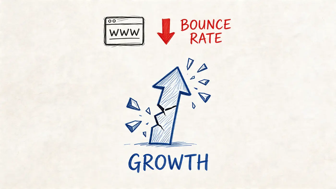
How to Reduce Website Bounce Rate: A 2026 Playbook
Learn how to reduce website bounce rate with our step-by-step playbook. Diagnose issues, prioritise fixes, and run A/B tests to boost conversions and revenue.

You’re probably looking at a familiar pattern right now. Traffic is coming in. Paid campaigns are live. Search visibility is decent. Maybe your team even shipped a redesign recently. Yet conversions haven’t moved, or they’ve slipped, and too many visitors leave after a single page.
That’s the moment bounce rate stops being a reporting metric and starts being a growth problem. If the wrong people are landing on the wrong pages, or the right people are landing on pages that load slowly, feel untrustworthy, or give them no clear next step, every marketing pound gets less efficient.
Teams often treat this as a design tidy-up. It isn’t. The most reliable way to fix it is to work like a CRO lead would. Diagnose the leak. Prioritise the fixes. Implement changes that address the actual cause. Then validate every change against business outcomes, not gut feel.
Why Your Website Bounce Rate Is Sabotaging Growth
A high bounce rate doesn’t just mean someone left quickly. It usually points to one of four failures: the page didn’t match intent, the experience felt poor, the site loaded too slowly, or the visitor didn’t know what to do next.
That matters because bounce rate sits upstream of almost every metric you care about. If visitors leave before they explore products, read proof, or reach your offer, conversion rate gets suppressed before your funnel even has a chance to work. The paid click may look cheap. The session may count as traffic. But the visit produced no commercial value.
Poor first impressions are a major part of the problem in the UK. Clutch’s web design analysis reports that 84% of consumers cite design as a key factor influencing purchasing decisions, and 80% abandon sites they perceive as unappealing, even if they’re interested in the product. That’s not a cosmetic issue. That’s revenue leakage at the top of the funnel.
Bounce rate needs context
A bounce isn’t always bad. Some visitors get what they need on one page and leave satisfied. That’s why it helps to review what bounce rate truly means in Google Analytics before making decisions. The number becomes useful when you pair it with page type, traffic source, device, and commercial intent.
A blog article can tolerate more single-page sessions than a product page or pricing page. An informational visit behaves differently from a paid landing-page click. If you ignore that context, you’ll waste time “fixing” pages that aren’t broken and miss the ones that are costing you sales.
Practical rule: Don’t ask whether bounce rate is high. Ask whether the wrong pages have a high bounce rate from the wrong traffic on the wrong devices.
It also exposes weak experience design
Visual engagement has a direct effect on whether users stay. Nostra.ai’s ecommerce optimisation guide reports that UK eCommerce sites using high-quality visuals achieve a 38% lower bounce rate than text-heavy pages. That aligns with what most CRO teams see in practice. Dense copy, flat layouts, and weak imagery rarely earn enough attention to move visitors deeper.
When bounce rate climbs, growth usually stalls in hidden ways:
- Paid traffic wastes budget because clicks leave before exploring the offer.
- SEO landing pages underperform because search intent and on-page experience don’t line up.
- Homepage traffic doesn’t route well because navigation, messaging, or hierarchy is unclear.
- Mobile users disappear first because friction compounds faster on small screens.
If you want to know how to reduce website bounce rate, don’t start with a random list of tips. Start with a playbook that connects behaviour to root cause, then ties fixes back to conversion and revenue.
Diagnose Why Visitors Leave Your Website
A page can look polished, load fast enough on your machine, and still lose visitors within seconds. The usual mistake is to treat that as a design problem before proving where the drop-off starts and what kind of visitor is leaving.
Good diagnosis follows a repeatable sequence. Start with analytics to isolate the pages and segments bleeding attention. Then review behaviour evidence to spot friction. Then collect direct feedback to confirm whether your reading of the problem is right.
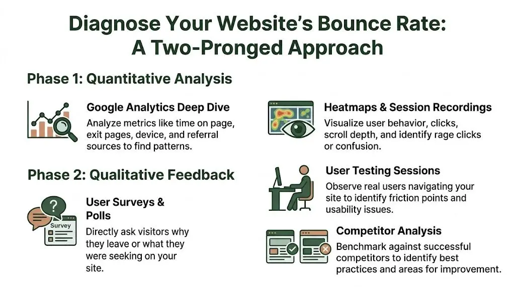
Start with GA4 and isolate the pages that matter
Open GA4 and ignore the sitewide average. Bounce rate only becomes useful when tied to page type, traffic source, and commercial intent.
I start with landing pages where a lost visit has a clear cost. That usually means:
- Paid campaign landing pages
- Product and collection pages
- Homepage sessions from non-branded traffic
- Blog posts meant to drive product or service consideration
- Pricing, quote, and service pages
Then segment each page to find the pattern behind the exits.
| Segment to check | What to look for |
|---|---|
| Traffic source | Does paid social bounce harder than organic search or email? |
| Device type | Is mobile materially worse than desktop? |
| New vs returning users | Are first-time visitors failing to see the right next step? |
| Landing page | Are a small number of entry pages causing most of the loss? |
This usually narrows the problem fast. If bounce rate is high only for one campaign, message match is a stronger suspect than sitewide UX. If mobile is the outlier, check layout, load behaviour, sticky elements, and tap targets before rewriting copy.
Use behaviour tools to see what analytics misses
GA4 shows the drop. It does not show the hesitation before it.
Session recordings and heatmaps fill that gap. A practical guide to heat maps on websites can help you read click concentration, scroll depth, and ignored elements without forcing patterns that are not really there.
Review a focused sample rather than hundreds of sessions. I usually watch recordings from one high-value page, split by device and source, until the same failure appears repeatedly. Ten to fifteen good recordings often produce a clearer brief than a long workshop.
Look for signals such as:
- Rage clicks on elements that look clickable but are not
- Shallow scrolling where visitors never reach proof, benefits, or CTAs
- Navigation drop-off after opening a menu or filter
- Repeated backtracking that points to confusion
- Ignored page areas where important content gets little attention
That level of detail matters because the fix changes with the cause. “Users are bouncing” is not a diagnosis. “Mobile visitors never see the primary CTA because the sticky header and promo bar consume the first screen” is.
Gather direct feedback while intent is fresh
Behaviour evidence still leaves room for interpretation. Direct feedback closes that gap.
Use a short on-page poll, an exit-intent prompt, or a post-visit survey with one or two plain questions:
- What were you hoping to find today?
- What stopped you taking the next step?
- Was anything unclear or difficult to use?
Keep it brief. Long surveys lower response quality and slow down analysis.
The wording people use is often more useful than the volume of responses. If visitors repeatedly say they could not tell what the company offers, the issue is not minor phrasing. The page has failed to establish relevance early enough.
Check the path onward, not only the entry page
Some pages lose visitors because they give people nowhere sensible to go next. The content may answer one question but fail to open the next step in the journey.
Audit each high-bounce page as a path, not a standalone asset:
- Does the page match the promise of the ad, email, or search result?
- Can a new visitor understand the offer quickly?
- Is the next action obvious without scrolling, hunting, or guessing?
- Do trust signals appear near likely objections?
- Are relevant internal links and supporting routes visible?
Trade-offs become evident. Adding more links can improve progression, but too many options can weaken focus on a primary CTA. The right choice depends on page intent. A blog article may need contextual routes to product pages, category pages, or related guides. A paid landing page may need fewer exits and a tighter path.
A useful diagnosis ends with a ranked list of root causes tied to specific pages and segments. That is the foundation for the rest of the playbook. It gives you testable hypotheses, cleaner prioritisation, and a direct line from bounce reduction to revenue impact once you validate changes in A/B tests.
How to Prioritise Fixes for Maximum Impact
Teams often don’t struggle because they lack ideas. They struggle because they have too many. A bounce-rate review can produce a backlog full of redesign concepts, technical tickets, content changes, navigation tweaks, and tracking requests. If you treat them all as equally urgent, progress slows.
The fix is to score opportunities before you touch the site.
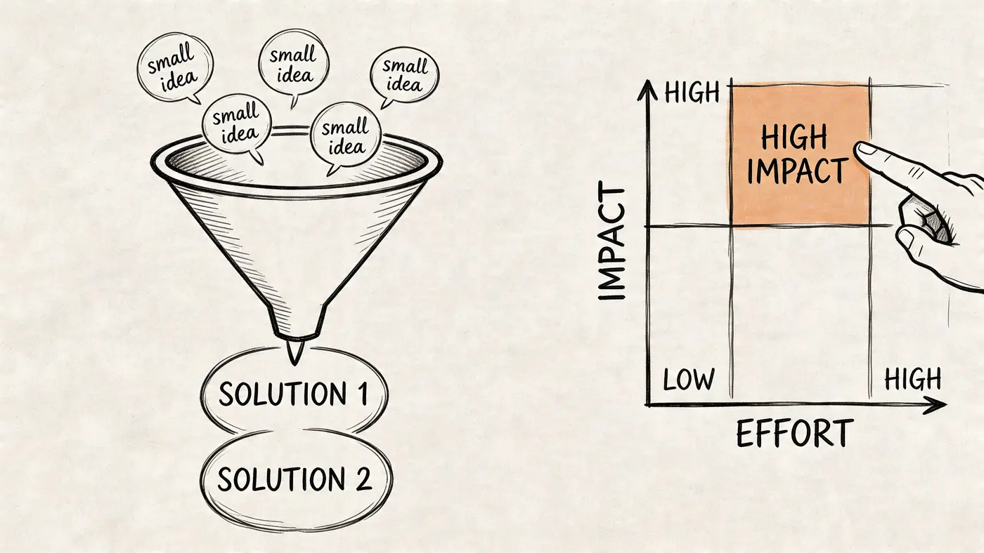
Use ICE to rank the backlog
A simple ICE framework works well for bounce-rate work:
-
Impact
How strongly is this fix likely to improve user progression or commercial outcomes on an important page? -
Confidence
How certain are you, based on evidence, that this issue is real and the proposed fix addresses it? -
Ease
How quickly can design, content, or engineering ship it without disrupting higher-value work?
Score each from low to high using your team’s own scale. What matters isn’t the exact number. What matters is forcing trade-offs.
A homepage overhaul often sounds important but scores poorly on ease and sometimes confidence. Compressing oversized images on a high-traffic product template may score far better because the issue is obvious, the implementation is contained, and the upside affects a large slice of sessions.
A practical comparison
Here’s the kind of comparison I’d make with a client team:
| Potential fix | Impact | Confidence | Ease | Why it ranks this way |
|---|---|---|---|---|
| Compress product-page images and review loading sequence | High | High | Medium | Clear speed issue on revenue-driving pages with a contained implementation scope |
| Redesign the entire homepage layout | Medium to high | Medium | Low | Could help, but often bundles several assumptions into one expensive project |
The trap is choosing the larger project because it feels strategic. In practice, smaller fixes with clearer evidence usually produce faster, cleaner wins.
If you want another useful perspective on which site metrics are worth reviewing before prioritising experiments, this summary of visitor statistics for websites is a good reference point.
Prioritise by page value, not annoyance
A bug that irritates your internal team isn’t automatically the first thing to fix. Prioritise where bounce has the highest business cost.
That usually means these page groups go first:
- Revenue pages such as product, collection, service, and pricing pages
- Campaign landing pages where paid traffic is paying for every weak session
- High-volume entry pages that shape first impressions
- Mobile templates if mobile bounce is consistently worse
The best prioritisation question is simple. If this page improved tomorrow, would finance notice the change next month?
That mindset keeps effort connected to outcome.
A short walkthrough can help if your stakeholders need a shared language for scoring and sequencing test ideas:
Avoid bundled fixes
One more trade-off matters here. Don’t package five changes into a single “bounce reduction sprint” unless the site is severely broken. If you update messaging, navigation, page speed, visuals, and trust elements all at once, you may lower bounce rate, but you won’t know why.
A better approach is to group fixes into coherent themes. For example, resolve speed issues on product templates first. Then tackle message match on paid landing pages. Then improve internal paths on high-performing content pages. That gives you a roadmap your team can defend and measure.
Proven Strategies to Reduce Bounce Rate
A paid visitor lands on a service page, waits for the hero image to settle, scans a vague headline, opens the menu, then leaves. Nothing is obviously broken. The page just fails the first ten seconds. That is where bounce rate is won or lost.
Once diagnosis is done and the backlog is ranked, the work becomes operational. I usually see four levers move bounce fastest: speed, clarity of page purpose, easier onward paths, and stronger trust at the moment a visitor needs reassurance. The mistake is treating these as generic best practices. They need to be applied to the pages and traffic sources that carry the most commercial weight.
Fix speed before you work on persuasion
Slow pages waste every other improvement. Better copy cannot help if the page is still loading. A stronger CTA cannot help if interaction is delayed on mobile.
Google’s Core Web Vitals documentation is useful here because it ties speed and visual stability to the actual loading experience users feel, not just lab scores. In practice, the pages with the worst bounce problems usually share the same technical pattern. Heavy media above the fold, too many third-party scripts, and layout shifts caused by banners, pop-ups, or delayed assets.
A practical speed checklist
Use a short build list your team can ship:
-
Compress and resize hero images
Large desktop assets still get sent to mobile users far too often. -
Remove or defer third-party scripts
Chat widgets, personalisation tools, tag bundles, and review apps often cost more than teams expect. -
Lazy-load below-the-fold media
Prioritise the first screen first. -
Preload critical fonts and key assets
This helps stabilise the initial render. -
Check template-level app bloat
On Shopify, this is often a bigger problem than image size alone. -
Test on real mobile connections
Desktop emulation hides pain that users feel immediately.
Google’s PageSpeed Insights gives a solid starting point for identifying render-blocking resources, oversized images, and JavaScript that slows interaction. For WordPress, caching and script control usually deliver the fastest gains. For Shopify, unused apps and theme customisations are common culprits. For Webflow, animated interactions and oversized background media often drag down first load.
A slow page should be treated as a conversion problem, not a design preference.
Treat Core Web Vitals as bounce-rate work
Teams often park Core Web Vitals with SEO or engineering. That separation causes delays. Visitors do not care which team owns LCP or CLS. They care whether the page feels usable.
Google explains Largest Contentful Paint, Cumulative Layout Shift, and Interaction to Next Paint in practical terms, and each one maps cleanly to bounce behaviour. If the main content appears late, confidence drops. If the layout jumps while someone tries to read or tap, trust drops. If the page feels laggy after a click, people abandon it.
For bounce reduction work, check these first:
- oversized hero sections
- cookie banners or promo bars causing layout shifts
- delayed menu interaction on mobile
- app scripts loading site-wide when they are only needed on a few pages
Make the next step obvious
A lot of visitors leave because the page gives them no clear route forward. The answer is not more links. It is better hierarchy.
The Nielsen Norman Group’s guidance on navigation remains one of the better references here because it focuses on findability and predictable user behaviour. Clear labels beat internal jargon. Visible category paths beat clever menu patterns. On mobile, hiding every meaningful path behind one ambiguous icon often increases abandonment, especially for first-time visitors.
What tends to work:
- Trim top-level navigation to the few paths new visitors care about
- Use descriptive labels based on customer language
- Keep high-intent routes visible on mobile
- Add breadcrumbs on category, product, and resource pages
- Fix dead ends with useful 404 pages, redirects, and related-page modules
Navigation changes also carry measurement risk. If bounce falls after simplifying a menu, check whether users are finding better paths or just clicking more out of confusion. This is one reason I prefer targeted tests and a clean read on significance before rolling changes site-wide. Otter A/B’s guide to Type I vs Type II errors in experimentation is a useful refresher when teams start reading too much into noisy results.
Use internal linking to answer the second question
Internal links should be planned around intent, not sprinkled in for SEO.
A visitor on a product page often wants delivery, returns, sizing, or proof. A visitor on a service page usually wants pricing, case studies, process, or FAQs. A visitor on an information article may be ready for a product comparison, demo, or consultation, but only if the jump feels earned.
Good internal linking does two jobs at once. It reduces bounce by giving uncertain visitors a relevant next step, and it improves session quality by moving them closer to revenue pages. If you’re also trying to improve your website's conversion rate, these actions allow engagement to start turning into commercial intent.
Improve trust before pushing harder on the CTA
High-bounce pages often ask for commitment before they have answered the basic credibility questions.
Trust usually improves through small, specific changes:
- show delivery, returns, pricing, or onboarding information near the decision point
- place reviews, testimonials, or client logos beside claims, not far below them
- display contact details and company information clearly
- remove outdated offers, weak imagery, and obvious copy errors
- use original proof where possible, not generic stock visuals
There is a trade-off here. Adding trust elements can also add clutter. The fix is not to pile on badges and logos. Put the right reassurance next to the doubt it resolves.
Match the page to the click that brought the visitor in
Bounce often starts before the session begins. Paid ads, email links, social posts, and search snippets all create a promise. If the landing page does not confirm that promise immediately, visitors leave.
A few common failures:
| Click promise | Page problem |
|---|---|
| “Free consultation” | The form is buried below company background and generic copy |
| “Running shoes sale” | Traffic lands on the homepage instead of the sale category |
| “VAT guide for UK retailers” | The article opens with a product pitch rather than answering the query |
This is usually a messaging fix, not a redesign job. Keep the headline aligned with the ad or search intent. Put the promised offer or answer in the first screen. Remove competing messages that slow the visitor down.
Use visuals to reduce uncertainty
Visuals earn their place when they clarify the offer. Product photos, comparison tables, short demos, annotated screenshots, process diagrams, and before-and-after examples can all reduce bounce if they answer a question the visitor already has.
Decorative stock imagery does the opposite. It adds weight, delays load, and gives no new information.
For ecommerce, better product and collection imagery often outperforms cosmetic button changes. For SaaS and lead generation pages, screenshots and short explainer visuals usually do more than abstract hero art. For service businesses, real work, real outcomes, and recognisable proof beat polished brand imagery every time.
The best-performing pages do not try to impress visitors into staying. They remove doubt, confirm relevance, and make the next action easy to choose.
Validate Your Fixes with Hypothesis-Driven A/B Testing
Teams ship a cleaner layout, see bounce rate dip for a week, and call it a win. Then lead quality softens, revenue stays flat, or the uplift disappears when traffic mix changes. Without a test, you do not know whether the fix worked, whether seasonality helped, or whether you moved clicks to a less valuable step.
That is why bounce-rate work needs the same discipline as any other conversion programme. Diagnose the issue, ship the smallest credible change, and test whether it improves the business outcome you care about.
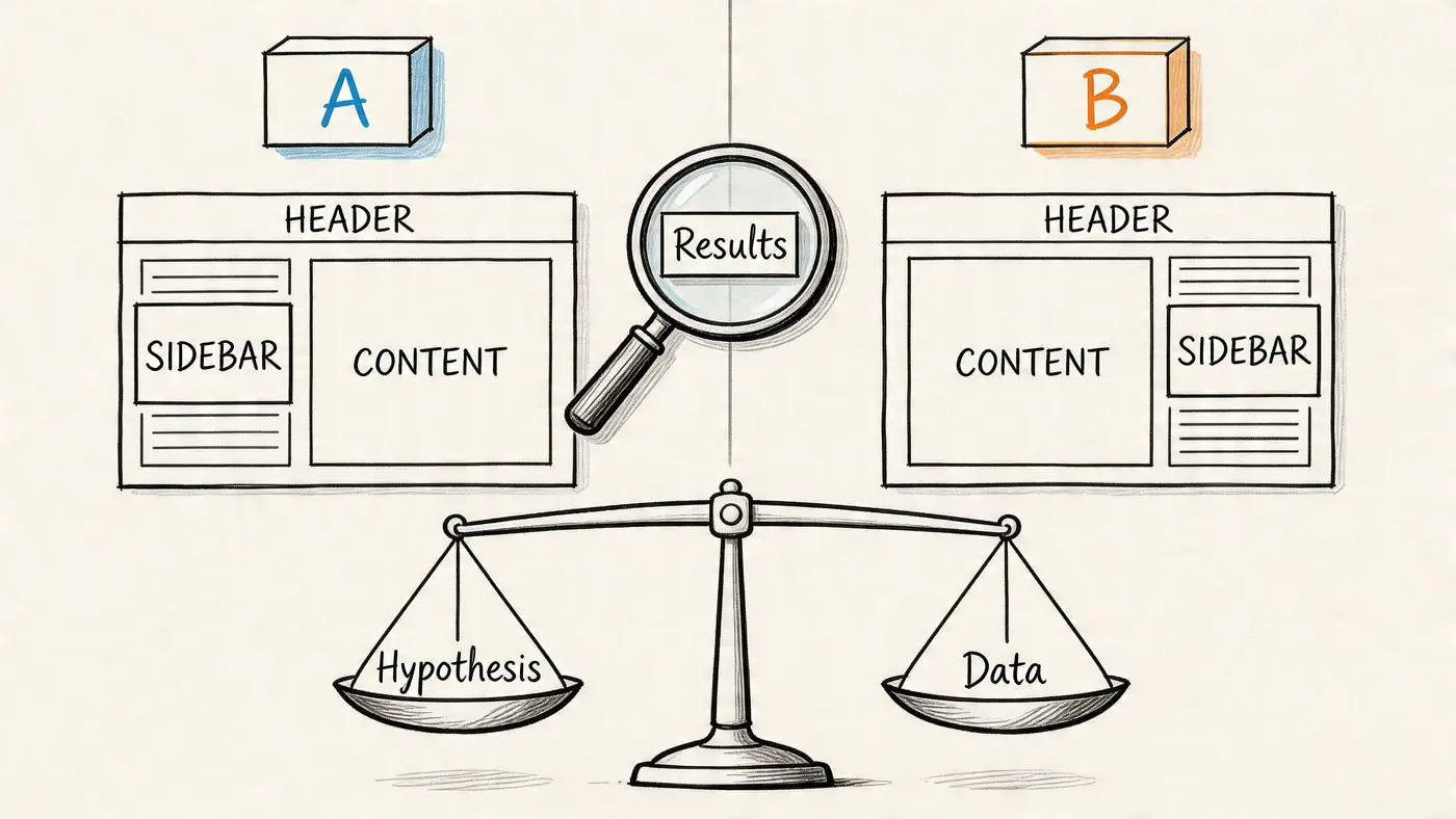
Turn each fix into a falsifiable hypothesis
A useful hypothesis connects one change to one behaviour and one outcome.
Good example:
By reducing the header menu to fewer options and surfacing a clearer category path, more new visitors will continue to a collection page because the first decision becomes simpler.
Weak example:
We think the new header looks cleaner.
The first gives you something to test. The second gives people room to rationalise whatever happens after launch.
This matters most on pages with obvious friction. Navigation changes, 404 recovery paths, trust placement, and weak message match are all testable because the intervention is specific and the expected user response is clear. If a page has several issues, resist the urge to redesign everything at once. A broad visual refresh can hide the underlying driver of improvement and makes the next decision harder.
Choose a primary metric that maps to value
Bounce rate is a diagnostic metric. It is rarely the metric that should decide whether a variant ships.
For ecommerce, the primary metric is usually completed purchase or revenue per visitor. For lead generation, it is qualified form submission, booked demo, or another step that has a known connection to pipeline. Behavioural metrics still matter, but they sit underneath the commercial one.
A practical test plan usually includes:
-
Primary metric
The result that creates value, such as purchases, qualified leads, or progression to a revenue-linked step. -
Secondary metric
A supporting behaviour, such as click-through to product pages, scroll depth to key content, or visits to the next page in the journey. -
Guardrail metrics
Measures that stop you shipping a false win, such as average order value, lead quality, error rate, or page speed.
I have seen variants cut bounce rate by pushing more people into the funnel, while overall profit worsened because the extra clicks came from lower-intent visitors. Guardrails catch that early.
Keep the test narrow enough to learn from it
Test one meaningful idea at a time where possible. If the issue is weak trust near checkout, test trust signals or reassurance copy close to the action. If the issue is poor message match, test the headline and supporting proof above the fold.
Avoid bundling all of this into one variant:
- new hero image
- new headline
- new CTA text
- new navigation
- new page layout
If that version wins, you get a result but very little insight. The next iteration becomes guesswork again.
Bounce-rate tests that usually earn their place
The best tests are not always dramatic. They are often small changes on high-value pages with a clear reason behind them.
-
Navigation simplification
Reduce top-level choices, remove vague labels, and make the first click easier. -
Headline and intent alignment
Match the landing-page message to the ad, email, or search query that brought the visit. -
Trust near decision points
Move reviews, delivery details, guarantees, accreditation, or security reassurance closer to the CTA. -
Next-step prompts on content pages
Add relevant internal links, product recommendations, or CTAs that fit the reader’s intent. -
404 recovery paths
Test search prompts, featured categories, or high-intent routes back into the site.
These tests work well because they tie directly to common bounce causes. Confusion, hesitation, weak relevance, and dead ends.
Avoid false winners
Poor test discipline creates expensive confidence. Small samples, stopping early, and misreading significance can make average ideas look good enough to ship.
If your team needs a plain-English refresher before calling results, review type 1 vs type 2 errors in A/B testing. It covers the two mistakes that distort test analysis most often. Shipping a loser because noise looked like signal, or rejecting a real improvement because the test was underpowered.
Use a platform that keeps the workflow tight. Otter A/B is useful here because it lets teams turn a diagnosed problem into a test, track the commercial metric alongside bounce-related behaviour, and build a record of what directly changed revenue. That is the difference between experimentation as a habit and experimentation as a growth system.
Document results so the team compounds learning
Every test should leave a paper trail. Not a slide full of screenshots. A short record of what changed, why it was tested, what happened, and what to do next.
A clean test summary should answer five questions:
| Question | What to document |
|---|---|
| What problem did we observe? | The behavioural or technical issue behind the test |
| What did we change? | The exact difference between control and variant |
| What was the hypothesis? | Why the change should alter user behaviour |
| What happened? | Movement in the primary metric, secondary metrics, and guardrails |
| What do we do now? | Ship, iterate, rerun with better power, or discard |
That record stops teams from repeating weak ideas every quarter. It also makes bounce-rate work accountable to revenue, not opinion.
Hypothesis-driven testing turns bounce reduction from a list of tips into a repeatable operating model. You diagnose the leak, prioritise the fix, test the change, and keep only what improves the journey and the result.
Turning Lower Bounces into Sustainable Growth
A paid campaign goes live on Monday. Traffic rises, reporting looks healthy at first glance, and then revenue barely moves. The usual culprit is not a lack of visitors. It is a site that fails to carry intent from the first click to the next action.
Lower bounce rate matters because it improves the yield on traffic you already pay for. Fewer abandoned visits mean more product views, more lead form starts, more checkout progress, and more chances to recover acquisition costs. That is why bounce work belongs in the growth model, not in a side conversation about engagement.
The teams that sustain gains treat bounce reduction as an operating system. They review landing-page behaviour every week, keep a ranked backlog, and tie each fix to a commercial metric before any work starts. That discipline prevents a common failure mode, where bounce rate drops on one page while lead quality, average order value, or completion rate gets worse somewhere else.
Performance is a good example. Speed often slips because new scripts, heavier creative, and template changes arrive month by month. The answer is not another one-off cleanup. It is ownership. Someone needs to review page weight, third-party tags, and mobile experience on a schedule, especially on high-value landing pages.
A practical checklist to keep
Use this as a standing operating rhythm:
- Review landing pages in GA4 by channel, device, and intent, then isolate the pages where bounce is blocking revenue.
- Watch session recordings and heatmaps to find where visitors hesitate, stall, or abandon the journey.
- Collect on-page feedback and support input to capture objections analytics will miss.
- Rank fixes with a clear framework such as impact, confidence, effort, and page value.
- Assign one owner per change so improvements are shipped, measured, and not lost in the backlog.
- Track business outcomes alongside behaviour including leads, sales, checkout progression, or qualified demo requests.
- Keep a test log so the team knows what worked, what failed, and what should be tried next.
This is how bounce-rate work becomes sustainable growth. Diagnose the leak, prioritise the right fix, test it properly, and keep the changes that improve revenue. Done well, that process compounds.
If you want to run that loop without slowing the site down, Otter A/B is built for fast, low-friction experimentation. You can test headlines, CTAs, layouts, and navigation changes with a lightweight setup, track outcomes tied to real business value, and give your team a cleaner way to decide what improves the journey.
Ready to start testing?
Set up your first A/B test in under 5 minutes. No credit card required.