Build a High-Converting Landing Page with WordPress
Build & optimize a high-converting landing page with WordPress. Our guide covers themes, builders, SEO, and A/B testing to boost conversions. Start now!
Most advice about a landing page with WordPress starts too late. It jumps straight to templates, colours, button shapes, or which page builder has the nicest drag-and-drop controls.
That’s backwards.
The biggest gains usually come from decisions made before the page looks polished. Hosting quality, theme weight, page structure, form friction, and test readiness decide whether a page merely exists or converts. If a team builds first and promises to “optimise later”, they usually end up defending opinions instead of learning from user behaviour.
WordPress is the obvious place to do this work for many UK teams. It powers over 1.5 million active websites in the UK and roughly 42% of CMS-driven sites, with WooCommerce used on 28% of UK e-commerce sites and Elementor present on over 25% of UK WordPress sites, according to Hostinger’s WordPress statistics. The platform isn’t the bottleneck. The workflow usually is.
A strong landing page with WordPress isn’t a one-time design task. It’s a build-measure-improve system. Teams that treat testing as part of the setup make better decisions, waste less traffic, and stop arguing over headlines that no one has validated.
Laying the Foundation for a High-Converting Page
Most conversion problems that appear to be “copy issues” are really foundation problems. A slow server, a bloated theme, and a plugin stack held together with hope will drag down even good offers.
That’s why the first decision isn’t what headline to write. It’s whether the page can load quickly, stay stable under campaign traffic, and give you a clean base for iteration. For deeper thinking on that side of the workflow, Otter A/B’s guide to conversion rate optimisation best practices is a useful companion because it frames CRO as a systems problem, not a copywriting trick.
Choose infrastructure that helps conversion
Cheap hosting often looks fine in a dashboard and terrible in a campaign. Shared environments can be enough for brochure sites, but paid traffic, launches, and e-commerce pushes expose weak setups fast.
A better approach is to choose hosting that gives you predictable performance, easy caching support, and straightforward staging. If your team can’t safely test changes before publishing, your landing pages become fragile. Fragile pages don’t get improved often because every change feels risky.
Use this filter when evaluating hosting:
- Speed under load means the page still feels responsive when an email send or ad campaign lands.
- Staging support gives marketing and dev teams a safe place to review changes before launch.
- Caching compatibility matters because performance fixes become much easier when your stack cooperates with common optimisation tools.
- Support quality matters when a checkout page, form embed, or plugin update fails at the wrong time.
Practical rule: If your landing page stack makes the team afraid to edit, the stack is already costing conversions.
Use a theme that gets out of the way
The wrong WordPress theme creates work you didn’t ask for. Many feature-heavy themes look attractive in demos because they bundle sliders, effects, animations, widgets, and template libraries. On a conversion page, most of that is baggage.
Landing pages need clarity. A lightweight theme gives you cleaner markup, fewer conflicts, and fewer visual distractions. It also makes it easier to isolate what changed when you test a page later. If the page has ten moving parts and six motion effects, you won’t know what’s helping and what’s hurting.
A simpler build usually wins in practice:
| Theme decision | What tends to happen |
|---|---|
| Lightweight, flexible theme | Faster setup, fewer conflicts, easier maintenance |
| Feature-stacked theme | More visual options, more code, more troubleshooting |
| Minimal landing page template | Better focus on one action |
| General-purpose homepage layout | More distractions and weaker intent matching |
Teams that want practical design inspiration can review examples that build effective landing pages WordPress without turning every page into a mini homepage.
Treat every plugin as conversion debt until proven otherwise
WordPress makes it easy to install “just one more plugin”. That’s useful right until the page starts carrying duplicate scripts, overlapping CSS, and tools no one audits anymore.
Be selective. Keep the stack tight. Every plugin on a landing page should have a clear job tied to performance, content, analytics, forms, or experimentation. If it doesn’t improve the page or support decision-making, remove it.
The foundation of a high-converting landing page with WordPress is simple. Stable hosting. A lean theme. A short plugin list. Everything else becomes easier after that.
Building Your Landing Page Structure
The build phase is where teams usually overcomplicate things. They add sections because competitors have them. They stack proof before clarifying the offer. They use a homepage layout for a campaign page, then wonder why visitors drift.
A landing page should feel narrower than a normal website page. One audience. One problem. One promise. One next step.
The first structural choice is your editor.
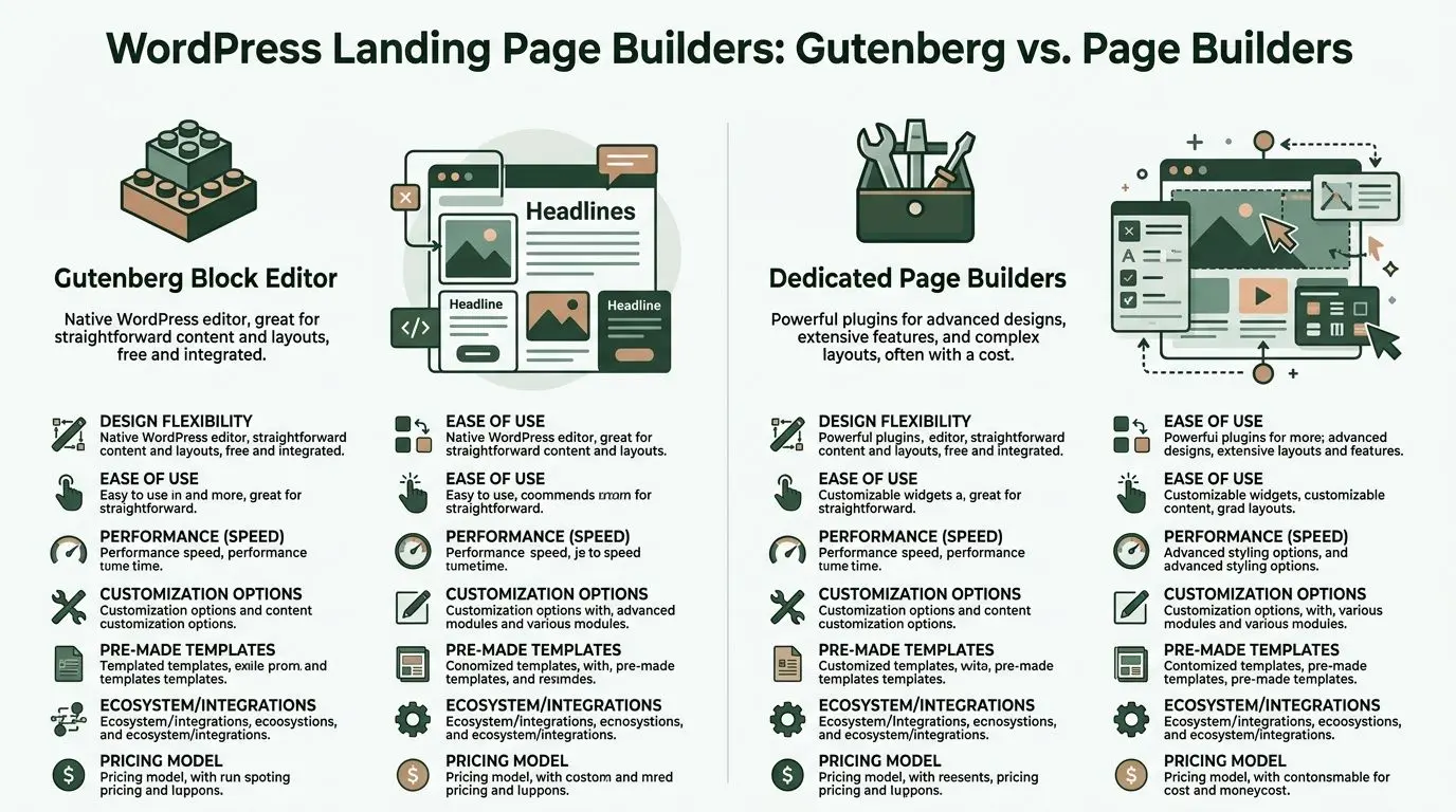
Gutenberg or a page builder
Neither option is universally better. The right choice depends on how much design freedom you need and how much performance discipline your team can maintain.
Gutenberg works well when
Gutenberg is the native WordPress editor. It’s the cleanest route for teams that want speed, lower complexity, and enough layout control to ship solid pages without a heavy builder layer.
Choose Gutenberg when:
- Your layout is straightforward and doesn’t require advanced positioning or animation.
- You want fewer dependencies because native tools are easier to maintain over time.
- Performance matters more than visual flourish and the team can work within a structured system.
- You’re comfortable using reusable blocks and patterns to standardise sections across campaigns.
Gutenberg is especially good for pages built around strong messaging and clean hierarchy. If the offer is sharp, you often don’t need much more.
Page builders work well when
Dedicated builders like Elementor, Beaver Builder, or Thrive Architect make sense when the team needs more visual control and faster non-technical editing.
They’re useful when:
- Marketing needs to launch without dev help for every layout change.
- The design requires richer section control such as layered visuals, custom spacing, or advanced forms.
- You’re building several campaign variants and want a familiar visual workflow.
- The team already knows the builder well, which reduces production friction.
The trade-off is weight. More builder features can mean more CSS, more scripts, and more cleanup. That doesn’t make page builders bad. It means they require discipline.
A simple decision framework
Here’s the practical comparison teams need:
| Question | Gutenberg | Dedicated page builders |
|---|---|---|
| Ease of maintenance | Strong | Depends on plugin stack |
| Advanced design flexibility | Moderate | Strong |
| Native WordPress feel | Strong | Lower |
| Risk of bloat | Lower | Higher if unmanaged |
| Best fit | Lean campaign pages | Design-heavy marketing pages |
If your team argues about this choice, use a boring rule. Pick the option that lets you publish, edit, and test reliably without slowing the page down.
Don’t choose the tool with the most options. Choose the tool your team can keep clean six months from now.
The wireframe that usually works
Most effective landing pages don’t need novelty. They need order. A strong structure usually follows a predictable flow because users arrive with predictable questions.
Hero section
A page's ability to earn or lose attention hinges on its hero section. The hero should answer three things quickly: what this is, who it’s for, and why it’s worth acting on now.
Keep the hero focused on:
- A clear headline tied to the traffic source
- A concise supporting line that sharpens the value
- One primary CTA
- A relevant visual or product cue
- Minimal navigation, and often none at all
Weak hero sections try to be clever. Good ones reduce uncertainty.
Benefit section
Features are fine, but visitors usually care about outcomes first. Translate functionality into business value, user relief, speed, clarity, confidence, or saved effort.
This section works best when each block is easy to scan. Use short headings, brief supporting copy, and avoid long paragraphs that sound like product documentation.
Proof section
Proof reduces anxiety. Depending on your business, that can be customer logos, testimonials, review snippets, awards, integration logos, or a concise process explanation.
Keep proof close to the claim it supports. Don’t dump all credibility elements into one giant “trust section” and hope it does the job.
Final conversion block
The bottom of the page should not introduce new complexity. It should restate the offer, remove the last bit of hesitation, and present the next step again.
A common mistake is making the final CTA visually weaker than the first one. If someone scrolls that far, they’re interested. Don’t make them work to convert.
Build pages, not mini websites
A landing page with WordPress should behave like a campaign asset, not a full browsing experience. That means fewer links, fewer side quests, and fewer “maybe this is also helpful” sections.
When teams strip the page back to one message path, editing becomes easier. Testing becomes easier too, because the page has a clearer logic. You can isolate what changed and learn from it, instead of trying to interpret noise from a page stuffed with mixed intent.
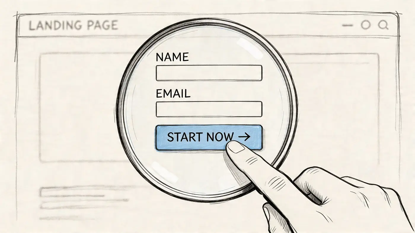
Mastering Forms and Calls to Action
The form and the CTA do the commercial work. Everything else supports them.
A lot of WordPress landing pages fail here because the team spends hours on layout and then settles for a generic button and an overbuilt form. That’s how a page ends up looking polished while subtly killing intent.
Common mistakes are well documented. Cluttered designs can increase bounce rate by 40%, and generic CTAs such as “Learn More” can reduce clicks by 35% compared with specific alternatives like “Book UK Demo”, according to ResponsiveMTS on landing page optimisation mistakes.
Write CTA copy that answers the visitor’s question
Users aren’t clicking because a button is orange. They click when the next step feels worth taking.
That means your CTA should communicate value, not just action. “Submit” says nothing. “Get My Free Audit” tells the visitor what they receive. “Book UK Demo” is stronger than “Learn More” because it’s specific, directional, and tied to a business outcome.
A simple way to improve button copy is to finish this sentence:
I want to...
If the answer is vague, the CTA will be vague too.
| Weak CTA | Stronger CTA |
|---|---|
| Submit | Get My Quote |
| Learn More | Book UK Demo |
| Contact Us | Talk to a Specialist |
| Sign Up | Start My Free Trial |
If you want a broader swipe file, these effective call to action examples are useful because they show how wording changes intent, urgency, and clarity.
Keep forms shorter than your internal team wants
Often, too much information is requested on the first conversion step. Sales wants qualification. Marketing wants segmentation. Operations wants edge-case details. The form ends up collecting everything except the lead.
A better rule is to ask only for what the next step requires. If sales can start with name, email, and one contextual field, stop there. Gather deeper information later in the process.
Use this checklist:
- Start with essential fields only. Every extra field should earn its place.
- Match field count to offer value. A demo request can support more friction than a newsletter signup.
- Use field labels that reduce ambiguity. “Work email” is clearer than “Email”.
- Write microcopy where doubt appears. Explain what happens after submission.
Field count should follow buying intent, not internal curiosity.
Use layout to reduce hesitation
Form design isn’t only about the inputs. It’s about what surrounds them.
Place the form near the core promise. Add one short reassurance line if privacy or follow-up concerns are common. Keep the submit area visually clean. Avoid sending the user into a sea of competing messages just as they’re ready to act.
For more complex offers, multi-step forms can work well because they break effort into smaller decisions. They’re especially useful when you need extra detail but don’t want to show a long, intimidating form up front.
A good way to sanity-check your own page is to watch a practical walkthrough like this:
Button design matters, but clarity matters more
Yes, button contrast matters. So does spacing, size, and mobile tap comfort. But design can’t rescue weak intent.
Keep the primary CTA visually dominant. Use one main button style for the page. If you add secondary buttons, make sure they don’t compete with the core action. A page with three equal CTAs usually has no real CTA at all.
The best forms and CTAs feel easy because they remove ambiguity. That’s the target. Not decoration. Not cleverness. Just a clear exchange between visitor intent and business value.
Optimising for Speed and Search Engines
A landing page that looks strong in review mode can still fail in the wild. It loads slowly on mobile, scripts pile up, images are oversized, and the metadata is either missing or written like an afterthought.
That matters because speed and discoverability affect both traffic quality and conversion quality. According to SaaSHero’s landing page conversion guidance, UK agencies report an average landing page conversion rate of 2.35%, while top performers reach 11.45% through optimisation. The same source notes that 83% of UK landing page traffic is mobile, and each extra second of delay can cause a 7% drop in conversions.
Fix the biggest performance issues first
You don’t need a weeks-long technical audit to improve a WordPress landing page. The biggest wins usually come from a short list of actions done properly.
Start here:
-
Compress your images before upload
Large hero images are one of the fastest ways to slow a page. Resize them to the actual display need, then compress them. Don’t upload desktop-sized assets for mobile-first traffic. -
Set up caching
A good caching plugin can remove a surprising amount of friction. If your host supports server-level caching, use it. If not, configure a reliable plugin and test the page before and after. -
Trim script bloat
Audit plugins, external embeds, chat widgets, heatmaps, and tracking scripts. Marketing pages often carry tools that were added for one campaign and never removed. -
Check mobile rendering first
Don’t evaluate performance only on a large office monitor. Mobile is where slow pages get exposed quickly.
For teams refining that stage of the process, Otter A/B’s article on optimising landing pages is worth reading because it ties technical cleanup directly to conversion outcomes.
Handle SEO like part of the offer, not admin work
Search optimisation on landing pages doesn’t need to be elaborate. It needs to be deliberate.
Use a title tag that reflects the actual offer and intent. Write a meta description that makes the click feel worthwhile. Keep the URL readable. Structure headings in a way that helps both users and search engines understand the page.
A practical launch checklist looks like this:
- Title tag includes the primary offer or keyword naturally.
- Meta description explains the value and gives a reason to click.
- Slug stays short and readable.
- Single H1 states the page promise clearly.
- H2s and H3s support scanning and structure.
- Internal links are selective and relevant, not excessive.
Search visibility helps only if the page promise matches what the visitor expected to find.
Don’t optimise the wrong page elements
Teams often spend too much time minifying tiny assets while ignoring oversized images or weak mobile layouts. Focus on what users experience.
If a landing page with WordPress feels fast, loads cleanly on a phone, and presents a clear search snippet, you’ve handled the highest-impact work. The point isn’t to win a technical purity contest. The point is to get qualified visitors onto a page that loads without friction and keeps them there long enough to act.
From Guesswork to Growth with A/B Testing
Best practice gets you to a competent first draft. It doesn’t tell you what your audience will prefer.
That’s the hard truth many teams avoid. They ship a landing page, watch leads come in, and assume the page is “working”. But a page can generate conversions and still leave a lot of performance on the table. The only reliable way to improve is to test specific changes against real traffic.
That matters even more on WordPress because teams can build quickly and therefore also make bad assumptions quickly. According to MageComp’s WordPress statistics roundup, UK WordPress landing pages using page builders such as Elementor can achieve 23% higher average conversion rates. The same source notes that without A/B optimisation, bounce rates average 40% to 50%, but can drop 15% to 25% post-testing.
Start testing before the page goes live
A/B testing works best when it’s part of the build plan. Not a rescue plan.
That changes how you create the page. You write a headline with an alternative in mind. You keep CTA logic simple enough to test. You structure the page so one variable can change without breaking the rest of the layout. You define what a conversion is before traffic arrives.
For a practical framework, Otter A/B’s guide to landing page split testing is useful because it focuses on running clean experiments instead of chasing random changes.
What to test first
The first test should target a high-impact element with clear interpretation. On most pages, that means the headline.
Why headline first? Because it affects every visitor, appears before the fold, and sets the frame for everything that follows. If the page promise is weak or mismatched, users won’t care how polished the rest of the page is.
Good early test candidates include:
- Headline angle such as benefit-led versus problem-led
- CTA wording such as action-first versus outcome-first
- Hero layout such as form-first versus copy-first
- Proof placement such as logos above the fold versus lower on the page
Avoid starting with low-impact cosmetic tests. Button shade, icon style, or minor spacing tweaks rarely teach much unless a stronger variable has already been settled.
A clean headline test workflow
Here’s the workflow that keeps teams honest.
Define one hypothesis
Write a plain statement before you touch the page.
Example:
A headline focused on the business outcome will generate more form submissions than a headline focused on product features.
This matters because it prevents retrospective storytelling. If you don’t define the test properly, every result becomes something you can spin.
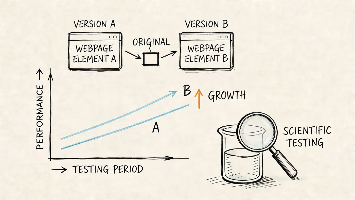
Create two distinct versions
Keep the rest of the page the same. If you change the headline, don’t also change the form, image, CTA, and proof stack. Otherwise you won’t know what caused the difference.
A useful pair might look like this:
| Variant | Headline style |
|---|---|
| Version A | Feature-led promise |
| Version B | Outcome-led promise |
The exact copy depends on the offer, but the contrast should be meaningful. Tiny wording edits often produce muddy results because the versions are too similar.
Track the right conversion goal
For lead generation, a thank-you page visit is usually cleaner than tracking button clicks alone. Clicks show intent. Completed submissions show outcome.
For e-commerce or booking flows, use the event or page that most closely reflects actual business value. The cleaner the goal, the easier it is to trust the result.
A test is only as useful as the conversion event behind it.
Keep the test disciplined
A/B testing fails when teams interfere too early. They check the numbers daily, panic when the first trend appears, then declare a winner before the sample is mature enough to mean anything.
Better habits:
- Run one important test at a time on a page with meaningful traffic.
- Avoid editing the page mid-test unless something is broken.
- Document the hypothesis, change, and goal before launch.
- Ignore early noise and wait for a stable result.
A lot of bad experimentation comes from impatience, not tooling.
What to do with the result
If one version clearly wins, publish it and move to the next highest-impact question. Don’t stop after one test. Strong landing pages usually improve through a chain of focused iterations, not a single breakthrough.
If the result is inconclusive, that’s still useful. It often means one of three things:
- The variable didn’t matter much.
- The versions were too similar.
- The page needs a bigger message shift before small tests are worth running.
That’s why testing turns a static landing page with WordPress into a real growth asset. It gives the team an operating rhythm. Build with intent. Launch with tracking. Test one meaningful variable. Keep the winner. Repeat.
When teams work this way, opinions lose power. Evidence takes over. That’s the point.
WordPress Landing Page FAQs
Should I build a landing page as a page or a post
Use a page. Landing pages are static, conversion-focused assets, and pages fit that use case far better than posts. Posts make sense for dated editorial content, category archives, and blog workflows. A campaign page should sit outside that structure.
How do I test a multi-step form
Test one layer at a time. Start with the entry point, such as the headline around the form or the wording on the first-step CTA. If you change step count, field order, and button copy all at once, you won’t learn much.
For multi-step forms, useful experiments include:
- Opening prompt that frames the benefit of starting
- First-step field choice to reduce intimidation
- Progress cues that reassure users the process is short
- Final CTA wording that reflects the outcome
What’s the best way to connect my form to a CRM
Use the form plugin or automation layer your team can monitor reliably. WordPress gives you plenty of integration options, but the best setup is the one that handles field mapping cleanly, passes hidden attribution data where needed, and doesn’t fail unnoticed.
Before launch, submit test leads with realistic values and confirm they land correctly in the CRM. Don’t assume the integration works because the plugin says “connected”.
What if my page builder conflicts with another plugin
Start by isolating the issue in a staging site. Disable non-essential plugins one by one and check whether the layout, scripts, or form behaviour changes. Conflicts usually come from overlapping JavaScript, duplicate optimisation features, or builder elements loaded by third-party add-ons.
If a plugin is important but unstable on landing pages, remove it from that page template. Campaign pages need reliability more than site-wide convenience.
What should I do if a test is inconclusive
Don’t force a winner. Review the hypothesis, traffic quality, and difference between variants. If the test asked a weak question, rewrite the test. If the page has deeper problems, move up the hierarchy and test message, offer framing, or form strategy before polishing smaller details.
If your team is ready to stop guessing which headline, CTA, or layout converts best, Otter A/B gives you a lightweight way to test WordPress landing pages without adding heavy performance overhead. It’s built for fast experiments, clean reporting, and decisions grounded in real user behaviour, so you can turn every landing page into an ongoing conversion programme instead of a one-off launch.
Ready to start testing?
Set up your first A/B test in under 5 minutes. No credit card required.