Optimizing Landing Pages: A Performance-First Playbook
Learn how to start optimizing landing pages without hurting site speed. A step-by-step playbook on auditing, A/B testing, and measuring revenue with Otter A/B.
You’ve probably seen this pattern already. Paid traffic is landing on the page, analytics says people are arriving in decent volume, and yet the page isn’t pulling its weight. The campaign team wants answers, the designer doesn’t want the page wrecked, and engineering is wary of another testing script that drags performance down.
That’s where most landing page programmes stall. Not because teams lack ideas, but because they don’t trust the process enough to ship experiments quickly. They worry about slow tools, visual flicker, muddied data, and tests that end with a shrug instead of a decision.
A better approach to optimizing landing pages starts with a simple rule. Treat performance as part of conversion work, not as a separate technical concern. If your testing setup damages the experience, you can end up “learning” from distorted behaviour rather than from the page itself.
Optimizing Landing Pages Beyond Guesswork

A lot of advice on optimizing landing pages still treats A/B testing as if it lives in a vacuum. Change the headline. Swap the CTA. Rearrange the hero. Those ideas are fine, but they ignore the operational reality. The challenge isn't a shortage of ideas; it's a shortage of confidence that testing won't slow the page, annoy users, or produce weak evidence.
That concern is justified. UK e-commerce sites on Shopify and WooCommerce saw a 24% drop in conversions when Core Web Vitals degraded during tests, according to DebugBear’s write-up of the performance issue. If the experiment layer harms LCP or CLS, the test can become the reason performance slips.
Why performance-first testing changes the quality of your results
A heavy testing setup creates two problems at once. First, it can reduce conversions directly by making the page feel sluggish or unstable. Second, it can contaminate the result, because you’re no longer comparing two page ideas under roughly equal conditions. You’re comparing two variants inside a compromised delivery environment.
That’s why lightweight testing matters. A small SDK, a clean implementation, and minimal interference with rendering preserve the behaviour you want to measure. When the page loads smoothly, the difference between control and variant is more likely to reflect the change you intended to test.
Practical rule: If the testing tool becomes noticeable to the visitor, it’s already too intrusive.
This is also where modern workflow matters. Teams that pair experimentation with faster analysis, cleaner reporting, and clearer decision-making move better than teams that run scattered one-off tests. If you’re already using tools that help structure landing page content and conversion workflows, platforms such as Sharpmatter AI can be useful for tightening the messaging side before you push variants live.
What works in practice
The strongest optimisation programmes share a few habits:
- They test business assumptions, not opinions. The change starts with a clear problem, such as form friction or weak message match.
- They protect page speed. Testing is treated as part of UX, not as a layer you can bolt on carelessly.
- They measure outcomes that matter. Conversions matter, but so does revenue per variant when the page has commercial intent.
- They keep the scope tight. One meaningful variable usually teaches more than several bundled changes.
What doesn’t work is the familiar pattern of random tweaks followed by premature celebration. Button colour debates. Hero swaps with no hypothesis. Tests launched on low-signal pages because they’re easy to access. That isn’t experimentation. It’s design roulette with a dashboard attached.
Finding Your First Optimisation Opportunities
Most poor landing pages aren’t failing everywhere. They’re failing at specific moments. A visitor scrolls, hesitates, re-reads a line, clicks an unclickable element, or reaches the form and drops. The job isn’t to “improve the page” in the abstract. It’s to find the exact place where intent leaks out.
Start with the funnel, not the homepage opinion
Open your analytics and trace the path that matters. If the page exists to generate demo requests, follow visitors from ad click to landing page to form start to form completion. If it’s an e-commerce page, look at visits, product engagement, add-to-basket actions, and completed purchases.
You’re looking for asymmetry. A page can have healthy traffic and weak submissions. It can have strong scroll depth and poor CTA engagement. It can have plenty of form starts but poor completion. Each pattern points to a different kind of friction.
Use quantitative data first to answer three questions:
- Where are visitors leaving?
- Where are they hesitating?
- Which traffic segments behave differently?
When you find a sharp drop, resist the urge to explain it immediately. The numbers tell you where to investigate, not why the problem exists.
Use behaviour tools to inspect the friction
Heatmaps and session recordings earn their place. They let you watch the page the way users experience it instead of the way the team imagines it works. Review rage clicks, dead clicks, quick bounces, abrupt scroll stops, and repeated form interactions.
A practical way to do this is to pair analytics with a disciplined review process. Don’t watch random sessions. Filter for users who reached a key step and abandoned. Filter for mobile visitors. Filter for returning users who still didn’t convert. If you want a solid primer on what behaviour visuals can reveal, this guide to heat maps on websites is a useful reference point.
When the same hesitation shows up across recordings, it’s rarely a user problem. It’s usually a page problem.
What to inspect on the page itself
Teams often jump straight to headlines and buttons. Sometimes that’s right. Often it isn’t. A more reliable audit checks friction in layers.
- Message match: Does the page continue the promise made in the ad, email, or search result?
- Information order: Does the page answer the visitor’s first question before introducing the next one?
- Visual hierarchy: Is the primary action obvious without fighting with secondary links and decorative elements?
- Trust timing: Are proof points visible before the visitor is asked to commit?
- Form burden: Does the form ask only for what the stage of the journey justifies?
The key is to separate surface symptoms from root causes. A weak CTA click rate may not mean the button copy is bad. It may mean the value proposition above it hasn’t done enough work yet.
Build a short list, not a long wishlist
By the end of the audit, you want a ranked list of issues. Not twenty ideas. Not a backlog full of “could test” suggestions. A short list.
A simple prioritisation table helps keep the team honest:
| Opportunity | Evidence seen | Likely friction type | Test priority |
|---|---|---|---|
| Form abandonment | Repeated exits at form step, hesitation in recordings | Request feels too demanding | High |
| Weak CTA engagement | Scroll reaches CTA but few clicks | Offer or button lacks clarity | Medium |
| Trust arriving too late | Users leave before proof section | Anxiety unresolved early | Medium |
| Mobile drop-off | Frequent pinch/zoom, awkward taps | Layout or field usability issue | High |
The best first experiments usually come from problems that are both visible and narrow. You want something important enough to matter, but contained enough that the result teaches you something clean.
From Data Insights to Testable Hypotheses
A landing page audit gives you observations. It does not give you a test plan. That gap matters. Without a proper hypothesis, teams end up changing things because they seem sensible, not because the evidence points there.
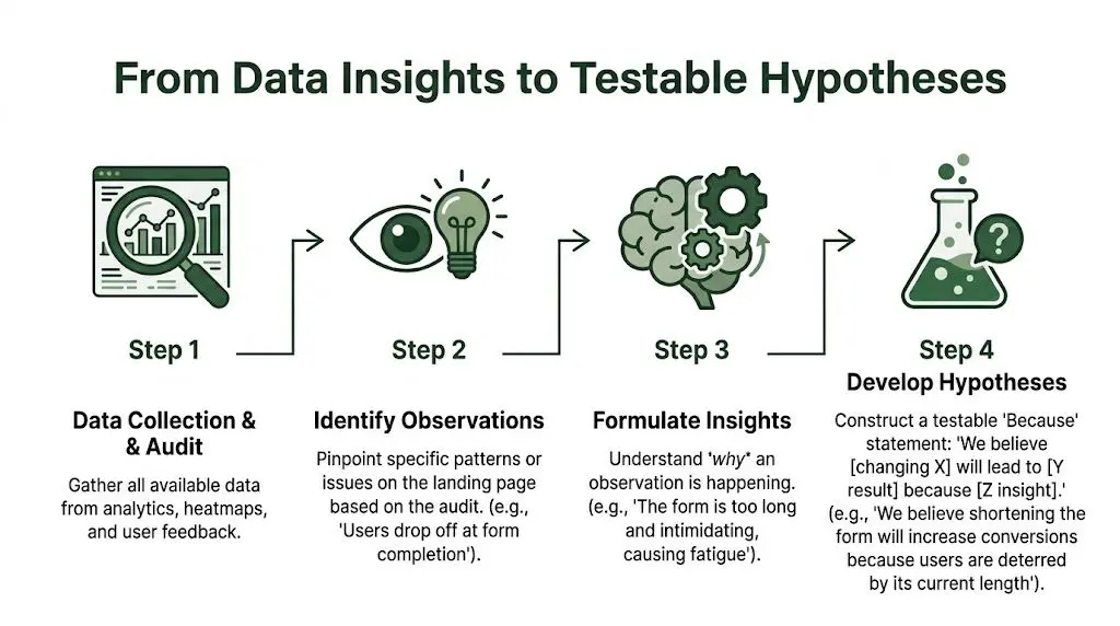
Use a hypothesis structure that forces clarity
The most practical version is plain and strict:
Because we saw [observation], we believe that [change] will cause [impact]. We’ll judge it by [metric].
That sentence does three jobs. It ties the proposed change to real evidence. It makes the expected effect explicit. It prevents the team from hiding behind vague language if the test underperforms.
Here’s the difference:
| Weak hypothesis | Strong hypothesis |
|---|---|
| We should test a new headline | Because session reviews show visitors leaving before reaching the proof section, we believe a clearer headline will improve engagement with the primary CTA. We’ll judge it by CTA clicks and completed submissions. |
| The form feels too long | Because visitors begin the form but abandon after the early fields, we believe removing non-essential fields will increase completed submissions. We’ll judge it by form completion rate. |
| Let’s move testimonials higher | Because users don’t reach the current social proof block, we believe placing trust signals earlier will reduce hesitation before the CTA. We’ll judge it by click-through to the form and final conversions. |
Example one, headline clarity
Suppose session recordings show visitors spending time in the hero, but not moving confidently into the page. They scroll a little, jump back up, and leave. That often signals message ambiguity. The page may be saying something polished but not something precise.
A testable hypothesis might be:
Because visitors pause in the hero and leave without deeper engagement, we believe rewriting the headline to state the core outcome more directly will increase CTA clicks. We’ll judge it by hero CTA engagement and completed conversions.
The trade-off is that a more specific headline can feel less “brand-led.” In practice, landing pages usually benefit when clarity beats cleverness.
Example two, CTA copy and intent alignment
Not every CTA issue is about colour or placement. Often the problem is psychological commitment. A button labelled “Submit” or “Continue” can feel transactional and vague. A button that reflects the value of the next step usually reduces uncertainty.
Here the hypothesis might be tied to intent:
- Observation: Visitors scroll to the CTA but don’t click.
- Belief: The button text doesn’t make the next step feel worthwhile.
- Change: Rewrite the CTA to reflect the offer, not the action.
- Metric: CTA click-through and downstream conversion.
This is also where discipline matters. If you change the copy, colour, size, and placement at once, you won’t know what caused the lift or the loss.
Example three, layout and trust placement
A page can have solid proof and still underperform because the proof arrives too late. Testimonials, brand logos, guarantees, and product evidence only help if users see them before their doubt peaks.
A useful layout hypothesis sounds like this:
Because visitors reach the first CTA before they’ve seen enough reassurance, we believe moving trust elements closer to the decision point will increase progression to the form. We’ll judge it by CTA interaction and completion rate.
This kind of test is especially helpful when your offer carries risk. Consultations, demos, finance products, and higher-consideration purchases often need reassurance earlier than teams expect.
A good hypothesis excludes as much as it includes
The strongest practitioners are ruthless about what a test is not trying to prove. If the issue appears to be form fatigue, don’t smuggle in a new hero section at the same time. If the issue is trust placement, don’t rewrite the pricing copy too.
That restraint is what makes optimizing landing pages cumulative. Each test sharpens the next decision instead of muddying the learning.
Running Experiments without Hurting Performance
The cleanest way to understand how performance-first experimentation works is to walk through a real test pattern. Form reduction is one of the most reliable examples because the friction is visible, measurable, and commercially important.
The scenario
The landing page is generating traffic, but lead volume is under target. Heatmaps and session recordings show repeated drop-off during form completion. The current form asks for more information than the page has earned.
That’s not unusual. The verified methodology for UK landing pages notes that UK e-commerce sites report 81% form abandonment rates, and that each field beyond 5 imposes a 20-30% conversion penalty, according to the Genesys Growth summary of the field-reduction test methodology. It also notes that a test reducing form fields from 8 to 4 produced a 120% conversion lift when run with a frequentist z-test at 95% confidence.
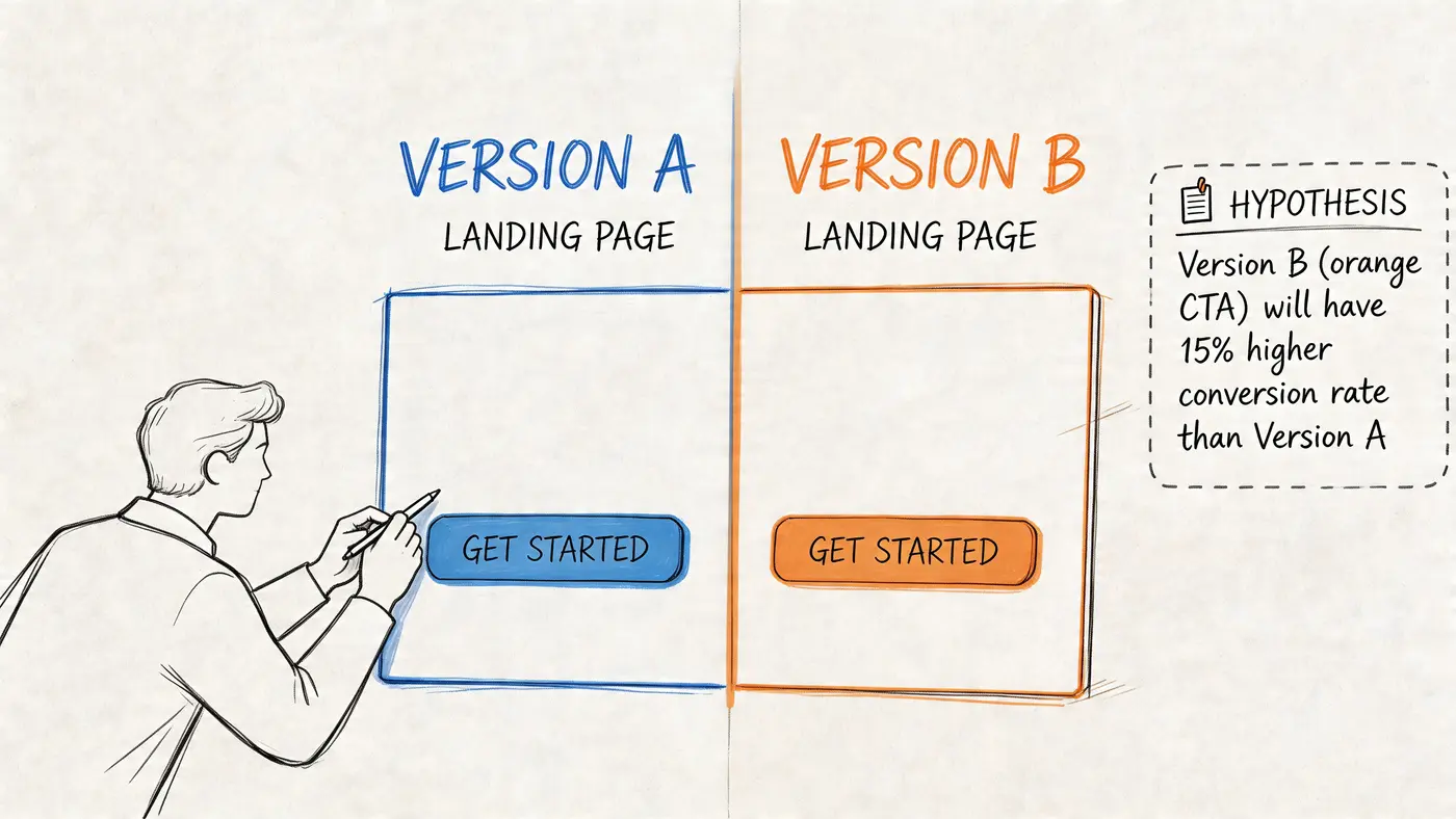
Build the experiment around one clear change
For this test, keep the control exactly as it is. The variant removes non-essential fields and preserves the action context. If it’s a high-value B2B lead form, you may still need some qualification. If it’s a low-friction lead magnet or enquiry page, strip the form back hard.
The control might ask for name, company, job title, phone, email, website, team size, and use case. The variant keeps only the fields the follow-up requires.
A simple setup looks like this:
| Test element | Control | Variant |
|---|---|---|
| Form length | 8 fields | 4 fields |
| Traffic allocation | Half of eligible visitors | Half of eligible visitors |
| Primary goal | Form completion | Form completion |
| Secondary view | Revenue impact where applicable | Revenue impact where applicable |
The discipline here is important. Don’t redesign the whole page while you shorten the form. You want the result to answer a single business question. Does lower friction generate more completed intent without harming lead quality enough to offset the gain?
Why the tool layer matters more than most teams think
Lightweight implementation stops being a technical footnote and becomes part of CRO practice. Otter A/B uses a 9KB SDK that loads in under 50ms with zero flicker, based on the publisher information provided for the platform. In practical terms, that means the test can run without adding the visual instability that heavier tools often introduce.
That matters because the same Genesys Growth methodology notes that UK users abandon at over 2 seconds load, and that page speed losses can drag conversion down before your copy or layout ever gets a fair read. If the experiment script delays rendering or swaps the interface after paint, users can react to the testing artefact, not just the variant.
If your team wants a broader discipline around release quality, this overview of non-functional testing is worth reviewing. It helps frame performance, stability, and usability as launch criteria, not post-launch clean-up.
A test is only trustworthy when the delivery conditions stay stable enough for users to react to the idea, not the implementation noise.
Run it with clean traffic and patient decision rules
Split eligible traffic evenly and keep the audience definition stable. Don’t funnel paid mobile visitors into one version and branded desktop traffic into the other. If your mobile audience behaves differently, segment after the test or run a dedicated experiment.
The UK methodology also points out that UK mobile traffic makes up 83% of visits and converts 8% lower, which is why responsive forms deserve extra scrutiny in this kind of test. On mobile, every unnecessary field adds keyboard friction, visual clutter, and a stronger sense of effort.
Once live, watch three things:
- Form completion rate for the primary outcome
- Revenue per variant when the page has a direct commercial path
- Behaviour quality in recordings so you can spot usability issues the topline data won’t explain
Don’t interfere too early. One of the easiest ways to ruin a test is to react to early swings as if they’re settled truth. Let the decision threshold do its job.
Here’s a useful walkthrough before that point in the process:
Watch for the trade-off that actually matters
Form reduction often increases volume. That doesn’t automatically mean it improves business quality. Some teams ask for too much too early. Others cut too aggressively and hand sales a flood of weak leads.
The answer isn’t to defend the long form by default. It’s to test qualification where it belongs. If the page is cold traffic, reduce early friction and qualify later. If the page serves high-intent demo requests, you may justify more fields. The methodology above explicitly notes that B2B can retain 7-10 fields for qualification without penalty in the right context.
That’s why experienced teams don’t ask, “Should forms be short?” They ask, “What information is worth requesting at this stage of intent?”
From Statistical Significance to Revenue Growth
A declared winner can still be the wrong business decision. That sounds obvious, but it’s where a lot of A/B testing programmes lose credibility. Teams celebrate a higher conversion rate even when the result doesn’t improve the commercial outcome that mattered in the first place.
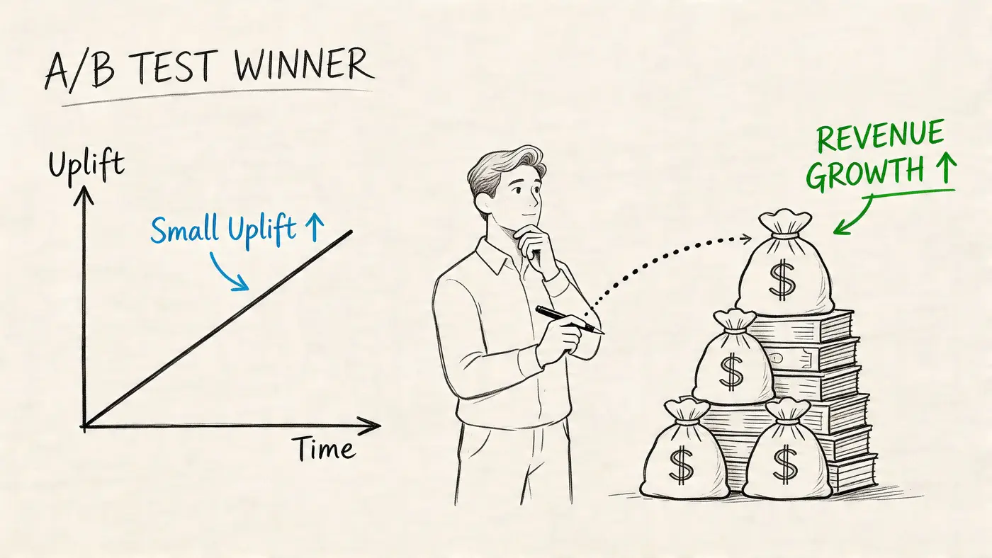
Significance answers one question, not every question
Statistical significance helps you judge whether the observed difference is likely due to the change rather than random variation. That’s useful, but it doesn’t tell you whether the winning version is commercially stronger, easier to operate, or sustainable across segments.
If you need a practical refresher on the mechanics, this explainer on testing statistical significance covers the decision logic clearly.
The right reading sequence is:
- Did the test reach a reliable decision threshold?
- Did the primary metric improve?
- Did the business metric improve as well?
- Did any downstream quality metric deteriorate?
That order prevents a common mistake. Teams often stop at step two.
Conversion rate can flatter a weak variant
A lead page is the obvious example. A shorter form may improve submissions while decreasing lead quality. An e-commerce variant may increase add-to-basket clicks while reducing average order value if the new layout overemphasises a lower-value product path.
That’s why revenue-aware analysis matters. When the page supports purchases, track revenue by variant, not just conversion count. When the page supports lead generation, connect form outcomes to downstream qualification where your setup allows it.
A simple interpretation table keeps stakeholder conversations grounded:
| Result pattern | What it means | Typical action |
|---|---|---|
| Higher conversion, higher revenue | Clear win | Implement and queue follow-up test |
| Higher conversion, flat revenue | Possible quality shift | Review basket mix or lead quality |
| Flat conversion, higher revenue | Valuable commercial win | Investigate why spend per converter rose |
| Higher conversion, lower revenue | False comfort | Do not roll out blindly |
Analyst’s note: A variant that creates more actions is not automatically creating more value.
Reporting the result so stakeholders trust it
Good reporting isn’t decorative. It’s part of decision quality. Stakeholders need to know what changed, why it changed, what metric moved, and what the business should do next. If the explanation is muddy, implementation gets delayed or challenged later.
A solid test summary includes:
- The hypothesis so people see the logic behind the change
- The scope so they know what stayed constant
- The decision metric so the result isn’t cherry-picked
- The business interpretation so the team knows whether to ship, refine, or reject
Many CRO teams achieve greater traction by presenting fewer charts and stronger conclusions. The test should end with a decision, not with a pile of screenshots and raw percentages detached from commercial context.
Advanced Tactics for Continuous Improvement
One winning test is useful. A sequence of linked tests is where a landing page programme starts compounding. That shift matters because optimizing landing pages rarely turns on one dramatic redesign. It comes from repeated reductions in friction, each based on what the last test taught you.
Treat every winner as the next control
The easiest way to stall is to celebrate a win and move on to another page before extracting the lesson. If a shorter form wins, the next question might be whether the form order should change. If a clearer headline wins, test whether the proof block can move higher. If trust placement improves CTA engagement, test which trust element does the heavy lifting.
This is not about endless tinkering. It’s about preserving learning continuity. A strong programme asks, “What did this result reveal about user hesitation?” Then it tests the next most relevant question.
A simple iteration ladder often looks like this:
- First test: Remove obvious friction.
- Second test: Strengthen the value explanation around the improved flow.
- Third test: Personalise the page for a more relevant audience segment.
- Fourth test: Tighten the commercial outcome, not just the raw conversion.
Use personalisation carefully and keep it lightweight
Personalisation is useful when it reduces ambiguity or makes the offer more locally relevant. It becomes harmful when it turns into a heavy, over-engineered targeting layer that adds compliance risk and bloated scripts.
This is one of the more neglected areas in UK landing page work. Verified data shows that 62% of landing pages lose 15-20% of conversions from intrusive cookie notices, and that lightweight geo-targeting such as showing VAT-inclusive pricing for UK visitors can boost AOV by 18%, based on the cited findings in Unbounce’s landing page optimisation article.
That combination matters. Teams often add clumsy consent flows and generic content in the name of compliance, then wonder why the page gets softer. In many cases, the smarter move is to keep targeting lightweight, relevant, and limited to what the visitor needs to make a decision.
The best personalisation usually feels like clarity, not surveillance.
Build a programme, not a queue of random tests
The maturity jump comes when testing stops being campaign clean-up and becomes part of operating rhythm. That means a few practical habits:
- Keep a tested knowledge base. Record what changed, what happened, and what the team learned.
- Prioritise by business value and implementation effort. A small change on a core page often beats a clever idea on a low-impact page.
- Review by segment. Some variants underperform overall but reveal a strong pattern on mobile, paid traffic, or returning visitors.
- Protect implementation quality. If the page degrades visually or technically, the learning will be weaker.
A landing page that keeps improving usually has a team behind it that has stopped asking for opinions first.
Making Data-Driven Decisions Your Default
The practical shift is smaller than often perceived. You don’t need a massive experimentation department to start optimizing landing pages well. You need one clear problem, one clean hypothesis, and a setup that doesn’t damage the experience while you test.
That mindset changes the work. Instead of arguing over what might convert better, the team starts building decisions around observed behaviour. Instead of treating page speed as someone else’s concern, marketing and development protect it together. Instead of chasing vanity wins, you judge experiments by business impact.
If you’re trying to make that operational, it helps to align every test with a measurable goal. This guide on how KPIs are measured is a useful reference when you need to tighten the connection between page changes and commercial outcomes.
Start with the friction that’s easiest to see. Run one disciplined test. Learn from it. Then make that cycle normal.
If you want to run performance-first landing page experiments without turning your site into a slower, noisier version of itself, Otter A/B is built for that workflow. It lets teams test headlines, CTAs, layouts, and forms with a lightweight setup while tracking outcomes that matter beyond simple conversion rate.
Ready to start testing?
Set up your first A/B test in under 5 minutes. No credit card required.