Checkout Conversion Rate Explained and How to Lift It
Learn what checkout conversion rate means, how to calculate it, UK benchmarks and a prioritized playbook to fix friction and lift revenue.
A shopper has reached the final screen. The product is in the basket, delivery details are complete, and the buying decision appears settled. Then the payment form asks for another piece of information, the preferred wallet isn't visible, or an unexpected charge appears. The shopper hesitates, closes the tab, and your acquisition spend produces no order.
That moment is why the checkout conversion rate deserves separate attention from traffic, product views, and add-to-basket activity. It measures how effectively your store turns high-intent shoppers into completed purchases. This guide defines the metric, separates it from related funnel measures, puts it in a UK context, and builds a practical testing sequence around payment friction. To estimate how a change could affect sales, you can also use this revenue impact calculator.
Why Checkout Conversion Decides Your Revenue
A checkout failure is different from a weak landing page. A visitor who leaves after viewing a product may still be comparing options or learning about your offer. A shopper who starts checkout has already taken several costly steps, including selecting a product, reviewing the basket, and signalling an intention to pay. Friction at this point wastes more than a visit. It wastes a near-term revenue opportunity.
Consider two stores with similar traffic and basket activity. Store A sends shoppers through a short, clear payment flow. Store B asks them to create an account, hides delivery costs until late in the process, and places the familiar payment wallet below a long card form. Store B may have strong advertising and persuasive product pages, yet its revenue is constrained by the final interaction.
A useful analogy is a physical till. More people joining the queue doesn't guarantee more completed sales if the till is slow, confusing, or unable to accept the payment method customers expect. Checkout conversion isolates that final queue, so your team can ask a more precise question: what prevents shoppers who started paying from finishing?
Why small improvements matter
The answer often isn't a dramatic redesign. It may be a clearer total, fewer fields, a guest option, better error handling, or a payment button that appears at the right moment on mobile. Each improvement removes a small amount of effort. Together, those changes can protect more of the demand you've already created.
The UK evidence supports treating checkout as a measurable commercial lever. The 2024 IMRG and Ecommpay research found that more than half of shoppers who reached checkout completed a purchase, while the gap between flow types showed that design still affected completion. The opportunity isn't theoretical. It sits inside an existing stream of high-intent users.
Practical rule: Don't begin by asking how to attract more visitors. First ask where committed shoppers stop, then test the smallest change that could remove that obstacle.
A sound optimisation programme connects three things: a consistent definition, a segmented diagnosis, and a revenue-aware experiment. The rate tells you whether completion changed. Revenue per checkout started tells you whether the change improved the business outcome. That distinction keeps teams from celebrating a percentage lift that comes from smaller orders, weaker customers, or a temporary shift in traffic mix.
What Checkout Conversion Rate Really Measures
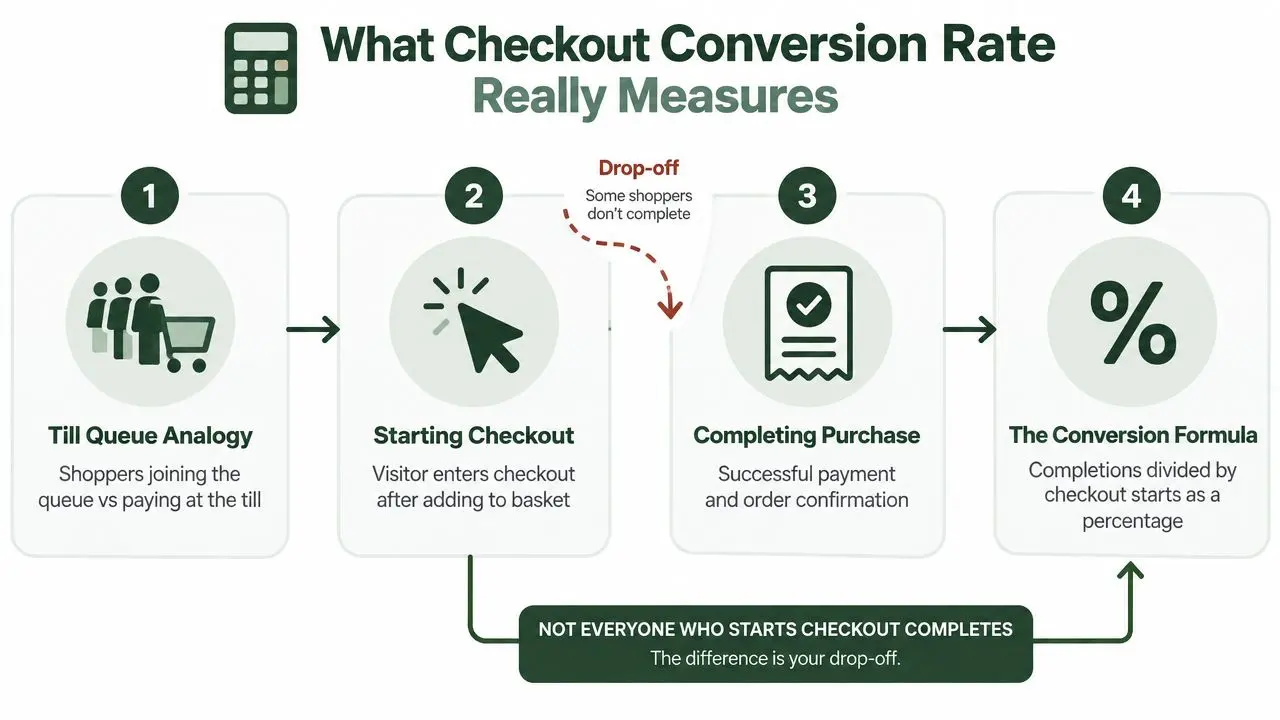
Think of a supermarket queue. Checkout starts are the shoppers who join the queue. Completed checkouts are the shoppers who reach the till, pay successfully, and leave with a confirmed purchase. The checkout conversion rate doesn't measure everyone who entered the shop, and it doesn't measure everyone who placed something in a basket. It measures the passage from joining the payment process to completing it.
The basic calculation is straightforward:
Checkout conversion rate = completed purchases ÷ checkout starts × 100
A checkout start needs a consistent event definition. Depending on your setup, it might fire when a shopper opens the checkout page, submits the first checkout step, or reaches a payment-ready screen. Pick one meaningful event and use it consistently. If one report counts page views while another counts shoppers who submitted delivery details, the rates won't be comparable.
Keep the funnel measures separate
Overall ecommerce conversion rate uses a broader denominator, usually visitors or sessions, and answers a different question: how effectively does the whole site turn visits into orders? Cart-to-checkout rate measures the move from basket intent into checkout. Checkout conversion rate begins later.
These measures can move in opposite directions. A campaign may bring more qualified visitors and improve site conversion while a payment issue lowers checkout completion. Conversely, a store may improve checkout while product discovery remains weak. Reporting the stages separately helps you avoid applying a top-of-funnel fix to a payment-stage problem.
Define the population before comparing it
Your dashboard should record at least the following distinctions:
- Checkout starts: Decide whether the event is a page load, a submitted step, or a payment-ready state.
- Completed purchases: Count a confirmed order, not a button click or a payment attempt.
- Unique shoppers: Choose whether repeat attempts count once or multiple times, then apply that rule everywhere.
- Customer type: Separate guest and registered shoppers if account behaviour differs.
- Payment route: Include card, wallet, and other express methods in a visible, consistent way.
- Device and browser: A mobile wallet issue can disappear inside an all-device average.
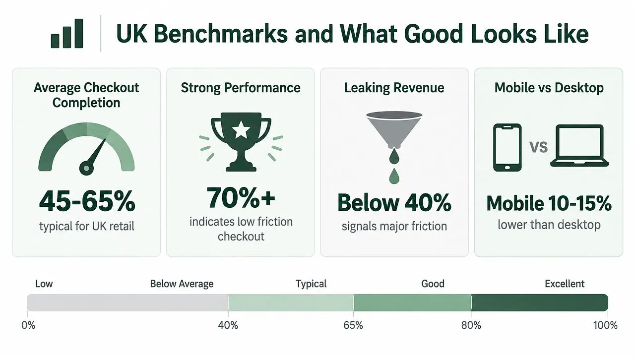
The 2024 UK retailer research reported an average checkout conversion rate of 58%, with single-page checkouts at 61% and multi-page checkouts at 56% across the period from 1 January to 30 June 2024, as detailed in the UK checkout conversion analysis. Treat that as a market reference, not a universal target. Your own rate becomes useful only when the numerator, denominator, audience, and time period remain stable.
UK Benchmarks and What Good Looks Like
A benchmark isn't a verdict. It gives you a starting position, but the value comes from locating the leak behind the average. UK ecommerce benchmark research published in 2026 reported an average checkout completion rate of about 45%, with top-quartile performance reaching 65%. The same benchmark set placed cart-to-checkout performance at 45–55% for average stores and 60–70% for strong performers, while checkout completion was listed at 55–65% for average stores and 70–80% for the top quartile, according to the published UK benchmark data.
Those ranges don't contradict each other automatically. They may reflect different samples, definitions, and benchmark populations. The practical lesson is to check which stage is underperforming before choosing a target.
Diagnose the location of the loss
If cart-to-checkout performance is weak, shoppers may be reacting to delivery information, basket presentation, or a weak transition into payment. If many shoppers reach checkout but few finish, the problem is more likely to involve forms, account requirements, payment authorisation, trust, or unexpected totals.
| Funnel measure | What it tells you | First question to ask |
|---|---|---|
| Cart to checkout | Whether basket intent becomes checkout intent | Are delivery, returns, and total cost clear before checkout? |
| Checkout completion | Whether checkout intent becomes a confirmed order | Where do shoppers encounter payment or form friction? |
| Overall site conversion | How the complete visit-to-order journey performs | Is the main constraint acquisition, product consideration, basket, or checkout? |
The wider context also matters. Independent UK conversion tracking placed overall ecommerce conversion at 1.51% in January 2026, down from 1.75% a year earlier, as reported in the same UK benchmark source. That doesn't prove checkout caused the decline. It does show why teams need to protect every high-intent stage when the broader environment becomes less forgiving.
Use segments instead of one blended target
A blended benchmark can hide a serious problem. Compare mobile with desktop, new shoppers with returning customers, guest with registered shoppers, and card payments with wallets. Then inspect browser, traffic source, delivery region, and error states where volume allows.
Set an improvement objective from your own baseline and segment it by the experience you're changing. A mobile wallet placement test should use mobile shoppers as its primary analysis group, while a guest-checkout test should examine shoppers who don't already have an account. The benchmark tells you what good can look like. Segmentation tells you what to fix first.
The Friction Factors That Lower Checkout Completion
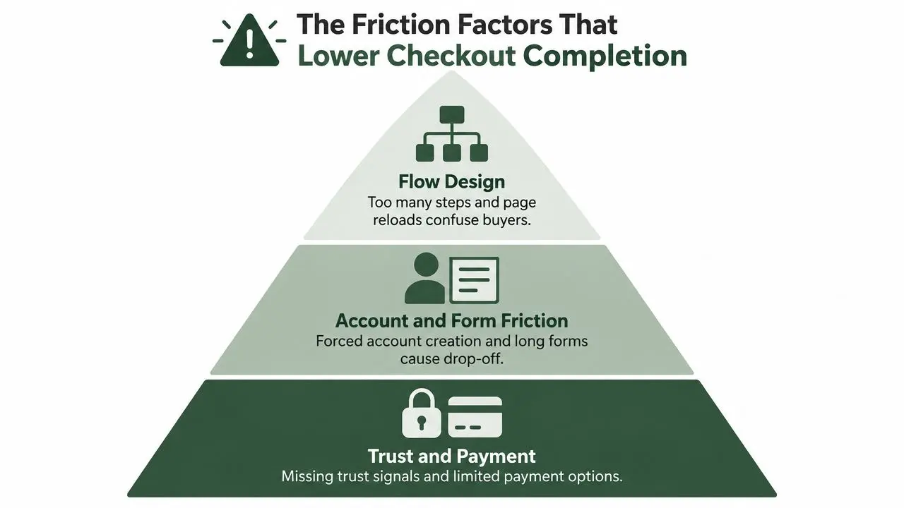
Checkout friction usually falls into four connected groups: flow design, account and form effort, trust and cost clarity, and payment or performance failures. These aren't abstract UX categories. They're moments a shopper can feel. A page reload interrupts momentum. A forced account asks for commitment before purchase. An unexplained fee makes the displayed price feel unreliable.
Flow design creates avoidable work
Multi-page checkout isn't automatically bad, and single-page checkout isn't automatically good. The relevant question is whether each step helps the shopper complete the order or merely reflects internal processes. Long sequences, unclear progress, repeated summaries, and unexpected reloads make the shopper remember what they've already entered and wonder how much remains.
The UK retailer data found 61% conversion for single-page checkout compared with 56% for multi-page checkout, a 5 percentage-point gap in that study, as documented by IMRG's checkout performance data. That result supports testing a consolidated flow, but it doesn't justify copying a layout without checking form complexity, mobile usability, and error behaviour.
Forms and accounts add cognitive load
A forced registration flow can turn a purchase task into an account-management task. Let shoppers buy as guests, ask only for information needed to fulfil and authorise the order, and offer account creation after confirmation. Use address autocomplete where it reliably reduces typing, preserve entered data after errors, and show field-level messages beside the problem.
In the same IMRG data, guest shoppers generated 59% of orders but converted at 52%, compared with 64% for registered shoppers. That pattern doesn't establish that registration causes the gap. Registered customers may already know the brand and have saved details. It does establish that guest and registered journeys deserve separate analysis rather than one combined rate.
Trust, totals, payment, and speed close the gap
Show delivery charges, tax treatment, returns information, and the final total before the shopper commits. Place reassurance near the payment action, not only in the footer. Make card errors specific, explain what failed, and prevent a declined payment from clearing the rest of the form.
Payment buttons also need to load quickly and behave predictably. A wallet that appears late, fails after a tap, or opens an unfamiliar redirect can create more friction than it removes. For practical examples of layout, reassurance, and field treatment, review these conversion tactics for checkout pages, then turn each observation into a testable hypothesis. You can also use this guide to reduce friction across digital journeys.
A useful audit should record the exact step, device, payment method, error message, and abandonment action. “Checkout is confusing” is a starting observation. “Mobile shoppers reach payment, select a wallet, wait for a failed hand-off, and return to the basket” is a test brief.
Payment Mix and Express Checkout Choices That Move the Needle
Payment optimisation isn't a logo-collection exercise. Adding every available method can make a checkout harder to scan, complicate maintenance, and distract from the method most likely to help the shopper. The better question is: which payment route removes the most effort for this UK audience, on this device, at this point in the flow?
One UK payment-mix analysis reports that 57% of UK adults used mobile wallets in 2025, making wallet-first design a relevant hypothesis rather than a niche convenience feature, as reported in the UK payment mix analysis. Adoption alone doesn't tell you which wallet should be first, or whether a wallet button should appear above the card form. Those are experience questions that require testing.
Card-first and wallet-first are different experiences
A card-first checkout presents the full form as the default route and treats wallets as secondary buttons. This can work for shoppers who prefer manual entry or use a desktop browser without a saved wallet. It can also push a fast mobile buyer through fields they could have avoided.
A wallet-first layout puts supported express methods near the primary action, often before the card form, while keeping cards visible for shoppers who need them. It may reduce input effort, but the button must make the next step clear, display the correct total, and handle wallet failure gracefully.
Test the experience rather than assuming the winner:
| Express methods offered | Checkout conversion rate | Implication for testing |
|---|---|---|
| One method | 54% | Test whether adding relevant methods improves completion without cluttering the payment area. |
| Four methods | 67% | Compare method breadth with placement, device, and method adoption before treating the difference as a universal rule. |
These figures come from the IMRG/Ecommpay UK retailer data. The study also reported an average checkout conversion rate of 58%, so the comparison should be read as evidence for a test hypothesis, not a guaranteed outcome for every store.
Prioritise relevance over quantity
Start by examining payment selection, authorisation success, and drop-off after each method. On mobile, test wallet prominence, button order, and whether a guest can complete the wallet flow without account creation. On desktop, compare a compact wallet panel with a card-first form, while keeping price, delivery, returns, and order details constant.
Teams choosing payment infrastructure can also compare provider capabilities, settlement needs, supported wallets, and the online payment systems for ecommerce that fit their operating model. The conversion decision still belongs in the checkout experiment. A method that looks valuable in a product list may not improve completed orders once placement, device behaviour, and error handling enter the picture.
A Prioritised Playbook to Test and Improve Checkout Conversion
A checkout backlog needs an order. Start with changes that remove obvious effort and are simple to isolate. Then test payment presentation and form behaviour. Leave more complex work, such as conditional flows or deep integration changes, until your evidence shows that the expected gain justifies the effort.
Begin with the highest-confidence obstacles
Single-page flow: If shoppers repeat information or lose context between steps, test a consolidated layout against the existing experience. Keep delivery choices, validation, and the order summary visible enough to prevent surprises.
Guest checkout: Make guest purchase the clear default, then offer account creation after order confirmation. Measure whether completion changes for new shoppers, not only the all-user average.
Cost transparency: Show the total, delivery charge, and relevant tax information before payment details. A clear total can remove the suspicion that the final click will reveal another charge.
Move to interaction and payment tests
Once the basic path is stable, test payment placement, wallet order, and express checkout prominence by device. Then test address autocomplete, sensible defaults, inline validation, and recovery from an invalid card. Change one primary experience variable at a time when the hypothesis depends on a specific mechanism.
A clean A/B test should keep traffic allocation consistent, avoid visual flicker, and define the primary event before launch. Checkout completion is useful, but revenue per checkout started is often the stronger decision metric because it connects the change to commercial value. Track purchase rate, average order value, refunds where relevant, and payment-method mix as guardrails.
Measurement rule: A higher checkout conversion rate isn't automatically a win if the variant lowers order value or attracts a different customer mix. Evaluate the money generated from comparable checkout starts.
Build a test brief that engineers can implement
Use a short brief with five fields:
- Observation: Identify the exact step and segment where shoppers drop.
- Hypothesis: State the friction and the expected behaviour change.
- Variant: Describe the smallest layout, copy, form, or payment change.
- Primary metric: Use revenue per checkout started, with completion as a supporting measure.
- Guardrails: Watch errors, payment authorisation, order value, refunds, and page performance.
A tool such as Otter A/B can run variants for checkout copy, layout, and flow while tracking purchase and revenue outcomes by variant. Before selecting a target, compare your internal results with broader ecommerce conversion benchmarks, making sure the definitions and audience are comparable.
Don't stop after one winning test. Record the mechanism, segment, and implementation detail, then use the result to choose the next experiment. A sequence of well-defined tests creates a stronger learning system than a single large redesign.
Turning Checkout Wins Into Sustained Revenue Growth
Checkout optimisation works best as a prevention strategy. UK basket-abandonment research from Novuna and Leeds Beckett found that around three-quarters of online baskets were left unpurchased in late 2024, while recovery rates remained below 5%, according to the UK checkout abandonment study. Recovery emails and reminders have a role, but they can't compensate for friction that could have been removed before payment.
The durable process is simple. Define checkout starts and completed orders consistently. Separate checkout conversion from cart-to-checkout and overall site conversion. Segment the experience by device, customer type, and payment method. Then prioritise the clearest obstacle, run a controlled test, and judge the outcome using revenue per checkout started alongside completion rate.
Store owners don't need to redesign everything at once. Start with one high-confidence change, such as a guest-first path, a clearer total, or a more visible wallet option. Keep the original experience available as a control, document what changed, and avoid declaring success from a rate movement that lacks a commercial or technical explanation.
Your next test should answer a specific question: what payment or form friction is stopping committed shoppers from completing today? Write that question down, choose the smallest credible change, and measure the result across the journey rather than relying on clicks alone.
Otter A/B lets growth teams test checkout copy, layouts, and flow changes while measuring purchase completion, revenue, average order value, and revenue by variant. Visit Otter A/B to set up a focused checkout experiment and turn your next friction hypothesis into a measurable decision.
Stop guessing
Ready to start testing?
Set up your first A/B test in under five minutes. No credit card required.
- 14-day free trial
- No credit card required
- Cancel anytime