Fix Cumulative Layout Shift: Improve UX & SEO Performance
Learn to fix Cumulative Layout Shift (CLS) in 2026. Discover its impact on UX & SEO, common causes, measurement, and A/B testing best practices.
You're probably dealing with this right now. A campaign goes live, a new banner gets added, a personalisation script joins the stack, and suddenly the page feels slippery. Someone tries to tap a CTA, the layout jumps, and they land somewhere else. Marketing sees weaker engagement. SEO sees a Core Web Vitals issue. Engineering gets asked why the page “moves around”.
That problem has a name. Cumulative Layout Shift measures the visual instability users feel when page elements move unexpectedly. It matters because people don't experience your site as a set of components. They experience it as trust, or a lack of it. If buttons move, forms shift, and text gets pushed down, the page stops feeling reliable.
The useful part is this. CLS isn't just a performance metric for developers. It's diagnosable, fixable, and fully relevant to experimentation. If you run tests, launch promos, swap components, or inject content with scripts, you're already shaping CLS whether you mean to or not.
That Frustrating Moment When the Page Jumps
A shopper is ready to buy. On mobile, their thumb is already heading for the add-to-basket button. Then a promo bar drops in from the top, the page shifts, and the tap lands on something else.
That is the user-side experience of CLS.
It usually does not look dramatic in a build review. It looks like a small late adjustment. In the browser, it feels more like someone nudged the interface while the user was mid-action. The result is lost clicks, broken reading flow, and a page that feels less reliable than it did a second earlier.
Google folded Cumulative Layout Shift into Core Web Vitals in 2020, which pushed visual stability out of the front-end quality bucket and into search, conversion, and campaign performance conversations. That change matters for marketing teams because many of the elements that move layouts are added for commercial reasons, not engineering ones.
Promo strips, cookie notices, stock messages, embedded reviews, recommendation modules, chat widgets, consent managers, and test variants often arrive after the initial layout has started rendering. If the page has not reserved space for them, the browser repaints the page and pushes content downward. The user experiences that as a jump, even if the component itself is working exactly as designed.
A page jump is not a cosmetic issue. It interferes with clicks, attention, and confidence.
This is also where teams misdiagnose the problem. They see lower engagement on a landing page, noisy heatmaps, or a checkout step that feels oddly fragile. The root cause is often simple. Something loaded late, and the layout had nowhere to put it.
A/B testing gets blamed for this a lot, sometimes fairly. A poorly implemented test can inject content after paint and cause visible movement. But testing is not in itself the problem. Done properly, it is one of the best ways to find layouts that convert well and stay stable. A flicker-free setup, including tools like Otter A/B, lets teams validate new messaging, promos, and page structures without turning the interface into a moving target.
That distinction matters. The goal is not to freeze the page and stop experimenting. The goal is to run experiments in a way that keeps the page visually stable from the first meaningful paint onward.
What Is Cumulative Layout Shift
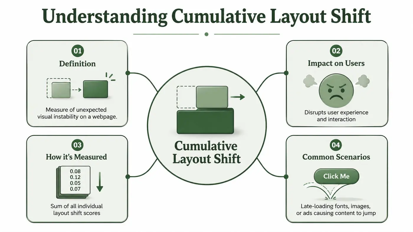
Cumulative layout shift measures how much a page moves unexpectedly while someone is using it. If text, buttons, images, or form fields shift after the initial layout appears, those movements add to the CLS score.
For a marketing team, the practical test is simple. If a visitor tries to read a headline, tap a CTA, or compare prices and the interface moves under them, that is a layout shift. If an accordion opens because they clicked it, that is expected behavior and does not count the same way.
How Google calculates it
Google calculates CLS by multiplying Impact Fraction by Distance Fraction, then taking the largest combined burst of layout shifts inside a 5-second session window, where shifts in that burst happen within 1-second gaps, as explained in Catchpoint's guide to cumulative layout shift.
In practice:
- Impact Fraction is how much of the viewport was affected
- Distance Fraction is how far the unstable element moved relative to the viewport
- Session window means Google evaluates clusters of shifts, not just one movement on its own
That scoring model is useful because it matches what users feel. A tiny badge moving a few pixels is usually minor. A late-loading promo bar that pushes the main content, CTA, and product image downward is far more disruptive, so it produces a worse score.
The thresholds that matter
Google groups CLS into three ranges:
| Classification | CLS score |
|---|---|
| Good | 0.1 or less |
| Needs improvement | between 0.1 and 0.25 |
| Poor | above 0.25 |
Teams also need to watch how CLS is judged across real visits. A site only qualifies as good if it stays at 0.1 or less at the 75th percentile of page loads on both mobile and desktop. As a result, a few unstable templates, devices, or campaign experiences can drag down the overall picture.
Practical rule: CLS is about whether the page stayed visually stable while the user was trying to use it.
A/B testing requires careful implementation. An experiment itself does not have to hurt CLS. The problem starts when a variant injects content after paint, changes element dimensions without reserving space, or swaps in a taller module once the page is already visible. With a flicker-free setup, testing becomes a way to compare layouts that are both persuasive and stable, instead of a source of extra movement.
Why CLS Matters for Your UX and SEO
A shopper opens a product page, starts reading the price, and taps Add to Basket just as a promo banner loads above it. The page shifts. They hit the wrong target, lose their place, and hesitate.
That is the primary cost of CLS. The interface stops feeling trustworthy.
On paper, layout shift sounds like a narrow front-end metric. In production, it affects the moments that carry commercial intent: selecting a variant, applying a filter, opening the basket, reading delivery details, or completing a form. If those elements move after the page appears, users have to re-orient before they can act. That extra friction shows up in lower confidence, weaker engagement, and muddier conversion data.
SEO is part of the same problem, not a separate one. CLS sits inside Core Web Vitals, so visual instability feeds into how Google evaluates page experience. It also tends to travel with other rendering issues. Pages that shift late often feel slow, especially if the main content arrives late as well. If your team is already working through Largest Contentful Paint improvements, CLS belongs in the same conversation because users experience both issues together.
UX damage usually appears before anyone labels it “CLS”
Teams rarely hear a customer say, “your layout shift score is high.” They hear that the page felt jumpy, the mobile landing page was awkward to use, or the checkout looked unreliable.
I see this pattern most often on pages with active marketing layers. Promo bars, recommendation widgets, cookie notices, review modules, countdown timers, and test variants all compete for space near the top of the viewport. Each one may look harmless on its own. Combined, they create a stack of late changes that pushes core content around just as someone is trying to use it.
This also affects experimentation quality. If a variant changes after first paint, you are no longer comparing two clean layouts. You are comparing one stable experience against another that visibly moves. That can distort the outcome of the test and make a valid design idea look weaker than it is.
The SEO impact is practical, not abstract
Google rewards pages that remain predictable while they load. Pages with visible movement ask users to wait, re-read, and re-click. Search engines may treat that as a weaker page experience, but the business effect often shows up first in behaviour metrics and conversion rates.
For ecommerce teams, that trade-off is familiar. A revenue-driving module added without reserved space can hurt the page that was supposed to benefit from it. That is why CLS should sit alongside eCommerce site speed optimization work, not outside it. Performance is not only about loading assets faster. It is also about keeping the interface stable while those assets arrive.
A stable layout makes the page feel faster, cleaner, and safer to use. That matters for users. It also matters for search visibility.
A/B testing fits into that picture better than many teams assume. Poorly implemented experiments can introduce shift. A flicker-free setup lets teams test alternate layouts, content hierarchy, and merchandising ideas without injecting instability into the page. Used that way, testing becomes part of the fix. It helps you find a version that converts well and stays visually stable under real traffic.
How to Measure and Diagnose CLS
A page can look stable on a developer laptop and still jump around for real users. That gap shows up all the time on pages with personalization, consent tools, test variants, and third-party widgets. If you want to diagnose CLS properly, measure it in production first, then recreate it in a controlled environment.

Start with field data
Field data shows what visitors experienced across devices, connection speeds, geographies, and template states. That matters because CLS often depends on conditions your team will not hit in a quick local check. A slow mobile connection, a delayed review widget, or an experiment that swaps content after render can all produce shifts that never appear in staging.
Start with PageSpeed Insights for the specific URL, then check whether the problem is isolated or template-wide. Product detail pages, collection pages, landing pages, and editorial templates usually fail for different reasons. Split mobile and desktop results early. A component that behaves on a wide viewport can wrap, resize, or inject above the fold on mobile.
Release history helps here. Match spikes in instability against promo launches, consent manager changes, third-party tags, or experiment deployments. Teams doing broader eCommerce site speed optimization usually get to the root cause faster when they review shared components instead of treating every unstable URL as a separate bug.
A/B testing belongs in that review, but it should be inspected precisely. The question is not whether a test exists. The question is whether the test changes layout after the browser has already painted the page. A flicker-free setup keeps experimentation from becoming the source of the shift, which means you can use tests to compare stable layouts instead of corrupting the result with visual movement.
Then use lab tools to isolate the cause
Field data tells you there is a problem. Lab tools tell you what moved, when it moved, and what loaded just before it.
Run Lighthouse first to get a repeatable baseline. Then record a Performance trace in Chrome DevTools and inspect the Layout Shifts track. That view makes CLS much easier to debug because you can tie visible movement to a specific render event, resource, or script execution.
The element that moves is often not the element that caused the problem. A CTA button may slide down the page, but the underlying cause is often a banner, image, embed, or injected block above it. That is why traces matter. They let you see the chain of events instead of blaming the most obvious visual casualty.
It also helps to review CLS next to Largest Contentful Paint diagnostics. Late-rendering hero modules, carousels, and promotional blocks often hurt both metrics at once.
Here's a good walkthrough for seeing layout shifts in action:
What to look for in a trace
When I diagnose CLS, I check for a small set of repeat offenders first:
- Elements injected above existing content. Cookie notices, promo bars, stock alerts, and review summaries.
- Media without reserved space. Images, videos, iframes, and embeds that expand after the initial layout pass.
- Third-party scripts. Tag-managed components often arrive late and force the browser to make room.
- Responsive layout changes. Grids, buttons, and navigation patterns that wrap differently on smaller viewports.
- Experiment logic that mutates the DOM after paint. Variant code can be fine, but late execution creates visible movement and contaminates test results.
A useful rule is simple. Inspect whatever loaded late, then inspect what sat above the content users were trying to read or click. That usually gets you to the cause faster than staring at the element that visibly jumped.
Common Causes of CLS and How to Fix Them
Most CLS issues come from a short list of patterns. The browser starts painting the page before it knows the final size of something important. When that thing eventually appears, the layout gets reshuffled.
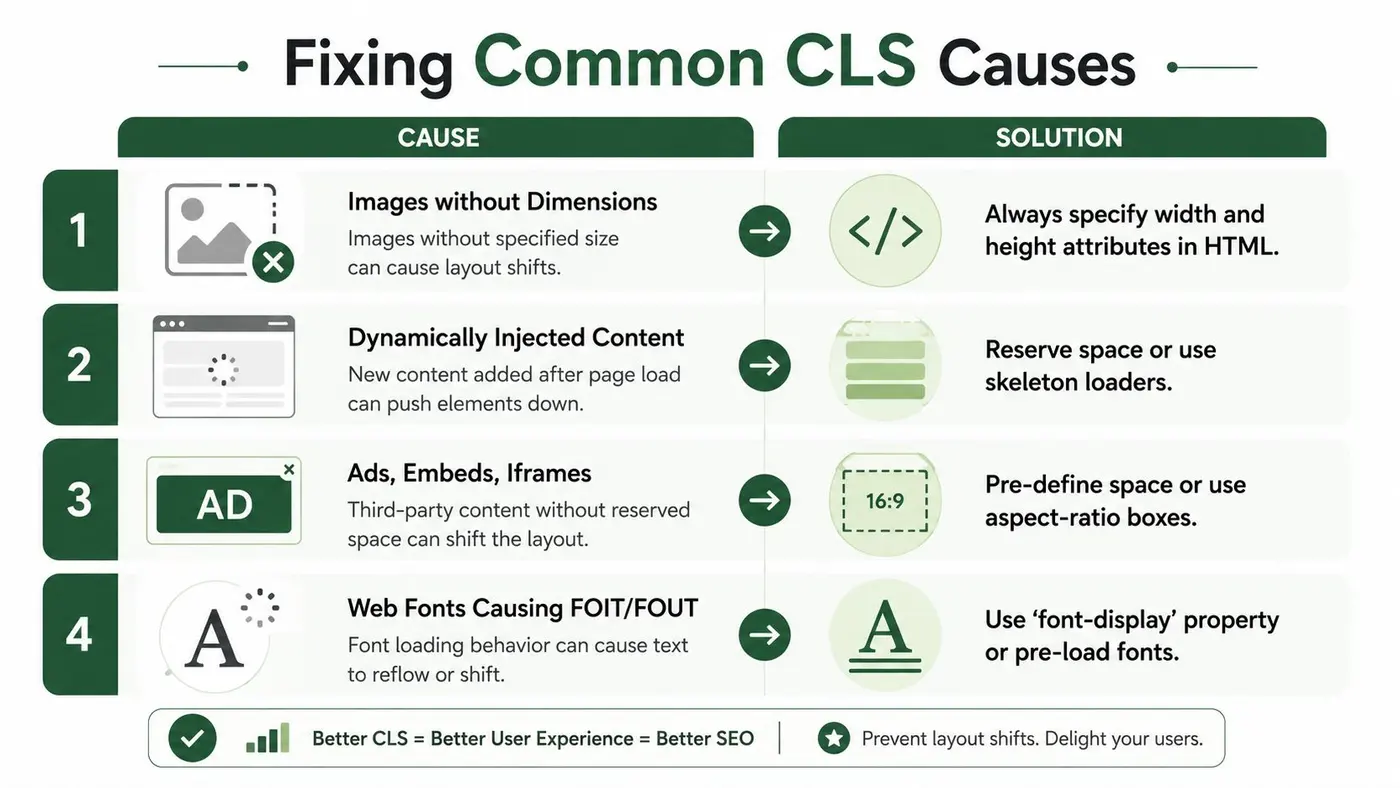
Request Metrics' explanation of CLS causes and fixes highlights a few points that matter in day-to-day implementation. Third-party scripts and tag management systems are frequent causes of instability, reserving space with CSS such as min-height or aspect-ratio is a core mitigation, and shifts within 500 milliseconds of user input are excluded, while asynchronous content injection without reserved dimensions remains a common source of poor scores.
Images and video without dimensions
This is still one of the easiest mistakes to ship.
If an image has no known size when the browser first parses the layout, the browser leaves a gap based on guesswork or no gap at all. Once the file loads, the surrounding content gets pushed aside.
Before
<img src="/images/product.jpg" alt="Product">
After
<img src="/images/product.jpg" alt="Product" width="800" height="800">
Or reserve the shape in CSS when the layout is responsive:
.product-image {
  aspect-ratio: 1 / 1;
  width: 100%;
  display: block;
}
If your team needs a practical primer on how to optimise website visuals, that's worth reviewing alongside CLS work because image handling often affects both stability and rendering speed.
Banners, alerts, and dynamic modules
The most damaging layout shifts usually happen near the top of the page. A stock alert, sale bar, consent message, or delivery notice appears late and pushes everything downward.
This version causes trouble:
const banner = document.createElement('div');
banner.textContent = 'Free delivery this weekend';
document.body.prepend(banner);
A safer pattern is to reserve space from the start:
<div class="promo-slot"></div>
.promo-slot {
  min-height: 48px;
}
Then populate that container rather than inserting a new element above settled content.
Reserve a seat for dynamic content before it arrives. Don't ask the whole page to stand up and rearrange itself.
If you're dealing with recurring promo bars or announcement components, it helps to standardise them. A shared slot with fixed behaviour beats a one-off script every time. This is especially relevant when reviewing website banner patterns and their trade-offs.
Ads, embeds, and iframes
Embeds are notorious because their final size is often controlled by a third party. If the frame expands after load, it can shift a lot of surrounding content.
Use wrappers with an expected ratio or minimum height:
.embed-shell {
  aspect-ratio: 16 / 9;
  width: 100%;
  background: #f5f5f5;
}
Or if the exact ratio varies, reserve a conservative minimum:
.review-widget-slot {
  min-height: 320px;
}
That doesn't make the embed fast. It makes the layout predictable.
Fonts and text reflow
A page can shift even when no boxes are injected. Text itself can reflow if the fallback font and loaded font occupy different space. Headlines wrap differently. Buttons become taller. Cards change height.
The fix depends on your stack, but the principle is simple:
- Preload important fonts when appropriate
- Use
font-displaydeliberately - Choose closer fallback fonts so reflow is reduced
- Test wrapped text states on narrow screens
What doesn't work
A few habits create more problems than they solve:
| Pattern | Why it fails |
|---|---|
| Injecting content above the header | It shifts everything below it |
| Relying on JS to set dimensions after load | The browser needed that information earlier |
| Using placeholders with no fixed size | A loader that changes size still shifts content |
| Assuming desktop stability means mobile stability | Wrapping and viewport constraints change the outcome |
The good fixes usually look boring. Known dimensions. Reserved slots. Predictable containers. Less surprise.
A/B Testing Without Hurting Core Web Vitals
A lot of teams assume A/B testing and Core Web Vitals are naturally in conflict. They're not. Bad implementation is the problem, not experimentation itself.

The usual failure mode is flicker. The original page renders, then the test tool swaps content after the fact. Headline changes. CTA size changes. A module appears. The layout jumps. Users see two states in quick succession, and CLS records the instability if the shift is unexpected.
Not all experiment-driven shifts count
A critical nuance is that Hostinger's UK guide to CLS points out that layout changes triggered by user-initiated experiments within 500ms of input are not counted in CLS. That distinction is important for growth teams.
If a user clicks a variant toggle, expands a panel, switches plan type, or chooses a different product view and the resulting change happens within that input window, that shift is treated differently from an unsolicited layout jump.
That means experimentation can be CLS-safe when it follows the interaction model users expect.
Testing patterns that usually work
There are several ways to run experiments without turning your pages unstable:
- Server-side or pre-rendered variants keep the initial layout consistent because the user receives one version, not a late swap.
- Same-footprint variants let you test copy and hierarchy while keeping component dimensions aligned.
- User-triggered experiments can be safe when the layout responds immediately to an action the user chose.
- Reserved experiment containers help when a tested module may vary in content length or media treatment.
A reliable rule is this: if the variant changes the size of a component, reserve the largest realistic footprint up front.
Testing patterns that create trouble
These are the ones I'd review first:
- Client-side swaps after paint
- Experiments loaded through stacked tag-manager logic
- Variant code that inserts banners or modules above settled content
- Headline tests where one variant wraps into multiple lines and no height is reserved
If you're unsure whether performance debt is already baked into your stack, it can help to improve site performance with an audit before scaling your experimentation programme. That kind of review often surfaces hidden script interactions and unstable template areas.
For teams running tests on publishing platforms, A/B testing workflows for WordPress are a good reminder that implementation details matter more than the idea of testing itself.
The best experiment is not the one with the cleverest hypothesis. It's the one users experience as a normal, stable page.
That's the mindset shift. A/B testing shouldn't be treated as a tolerated source of CLS. It can help you find layouts that convert better while staying visually stable. In many teams, that's a key opportunity. Use tests to prove which stable design wins, rather than accepting instability as the cost of learning.
Building a Visually Stable Web
Cumulative layout shift is one of the clearest examples of where user experience, engineering quality, and search performance all point in the same direction. Users want pages that stay put. Developers want predictable rendering. Marketing wants landing pages that don't sabotage intent at the point of action.
The work is rarely glamorous. Reserve space for images. Give embeds a container. Stop injecting surprise content above the fold. Audit the scripts that arrive late. Treat promo bars, recommendation widgets, consent tools, and experiments as layout decisions, not just marketing add-ons.
A good operating model is simple:
- Measure real-user behaviour first
- Use browser tooling to find what shifted
- Fix the cause, not only the visible victim
- Design experiments so layout changes are deliberate and stable
The broader point is bigger than passing a metric. A visually stable site feels trustworthy. People can read without losing their place, click without second-guessing, and compare options without the page moving under them. That kind of calm interface is easy to undervalue until it disappears.
Teams that treat stability as part of product quality usually make better decisions elsewhere too. They become stricter about third-party scripts, more disciplined about component design, and more careful with what gets injected after render. That shows up in UX, SEO, and conversion work at the same time.
If you want to run experiments without introducing flicker or layout instability, Otter A/B is built for that job. It gives teams a lightweight way to test headlines, CTAs, and layouts while keeping page experience intact, so you can learn what converts better without turning A/B testing into a CLS problem.
Stop guessing
Ready to start testing?
Set up your first A/B test in under five minutes. No credit card required.
- 14-day free trial
- No credit card required
- Cancel anytime