Landing Page Conversion Rate: How to Measure and Improve It
Master your landing page conversion rate with proven tactics for headlines, CTAs, and layout. Learn benchmarks and A/B testing strategies that drive results.
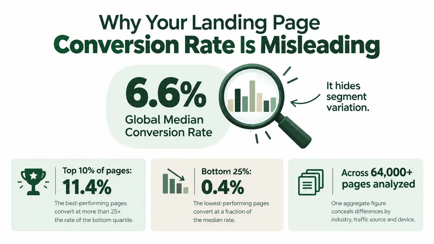
The median landing page conversion rate is 6.6%, based on a benchmark covering 41,000 landing pages. That figure is only a starting point, because conversion varies significantly by traffic source, page type, audience intent, and visitor quality.
So what does “good” mean for your page? A rate that looks weak against a broad benchmark may be healthy for cold organic traffic, while the same result could signal a serious problem on a high-intent pricing page. Treating conversion rate as a single universal score leads teams to test the wrong things, misread channel performance, and optimise for more leads instead of better business outcomes.
Why Your Landing Page Conversion Rate Is Misleading
A good landing page conversion rate depends on who arrives, why they arrive, and what action the page asks them to take. Comparing a homepage with a narrow campaign page is not a meaningful benchmark. Neither is comparing paid search traffic with low-intent social traffic and calling the difference a design failure.
The basic calculation is simple:
Landing page conversion rate = conversions ÷ visitors × 100
The difficulty lies in defining both sides of that equation. A conversion might mean a purchase, a qualified enquiry, a demo request, an email sign-up, or a click to the next step. “Visitors” might mean sessions or unique users. Unless those definitions remain consistent, the resulting percentage gives a false sense of precision.
A widely cited benchmark covering 41,000 landing pages, 464 million visitors, and 57 million conversions recorded a 6.6% median conversion rate in Q4 2024 (UK landing page conversion rate benchmarks). That number is useful as a broad reference point, but it doesn't tell you what a specific page should achieve.
Context changes the verdict
UK benchmark summaries report a dedicated landing page at around 4.84%, compared with approximately 1.1% for homepage traffic, 2.7% for product pages, and 11.2% for pricing pages (landing page optimisation guidance for UK marketers). Those figures describe different visitor expectations. A pricing-page visitor has often already researched the offer, while a homepage visitor may still be deciding what the business does.
The practical response is to create separate benchmark groups for:
- Page intent, such as lead capture, product selection, pricing, or purchase.
- Traffic source, such as direct, email, paid search, organic search, or social.
- Audience quality, including returning visitors, prospects, customers, and cold audiences.
- Conversion definition, separating a completed commercial action from an early engagement signal.
Practical rule: Never ask whether your conversion rate is good before asking, “Good for which audience, page type, and action?”
A rate should help you diagnose performance, not replace diagnosis. If you want a useful companion metric, compare conversion rate with qualified lead rate, revenue per visitor, average order value, or the next meaningful funnel step. Broader context on why secondary metrics matter is available in this guide to conversion rate and secondary metrics.
Benchmarking Performance by Traffic Source and Page Type
What should your landing page conversion rate be for the visitors reaching it? A generic average cannot answer that. UK benchmark data shows why: a 2026 report covering 2.4 million sessions records 7.42% for direct traffic, 6.94% for email, and 1.94% for organic social, while the same UK conversion benchmark report puts dedicated landing pages at 4.84% and ecommerce product detail pages at 2.94%. The traffic source affects visitors' prior knowledge, motivation, and readiness to act before the page loads.
Use those differences to decide where to investigate. If email traffic converts well but organic social traffic does not, changing the button colour across every page is unlikely to address the problem. The social audience may need a different offer, clearer message match, more education, or a lower-friction first step.
Build an honest comparison set
Segment your reporting before judging performance. In your analytics platform, combine source, campaign, device, page template, and conversion event, then compare equivalent groups:
| Comparison | What it can reveal |
|---|---|
| Email versus organic social | Differences in familiarity and intent |
| Dedicated campaign page versus product page | Whether the destination matches the campaign |
| New visitors versus returning visitors | The effect of prior awareness |
| Lead form completion versus qualified lead | Whether volume creates commercial value |
| Mobile versus desktop | Friction caused by layout, forms, or speed |
The report's 4.84% dedicated-page rate exceeds the 2.94% product-page rate by 1.90 percentage points. That gap describes a difference between page types, not a universal performance lift. A focused page can work better because it presents one promise, one audience, and one next step.
A focused page still has trade-offs. An ecommerce visitor may need product comparisons, delivery information, or reassurance before buying, so removing every product link can reduce confidence rather than improve conversion. Choose the page structure according to intent. For practical guidance on building a focused Shopify experience, review these Shopify landing page design principles.
Find the expensive mismatch
Look for high-value traffic arriving on a page built for a different job. Paid search visitors seeking a specific service should not have to decode a generic homepage. Email subscribers responding to a precise offer should not arrive at a product catalogue with no reference to the message that brought them there.
Prioritise segments with both meaningful volume and commercial importance. A small improvement among high-value visitors can matter more than a larger percentage change in low-quality traffic. Review channel-level conversion alongside qualified leads, sales, and revenue before committing budget to A/B testing.
Measuring Conversion Rates with Statistical Rigor
A trustworthy landing page conversion rate starts with a trustworthy measurement setup. Before changing copy or launching an experiment, write down the conversion event in plain English. “Form submitted and accepted by the CRM” is stronger than “button clicked”, because it represents a completed action rather than an intention.
Use a primary conversion and supporting micro-conversions. The primary event might be a purchase, booking, or qualified enquiry. Micro-conversions can include form starts, field errors, checkout starts, brochure downloads, video engagement, or clicks that reveal pricing. These signals won't replace the main outcome, but they help explain where visitors stop.
Make the reporting definition explicit
Choose whether the denominator is sessions or users. Session-based reporting can count the same person more than once, which may be appropriate for repeated purchase journeys. User-based reporting gives a clearer view of unique people, but it can complicate attribution when visitors return through different devices or channels.
Record the following before you trust a result:
- Conversion event: What exact action counts?
- Attribution window: How long after the visit can the action be credited?
- Traffic exclusions: Are internal visits, bots, test orders, or staff activity removed?
- Channel rules: Does the same visitor receive credit from one source or several?
- Business outcome: Does the conversion become revenue, a qualified lead, or merely a database record?
A page can increase form submissions while lowering lead quality. It can also reduce headline conversion while increasing completed purchases because the new experience filters out poor-fit visitors. Track the outcome that the business values.
Don't confuse a spike with evidence
A short-term lift may come from a different audience mix, a promotion, a news event, or ordinary variation. Statistical significance helps you judge whether the observed difference is likely to reflect a real effect rather than noise. It doesn't tell you whether the test idea was strategically wise, whether the result will persist, or whether the extra conversions are valuable.
Define the hypothesis before looking at results. State the expected mechanism, such as, “Replacing a generic CTA with a description of the next step will reduce uncertainty for first-time visitors.” Decide the primary metric in advance, and avoid stopping a test only because the latest result looks favourable.
Teams that need a deeper explanation of experiment sizing can use this guide to calculate statistical power. The important operating principle is simple: measurement discipline comes before optimisation velocity.
Key Factors Influencing Landing Page Performance
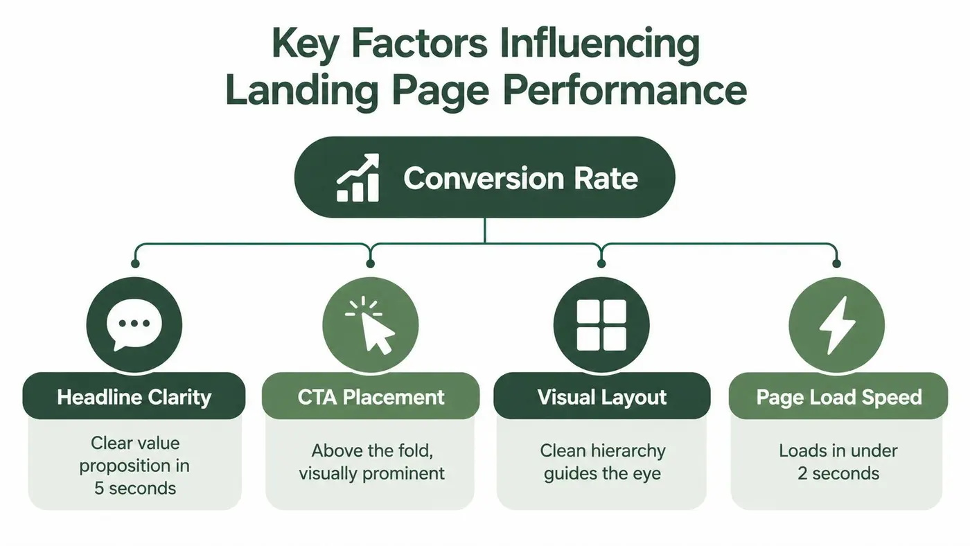
Most underperforming pages don't have one mysterious flaw. They have a series of small mismatches between the visitor's expectation and the experience on the page. The highest-return fix depends on the page type, so the right audit compares alternatives rather than applying a universal checklist.
Start with the message
A headline such as “Welcome to our platform” describes the brand but gives the visitor no reason to continue. A useful headline identifies the audience, problem, or outcome in language that matches the ad, search query, or email.
Check the first screen without scrolling. Can a visitor understand the offer, its main benefit, and the next action? If not, redesigning the lower half of the page won't address the first point of failure.
Treat the CTA as a promise
“Submit” describes a technical event. “Request a quote” describes what the visitor expects to happen next. The stronger label isn't automatically the one with more energy. It is the one that reduces uncertainty and accurately sets expectations.
CTA placement also depends on commitment. Put an immediate action near the primary value proposition for a simple offer. For a high-consideration purchase, repeat the CTA after proof, objections, and product detail. Don't force every visitor through the same persuasion sequence.
Compare clarity with decoration
A clean visual hierarchy should guide attention from problem to solution to evidence to action. Decorative imagery can support that sequence, but it shouldn't compete with the headline or push the form below the point where visitors understand the offer.
Audit each element by asking, “Does this help the visitor decide?” Remove navigation links, animations, carousels, and fields that don't support the page's objective. Keep useful reassurance, such as delivery information, privacy wording, guarantees, or relevant customer evidence.
Test performance before copy
Slow pages create friction before a visitor can evaluate the offer. Check the experience on an ordinary mobile connection, not only on a fast office network. Compress oversized images, remove unnecessary scripts, reserve space for dynamic elements, and verify that the first interaction works as soon as the page becomes usable.
A useful audit order: message clarity first, interaction friction second, technical performance third, visual polish last.
That order prevents teams from spending a week debating brand colours while visitors still can't understand the offer or complete the form.
Implementing A/B Testing for Continuous Improvement
A/B testing works best when it answers a specific business question. “Let's test the page” is not a hypothesis. “Visitors from paid search may hesitate because the headline promises a category while the form asks for a sales conversation, so we'll test a product-specific headline and CTA” is testable.
Start with the evidence already available. Read search terms, ad copy, sales objections, customer-support tickets, form abandonment data, and session recordings. Pick one friction point that is both plausible and commercially important.
An illustrative testing workflow
Consider a representative ecommerce team with a campaign page that receives relevant traffic but produces few completed purchases. The team notices that the ad promotes a specific product bundle, while the landing page opens with a broad brand statement and sends visitors into a general catalogue.
The team writes three hypotheses:
- A headline that names the bundle will improve message match.
- A CTA that describes the purchase action will be clearer than a generic button.
- Showing delivery and returns information near the decision point will reduce hesitation.
The team shouldn't change all three at once if it wants to understand the cause. It could begin with the headline, keep the rest of the page stable, and define completed purchases as the primary goal. If the headline variant wins, the team can carry the learning into a second experiment rather than claiming that every page element caused the result.
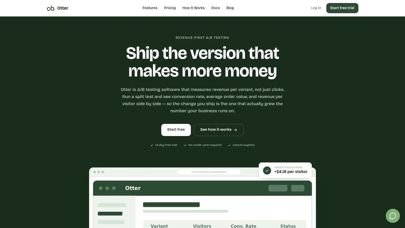
A lightweight tool such as Otter A/B can create variants for headlines, CTAs, layouts, or full-page experiences, then report conversion outcomes and test significance from a dashboard. The platform can be used alongside common site and ecommerce setups, but the tool won't compensate for a weak hypothesis or poor event tracking.
Keep the experiment interpretable
Avoid changing the headline, pricing, form, imagery, and checkout path in a single test unless the purpose is to compare complete experiences. A full-page test can reveal which experience performs better, but it won't tell you which individual change created the difference.
Before launch, confirm that the variant renders correctly on mobile, that analytics receives the right event, and that users aren't exposed to multiple conflicting tests. After launch, monitor technical errors and commercial outcomes, not just clicks. A losing variant can still reveal a valuable objection or message mismatch.
Case Study - Optimising Headlines and CTAs
A common CRO mistake is assuming that adding more features will make a page more persuasive. In practice, extra specifications often bury the reason the visitor arrived. The strongest intervention is frequently not more content, but a clearer path from need to action.
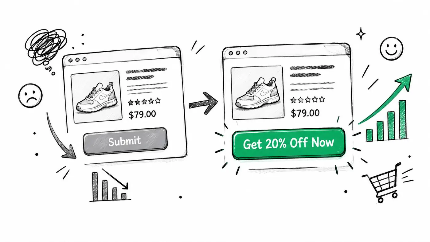
Take a representative ecommerce brand selling a specialist product. Its campaign page leads with the company name, lists numerous product features, and ends with a button labelled “Submit”. Customer-service conversations show that shoppers mainly want to know whether the product suits their situation, what they receive, and what happens after purchase.
The team creates a simpler variant. The headline states the product outcome, the supporting copy explains the offer in direct language, and the CTA tells visitors what they will do next. The page moves secondary specifications below the primary decision and puts relevant reassurance beside the action.
The team doesn't call this a success because the page looks cleaner. It defines success as a completed commercial action, then checks whether the change affects qualified purchases rather than only button clicks. If the result is inconclusive, the team learns that the hypothesis wasn't proven, not that testing has failed.
What the example challenges
The “more features” assumption fails when visitors don't yet understand the basic proposition. Feature detail has a role, particularly for technical or high-consideration products, but it should answer questions in the order visitors ask them.
A useful sequence is:
- Recognition: Is this relevant to my need?
- Value: What outcome does it provide?
- Confidence: Can I trust the offer?
- Action: What happens when I click?
A headline experiment and a CTA experiment may look small, but they can expose a larger positioning problem. The team might discover that the offer itself needs clarification, that the audience is poorly targeted, or that the landing page is asking for too much commitment too early.
The lesson isn't that every brand should use shorter copy or promotional language. It is that clarity must precede persuasion. Give visitors enough information to make a confident decision, then test the sequence and wording instead of relying on design preference.
Common Misconceptions About Conversion Optimisation
Conversion optimisation has accumulated plenty of rules that sound sensible until they meet a real audience. “Shorter always converts better”, “one template works everywhere”, and “more traffic solves the problem” are all too blunt to guide a serious programme.
Myth one means more features create more demand
Features matter when they resolve a buyer's concern. They hurt when they create cognitive load before the visitor understands the offer. A specialist buyer may need technical detail, while a first-time visitor may need a simple explanation and a credible next step.
The answer isn't to strip every page down to a headline and button. Match the information depth to the decision. Use progressive disclosure, comparison content, FAQs, demonstrations, and proof where they answer real objections.
Myth two means a single winning template exists
A pricing page, lead magnet page, product page, and application page have different jobs. Even two pages promoting the same product may need different messaging if one serves returning customers and the other serves cold search traffic.
Templates can improve production quality, but they shouldn't dictate the proposition. Preserve the structural elements that support usability, then adapt the copy, evidence, form, and CTA to the audience.
Myth three means traffic volume makes every test reliable
More visitors can help an experiment reach a conclusion, but volume doesn't repair bad targeting, inconsistent tracking, or a weak primary metric. A test with mixed audiences and unclear goals can produce a confident answer to the wrong question.
A disciplined testing culture does three things:
- Documents the hypothesis before the result appears.
- Protects the primary metric from post-hoc interpretation.
- Uses failed tests as evidence about the audience, offer, or page experience.
Guesswork can produce an attractive page. Structured experimentation tells you whether the change improved the outcome that matters.
Your Action Plan for Higher Conversions
Start with diagnosis, not an experiment backlog. A landing page conversion rate is useful only when you know which visitors it describes and what the conversion represents.
Create the baseline
Record the page, offer, audience, source, device, conversion event, and reporting period. Calculate the rate using a consistent definition, then segment it by traffic source and page type. Use the available UK benchmarks as context, not as a pass-or-fail grade.
Next, inspect the funnel behind the headline number. Compare visits with form starts, form completions, qualified leads, purchases, revenue, and repeat activity. If the page generates volume but poor-quality leads, increasing the headline conversion rate may worsen the sales team's workload.
Identify the highest-value friction
Review the page in this order:
- Message match: Does the headline reflect the promise that brought the visitor?
- Offer clarity: Can the visitor explain the value without studying the page?
- Commitment level: Does the CTA ask for an appropriate next step?
- Trust: Are objections, privacy concerns, delivery details, or proof addressed?
- Interaction: Can visitors complete the action easily on their device?
- Measurement: Does the data capture the commercial outcome correctly?
Use recordings, form analytics, search terms, support conversations, and sales feedback to support the diagnosis. Don't treat a heatmap or a handful of comments as proof on its own. Qualitative evidence generates hypotheses, while controlled measurement evaluates them.
Run one useful test
Choose the largest plausible source of friction and write a falsifiable hypothesis. Change one meaningful variable, unless you're deliberately comparing complete page experiences. Set the primary goal before launch, check the implementation, and leave the test running until the evidence supports a decision.
Document the result whether the variant wins, loses, or remains inconclusive. Apply the learning to the next test, but don't generalise beyond the audience and page context you measured.
For a practical checklist covering page structure, messaging, forms, and testing, use this guide to landing page optimisation. The aim isn't to chase a benchmark. It is to build a repeatable process that turns visitor evidence into better decisions and stronger commercial outcomes.
Otter A/B lets teams test landing page headlines, CTAs, layouts, and complete page variants while tracking conversion goals and experiment significance. Visit Otter A/B to start testing a specific page hypothesis and replace design assumptions with evidence.
Stop guessing
Ready to start testing?
Set up your first A/B test in under five minutes. No credit card required.
- 14-day free trial
- No credit card required
- Cancel anytime