How to Drive Conversion Rate Improvement That Lasts
A practical guide to conversion rate improvement, from hypothesis to permanent winner, with real testing methodology and analysis you can act on today.
More traffic is the default answer to a conversion problem, and it's often the least useful one. If visitors arrive with unclear intent, struggle to understand the offer, or encounter friction at checkout, buying more visits sends more people into the same leaky journey.
Conversion rate improvement is a decision-making discipline, not a checklist of button colours and headline variations. The useful question isn't “How do we reach a universal conversion benchmark?” It's “Which qualified visitors are underperforming, why are they hesitating, and does fixing that hesitation increase revenue per visitor?”
Why More Traffic Is Rarely the Real Problem
A traffic dip can be obvious. A value-extraction problem is harder to see.
A sitewide conversion rate blends together mobile and desktop visitors, returning customers and first-time browsers, paid and organic traffic, high-intent product searches and early-stage research. One blended number can hide a profitable segment alongside a weak one. It can also make a healthy category look poor because the team is comparing it with an unsuitable market average.
Great Britain provides a useful warning. One benchmark measured e-commerce conversion at 3.1% in Q4 2024, while a separate comparison showed conversion moving from about 2.18% in Q4 2023 to 1.94% in Q4 2024, a decline of roughly 11% year over year. These figures come from Great Britain e-commerce conversion benchmarks, and they point to a mature market where small improvements can matter because the starting rate is already in the low single digits.
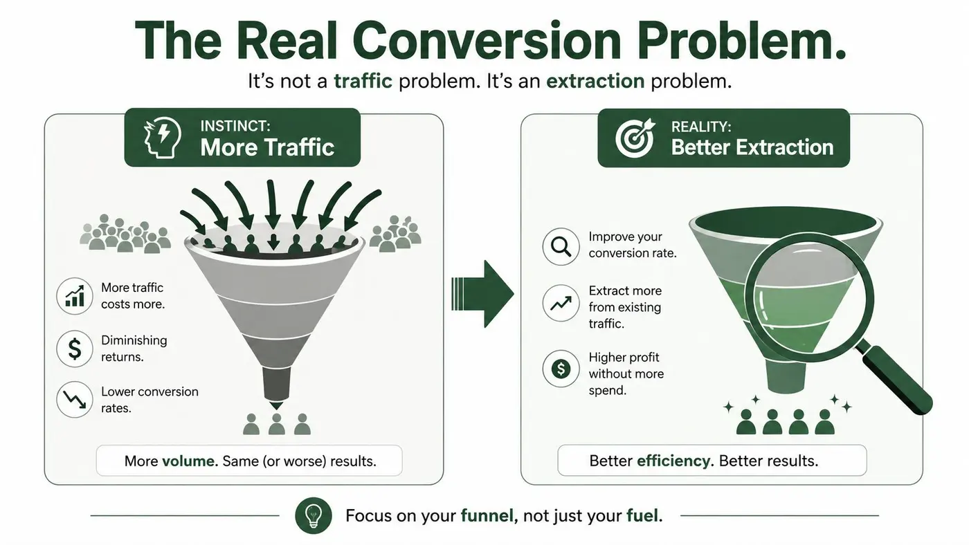
Diagnose before you optimise
UK benchmarks also vary sharply by source, period and category. One April 2026 benchmark placed the average e-commerce conversion rate at 3.4%, with a median site at 2.35%, while another live-data source reported an average of 1.93% in May 2026, up from 1.76% a year earlier. The same live-data source reported category rates including 5.01% for arts and crafts, 3.00% for kitchen and home appliances, 2.56% for pet care, 1.53% for fashion, and 1.20% for food and drink. See the UK 2026 e-commerce benchmark analysis for the source context.
That spread makes “What's a good conversion rate?” a weak starting question. Ask three sharper ones instead:
- Traffic quality: Are visitors arriving with the intent your landing page and offer assume?
- User experience: Are speed, navigation, product information or checkout creating avoidable hesitation?
- Category effect: Does the buying cycle, price point or purchase frequency naturally produce a different baseline?
A store shouldn't chase another category's average. It should identify the segment that underperforms relative to its own intent and commercial value, then test the reason.
Set a Primary Goal and a Real Baseline
Conversion rate is a decision input, not the final objective. Before changing a headline or button, define the commercial outcome the experiment should improve. A purchase, completed signup or qualified lead can serve as the primary goal, provided the event is defined consistently in analytics and the experimentation tool.
Choose the metric closest to business value. An online shop may use purchase conversion, while a lead-generation site may need qualified leads rather than completed forms. If qualification data is reliable, pair the conversion rate with revenue per visitor or downstream value. A higher conversion rate that attracts smaller orders or weaker leads can be a commercial loss.
Set the baseline before the test is designed. Use a clean historical window that represents normal trading conditions, including ordinary weekday and weekend behaviour. Check for promotions, stock problems, tracking changes and unusual campaigns that could distort the comparison. Exclude internal visits and obvious bot activity where the data allows, then record the dates, filters and exclusions.
Record the inputs behind the headline rate:
- Primary conversion: The precise event, such as a completed purchase.
- Visitors and conversions: The denominators behind the rate.
- Device split: Separate mobile and desktop baselines when behaviour differs materially.
- Channel split: Paid search, organic, email, affiliates and direct traffic often carry different intent.
- Commercial context: Revenue, average order value and revenue per visitor.
- Operational context: Promotions, pricing changes, fulfilment restrictions and stock availability.
A sitewide average can hide the decision that matters. UK digital-experience data covering 90 billion sessions and 6,000 sites reported desktop conversion around 3.7% versus 1.8% on mobile. The comparison appears in this UK CRO testing guide. A desktop improvement may therefore conceal a mobile regression, or the reverse.
Baseline rule: Use a flat, honest baseline built from comparable visitors, channels and trading conditions.
Inspect mobile and desktop separately when their journeys, layouts or intent differ. Separate tests are not always necessary, but segment results should be reviewed before declaring a winner. The north-star metric guidance can help settle which outcome should lead the programme when conversion rate and commercial value point in different directions.
Prioritise Hypotheses You Can Win With
A long experimentation backlog can create the appearance of progress while producing little commercial learning. Low-risk ideas are easy to approve, but several weak tests can consume weeks and leave the team with inconclusive results. The constraint is not test volume. It is choosing questions with a credible path to changing revenue per visitor.
A UK-focused dataset of 2,408 tests found 17.4% produced a statistically significant winner, 8.4% produced a significant loser, and 74.2% were inconclusive or showed no detectable difference. Those figures are reported in UK A/B-testing statistics. A clear winner is therefore roughly a one-in-six outcome, which makes prioritisation more valuable than filling the roadmap.
Score the opportunity, then challenge the score
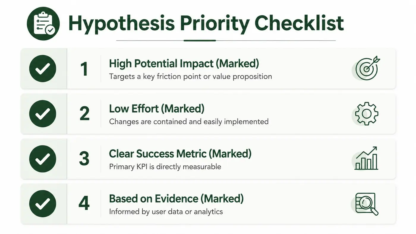
Use an ICE-style score to expose the assumptions behind each idea:
- Impact: How much of the journey could the change affect, and how close is that journey to a commercial decision?
- Confidence: What evidence supports the problem, such as analytics, customer recordings, search data, support tickets or user research?
- Ease: Can the team implement and measure the change without tracking or operational risk?
The score is not scientific precision. It creates a useful argument about what the team believes and why. A checkout change supported by repeated error reports should outrank a colour preference based on a stakeholder's taste.
Give priority to changes that can alter the decision itself: pricing presentation, delivery clarity, product reassurance, offer structure, checkout friction and the value proposition. For example, a product-detail hypothesis could test whether clearer fit information reduces uncertainty for mobile fashion shoppers before checkout. Resources such as virtual models for clothes can broaden the options beyond generic product photography.
Ease is a delivery constraint, not a proxy for value. A CTA colour test belongs high in the queue only when evidence points to a visibility problem. A confusing returns policy may deserve priority despite requiring more coordination, because it can affect completed purchases and revenue per visitor.
Keep the active queue narrow enough to analyse properly. Otter A/B's test prioritisation calculator can structure the scoring discussion, while the final decision should account for customer evidence, economics and implementation constraints.
Designing the Test So It Can Win
A test can produce a clear winner and still teach the team almost nothing. Start with one decision, one audience and one proposed mechanism: “If we change X for audience Y, we expect Z because of W.” If the variant changes several unrelated elements, any lift becomes difficult to interpret. The team may improve conversion rate without learning what deserves investment next, or whether the change improves revenue per visitor.
Use a two-arm A/B test when the question is narrow. One control and one variant keep the comparison readable, particularly when traffic is limited or the baseline conversion rate is modest. Multivariate testing has a different trade-off. It can examine combinations, but only when traffic and implementation capacity can support the additional comparisons.
Otter A/B can support this workflow when the team needs to enforce a single-variable hypothesis. Configure the control and variant around the same audience, define the traffic split before launch, and record the primary metric and guardrails in the test brief. Its value here is operational consistency, not a longer feature list. Visit Otter A/B for product details.
Choose the design that matches the question
| Test Design Choices and When to Use Them | Best For | Watch Out For |
|---|---|---|
| A/B test | Comparing one focused change with a control | Hidden differences between segments |
| Multivariate test | Exploring combinations when traffic and implementation capacity support it | Thin samples and hard-to-explain interactions |
| Sequential rollout | Reducing operational risk when a full release needs caution | Interpreting rollout effects as test evidence |
| Personalised experience test | Evaluating a clearly defined audience-specific message | Segment definitions that change during the test |
Test one high-impact element at a time where possible. That could be a headline, CTA, checkout step, page layout or offer explanation. Changing the headline, pricing display, imagery and navigation together is valid only when the question concerns the complete experience. Otherwise, the result may identify a conversion-rate change while hiding the reason, limiting the next decision and making revenue-per-visitor impact harder to assess.
For a practical page-level review, this actionable landing page guide can help teams identify clarity, hierarchy and friction issues before converting them into test hypotheses.
A short walkthrough can align implementation teams on mechanics before launch.
Reading the Results Without Fooling Yourself
A promising graph is not evidence by itself. Statistical significance is a decision rule applied to data collected under conditions agreed before launch.
A frequentist z-test estimates how compatible the observed conversion difference is with random variation. A 95% confidence threshold can serve as a practical default, but it does not guarantee that a variant will keep winning after release. It also says nothing about whether the change matters commercially.
Set the decision rules before launch
Document the planned sample size, primary metric, minimum detectable effect, test duration and decision rule. Keep the control stable, limit variants and choose one primary outcome. If the test reaches its planned sample without a clear difference, that is still useful evidence. It stops a weak idea from becoming a permanent change merely because the team wants a winner.
The dashboard can create false confidence in several ways:
- Stopping early: A strong day can make a variant appear superior before normal variation settles.
- Repeated peeking: Checking results continually and declaring a winner at the first favourable reading increases the chance of a false positive.
- Blended analysis: Changes in device or channel mix can move the overall rate even when no segment improved.
A notification should mark a pre-agreed milestone, not start a new interpretation. Once a threshold is crossed, review sample quality, segment performance, implementation integrity and commercial metrics before making the release decision.
Attribution requires separate scrutiny. Paid social platforms may assign conversions differently, so a channel report should not be treated as experiment evidence. The guide on attribution models for Meta and TikTok helps distinguish platform reporting from a controlled site test.
Statistical language also needs restraint. Otter A/B's p-value explanation offers a plain-language explanation of the underlying concept. Use the result to classify the test as a winner, loser or inconclusive, then record the reason, the segments affected and the commercial metric that supported the decision. “Interesting” is not a decision category.
When a Conversion Loser Is Still a Commercial Win
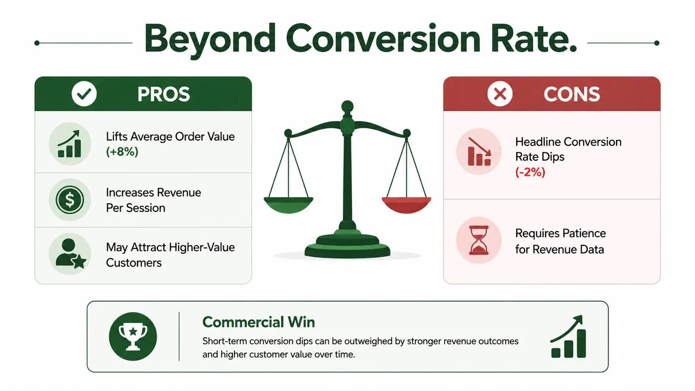
A lower conversion rate can represent a better business outcome. Orders are only one part of the equation. A variant may produce fewer transactions while attracting larger baskets, raising revenue per visitor. The opposite is also possible: an easier offer increases orders but lowers average order value enough to reduce revenue per visitor.
Use the supplied commercial scenario as a decision test. A headline variation drops conversion by 2% but lifts average order value by 8%. The rate movement labels it a loser, but that label is incomplete. Compare the actual control and variant values. If the AOV gain outweighs the purchase decline, revenue per visitor increases and the variant merits consideration. Headline percentages alone cannot establish that result.
Read the commercial outcome as a connected set of measures:
- Purchases: Did completed transactions increase or fall?
- Average order value: Did each transaction become more valuable?
- Revenue per visitor: Did the typical visitor generate more revenue?
- Revenue trend: Does the result hold across the observed period, rather than appearing on one favourable day?
Category economics change the meaning of the result. Recent benchmark content places food and grocery around 10.8% to 11.1%, electronics and home or furniture near 1.9% to 2.1%, and luxury below 1% in some comparisons. The UK conversion optimisation coverage focused on revenue economics presents these figures as context, not universal targets. Basket size, margin, repeat purchase behaviour and customer intent determine whether a conversion movement helps the business.
A conversion-rate winner is not automatically a revenue winner. Judge the variant against the economics of the business.
A checkout simplification that increases purchases but attracts smaller baskets may support customer acquisition or repeat purchase goals. It may weaken performance where fulfilment costs and margin depend on larger orders. Set the commercial decision before reviewing the result, then treat conversion rate as one input in the decision, not the scoreboard itself. The experiment succeeds only when its chosen outcome improves the economics you are responsible for.
Shipping Winners and Feeding the Learning Loop
A test programme compounds only when the team converts validated learning into shipped experience. Leaving a winning variant running indefinitely creates operational ambiguity, while replacing it without preserving the measurement setup can erase the evidence that justified the decision.
Create a release checklist:
- Confirm the result: Review the primary goal, segment performance, sample quality and revenue measures.
- Document the decision: Save the hypothesis, audience, control, variant, dates, result, limitations and rollout choice.
- Release carefully: Graduate the winning experience to the relevant audience, then verify analytics, merchandising, checkout and any connected campaigns.
- Monitor after launch: Watch for implementation drift, stock changes, seasonality and channel changes that could alter the effect.
- Refresh the backlog: Retire the tested hypothesis and add follow-up questions based on the segment or device that responded most clearly.
Documentation should be accessible to marketers, designers, product managers and engineers. Brandable, password-protected reports make stakeholder sharing easier, and Slack notifications can surface milestones when a test reaches the agreed significance threshold. Otter A/B also tracks purchases, average order value, revenue per variant and revenue trends over time, which keeps the handoff focused on commercial outcomes rather than a single rate.
The strongest learning loops produce new questions. A winning mobile message may lead to a desktop information-architecture test. A revenue-per-visitor improvement may prompt a margin or repeat-purchase analysis. A clear loser may reveal that the team diagnosed the friction incorrectly. None of those outcomes is wasted if the decision is recorded and the next hypothesis improves.
Conversion rate improvement lasts when every test changes the organisation's judgement, not just the page. Build the habit of measuring, deciding, shipping and learning again.
Otter A/B gives teams a lightweight way to test headlines, CTAs and layouts while tracking purchases, average order value and revenue per variant. Visit Otter A/B to start turning conversion rate improvement into a repeatable, revenue-focused experimentation process.
Stop guessing
Ready to start testing?
Set up your first A/B test in under five minutes. No credit card required.
- 14-day free trial
- No credit card required
- Cancel anytime