Case Study Presentation: How to Win Stakeholders
Learn how to build a case study presentation that persuades stakeholders and drives decisions in 2026.
The most popular advice about a case study presentation is also the least reliable: “Let the results speak for themselves.” They won't. A strong experiment can still be ignored if the audience can't see the business problem, trust the evidence, or understand what decision you want them to make.
In practice, the presentation is where an experiment earns its second chance. Running the test answers what happened. Presenting it well answers why it matters, what the organisation should do next, and whether the result deserves implementation. UK guidance treats case studies as structured academic and professional work, with an introduction, main body, and conclusion, rather than as loose storytelling. Sheffield Hallam University also recommends the TED model, Topic, Evidence, Discussion, so each paragraph connects a point to proof and interpretation (Sheffield Hallam University's case study structure guidance).
The same discipline applies to CRO. Your deck needs traceable reasoning, selective metrics, and a recommendation that survives sceptical questions.
Why Most Experiment Results Die in the Slide Deck
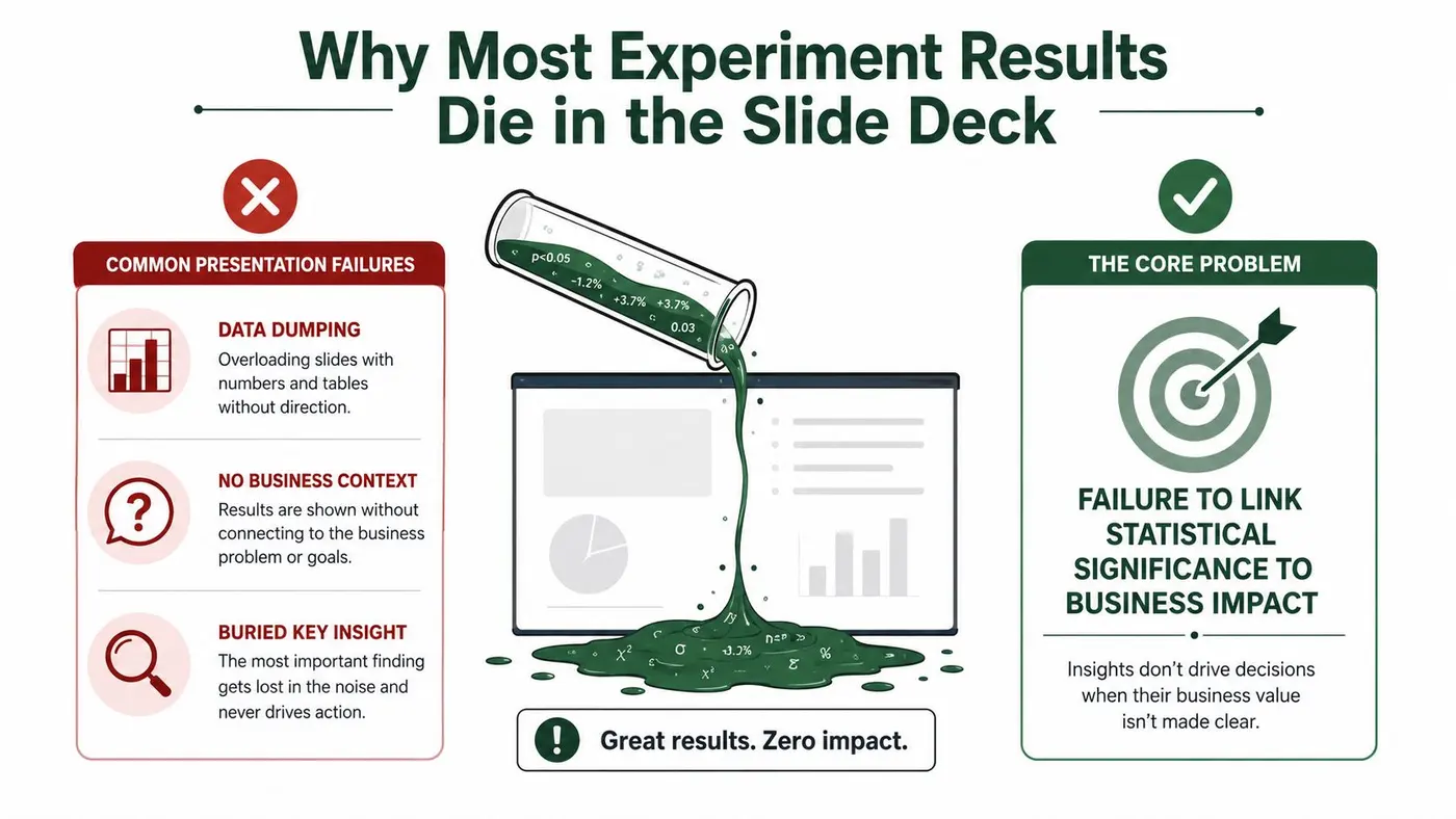
A winning test doesn't automatically create buy-in. Stakeholders don't approve implementation because a chart looks impressive. They approve it when the evidence answers their commercial, operational, technical, and strategic concerns with minimal ambiguity.
I've seen experiment readouts fail for three predictable reasons. The presenter starts with the methodology, the deck includes every available metric, or the result appears without the strategic context that gives it meaning. In each case, the audience has to do the work of connecting the experiment to a decision. Most won't.
The methodology trap
Methodology matters, but it rarely belongs on the opening slide. An executive audience usually needs the problem and commercial implication before it needs traffic allocation, event definitions, or implementation details. Put the experiment design in the deck, but keep it subordinate to the decision.
A useful opening sounds like this:
The decision: Checkout users were abandoning before payment, so we tested a simpler reassurance message and need approval to roll the winning treatment into the next release.
That sentence gives the room a reason to listen. It also prevents a common failure mode, presenting a technically rigorous experiment that nobody can map to a current priority.
The data dump
More data can reduce credibility. A slide packed with charts, decimal places, segments, and tool screenshots forces stakeholders to identify the primary result themselves. If they disagree about which number matters, the discussion starts in the wrong place.
UK statistical reporting guidance says data should be contextualised, analysed, interpreted, and challenged where necessary. It also recommends making the source, purpose, collection method, assumptions, and uncertainty explicit, while limiting tables to essential information (BBC guidance on reporting statistics and data). That isn't just a journalism standard. It's a practical rule for CRO readouts.
The missing strategic frame
A conversion lift can matter to a growth team while creating risk for brand, engineering, finance, or customer support. Your case study presentation should anticipate those trade-offs instead of treating objections as resistance.
The purpose isn't to report everything that happened. It's to make the recommended action clear, defensible, and proportionate to the evidence. A result that stays trapped in a slide deck hasn't created business value yet.
A Slide-by-Slide Structure That Actually Persuades
A persuasive deck follows the audience's decision path, not the order in which your team ran the experiment. For a short internal or client presentation, use a compact sequence that moves from problem to decision.
Slide one, the hook
State the business problem in one sentence. Use the language of the stakeholder who owns it, such as checkout abandonment, margin pressure, activation drop-off, or sales-qualified lead quality.
Avoid opening with the experiment name. “Homepage CTA test” describes an activity. “High-intent visitors weren't reaching the pricing page” describes a business problem.
Slide two, the hypothesis
Connect the proposed change to a strategic belief. Explain who experienced the problem, what you changed, and why you expected the change to help.
A useful format is:
- Audience: Who saw the experience?
- Change: What differed between control and variant?
- Reason: What user behaviour or business assumption supported the test?
This slide turns a button colour or layout change into a testable business bet.
Slide three, the method
Keep methodology to one slide unless the audience needs deeper validation. Show the control and variant visually, identify the primary goal, list material exclusions, and explain how the test was run.
Engineers may need implementation notes, tracking logic, and release constraints. VPs usually need enough information to judge reliability, not a technical walkthrough. Put detailed QA evidence in an appendix and make it available during questions.
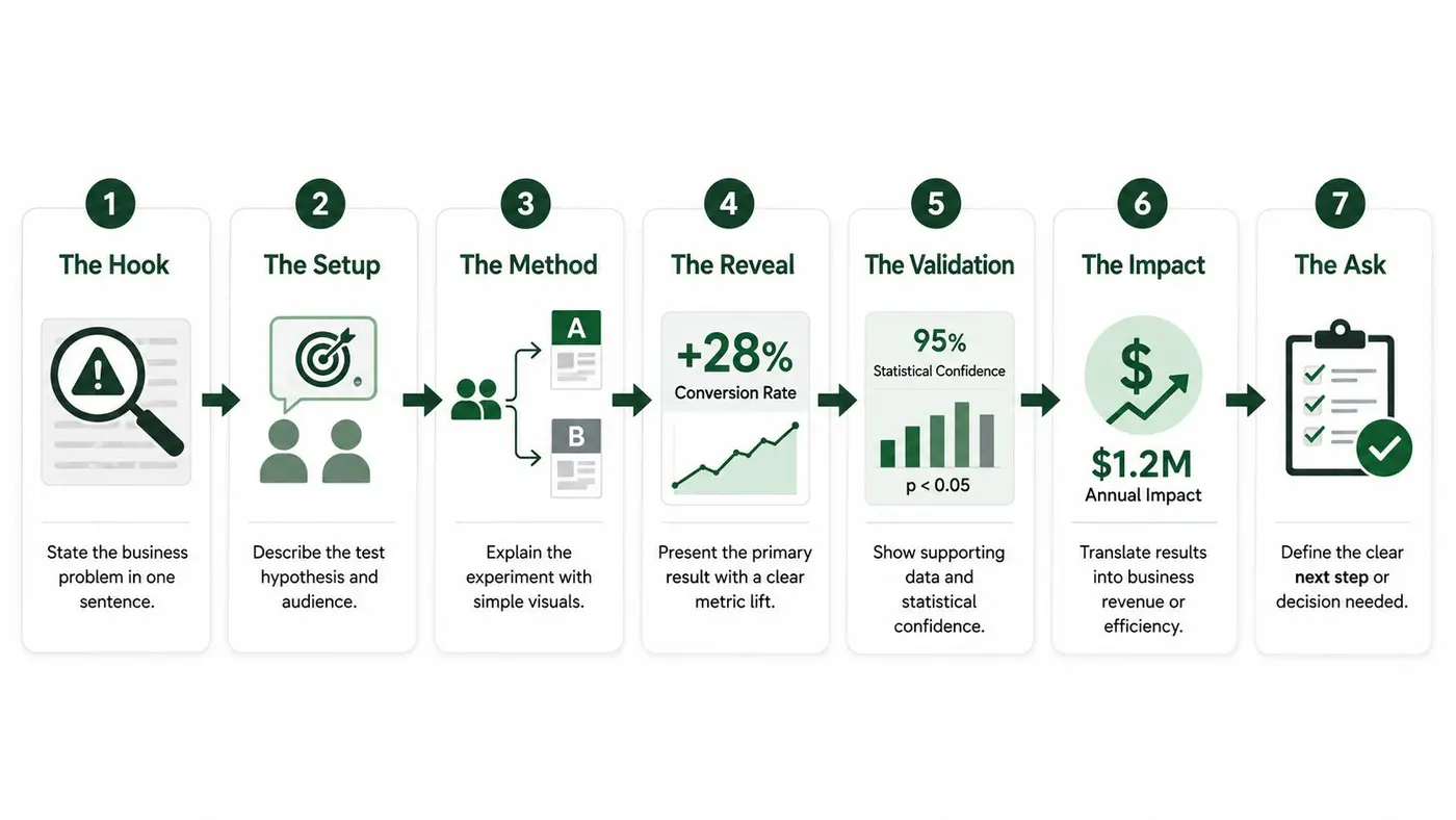
Slide four, the reveal
Lead with the primary outcome. Use a large, readable chart with a clear title that states the conclusion, such as “The revised product page increased completed purchases.”
Don't make the audience decode whether the result was positive. Show the direction, the relevant comparison, and the decision implication.
Slide five, the validation
Add supporting metrics, uncertainty, and guardrails. Explain whether the result was consistent across the tested experience, whether revenue moved in the same direction, and whether any important negative effect appeared elsewhere.
This is also where you answer the sceptical questions before they're asked. Was the measurement window appropriate? Were there tracking issues? Did a segment behave differently? Did the result depend on a narrow audience?
Slide six, the insight
Explain why the result may have occurred, separating evidence from interpretation. A qualitative observation such as “users may have needed clearer delivery information” is useful when you label it as a hypothesis rather than presenting it as proven causation.
Slide seven, the ask
End with one decision. Recommend implementation, another test, a research activity, or no action. Name the owner, the next milestone, and any dependency.
If you need help shaping a persuasive pitch beyond experiment reporting, Contesimal's guide on AI pitch tools for creators offers useful framing ideas. The principle is the same: tools support the argument, but they don't replace a clear decision.
Choosing and Presenting the Right Metrics
Metric selection is a credibility decision. If every available measure appears on the results slide, the audience may suspect that the presenter is searching for a favourable interpretation.
Use one headline metric, then add evidence that validates or constrains it. For most website experiments, conversion rate is the clearest behavioural headline. Revenue, average order value, or revenue per visitor can show whether the behavioural movement translated into commercial value. Guardrails help identify damage that a narrow success metric could hide.
Which metrics to show in your case study presentation
| Metric Type | When to Feature | Presentation Tip |
|---|---|---|
| Primary conversion metric | Always, when it directly reflects the hypothesis | Make it the headline and define the conversion event plainly |
| Revenue outcome | When the test can affect purchases or commercial value | Show whether the financial direction supports the conversion result |
| Average order value | When basket composition or pricing behaviour may change | Present it as a validator, not a substitute for the primary goal |
| Statistical confidence | When recommending action | Explain uncertainty in ordinary language and show the relevant interval where available |
| Guardrail metric | When the change could create an unwanted side effect | Keep it visible, but don't let secondary measures bury the primary decision |
| Segment result | When there is a credible behavioural or commercial reason to inspect it | Disclose limitations and avoid presenting exploratory segments as universal findings |
A percentage lift without context is easy to exaggerate. Pair relative movement with absolute performance, the timeframe, the audience definition, and the number of observations used in the analysis. Stakeholders should be able to distinguish a meaningful business change from a visually dramatic but fragile comparison.
Confidence intervals often communicate more than a p-value alone because they show the plausible range around an estimate. If the interval is wide, say so. If it overlaps a decision threshold, frame the recommendation cautiously. UK statistical guidance specifically stresses the importance of uncertainty and showing the margin of error when results fall within it (BBC statistical reporting guidance).
What weakens trust
Don't cherry-pick a convenient time window, hide novelty effects, or promote a segment result without explaining its limitations. Don't use a secondary metric to rescue a failed primary outcome unless you clearly label the change in decision criteria.
For practical detail on organising experiment readouts, use these A/B testing reporting best practices. Teams that need a broader perspective on evidence-led visual decisions can also consult Uxia's data driven design guide.
The strongest metric slide makes the conclusion easier to challenge, not harder. That transparency gives stakeholders somewhere solid to stand when they approve the next step.
Building a Narrative That Stakeholders Remember
A CFO doesn't experience your experiment as a sequence of events in an analytics platform. They experience a business problem, a proposed risk, a period of uncertainty, and a decision with financial consequences. Your narrative should follow that journey.
Consider a checkout redesign. The weak version begins with traffic allocation, moves through screenshots, and finishes with a conversion chart. The stronger version begins with the commercial tension: customers were reaching checkout but failing to complete their purchase, and the team needed to reduce friction without damaging order value or margin.
Act one, the tension
Define the starting problem and the desired outcome. Keep the stakes concrete without inventing precision. A CFO may care about profitable orders and operational cost. A brand team may care about whether a more direct message weakens the customer experience. A product leader may care about activation and retention.
Act two, the experiment
Present the test as a controlled attempt to resolve the tension. Explain the hypothesis, the experience users saw, and the risk the team was managing.
Early noise can become useful narrative material, provided you don't dramatise it. You can say that the result was initially uncertain, then explain what evidence justified the final interpretation. The story isn't “the chart eventually turned green”. It's “the team waited for evidence strong enough to support a decision”.
Act three, the implication
Reveal what the data supports and what it doesn't. A win should lead to implementation conditions. A loss should lead to what the team learned and whether the original assumption needs changing. An inconclusive result may justify better instrumentation, a refined hypothesis, or no further investment.
A memorable result isn't merely surprising. It changes what the audience believes they should do next.
A brand stakeholder who dislikes the winning design may accept it when the presentation acknowledges the creative trade-off, explains the measured outcome, and proposes safeguards for rollout. A finance stakeholder may care less about the visual treatment than whether the result affects profitable revenue. Adjust the emphasis, not the evidence.
For more practical guidance on communicating results to different decision-makers, see this resource on stakeholder communication.
The narrative should reduce cognitive load. Every slide needs a job, every chart needs a conclusion, and every conclusion needs a clear relationship to the decision.
Sharing Results Beyond the Meeting Room
The meeting is only one point in the decision cycle. People who approve implementation may not attend the presentation, while engineers, commercial owners, and future analysts may need the evidence long after the original discussion.
Start with a stakeholder-ready PDF. Put the decision, primary result, business implication, and recommendation on the first page. Keep the full methodology, chart definitions, and exploratory analysis behind that summary so readers can choose their depth.
Match the format to the audience
A written summary works well when the decision is straightforward and the evidence needs a searchable record. A short screen recording helps when the story depends on visual comparison or when stakeholders need to hear the interpretation. A one-page document is useful for leadership circulation, planning discussions, and teams that weren't present.
UK case studies have also served public-sector and knowledge-transfer purposes for years. The APSE archive includes dated local-government presentations covering leisure services, libraries, sports participation, and cultural programming, including examples that foreground before-and-after outcomes (APSE case study presentation archive). The lesson is practical: preserve context, dates, ownership, and outcomes so the work remains accountable outside the original room.
A distribution checklist
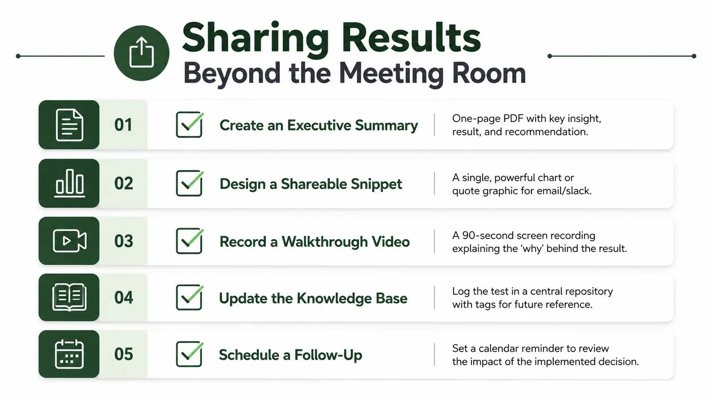
- Create an executive summary: State the insight, result, recommendation, and unresolved risk on one page.
- Share one useful visual: Choose a chart that can stand alone in an email or Slack message, with its conclusion in the title.
- Record the walkthrough: Explain the reason behind the result, not just what each slide contains.
- Update the knowledge base: Archive the hypothesis, design, metrics, result, decision, and tags in Confluence, Notion, or your chosen repository.
- Schedule the follow-up: Set a reminder to review implementation quality and downstream effects.
Use a dashboard creation workflow when the result needs ongoing monitoring rather than a single static report. Losses deserve the same treatment as wins. A well-documented failed test prevents repeated assumptions and gives future teams a clearer starting point.
Turning One Presentation Into an Experimentation Culture
A single persuasive case study presentation can change how a team evaluates ideas. It shows stakeholders that experimentation isn't a collection of isolated wins. It's a decision system with a visible backlog, consistent standards, and a record of what the organisation has learned.
The repeatable checklist is straightforward:
- Lead with the business problem.
- State the hypothesis as a strategic bet.
- Keep methodology proportionate to the audience.
- Choose one primary metric and explain its context.
- Show uncertainty and guardrails.
- Interpret the result without overstating causality.
- End with one named decision.
- Distribute the record where future teams can find it.
The quality bar should include accessibility. A 2025 UK study across four universities found that teachers and students often value confident delivery, eye contact, minimal prompts, and “natural” body language, which can disadvantage students whose content is strong but whose speaking style is less conventional (the 2025 UK study of oral presentation assessment). In commercial settings, the equivalent risk is rewarding presentation polish over analytical substance. Offer accessible materials, allow questions in writing, and make the evidence available independently of performance style.
Training access also affects quality. Buffalo 7's UK survey reported that 77% of employees were expected to present, while 23% had received training and 41% said they had received none (Buffalo 7's presentation skills survey). A shared template can reduce dependence on individual confidence, especially when teams need to prepare quickly.
Create a visible experiment backlog, hold regular result showcases, and maintain a searchable library of past case studies. A working journal, such as Walling's Journal for freelancers, can also provide useful inspiration for keeping decisions and learning organised over time.
The cultural shift appears in the questions stakeholders ask. Instead of approving opinions first and testing later, they begin asking whether the assumption has been tested, what the evidence says, and what the next decision should be. Treat every presentation as an investment in that behaviour. The next experiment gets easier to approve when the last one was clear, honest, and useful.
Otter A/B helps teams run website experiments, track conversion and revenue outcomes, and share brandable reports that stakeholders can understand quickly. Visit Otter A/B to start testing headlines, CTAs, layouts, and other customer experiences without a credit card.
Stop guessing
Ready to start testing?
Set up your first A/B test in under five minutes. No credit card required.
- 14-day free trial
- No credit card required
- Cancel anytime