Lazy Loading Implementation That Actually Works
A practical lazy loading implementation guide covering native, JavaScript, and library approaches, Core Web Vitals impact, and fixes for common issues.

Adding loading="lazy" to every image is not a performance strategy. It's a reliable way to delay the image users need first, damage Largest Contentful Paint, and create a debugging task that didn't exist before. Lazy loading works when you defer non-critical resources, not when you apply the attribute indiscriminately.
That distinction matters on UK websites, particularly WordPress sites and public-facing services where performance, accessibility, keyboard access, and screen-reader behaviour all need to work together. The MDN guide to lazy loading describes the technique as a way to mark non-critical resources so they load only when needed, shortening the critical rendering path and reducing page load time. Google Search Central similarly recommends browser-native lazy loading for images and iframes, provided content visible in the viewport loads immediately.
The practical question isn't whether lazy loading is useful. It is which assets should wait, which must load immediately, and how you'll prove the decision helped.
Why Lazy Loading Implementation Is Harder Than It Looks
Lazy loading is easy to add and easy to misuse. It delays requests for resources visitors probably have not reached, reducing initial transfer work, network contention, and memory used by media that never enters the viewport. It does not compress an image, improve server response time, remove render-blocking JavaScript, or reduce an oversized hero asset.
The common “add the attribute everywhere” approach can make performance worse. If the browser needs an image for the first viewport, delaying its request pushes the bottleneck later in the rendering sequence. Large-scale data in web.dev's LCP lazy-loading guidance shows the risk. The median page without lazy loading had a 75th percentile LCP of 2,922 ms, while the median page with lazy loading was slower at 3,546 ms. WordPress pages showed the same pattern, with 3,495 ms without lazy loading compared with 3,768 ms with it.
Those figures do not show that lazy loading is bad. They show that choosing the wrong assets is bad.
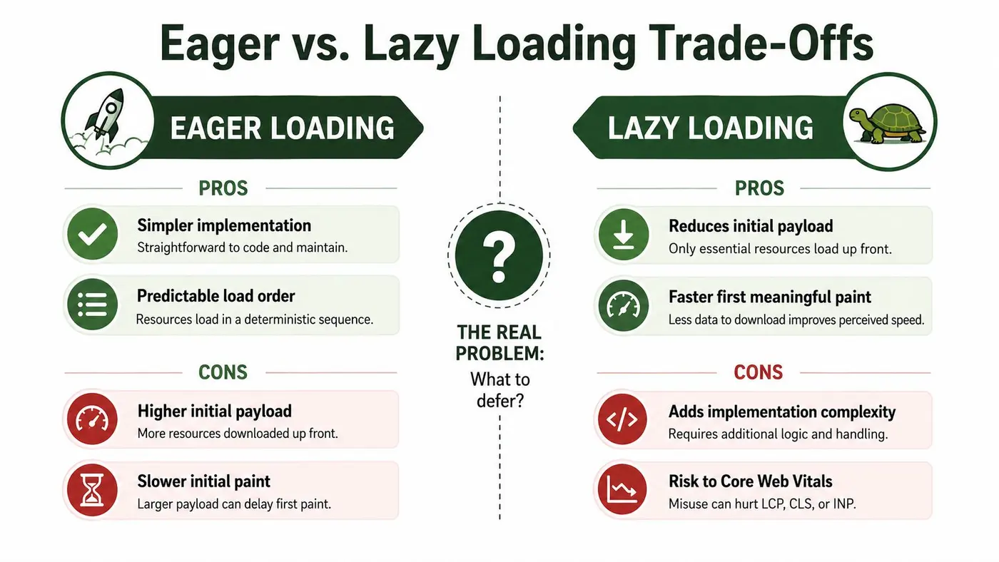
Decide what waits before writing code
Start with an asset audit. Classify every image, iframe, poster, and background asset using two practical questions:
- Is it visible immediately? Hero imagery, logos, navigation icons, and primary content usually need an eager request.
- Is it needed for the first interaction? An embedded map below the opening content can wait. A product image beside the purchase button probably cannot.
The Government Digital Service front-end performance guidance takes the same practical position for UK public-sector work. Keep main content in HTML, delay below-the-fold images and embeds, and avoid lazy loading content likely to be visible immediately.
Poor implementation can also create Cumulative Layout Shift. Without reserved space, the browser renders a short card, the image arrives, and the card expands beneath the user's pointer or keyboard focus. Lazy loading triggers the timing, but missing dimensions create the shift.
The Cumulative Layout Shift guide from Otter A/B explains how layout movement affects page experience and offers useful implementation context. Teams addressing broader performance issues can also use this practical resource to improve website speed in Australia, especially when media is only one part of the page's performance profile.
Native HTML is the sensible default
For ordinary below-the-fold images, begin with browser-native loading:
<img
  src="/images/article-card.jpg"
  alt="A laptop displaying a product dashboard"
  width="800"
  height="450"
  loading="lazy"
  decoding="async">
For responsive images, put the loading hint on the img element inside picture:
<picture>
  <source
    media="(min-width: 800px)"
    srcset="/images/hero-wide.webp">
  <source
    srcset="/images/hero-narrow.webp">
  <img
    src="/images/story-image.jpg"
    alt="A team reviewing a design on a large screen"
    width="800"
    height="450"
    loading="lazy"
    decoding="async">
</picture>
An iframe can use the same browser-native mechanism:
<iframe
  src="https://example.com/embed"
  title="Interactive service map"
  width="800"
  height="450"
  loading="lazy">
</iframe>
loading="lazy" asks the browser to defer the resource. loading="eager" asks it to load without that lazy hint, although normal browser prioritisation still applies. Fetch distance is not a fixed value to guess. Browsers consider viewport size, connection conditions, and screen density.
Skip lazy loading for the hero image, the likely LCP element, above-the-fold logo, primary product image, and any media required for the first viewport. decoding="async" can complement lazy loading for non-critical images by allowing decoding work without making the browser wait synchronously. It does not make a critical asset safe to defer.
If a custom loader sits on top of native markup, preserve a no-JavaScript path:
<img
  src="/images/placeholder.jpg"
  data-src="/images/article-card.jpg"
  alt="A laptop displaying a product dashboard"
  width="800"
  height="450"
  loading="lazy">

<noscript>
  <img
    src="/images/article-card.jpg"
    alt="A laptop displaying a product dashboard"
    width="800"
    height="450">
</noscript>
Keep the HTML meaningful. UK teams should also consider accessibility expectations shaped by the Equality Act 2010 and WCAG-aligned public-sector practice. An optimisation that hides essential content from a screen reader, traps keyboard focus, or makes content unavailable without JavaScript has failed, even if the network waterfall looks better.
JavaScript Lazy Loading with IntersectionObserver
Native loading is enough for standard img and iframe elements. JavaScript becomes useful for CSS background images, custom elements, video posters, and markup where the browser can't express the trigger you need.
A small IntersectionObserver implementation can keep that behaviour explicit:
const lazyItems = document.querySelectorAll('[data-lazy-src]');

if ('IntersectionObserver' in window) {
  const observer = new IntersectionObserver((entries, currentObserver) => {
    entries.forEach((entry) => {
      if (!entry.isIntersecting) return;

      const element = entry.target;
      const source = element.dataset.lazySrc;

      if (element.tagName === 'IMG') {
        element.src = source;
      } else {
        element.style.backgroundImage = `url("${source}")`;
      }

      element.removeAttribute('data-lazy-src');
      currentObserver.unobserve(element);
    });
  }, {
    rootMargin: '300px 0px',
    threshold: 0.01
  });

  lazyItems.forEach((item) => observer.observe(item));
} else {
  lazyItems.forEach((element) => {
    const source = element.dataset.lazySrc;

    if (element.tagName === 'IMG') {
      element.src = source;
    } else {
      element.style.backgroundImage = `url("${source}")`;
    }
  });
}
The positive rootMargin starts the request before the element reaches the viewport. It should be tuned against image size, connection quality, scroll speed, and the amount of work competing for the network. A margin that's too small produces visible waiting. One that's too large turns most of the page into eager loading.
A low threshold is appropriate when the goal is to begin fetching as soon as the element starts approaching visibility. The observer fires once for each observed element, so carousels, reusable modals, and virtualised lists need an explicit re-observation strategy when nodes are recycled.
Framework-rendered content needs the same care. Observe newly inserted nodes after a product grid updates, rather than assuming the initial query captured everything. In a single-page application, disconnect observers when a route or component is destroyed to avoid retaining detached elements. For testing patterns around custom behaviour, the custom CSS and JavaScript testing documentation is a useful reference point.
Don't make the fallback depend on a polyfill unless the project needs one. If an older browser lacks IntersectionObserver, loading the asset directly is safer than allowing a broken image, inaccessible content, or an interaction that never completes.
Choosing a Library Versus a Custom Script
The least complicated solution is usually the safest one. For a normal below-the-fold image, native HTML needs one attribute and preserves the browser's responsibility for scheduling. Adding a library solely to write loading="lazy" into the DOM adds code without adding capability.
Libraries such as lazysizes, yall.js, and Lozad.js become more reasonable when a project needs a coordinated system for background images, responsive sources, custom events, legacy browser behaviour, placeholders, or framework integration. They can reduce repeated implementation work, but they also introduce dependency updates, configuration decisions, and another layer to inspect when a request doesn't fire.
| Approach | Best fit | Main risk |
|---|---|---|
Native loading
|
Standard images and iframes below the fold | Limited control over custom triggers |
| IntersectionObserver script | Background images and bespoke components | Edge cases become your maintenance burden |
| Lazy-loading library | Many media patterns across legacy or complex templates | Extra bundle and configuration overhead |
A custom observer is appropriate when the trigger must be tuned precisely or an existing design-system utility already exposes the required API. It's not automatically more performant than native loading. The browser still needs to fetch, decode, paint, and lay out the asset, regardless of whether an attribute or script initiated the request.
Test the decision on actual page types, not a blank demo. Product grids expose image density problems. Editorial pages reveal poor placeholders. Advertising slots and third-party embeds expose timing and failure behaviour. Check the Network panel, layout stability, console output, and experience while scrolling on a throttled mobile profile.
Practical rule: Choose the least complex implementation that satisfies the trigger, accessibility, responsive-image, and browser-support requirements.
If a library wraps native attributes while adding no meaningful behaviour, remove it. If a custom script has grown into a second framework, reassess whether native loading or a maintained library would be easier to operate.
Protecting Core Web Vitals During Implementation
The LCP candidate is a protected asset. Don't put loading="lazy" on it because an audit tool suggested deferring offscreen media. Identify the element using Chrome performance tooling or Lighthouse, then decide how to request it early.
For a critical image, the usual pattern combines:
- Eager loading, so the browser doesn't treat it as a deferred resource.
- Appropriate fetch priority, where the browser and framework support it.
-
Responsive
srcsetandsizes, so the browser selects a suitable resource. - Intrinsic dimensions, so layout is stable before decoding finishes.
The Core Web Vitals explained guide is useful background for teams that need to connect LCP, CLS, and interaction responsiveness to real page decisions. For project-specific validation, keep a record of which element was LCP on each important template. A redesign can change that candidate without changing the lazy-loading code.
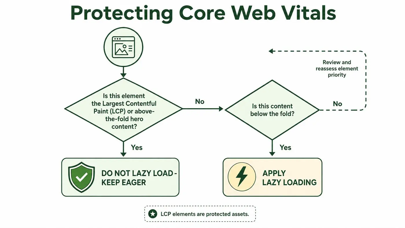
Reserve space for deferred media
Below-the-fold media still needs a stable box. Add width and height attributes where possible, or use a container with a known aspect-ratio:
.card-media {
  aspect-ratio: 16 / 9;
  overflow: hidden;
}

.card-media img {
  display: block;
  width: 100%;
  height: 100%;
  object-fit: cover;
}
A blank placeholder that has no final dimensions isn't a layout strategy. It leaves the browser guessing, then forces surrounding content to move when the image arrives.
For custom observers, start fetching early enough that scrolling doesn't expose an empty card. Use a modest positive rootMargin, then verify the result on real devices and slower connections. Don't increase it until the whole page is effectively eager.
Measure LCP, CLS, Interaction to Next Paint, request timing, and error rates under mobile throttling. Synthetic results help isolate a regression, but field data tells you whether visitors experience it across different devices, routes, and network conditions. The performance monitoring guidance from Otter A/B can help teams formalise that measurement process. In experimentation workflows, Otter A/B is one option for testing headlines, CTAs, and layouts while its asynchronous SDK and anti-flicker behaviour are considered alongside the page's loading policy.
A Practical Rollout Checklist
Start with evidence, not a plugin. Inventory images, iframes, posters, background images, and framework-generated media for each relevant template. Record their position and purpose, then identify the current LCP element in browser tooling. Capture baseline mobile Core Web Vitals, transfer size, request activity, and layout-shift sources before changing markup.
Lazy loading can harm LCP when it catches the content that establishes the first view, as the web.dev data shows. Apply it to below-the-fold assets and keep likely LCP candidates available for the initial render. The technique is not the problem. Misclassifying assets is.
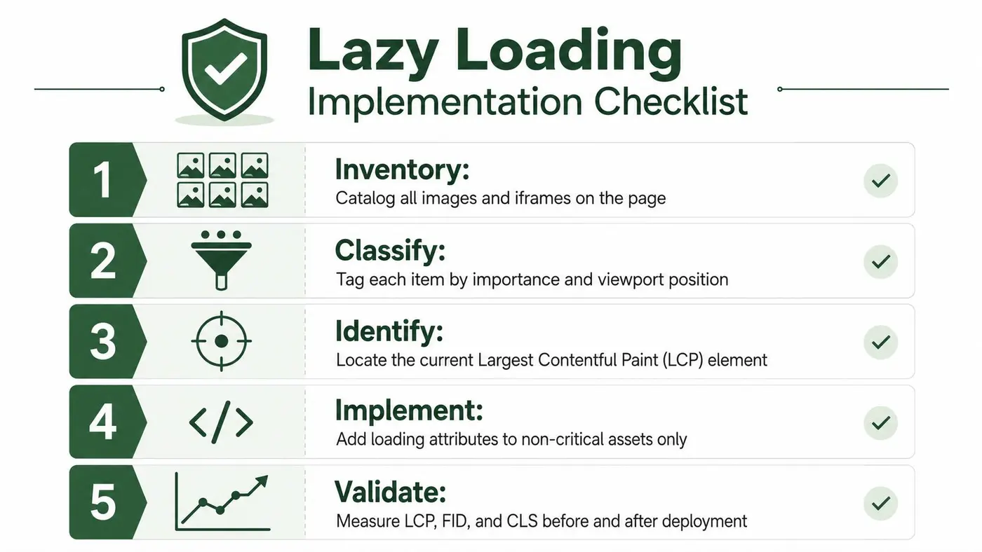
Use a controlled sequence
- Inventory: Catalogue media across the target templates.
- Classify: Separate above-the-fold content, likely LCP candidates, and deferred resources.
- Identify: Confirm the LCP element instead of trusting the design mock-up.
-
Implement: Keep critical media eager, use native loading for ordinary deferred media, and reserve
IntersectionObserverfor custom behaviour. - Validate: Compare LCP, CLS, interaction responsiveness, request waterfalls, and error logs before widening the rollout.
Add dimensions and meaningful alternative text during implementation. Test keyboard navigation, focus behaviour, print views, crawler-visible HTML, slow connections, dynamic routes, and back/forward restoration. These checks expose failures that a fast desktop preview can hide.
Use a feature flag or template-level rollout to limit exposure. After deployment, inspect image decode failures, console errors, request timing, and scroll interactions. The ARPHost hosting speed guide provides broader performance context, but lazy loading remains one controlled part of page-speed work, alongside server response and rendering improvements.
Roll back promptly if LCP, CLS, accessibility, or business outcomes deteriorate. Document the policy by template so later content changes do not reintroduce eager loading or an incompatible placeholder.
Troubleshooting Common Lazy Loading Problems
Most failures fit a small set of patterns. Diagnose the browser behaviour first, then inspect the markup and component lifecycle.
The image arrives and the page jumps
Zero-height image boxes are the common cause. Add intrinsic dimensions:
<img
  src="/images/card.webp"
  alt="A product detail screen"
  width="640"
  height="360"
  loading="lazy">
If the image is fluid, place it inside a stable container:
.media {
  aspect-ratio: 16 / 9;
}

.media img {
  width: 100%;
  height: 100%;
  object-fit: cover;
}
Don't replace the image with an invisible placeholder that changes dimensions when the request completes. The browser needs the final geometry before it needs the pixels.
Scroll restoration misses content
Single-page applications can restore the scroll position before a custom observer has attached or before dynamically rendered elements exist. The user returns to a route, the browser places them halfway down the page, and the expected media never enters the observer's tracked set.
Restore route state before calculating lazy targets. Attach the observer after the framework has rendered the restored view, and explicitly process elements already within or near the viewport. Back and forward navigation deserves a separate test because it follows a different lifecycle from a fresh page load.
Assistive technology sees an incomplete interface
Lazy loading mustn't hide meaningful content from the accessibility tree. Keep headings, text, labels, and essential information in HTML. Don't turn a media placeholder into a role="button" unless it behaves like a real button with keyboard activation, focus styling, and an accessible name.
If a user opens a modal or activates a carousel item while its content is still loading, retain focus and return it to the triggering control when the component closes. A deferred request shouldn't erase the interaction context.
Debug the request, not just the audit score
Use Chrome DevTools Network throttling to watch when a request begins relative to scrolling. Lighthouse's “Defer offscreen images” audit can identify candidates, but it can't decide whether a visible image is strategically important or whether a component's fallback is accessible.
For custom loaders, add a small performance observer to flag resources that arrive too late after a scroll event:
const lazyStart = new Map();

document.addEventListener('scroll', () => {
  document.querySelectorAll('[data-lazy-src]').forEach((element) => {
    if (!lazyStart.has(element)) {
      lazyStart.set(element, performance.now());
    }
  });
}, { passive: true });

const resourceObserver = new PerformanceObserver((list) => {
  for (const entry of list.getEntries()) {
    if (!entry.name.match(/\.(avif|webp|jpe?g|png)(\?|$)/i)) continue;

    const start = [...lazyStart.values()][0];
    if (start && performance.now() - start > 1500) {
      console.warn('Lazy image may be loading late', entry.name);
    }
  }
});

resourceObserver.observe({ type: 'resource', buffered: true });
Treat this as a diagnostic aid, not a universal success metric. Check the actual element, viewport position, request priority, and whether a framework replaced the node before the observer handled it.
Building Habits That Keep Lazy Loading Effective
Lazy loading fails most often through small regressions, not a broken API. A new hero component may inherit a card helper, an editor may mark a banner as lazy, or a redesign may remove image dimensions. The code still works, but its assumptions no longer match the page.
Treat loading policy as part of the design system and review process:
- Protect the LCP candidate: Keep the first meaningful visual result eager unless testing shows otherwise. Deferring the wrong asset can delay LCP and make the page feel slower.
- Declare intrinsic dimensions: Give every deferred image width and height, or place it in a stable aspect-ratio container. This prevents space from collapsing when the request completes.
- Audit after template changes: Recheck loading attributes whenever a hero, card grid, embed, or responsive image component changes.
Browser-native lazy loading follows consistent patterns across img, iframe, and video elements. Document which resources are critical, which can wait, and which component owns that decision. For UK public-sector templates, keep main content in HTML and defer extra media rather than visible content.
Put policy where people make decisions
Storybook documentation should identify eager and lazy variants for each component. A banner occupying the first viewport should not inherit a generic card's loading behaviour. Separate critical media from deferred media in the component API, rather than exposing one unrestricted boolean that makes the unsafe choice easy.
Review the implementation with Lighthouse and real-user monitoring after template changes. Check for lazy attributes on hero imagery, layout movement, missing alternative text, and requests that start too late after route restoration. Turn each finding into an owner and a follow-up action.
A lightweight routine keeps the policy current:
- Audit the template before deployment.
- Canary the change on a low-traffic page.
- Compare real-user metrics after the observation period.
- Record the loading policy and rollback path in the runbook.
The goal is a default that preserves LCP, accessibility, and layout stability without relying on individual memory during every redesign.
Otter A/B helps teams test headlines, CTAs, and layouts while keeping loading behaviour and page experience under observation, so a conversion change does not hide a performance regression. Visit Otter A/B to connect controlled experiments with front-end decisions that affect real visitors.
Stop guessing
Ready to start testing?
Set up your first A/B test in under five minutes. No credit card required.
- 14-day free trial
- No credit card required
- Cancel anytime