Performance Monitoring: A Guide to A/B Testing in 2026
Master performance monitoring for A/B testing. Compare RUM, APM, and synthetic methods, track Core Web Vitals, and detect regressions.
A variant can look brilliant in the experiment dashboard and still poison the user journey. That's the part CRO teams feel at 2am, when the test looks statistically clean but mobile sessions start stuttering, the page feels sticky, and conversion on slower devices goes sideways.
That failure mode is exactly why performance monitoring can't sit outside experimentation. If you're changing layouts, loading extra scripts, or swapping content at the edge, you're not just testing persuasion, you're testing page health too. The hard part is keeping enough visibility to trust the result without bolting on so much instrumentation that the monitoring becomes part of the problem.
When a Winning Variant Secretly Hurts Performance
A team celebrates the lift. The treatment wins on conversion, stakeholders are already asking how fast it can roll out, and the dashboard looks tidy enough to sign off. Then someone checks the performance traces and notices the new variant dragged in extra render-blocking JavaScript, slowed the first meaningful paint on mobile, and turned a “winner” into a conversion drag for the people who matter most.
That's the trap with experiment-only thinking. A/B testing tells you which variant won on the metric you chose, but it doesn't automatically tell you whether the winner made the page harder to use. In UK digital operations, that gap matters because service quality is treated as a formal governance concern, not an informal IT task, and measurable performance sits inside the government's own service standard framework (UK Government Digital Service service standard guidance).

Why the “winning” variant can still lose
A variant can improve the funnel on desktop and still frustrate users on slower connections, especially when its client-side code adds layout shifts or delays interactivity. That's where performance monitoring becomes the safety net, because it shows whether the test improved the business outcome or just moved the bottleneck somewhere less visible. Microsoft's Well-Architected guidance is blunt on the mechanics, percentiles beat averages for latency because averages can stay flat while tail latency gets worse under contention (Microsoft Well-Architected monitoring guidance).
Practical rule: if a variant needs more JavaScript, treat the added execution time as part of the experiment cost, not a separate engineering concern.
The operational lesson is simple. Monitor the conversion metric and the speed metric together, then ask whether the lift survives on the devices and networks that pay your bills. If it doesn't, you didn't find a winner, you found a regression with better copy.
Comparing RUM, APM, and Synthetic Monitoring Approaches
Experimentation teams usually end up with three monitoring lenses, and each one answers a different question. Real User Monitoring tells you what happened to actual visitors. Application Performance Monitoring helps you understand why the stack slowed down or errored. Synthetic monitoring gives you a controlled baseline before traffic ever sees the change.
The mistake is trying to make one method do everything. RUM is closest to reality, but it's noisy because users arrive on different devices, networks, and geographies. APM is the best friend of anyone debugging the backend, yet it can miss front-end experience details unless it's paired with browser telemetry. Synthetic checks are clean and repeatable, but they don't represent every real-world device path, which is why they're strongest as a pre-launch guardrail rather than the whole answer. For setup details around baselining, this uptime monitoring guide is a useful operational companion.
| Monitoring Methods for Experimentation Teams | Best For | Data Source | Latency to Insight | Experiment Use Case |
|---|---|---|---|---|
| RUM | Real visitor experience, including device and network variation | Browser events from actual users | Fast once traffic arrives | Live experiment tracking and post-experiment validation |
| APM | Backend bottlenecks, request paths, host saturation, error tracing | Server, service, and infrastructure telemetry | Fast for diagnostic teams | Finding the root cause when a variant slows delivery |
| Synthetic monitoring | Controlled regression detection before launch | Scripted browser runs from fixed locations | Immediate for scheduled checks | Pre-launch validation and smoke testing after deploys |
Which layer to use first
If your variants are mostly copy or content changes, RUM plus a lightweight synthetic check may be enough. If the treatment touches APIs, render logic, or routing, you need APM in the mix as well. The goal isn't to collect more graphs, it's to see whether a variant changed the user journey, the server path, or both.
The other reason to combine methods is operational noise. UK organisations reported a median of 2,700 cyberattacks per week in 2024 (Splunk), which means your alert stream can get messy fast. A single monitoring lens won't always separate a genuine performance regression from background volatility, but paired baselines make that much easier to spot.
Real user data tells you what customers felt. Synthetic data tells you whether the rollout was broken before they felt it.
Critical Metrics Every Experimentation Team Must Track
The wrong metrics create false comfort. A variant can look healthy on a coarse dashboard while a subset of users hits a slow or unstable experience, and that's exactly where experiment conclusions go bad. The safest setup is to track a small set of metrics that map directly to perceived speed, responsiveness, stability, and delivery health.
The metrics that actually expose variant damage
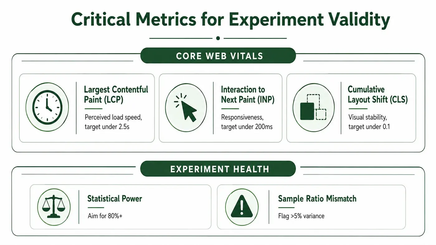
Largest Contentful Paint, Interaction to Next Paint, and Cumulative Layout Shift are the front-end trio worth caring about because they map to perceived load, responsiveness, and visual stability. For a practical benchmark, the infographic guidance here is straightforward, keep LCP under 2.5s, INP under 200ms, and CLS under 0.1. That lines up with the need to protect Core Web Vitals without drowning the team in vanity measures.
Server-side metrics matter just as much. Time to First Byte helps show whether the origin, cache, or edge path is delaying the start of the experience. Error rate and throughput tell you whether a variant is amplifying failures or handling less traffic well.
Why percentiles beat averages in experiments
Averages flatten the story. A treatment can post a respectable mean latency while the slowest users suffer badly enough to abandon the page, which is why Microsoft's guidance recommends p50, p95, and p99 instead of averages for latency monitoring (Microsoft Well-Architected monitoring guidance). Pair those percentiles with CPU queue length, memory paging rate, and disk utilisation, because tail latency usually shows up when the system is under contention.
The experiment-specific metrics matter too. The infographic flags statistical power at 80%+ and sample ratio mismatch above 5% variance as health checks, and those are the right kinds of guardrails to keep a test from drifting into nonsense. A clean conversion lift means less if your assignment split is broken or the traffic mix is skewed.
For KPI design and reporting structure, Otter A/B's KPI measurement guide is relevant because the same discipline applies to experiments. Pick metrics that connect to outcomes, not dashboards that merely look busy.
Important: if a variant wins on speed for most users but blows out the p95, treat it as a business risk, not a technical footnote.
Instrumenting Your Experimentation Workflow for Performance Visibility
Instrumentation should feel boring. If the setup is clever, fragile, or heavy, it'll eventually bite you in the page lifecycle and ruin the very measurements you were trying to protect. The cleanest pattern is to keep the experiment SDK thin, attach variant identity to performance events, and push only the telemetry you will use.
Start with the SDK, not the dashboard
Choose an SDK that loads asynchronously and doesn't block rendering. Otter A/B is one example of a lightweight option, with a 9KB SDK that loads in under 50ms and is designed for zero flicker. That matters because experiment delivery shouldn't become a performance tax, especially on pages where Core Web Vitals already sit close to the line.
Once the client is in place, tag every performance event with the variant ID and the experiment name. That lets you compare LCP, INP, and CLS between control and treatment groups without guessing which request or render path belongs to which test. If your stack uses Google Tag Manager, Shopify, Next.js, or a custom front end, the same rule applies, keep the experiment assignment available early enough for the performance observer, but light enough that it doesn't delay first paint.
Wire the metrics where the page already emits them
Hook into the browser's performance lifecycle rather than inventing a second one. The Performance Observer API is the right place to capture Core Web Vitals and attach them to the variant assignment before sending data to your analytics layer. That keeps your monitoring aligned with the user journey instead of retrofitting a separate stream after the fact.
A practical sequence looks like this:
- Load the experiment client asynchronously.
- Resolve variant assignment quickly.
- Attach the variant ID to performance entries.
- Ship the enriched metric to your central store.
If the monitoring script is heavier than the experiment logic, you've already lost control of the page.
The last piece is governance. Make sure the same telemetry stream can feed both the experiment report and the observability stack, otherwise teams end up arguing from different dashboards. That split is where unnecessary blame-shifting starts, and it's usually avoidable with a single event schema.
Detecting Experiment-Induced Regressions Before They Cost Revenue
A conversion win that slows the page can still hurt revenue per session. That's the dangerous version of success, because the variant looks healthy in the experiment report while the customer journey gets more fragile underneath it. The clean way to catch this is to segment performance data by variant and line it up against funnel outcomes in the same time window.
Read the experiment and the performance chart together
The first job is correlation, not diagnosis. If the treatment variant's p95 LCP and error rate drift upward at the same time conversion starts slipping on mobile, that's a signal worth pausing on. If the conversion lift survives while performance remains stable, you've got a much stronger case for rollout.
The next job is separating experiment-caused problems from environmental ones. Third-party scripts, CDN changes, and upstream service issues can all create the same symptoms, so you need a baseline from control traffic and from non-experiment windows. Without that, every slowdown looks like a product decision when it might just be a dependency issue.
Build a gate, not just a dashboard
Dashboards are observational. Gates are operational. When a variant crosses your danger line, pause the experiment or route traffic away from the treatment before the slower experience spreads.
A good gate uses a combination of conditions, not a single metric. For example, you'd watch the performance percentiles, the error stream, and the assignment integrity together, because one clean number can hide a much uglier composite problem. The UK public-sector approach to monitoring is useful here, because it treats measurement as a continuing feedback loop into decision-making rather than a reporting exercise (NCBI guidance on performance monitoring).
If you need more structure for the reporting layer around those decisions, this dashboard creation guide is a good companion when you're building the actual view.
Alerting Thresholds and Dashboard Patterns That Actually Work
Alerts only help when they're specific enough to act on and dull enough to trust. A flood of generic warnings teaches nobody anything, and a dashboard without clear thresholds turns into a wallpaper mural of numbers. For experimentation, the most useful setup is one that combines variant comparison, time-series overlays, and a short list of escalations the team recognises immediately.
Thresholds that are worth wiring in
A sensible starting point is to alert on p95 LCP above 2.5 seconds, p95 CLS above 0.1, and a material error-rate spike for any variant. Those thresholds aren't magic, but they're useful because they map to visible user pain and are easy to explain to stakeholders. You can refine them later, but you need a disciplined starting line first.
The dashboard itself should answer three questions fast. Is the experiment running. Is the treatment behaving differently from control. Is the difference big enough to interrupt rollout. If the answer to any of those takes more than a glance, the view is too busy.
How to troubleshoot without thrashing
When CLS spikes suddenly, start with layout shifts introduced by injected content, lazy-loaded elements, or late-running banners. When TTFB degrades, check the origin path, cache behaviour, and any recent server-side changes before blaming the variant. When throughput drops, look for request saturation, queueing, or a dependency that's throttling the treatment path.
Decision rule: if a regression appears only in one variant, treat the experiment layer as the first suspect. If it appears everywhere, look outside the test.
For live notification design, Slack is a good place to surface milestones and pauses so the right people see them immediately. That works especially well when paired with a dashboard that tracks test state, performance state, and whether the experiment has crossed a stop condition. If the alert can't tell an engineer what to do next, it isn't an alert yet.
Recommended Practices for Lightweight and Effective Monitoring
Start light, then instrument deeper only where the data gap justifies it. That keeps the monitoring stack from becoming a performance problem of its own, which is a common failure in experimentation programmes that keep adding scripts every time someone wants one more view. Lightweight client code, clean variant tagging, and a single metrics pipeline usually beat a pile of disconnected tools.
The other practical move is to make the data usable beyond engineering. Brandable reports help agencies and client teams review test outcomes without handing them a raw dashboard dump, and Slack notifications keep milestone visibility close to where work already happens. If you're on Shopify and need a store-specific implementation lens, Grumspot's Shopify performance optimisation tips are a useful reference alongside your monitoring plan.
A few habits hold up well in real teams:
- Keep the SDK lean: load the experiment layer without blocking render, and avoid adding monitoring scripts that compete with the page itself.
- Use performance as a primary experiment metric: don't treat Core Web Vitals as optional diagnostics after the conversion chart looks good.
- Share results in plain language: product, design, and client stakeholders need to understand whether a variant helped or hurt the experience.
- Automate the pause decision: if a variant crosses a known danger threshold, don't wait for a manual debate.
The best programmes treat performance monitoring and experimentation as one system. Conversion tells you what changed, speed tells you whether the change is sustainable, and the combination tells you whether rollout is safe.
If you want a lightweight way to run experiments without turning measurement into overhead, Otter A/B gives you variant testing, revenue tracking, and reporting in a small SDK designed to stay out of the way. It fits this use case when you need clear experiment readouts without adding avoidable drag to Core Web Vitals. Visit it, set up a test, and compare the business result with the performance result before you ship the next winner.
Stop guessing
Ready to start testing?
Set up your first A/B test in under five minutes. No credit card required.
- 14-day free trial
- No credit card required
- Cancel anytime