Dashboard Creation: A Guide to Building Experimentation Hubs
A step-by-step guide to dashboard creation for conversion and experimentation. Learn to plan, design, build, and govern dashboards that drive decisions.
You can feel the problem before you can name it. The data is there, Google Tag Manager, Shopify, the A/B testing tool, maybe a CRM export too, but the team still opens the same spreadsheet twice a week and asks the same question, what should we do with this?
That gap is usually not a data problem, it's a dashboard creation problem. Most dashboards are built as if they're a presentation layer, then abandoned like a finished slide deck. The stronger model is a lifecycle, which is exactly how UK public-sector guidance frames dashboard work, from discovery through alpha, beta, live, and retirement rather than a one-off build UK dashboard lifecycle guidance.
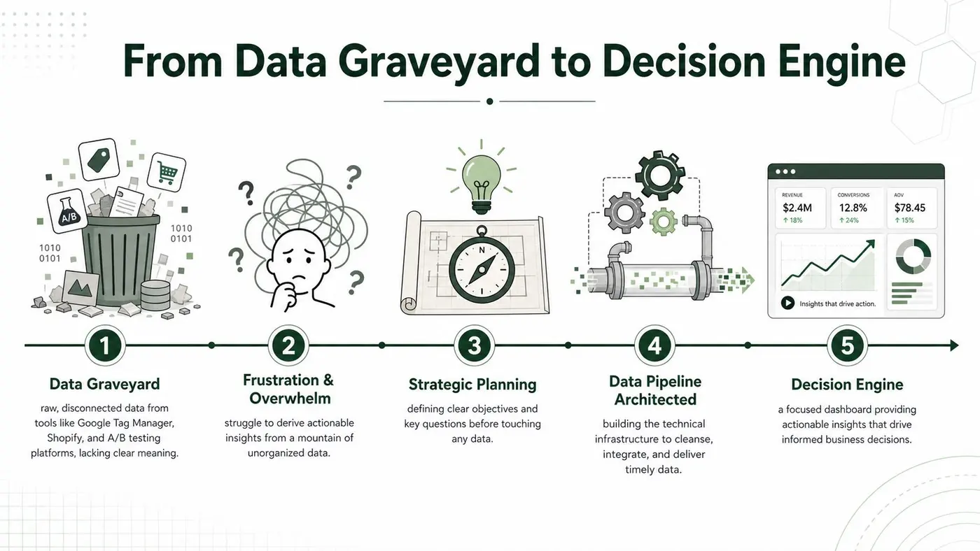
A useful mental model is simple. Raw data becomes a governed pipeline, the pipeline feeds a focused page, and the page earns its place only if people use it to make decisions. If you want a practical parallel outside experimentation, the same lifecycle thinking shows up in digitized financial reporting workflows at Wisely, where the value comes from repeatable, trusted reporting rather than one-off views digitized financial reporting workflows. A good reference point for decision-led thinking is also data-driven decision making.
Practical rule: if the dashboard can't survive a handover, it isn't finished.
Introduction From Data Graveyard to Decision Engine
The common failure mode is easy to spot. A dashboard starts with intent, then gradually becomes a data graveyard, full of charts that look busy but don't answer a decision anyone needs to make today. That's why the UK Office for Statistics Regulation says dashboard development should start with user needs at the centre and should have maintenance plans agreed before creation, so the time, money, and ownership are in place for the dashboard's whole life OSR dashboard guidance.
What changes when you treat the dashboard as a product
The big shift is governance. The OSR also expects dashboards to be released openly and transparently, with clear sign-off, a plan for archiving from the start, and prominent caveats when data quality needs context OSR dashboard guidance. That sounds formal, but the practical payoff is straightforward, your dashboard stops being a visual artefact and becomes a controlled statistical release.
That matters in CRO and experimentation because dashboards often die from ownership ambiguity, not bad charts. Someone builds it, some metrics get added, no one owns the refresh process, and three months later the team is debating whether the numbers are even current. The UK guidance on building and managing dashboards makes the same point in different language, dashboards need repeatable publication, user-centred iteration, and sustainable refresh cycles, not just a polished first version UK dashboard lifecycle guidance.
The image above gives a simple narrative for that shift, from disconnected inputs to a decision engine. If the dashboard is going to live inside an experimentation programme, the end state is not “pretty reporting”, it's a page that people trust enough to use every day. That's the bar.
Planning Your Dashboard Before You Build
The most expensive dashboard mistake is starting with charts. Teams open with a wish list, conversion rate, revenue, sessions, segments, device splits, heatmaps, then wonder why nobody can find the signal. A better starting point is audience, because an executive summary and a CRO workbench are different products even when they pull from the same tables.
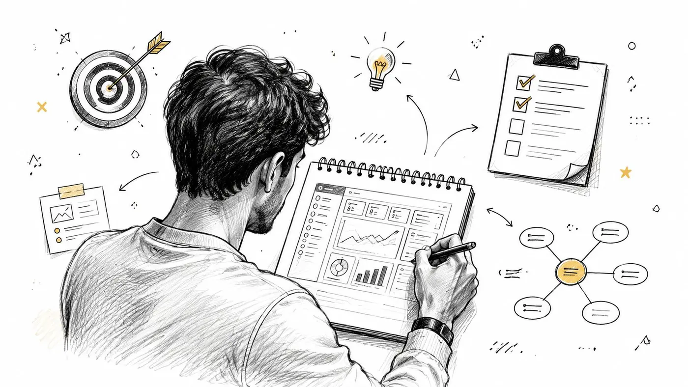
Define who the page is for
If the primary user is a C-level stakeholder, the page needs speed, confidence, and a short path to the main point. If it's a CRO analyst, the dashboard can support drill-down, segment cuts, and test-level detail. The mistake is trying to satisfy both with one undifferentiated screen, because that's how you end up with a wall of metrics that nobody owns.
A practical way to prevent that is to write down the decision-maker, the daily user, and the fallback user. Then ask what each of them needs to know in 30 seconds, and what they need to be able to do after that. That framing keeps the page honest, because a metric only earns space if it supports a real decision.
Lock the dashboard to three decisions
A proven methodology is to define the three decisions the page must support, map each to a business goal, and then restrict the page to a small KPI set dashboard design workflow. That rule sounds restrictive until you use it once. Then it becomes obvious how much clutter was sitting on the page without doing any work.
If a widget can't be tied to a specific decision or goal, cut it.
That single filter solves a lot of scope creep. It also changes how you define KPIs, because you're no longer asking, “What can we measure?”, you're asking, “What do we need to know to act?” For experimentation dashboards, that usually means headline outcome metrics first, then supporting context only where it changes interpretation.
The video below is a useful companion if you want to hear the planning logic in a more operational format.
Set the charter before the first chart
A lightweight charter beats a long requirements doc. It should state the audience, the three decisions, the KPI owner, and what gets excluded. That sounds mundane, but it's the difference between a dashboard that stays focused and one that turns into a dumping ground every time someone wants “just one more widget”.
Keep the KPI set tight enough to scan. In practical BI terms, the key insight should sit in the top-left corner, with no more than three to four KPIs per section, and many executive views start to break down once they push past five to six KPIs Power BI dashboard design guidance. Those limits are useful because they force prioritisation. If you can't decide which metric matters most, the page isn't ready.
For teams who want visual inspiration while keeping the planning discipline intact, design inspiration for SaaS founders is worth skimming after the charter is clear. Good references help with layout ideas, but they should never replace the decision filter.
Architecting Your Data Pipeline
A dashboard only earns trust if the data behind it is stable. If your figures depend on someone exporting CSVs, merging sheets, and fixing filters by hand, the dashboard will age badly, no matter how good the interface looks. UK government guidance explicitly recommends reducing manual intervention by connecting to auto-updating sources, because the maintenance burden is part of the product, not an afterthought government data dashboards guidance.
Build the flow from event to metric
For experimentation work, the cleanest pattern is usually event capture, transformation, metric layer, then visualisation. Events might come from an SDK, a tag manager, or server-side tracking, while commerce data comes from the store platform. The important part is not the specific tool, it's that the event names, metric definitions, and refresh rules stay consistent so the dashboard never has to guess what a conversion means.
A single source of truth is vital. Revenue should come from one place, conversion logic should be defined once, and every downstream chart should inherit those definitions. If teams duplicate business logic across the dashboard, the pipeline becomes fragile and every refresh risks a subtle mismatch.
The screenshot below reflects the kind of tidy flow you want, a clean path from raw events to usable reporting.
Minimise handoffs and breakpoints
Every extra manual step is a chance for the dashboard to drift. The Government Data Service advises using recurring reports and automatic updates so the system does not depend on someone remembering to push data through the stack government data dashboards guidance. In practice, that means wiring sources directly where possible, checking refresh cadence, and documenting who owns each feed.
If your team is cleaning event names, deduplicating rows, or normalising timestamps manually, make that an exception process, not the default. For practical help on avoiding brittle inputs, data cleaning best practices is a useful reference. The goal is not perfection, it's predictable inputs and fewer surprises.
Keep the refresh model boring
Dashboards fail when they depend on heroics. When someone has to click three tools, export two files, and paste one formula before the data appears, the system is already too fragile. The better pattern is a pipeline that refreshes on its own, flags issues quickly, and makes the failure obvious before the numbers are shared.
That's why the technical layer should be treated as part of dashboard creation, not separate from it. The dashboard's usefulness depends on whether the pipeline can keep pace with the business questions it's supposed to answer.
Designing for Clarity and Action
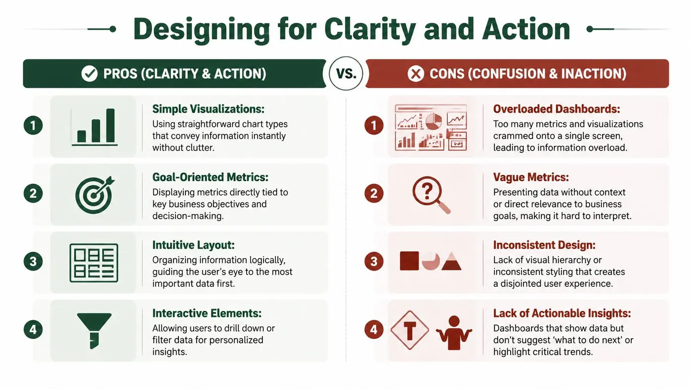
Good dashboard design is about reducing effort, not showing off. The first second matters because users don't read a dashboard from left to right like an essay, they scan for the first reliable signal. UK BI guidance puts the most important insight in the top-left corner and warns against overloading executive views with too many measures, because cognitive load goes up fast when the page gets crowded Power BI dashboard design guidance.
Use hierarchy to make the answer obvious
A dashboard needs one obvious focal point per page. That can be a headline KPI, a trend line, or a test result, but it should be unmistakable. White space helps here because it separates the primary signal from the supporting context, and labels do more work than colour when the page has to remain accessible.
UK-oriented guidance on layered information design also stresses chunking and progressive disclosure, which is a good way to think about complexity. Put the main answer up front, then let users drill into segments, geography, device, or test cells only when they need more context. This is the right compromise between “keep it simple” and “don't hide the detail”.
Choose charts that match the job
Use a line chart for change over time, a bar chart for comparing variants, and a compact table when precision matters more than visual flair. Don't use a chart because it looks modern. Use it because the user can read the answer faster than they could from text.
If you're comparing A/B variants on conversion rate or revenue per user, a bar chart often does the job better than a dense multi-line view. If the question is whether performance moved after launch, trend over time is the right lens. The chart choice should follow the decision, not the other way around.
Reinforce accessibility in the layout
Design choices that help sighted power users usually help everyone else too. Labels should reinforce colour, not depend on it. Related metrics should be grouped together, and interactive controls like slicers or filters should be close to the visuals they affect so the user doesn't have to hunt.
For additional layout ideas, design inspiration for SaaS founders is useful if you want to see how clean, product-style interfaces handle hierarchy without losing density. Use it as a reference point, not a template. A good dashboard should be legible under pressure, not just attractive in a mockup.
Design rule: if someone needs a legend to find the point, the chart is doing too much work.
Interpreting Statistical Readouts Correctly
A dashboard can look precise and still mislead the team. In experimentation, the hard part isn't just seeing a lift, it's knowing whether the result is stable enough to act on. That's why statistical readouts need to be translated into business language before they become decision fuel.
Read significance as risk management
When a platform reports statistical significance at a 95% confidence threshold, the practical meaning is about risk control, not magic certainty. It tells you how cautious the team should be about calling a winner, and it helps prevent overreacting to noise. Otter A/B's frequentist z-test engine is built around that threshold, so the platform can tell you when a winner emerges, but the team still has to decide whether the result fits the business context Otter A/B.
Confidence intervals matter for the same reason. They show the plausible range around the observed effect, which is more useful than a single point estimate when you're deciding whether to roll out a change. If the range is wide, the result is less settled than the headline number might suggest.
For a deeper statistical refresher, what is a confidence interval in statistics is a practical companion. The key habit is to look past the headline lift and ask what range of outcomes the data still allows.
Don't stop tests early because the graph looks good
Early winners are seductive. The problem is that a promising graph can still be the result of incomplete data, uneven traffic, or not enough exposure. If the test was designed to run to a given sample size, let it get there before you decide what's real.
That's the operational discipline that protects the dashboard from becoming a wish engine. The page should show the current state clearly, but it shouldn't encourage premature action by making every transient fluctuation look like a conclusion. A disciplined team uses the dashboard to make the next decision, not the fastest one.
Give teams the right question to ask
The right question is not “Is the variant up?” The right question is “Is this effect real enough, stable enough, and valuable enough to ship?” That framing keeps the dashboard honest because it combines statistical interpretation with business judgment.
A simple rule works well here. If the confidence readout and the trend line agree, and the metric aligns with the original goal, the result deserves attention. If they don't line up, the team should slow down and inspect the segment mix, traffic quality, or measurement setup before acting.
Governing and Maintaining Your Dashboard for the Long Term
Most dashboards don't fail on launch day. They fail when the owner changes roles, the source schema shifts, or everyone assumes someone else is watching it. UK government guidance is blunt on this point, dashboards need clarity on who the decision-maker is, who manages data access, and who to contact when sources break, while also reducing manual intervention through auto-updating sources government data dashboards guidance.
Assign ownership like you expect things to break
Ownership has to be explicit. Name the decision-maker, the data steward, and the person who gets the first alert when the feed fails. If those roles are fuzzy, the dashboard becomes everyone's responsibility and no one's job.
The maintenance plan should also cover failure modes. What happens if a source stops updating, a metric definition changes, or a new campaign structure lands in the tracking layer? Those issues are normal, not exceptional, so the response should already be documented.
Automate alerts and review cycles
Alerts are only useful if they point to action. A Slack notification for a test reaching significance, or for a metric dropping outside tolerance, is useful because it routes attention quickly. For operational monitoring patterns that keep systems visible, optimizing site reliability with monitoring is a helpful parallel, even though dashboard monitoring is about data trust as much as uptime.
Periodic reviews matter too. Metrics that no one uses should be retired, and pages that no longer support a decision should be simplified. That review cycle keeps the dashboard lean and reduces the risk that stale visuals linger just because nobody wants to touch them.
Keep accessibility and data access current
Governance is not just about ownership. It also covers accessibility, navigation, and the practical ways people consume the dashboard. If the page needs a downloadable data file, descriptive alternative text, or clearer structure for keyboard users, those details belong in the maintenance plan, not a backlog that never gets prioritised.
That's why dashboard creation is a lifecycle problem. The launch is only the beginning. The ongoing effort involves keeping the page trustworthy, low-maintenance, and aligned with the decisions it was built to support.
Conclusion The Living Dashboard
A good dashboard doesn't just display data, it keeps a team oriented. When you plan it around decisions, architect the data carefully, design for quick comprehension, and govern it properly after launch, it becomes a living part of the operating system. That's the difference between a report people glance at and a dashboard they depend on.
If you want a dashboard that survives real use, treat it like a product with an owner, a refresh plan, and a retirement path. That mindset keeps the work focused and the numbers trusted.
A CTA for Otter A/B.
Stop guessing
Ready to start testing?
Set up your first A/B test in under five minutes. No credit card required.
- 14-day free trial
- No credit card required
- Cancel anytime