Mastering Device Compatibility for Superior UX
Improve UX with flawless device compatibility. Discover common issues, effective testing, and how Otter A/B’s SDK ensures seamless cross-device experiments.

You launch an A/B test on Monday morning. By Tuesday, the numbers look strange. Mobile conversion is down, Safari users barely enter the funnel, and one variant seems to “win” only on desktop. The copy probably isn't the problem. The layout might not be either. Often, the actual issue is much quieter: some visitors never got the same experience in the first place.
That's what makes device compatibility so important for growth teams and developers. If a test renders differently on one browser, loads late on another, or fails on older hardware, your experiment stops being a fair comparison. You're no longer measuring behaviour. You're measuring technical inconsistency.
A good UX testing process catches that early. If you need a broader framework for evaluating experience before and during experiments, this guide to user experience testing is a useful companion. It helps connect interface quality with trustworthy data.
Introduction to Device Compatibility
Device compatibility means your site, app, or experiment works as intended across the combinations of devices people use. That includes phone models, operating systems, browsers, screen sizes, and network conditions.
For experimentation, this matters more than many teams realise. A campaign can look healthy in a staging environment, then fail imperceptibly in production because one browser interprets CSS differently, an older phone struggles with JavaScript, or a weak mobile connection delays the variant until after the page has already painted. Users feel that as friction. Analysts see it later as noisy data.
Why experiment teams get caught out
Testing often focuses on what's easy to test. A recent MacBook. A current iPhone. One Android handset. Current Chrome. That catches obvious bugs, but it doesn't reflect the messiness of real traffic.
A visitor might arrive on an older iPhone using Safari, with battery saver on and a weak connection. Another might use a region-specific Android device on a carrier with uneven support for that model. Both are valid users. If one gets the control and the other gets a half-broken variant, your conversion data starts drifting away from reality.
Practical rule: If visitors on different devices don't receive the same quality of experience, your test result can't be trusted.
What smooth compatibility looks like
A compatible experiment does four things well:
- Loads consistently: The control and variant appear when expected.
- Renders predictably: Layout, text, buttons, and forms behave the same way across major environments.
- Tracks reliably: Events fire without dropping users from the dataset.
- Respects constraints: Older devices, slower connections, and unusual browser settings still get a usable experience.
That's the standard worth aiming for. Not perfection on every device ever made, but dependable performance across the combinations that matter to your audience.
Understanding the Key Concepts
When marketers hear “device compatibility”, they often think only about screen size. That's part of it, but it's only one part. A better analogy is language. Two people may both speak English, but one uses different spelling, slang, and pronunciation. Browsers and devices behave in a similar way. They're working from shared web standards, yet they still interpret things differently.
In the UK, smartphones are central to everyday browsing. Smartphone penetration reached 94% of the total population in 2023, with near-universal adoption among younger demographics, and UK adults spent an average of 4 hours and 24 minutes daily on smartphones according to UK mobile and internet usage figures. That alone tells you mobile compatibility isn't a nice extra. It's core UX work.
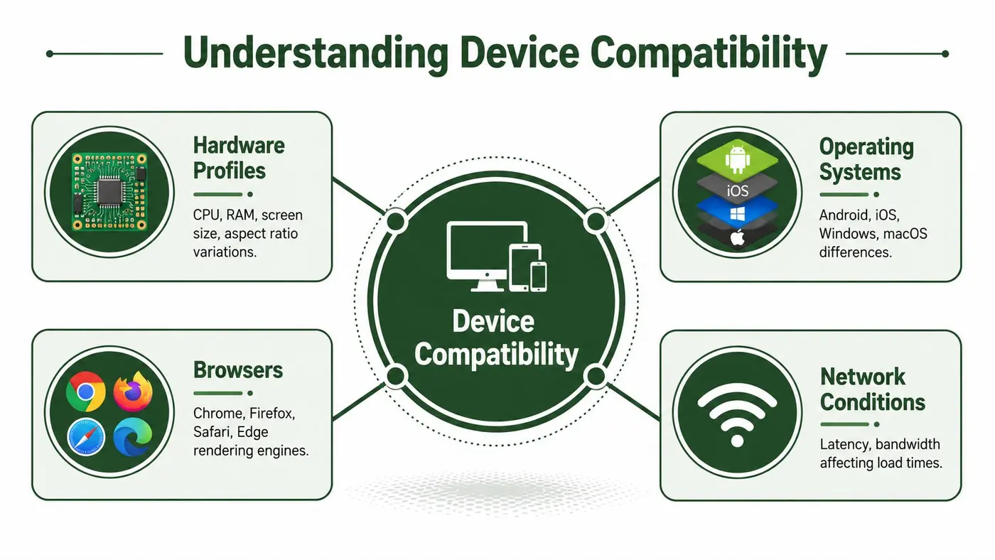
The four parts that shape compatibility
Hardware profiles
Hardware affects how quickly a device can parse scripts, paint content, and respond to user input. A premium phone and a budget handset may open the same page, but not at the same speed or with the same stability.
Key differences include:
- Processor capability: Slower chips can delay script execution.
- Memory limits: Lower RAM can cause stutter, reloads, or tab crashes.
- Screen dimensions: Narrow widths and unusual aspect ratios can break layouts.
- Input method: Touch behaviour differs from mouse and keyboard behaviour.
Operating systems
iOS and Android don't behave identically, even when the page looks similar at first glance. Permissions, embedded browsers, keyboard handling, and scrolling quirks can all vary.
Older OS versions add another layer. They may lack support for newer APIs, which can affect animations, storage, or event tracking. That doesn't always create a total failure. Sometimes it causes the more dangerous problem: a partial failure that goes unnoticed.
Browsers
Browsers are the rendering layer between your code and the user's eyes. Chrome, Safari, Firefox, and Edge can interpret styles, fonts, spacing, and scripts in slightly different ways.
If you want a practical refresher on layout systems that adapt across screens, it helps to discover responsive design with Wise Web. Responsive design won't solve every compatibility problem, but it gives you the base structure needed for flexible interfaces.
Network conditions
The same experiment can feel polished on Wi-Fi and frustrating on mobile data. A delay of even a fraction of a second can change what loads first, when a variant appears, and whether a user sees flicker before the page settles.
Good device compatibility isn't one test on one phone. It's a habit of checking how hardware, software, browsers, and networks interact.
Impact on UX and Experiment Results
A compatibility problem is never just technical. It changes what users see, how quickly they can act, and whether your metrics still mean what you think they mean.
In the UK, mobile devices account for 43.1% of all web traffic, and Safari-specific rendering checks are critical for maintaining functionality and performance according to UK web traffic and browser usage analysis. For many teams, that means a large share of real visitors are likely to experience experiments through mobile Safari. If your variant works well in Chrome but shifts or clips in Safari, that isn't a minor bug. It's a direct threat to UX and to the validity of the test.
How bad compatibility distorts behaviour
Think about a product page test where Variant B changes the hero layout and CTA position.
On a well-supported device, the page loads cleanly. The user scrolls, reads, and clicks.
On a problematic device, one of several things may happen:
| User sees | UX effect | Experiment effect |
|---|---|---|
| Text wraps badly or overlaps | The page looks untrustworthy | Conversion rate falls for reasons unrelated to the idea being tested |
| The variant appears after the first paint | The user notices flicker or content shifts | Behaviour reflects distraction, not message quality |
| A button sits below the fold on one screen size | The CTA becomes harder to reach | Click data becomes biased by layout rather than copy |
| A script error stops event tracking | The user may still convert | Reporting undercounts one side of the test |
That's why experienced teams treat rendering consistency as part of experimental design, not just front-end polish.
Latency can corrupt a fair test
Network mismatch creates another hidden bias. Devices incompatible with a carrier's primary 5G band can experience up to 300ms additional latency during page renders, which can hurt Core Web Vitals and affect z-test thresholds, according to carrier compatibility analysis at WillMyPhoneWork.net.
For UX, that extra delay can mean a later paint, a delayed variant, or a form that feels slow to respond. For experimentation, it can separate users into different experience buckets based on hardware and network support rather than random assignment alone.
Why the result can look “statistically fine” and still be wrong
A dashboard may still report a winner. But if one segment got a degraded version of the page, the result is contaminated. You didn't test one idea against another under equal conditions. You tested one idea plus a technical penalty against another without it.
If a variant loads differently by device, the test isn't comparing messages or layouts fairly. It's comparing delivery conditions.
Common Compatibility Challenges
The most expensive compatibility problems are rarely dramatic. They tend to be small failures that slip through review, then compound across traffic.
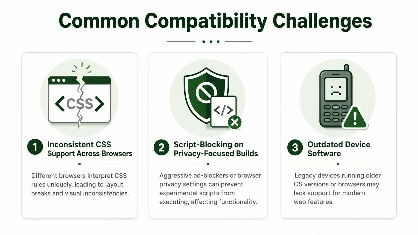
Browser rendering differences
A layout can be perfectly aligned in one browser and slightly broken in another. Safari is a common source of surprises for growth teams because spacing, sticky elements, viewport height, and form controls can behave differently from Chrome.
That matters most on conversion-critical components:
- Hero sections: Overflow and clipping can hide the message.
- Sticky CTAs: Positioning bugs can block content or disappear on scroll.
- Checkout forms: Autofill, focus states, and validation can vary by browser.
If you're diagnosing layout instability, this explanation of cumulative layout shift and why it hurts conversions helps connect visual movement with user frustration.
Script-blocking and delayed execution
Some browsers and privacy-focused environments are stricter about scripts. A testing snippet might load later than expected, fail to apply a class, or be blocked from firing a tracking event.
That creates a particularly awkward situation for marketers: the test may appear active in the dashboard while some visitors still see the original experience. The issue isn't random traffic allocation anymore. It's inconsistent execution.
A short walkthrough helps illustrate the kind of failures teams watch for in front-end testing:
Older devices and software gaps
Legacy hardware often struggles with modern front-end patterns. Newer frameworks, heavier scripts, and richer interfaces can expose limits in older browsers or outdated operating systems.
Even simple buying guides can help a testing team think more concretely about current hardware generations. For example, a comparison of refurbished iPhone 13 or 14 details can remind teams that many shoppers use previous-generation devices, not only the newest flagship phones.
Carrier and network mismatch
Not all mobile performance issues come from the browser. Some begin at the network layer. As noted earlier, a device that doesn't align well with a carrier's primary band may incur additional render delay. That can be enough to change load order, shift event timing, or make a variant feel unstable.
Small compatibility issues rarely announce themselves. They show up as odd drop-offs, noisy segmentation, or a “surprising” winner that can't be reproduced.
Testing Strategies and Best Practices
Compatibility testing works best when it's organised like a funnel. Start broad, narrow to the combinations that matter most, then validate edge cases that could still distort your data.
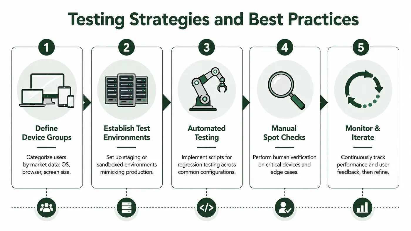
Build a practical device matrix
You don't need every device. You need the right spread of devices.
A useful matrix usually includes:
-
Primary traffic environments
Cover the operating systems, browsers, and screen sizes your visitors use most. -
Known risk combinations
Include the setups where your team has seen bugs before, such as Safari on iPhone, embedded in-app browsers, or older Android builds. -
Experience-critical journeys
Test high-value flows first. Home page, product page, cart, checkout, sign-up, and lead capture forms.
A matrix keeps testing focused. Without it, teams often retest familiar devices and miss the combinations that create risk.
Combine automated and manual checks
Automation is excellent for repeatability. Manual review is better for judgement. You need both.
| Method | Best for | Watch for |
|---|---|---|
| Automated browser checks | Regressions after code changes | Missing visual nuance |
| Real-device testing | Touch, keyboard, scrolling, and rendering quirks | Limited scale |
| Network throttling | Slow loads and delayed script execution | Unrealistic assumptions if profiles are too narrow |
| Accessibility review | Zoom, contrast, and assistive settings | Needing human verification for context |
Use a pre-launch checklist
The UK's 2G and 3G decommissioning planned by the end of 2025 can risk breaking SDK delivery on legacy devices used by vulnerable populations, according to the Digital Poverty Alliance policy brief on 2G and 3G sunsetting. That's a strong reminder to include fallback verification for older hardware, especially if your audience includes older or accessibility-dependent users.
A solid checklist should include:
- Variant delivery: Does the correct experience appear consistently on first load?
- Render stability: Are there jumps, reflows, or hidden elements?
- Tracking integrity: Do conversion and revenue events fire on each supported setup?
- Network resilience: Does the experience remain usable under slower conditions?
- Older hardware fallback: If advanced features fail, does the page still function?
- Accessibility settings: Do zoom, larger text, and colour adjustments break layouts?
Troubleshoot in the right order
When a test behaves oddly, check the basics first.
Start with environment differences. Then review load timing. Then inspect what the user saw. Many teams jump straight to analytics, but compatibility issues often begin long before the event layer.
Field note: If one segment underperforms unexpectedly, verify delivery and rendering before you debate copy, pricing, or offer quality.
Leveraging Otter A B for Compatibility
The right testing setup reduces compatibility risk by design, not just by patching issues after launch. That's where implementation details matter.
Otter A/B is built around a 9KB SDK that loads in under 50ms, with zero flicker and 99.9% uptime. Those traits are especially useful in compatibility work because they reduce the chance that users on slower devices or shakier networks will see the page before the experiment applies. A lighter SDK also puts less strain on lower-powered phones that might struggle with heavier scripts.

Why lightweight delivery matters
A heavy testing script can become part of the compatibility problem. It may delay rendering, create visual instability, or fail under constrained conditions. A lightweight loader lowers that risk.
This matters even more as network environments evolve. EE's 5G Standalone network covers half the UK, but many region-locked devices may lack the firmware needed for those frequencies, as reported by ISPreview's coverage of EE's 5GSA rollout. In that kind of mixed environment, conditional loading is valuable because it helps prevent silent failures on unsupported hardware.
Useful patterns for teams
Otter A/B is especially practical for teams running tests across Shopify, WooCommerce, Webflow, WordPress, Next.js, and Google Tag Manager because it fits into stacks marketers and developers already use.
A few implementation habits help:
- Condition by capability: Load variants only when the required features are supported.
- Preview before release: Validate what each variant looks like on target devices before sending traffic.
- Keep the test small: The more DOM changes you make at once, the more compatibility risk you introduce.
- Review edge cases in the preview layer: The Otter A/B preview bar documentation is useful for checking variant appearance before launch.
Otter A/B won't eliminate the need for real testing discipline. Nothing will. But a lightweight, low-flicker setup gives teams a better starting point, especially when they care about preserving UX and keeping experiment data clean.
Conclusion and Next Steps
Device compatibility sits at the intersection of UX, engineering, and experimentation. If a page loads differently across browsers, fails on older devices, or slows down on mismatched networks, users feel the friction first. Your reports reflect it later.
The most reliable teams treat compatibility as part of experiment design. They define a device matrix, test critical journeys on real hardware, watch for browser-specific rendering issues, and verify fallback behaviour on older setups. That approach protects both the user experience and the quality of the conclusion.
If your tests have ever produced results that felt inconsistent, difficult to explain, or hard to replicate, compatibility is one of the first places worth investigating. Tightening this layer often improves both confidence and conversion work at the same time.
Otter A/B helps teams run faster, cleaner experiments with a lightweight 9KB SDK that loads in under 50ms, avoids flicker, and protects UX across devices. If you want a simpler way to launch tests on Shopify, WooCommerce, Webflow, WordPress, Next.js, or through Google Tag Manager, try Otter A/B and start validating ideas without adding avoidable compatibility risk.
Stop guessing
Ready to start testing?
Set up your first A/B test in under five minutes. No credit card required.
- 14-day free trial
- No credit card required
- Cancel anytime