First Input Delay Explained and Why It Still Matters in 2026
Learn what first input delay is, how it shapes Core Web Vitals and SEO, and the practical fixes that keep your site fast and responsive in 2026.

You're on a live page, a visitor has just tapped a button, and nothing happens. No spinner. No colour change. Just that awkward pause where the site feels like it's thinking harder than the person using it. That pause has a name, First Input Delay, and it's one of the cleanest ways to understand why a page can look fast but still feel frustrating.
For UK teams, that matters because the benchmark learned was 100 milliseconds or less for a good experience, measured at the 75th percentile across mobile and desktop real-user loads (MDN's First Input Delay glossary). FID is no longer a live Core Web Vital, but it still explains the responsiveness problems that product, marketing, and engineering teams spent years chasing, and it gives you the right mental model for what INP judges now.
What First Input Delay Actually Measures
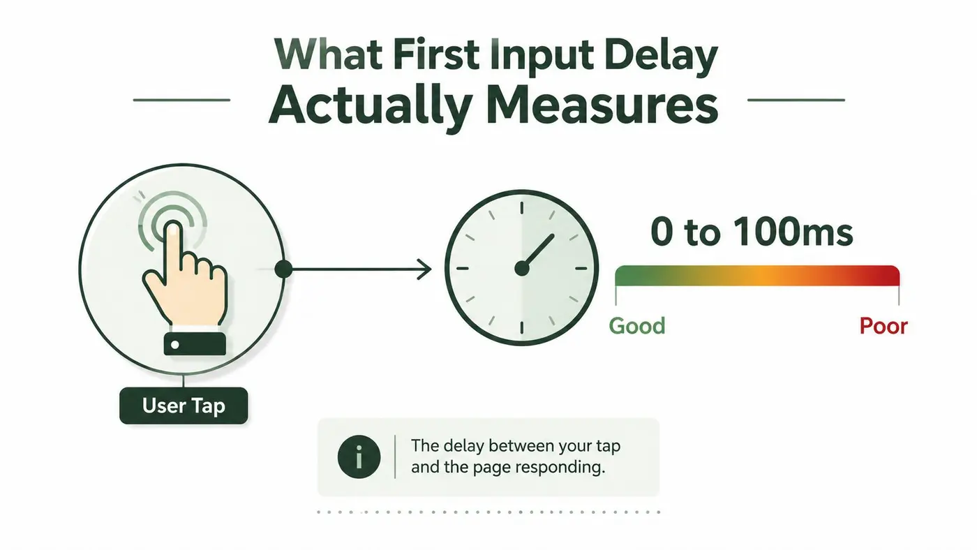
First Input Delay measures the time between a user's first interaction and the browser's ability to respond. A visitor taps a menu, clicks a button, or starts typing in a form, and the browser may still be busy finishing other work before it can begin handling that input. That waiting time is the signal FID was built to capture, measured in milliseconds from the user action to the moment event handlers can start running.
That detail matters because FID is about how quickly the page can react, not how fast it looks. A homepage can finish painting on screen and still feel stuck if the browser is occupied when someone tries to use it. For a marketing team, that shows up as a CTA that does nothing for a beat. For a product team, it shows up as a form that feels unresponsive even though the layout is already visible.
Google's guidance for a good experience was 100 ms or less, and it recommended looking at the 75th percentile of page loads across mobile and desktop (MDN, web.dev). That percentile rule matters because it keeps teams from optimising only the cleanest lab runs or the fastest visits. It asks a more honest question, what did most real users feel when they tried to act?
Practical rule: if the first click feels sticky, the issue is responsiveness first, not visual design.
The metric also mattered for SEO because it lived inside Google's Core Web Vitals reporting, which site owners could review in Search Console and PageSpeed Insights until FID was retired in 2024 (Request Metrics). That is why growth, SEO, and engineering teams all paid attention to it. It was a record of how real humans experienced the page the first time they tried to use it, and it gave teams a way to spot the quiet damage caused by A/B testing scripts, tag managers, and other third-party code that competes for the same browser time.
For a clearer link between interaction speed and visual loading, compare FID with Largest Contentful Paint. The two metrics measure different parts of the experience, and that difference is exactly why FID became the starting point for understanding INP later on.
Why FID Mattered for Core Web Vitals and SEO
FID mattered because it was never evaluated in isolation. Google grouped it with Largest Contentful Paint and Cumulative Layout Shift to form Core Web Vitals, a trio that gave site owners a practical health check for loading, stability, and responsiveness. A doctor does not look at one vital sign and declare someone healthy, and Google used the same approach for pages.
That structure changed how teams talked about performance inside the business. A marketing team could see that the hero banner loaded quickly, yet a checkout button still lagged because something else was holding the browser busy. A product manager could look at the numbers in Search Console and understand that good content was not enough if the first interaction felt delayed. Those conversations made the metric useful.
The threshold stayed simple, 100 ms or less was the good-experience line, and Google recommended the 75th percentile of real-user loads, segmented by mobile and desktop. That rule is easy to overlook, but it stops teams from hiding behind perfect lab conditions. The page has to feel responsive for real people on real devices, not just for a developer on a powerful laptop.
If you need a resource that connects this thinking to commercial page design, the Guide for SaaS product managers is a useful companion. It sits in the same practical world as FID, where interface speed affects how confidently people move through a product flow.
Core Web Vitals fed into Google's page experience signals, so a site with strong content could still underperform if its interactions felt sluggish. That did not mean FID was the only thing that mattered, but it did mean responsiveness had enough importance to influence how teams prioritised engineering work. Today, that same strategic pressure lives on through INP, not through FID's old scorecard.
Measuring FID in the Lab Versus the Field
A page can look quick in a test and still feel slow to a visitor. That gap is the reason lab results and field data need to be read as two separate signals, not as one blended score. Lighthouse or WebPageTest gives you a controlled run that is useful for debugging, while real users bring in device limits, network noise, consent banners, and experiment code that the lab may never see.
What the lab can and can't tell you
Lab tools often simulate a click or key press because they do not know which interaction a real person will make first. That lets you estimate the shape of a delay, but it does not always show the first moment that mattered to the user. A lab trace is strong for iteration, and weaker as proof of lived experience.
Field data comes from actual visits, usually through Chrome UX Report data surfaced in Search Console and PageSpeed Insights. It shows what real users experienced, but there is a trade-off. The reporting usually arrives with a two-to-four-week lag, so the picture is useful for pattern-spotting rather than live diagnosis.
The clean workflow is simple, use lab data to debug and iterate during development, then trust field data to confirm what visitors actually felt in production.
| Aspect | Lab Tools (Lighthouse, WebPageTest) | Field Data (CrUX, Search Console) |
|---|---|---|
| What it measures | Scripted interactions in a controlled run | Real-user interactions on live visits |
| Strength | Reproducible and fast for debugging | Reflects actual visitor experience |
| Weakness | Can miss the first real interaction that matters | Reporting arrives after a delay |
| Best use | Isolating and testing fixes | Confirming production behaviour |
That split matters for product teams and marketers because the browser can behave one way in a clean test and another way once the page loads everything else around it. A/B testing scripts, consent tools, chat widgets, and tag managers often remain idle until the user tries to click, then they steal time from responsiveness. If the field data looks worse than the lab trace, the cause is usually in those extra scripts, not in the simple page you tested.
If you also need to understand how visual instability affects the same experience, see the guide to Cumulative Layout Shift. FID was useful because it taught teams to separate what the browser could do in theory from what users felt in practice, and that remains the right habit for modern responsiveness work.
The Move From FID to INP and What Changed
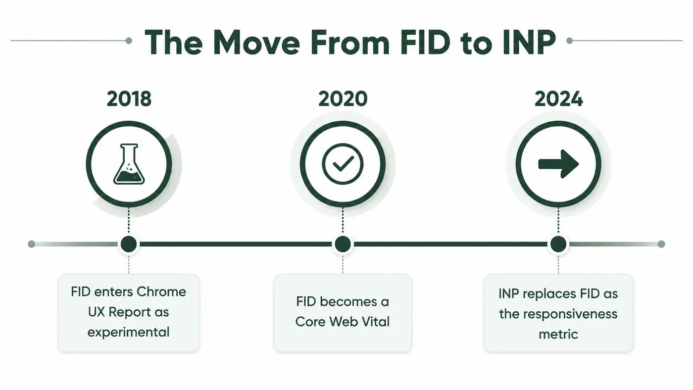
A page can look fine in a quick test and still feel slow once real users start clicking around. That is the problem FID helped teams notice, because it showed whether the browser could respond when someone tried to interact. FID entered the Chrome UX Report as an experimental signal in July 2018, then became a Core Web Vital before being retired in 2024 and replaced by Interaction to Next Paint. By September 2024, PageSpeed Insights, CrUX, and the Web Vitals extension had stopped reporting FID. That timeline matters because it keeps FID in the story instead of treating it like a metric that no longer teaches anything. It was the bridge. Request Metrics
Why Google moved on
FID only counted the first interaction. That helped, but it left a gap. A page could answer the first tap quickly, then slow down when someone opened a filter, switched a variant in an experiment, or moved deeper into checkout. FID measured the first impression, not the rest of the conversation.
INP closes that gap by watching interactions across the visit and reporting the slowest one within the 75th percentile. Google's practical target for good responsiveness is 200 ms or less, and very poor responsiveness is associated with much slower interaction timing, which is why the newer metric holds the whole page to a stricter standard of real behaviour (web.dev for the older FID framing). The point is not to memorise another score. It is to keep the page responsive after the first click, not just before it.
For teams keeping older dashboards, FID still appears in historical audits and legacy reports. That can make a page look fixed in one export and still feel heavy in current tooling. Reading those reports correctly means knowing which metric you are looking at and which moment in the journey it described.
The internal logic did not change. Keep the main thread free, and the page feels better. That same engineering discipline improves INP too, which is why FID still works as a foundation for understanding responsiveness rather than as a dead metric. Third-party scripts and A/B testing tools often make that lesson visible, because they can sit idle until a user interacts and then steal time from the browser. For a companion view on another former Core Web Vital, see Cumulative Layout Shift.
Diagnosing Responsiveness Problems Step by Step
When a page feels sticky, start in Chrome DevTools Performance. Record a trace, reproduce the tap or click that feels slow, and then look for long tasks on the main thread. A long bar in yellow or red usually means something blocked input while the browser should have been reacting.
What to look for in the trace
The goal is to find the work that sat in front of the user's input. In the flame chart, watch for synchronous JavaScript that runs before the event handler gets a chance to start. If a click is queued behind a bundle, a tag manager payload, or a hydration task, that's your bottleneck.
The most useful warning signs are straightforward:
- Long tasks over 50 ms: these are the chunks that start to crowd out responsiveness.
- Event handlers queued behind scripts: the browser is ready to listen, but the thread is busy.
- Heavy scripting during page load: this often explains why the first interaction feels delayed.
- Visible main-thread spikes in the flame chart: these point to work that should be split or deferred.
Practical rule: profile on a throttled mid-tier mobile setup, not just on a flagship laptop, because powerful hardware hides the delay real visitors feel.
The usual culprits are familiar. A big hero-page JavaScript bundle can do too much up front. Third-party tags can block the main thread before the page is interactive. Hydration on a large single-page app can delay the browser's ability to respond. Analytics snippets can fire too early and compete with the user's first action.
If you want to make debugging a habit, profile before and after every meaningful change. That simple ritual prevents “optimisations” that improve one area while harming another. It also gives teams a shared language for responsiveness, which is much easier to manage than arguing about whether a page “feels slow”.
Practical Fixes That Free the Main Thread
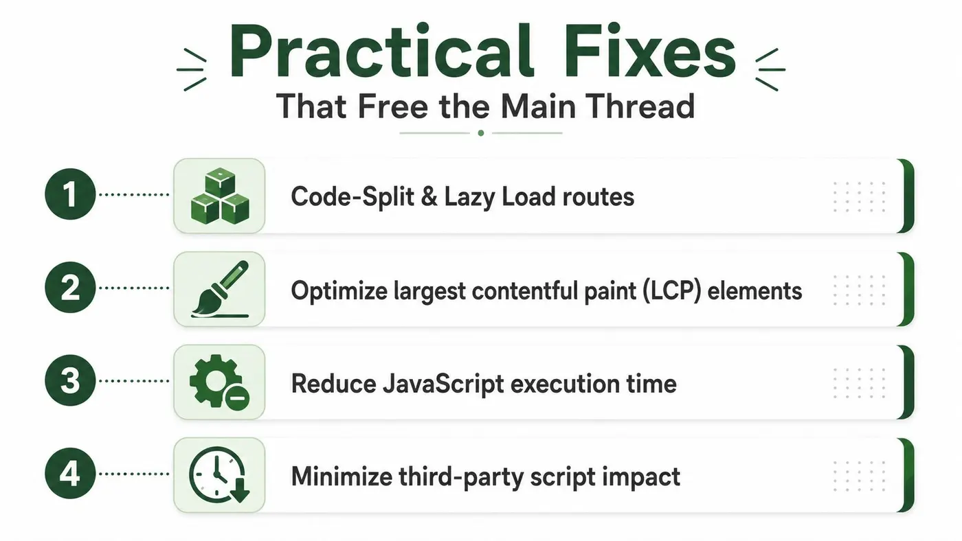
The fastest wins usually come from making the browser do less work before the first interaction. Start with code splitting and route-level lazy loading so the browser only parses what the user can see. If the current page does not need the whole app bundle, don't make it pay for the whole app bundle.
Fixes in priority order
- Code-split and lazy load routes: this keeps initial parsing smaller and gives the browser more room to respond.
-
Use
deferandasynccarefully:asyncfetches in parallel and runs when ready, whiledeferwaits until parsing finishes. Both help, but they solve different timing problems. - Extract critical CSS: above-the-fold content should not wait for a giant stylesheet pass before it can paint.
- Move CPU-heavy work into web workers: JSON parsing, sorting, and filtering are classic candidates for offloading.
- Audit third-party scripts: tags, chat widgets, and marketing pixels should earn their place, not block the page by default.
The core rule is still the same, anything that runs too long should be split into smaller chunks. That is how you keep the browser free to answer the user's first tap. If the main thread gets a breathing gap between tasks, responsiveness improves because the browser can start handling input instead of waiting in line.
Engineering shorthand: if a feature is not critical to the first interaction, it should not compete with the first interaction.
Third-party script management deserves extra attention because it often looks harmless in a release checklist. A font loader, a chat widget, or a consent banner can all add delay that product teams never see in screenshots. If a tool can be loaded later without changing the experience, it should be loaded later.
For teams comparing vendors or building an internal case for monitoring, implementing performance monitoring solutions is a good reference point for the operational side of that work. The main lesson is simple, responsiveness gets better when you measure it continuously instead of treating it like a one-time optimisation project.
Keeping A/B Testing and Experimentation Responsive
A/B testing is one of the easiest ways to accidentally break responsiveness. Many experimentation scripts inject synchronously, mutate the DOM before paint, and compete with the first interaction just when the browser should be staying calm. A test that improves conversion but slows every variant can cost more than it returns.
What a fast experimentation stack looks like
A responsive SDK has to stay small, load asynchronously, and avoid flicker. It should assign variants without dragging the main thread through a pile of client-side logic, and it should fail safely if the script doesn't load. If experiment delivery blocks rendering or interaction, the testing stack has started to act like a performance bug.
That's why the performance budget has to include experimentation tools. A heavyweight SDK can undo the gains from code splitting, deferred scripts, and worker offloading in a single release. The browser does not care that the blocking code is “for growth”, it only knows it can't respond yet.
Otter A/B is one example of an experimentation platform built around that constraint, with a 9KB SDK, sub-50 ms load, zero flicker, and a frequentist z-test engine for statistical significance. It also has A/B testing for WordPress guidance that fits the same idea, experiments should support the page, not slow it down. Used well, that kind of setup keeps testing inside the performance budget rather than consuming it.
If you're choosing tools, check for a few qualities before you add anything to production:
- Async loading: the experiment should not block first paint or first input.
- Tiny payloads: payload size should stay low enough that it doesn't compete with core UI code.
- Server-side or edge assignment: variant selection should happen before the browser has to carry the cost.
- High uptime: a failed experiment should never freeze the page.
The right test platform measures conversion without making the interface feel heavier.
That's the connection to FID and INP. Responsive sites are not just a front-end goal, they're also a testing requirement. If your experiments are slow, your optimisation programme is measuring itself with a broken ruler.
Responsiveness as a Continuous Discipline
The teams that stay fast treat responsiveness as part of the operating model, not a cleanup task. The habits are simple. Measure on real users in the field, audit third-party scripts every quarter, and enforce a performance budget that includes experimentation tools as well as core product code.
FID still matters here because it taught the right instinct, keep the main thread clear for the user's first action. INP tightened that instinct by watching every interaction, not just the first one. That shift did not relax the rules. It made them stricter.
As AI-driven personalisation and heavier client frameworks become more common, the pages that feel effortless will belong to the teams that protect responsiveness as a default. Product, marketing, and engineering all have a role in that work because the browser doesn't separate “business code” from “user pain”. It only reacts to the total load in front of it.
If you want experimentation that doesn't damage responsiveness, Otter A/B is built for that use case. It gives teams a lightweight way to test headlines, CTAs, and layouts while staying inside a performance budget, so you can keep learning without making the page feel slower. Visit Otter A/B to see how it fits into a responsiveness-first workflow.
Stop guessing
Ready to start testing?
Set up your first A/B test in under five minutes. No credit card required.
- 14-day free trial
- No credit card required
- Cancel anytime