Social Proof Messaging: Boost Conversions in 2026
Learn to boost conversions with social proof messaging. Covers psychology, types, copy templates, & A/B testing with Otter A/B.

Most product pages don't fail because the visitor has zero interest. They fail in the last few seconds before action. The product looks right, the price feels acceptable, the visitor scrolls back to the call to action, then hesitates.
That pause is where social proof messaging earns its place. Done well, it reduces uncertainty at the exact moment someone needs reassurance. Done badly, it becomes wallpaper, or worse, a dark pattern that makes the page feel manipulative.
The difference usually isn't whether you added social proof. It's whether you matched the message, the placement, and the test plan to the decision the shopper is trying to make.
From Hesitation to Action with Social Proof
A common CRO problem looks deceptively simple. Traffic lands on a product page. Engagement looks healthy. Visitors view images, expand delivery details, maybe even select a size. Yet too many leave without adding to basket.
In most cases, that isn't a persuasion failure at the top of the funnel. It's a confidence failure near the click.
A shopper hovering over “Add to Cart” is often asking silent questions:
- Is this a safe choice
- Do other people buy this
- Am I about to make a mistake
- Can I trust what this page is telling me
Social proof messaging works because it answers those questions without forcing the visitor into more research. It acts like a shorthand signal that says this product is being chosen, used, or trusted by other people.
That doesn't mean any proof will do. A generic badge or vague popularity claim often blends into the page. A timely, relevant cue placed near the action point can shift behaviour because it reaches the user when doubt is highest.
Practical rule: The closer the uncertainty is to the CTA, the closer your reassurance should be too.
The strongest social proof programmes don't treat this as decoration. They treat it as part of the decision architecture of the page. That means choosing the right proof type, placing it where it supports rather than interrupts, and testing whether it improves revenue, not just attention.
The Psychology Behind Why We Follow the Crowd
People rarely make buying decisions in a vacuum. When they're unsure, they scan for cues. In physical retail, they notice a queue outside a café or a busy table in a restaurant. Online, the equivalent cue is social proof messaging.
That's why this tactic keeps working when it's grounded in real behaviour. It reduces ambiguity. It gives the visitor a shortcut.
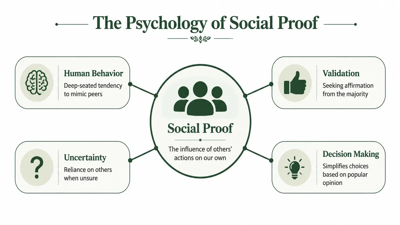
Uncertainty drives the need for proof
When people already know what they want, social proof has less work to do. When they're unsure, it becomes far more influential. A first-time buyer choosing between similar products wants evidence that the option in front of them is credible, common, and low risk.
This is why social proof tends to work best around moments of hesitation. It doesn't create demand from nothing. It resolves doubt that's blocking action.
For a wider behavioural lens, exploring the psychology of persuasion is useful because it helps frame social proof as one influence mechanism among several, not a standalone trick.
Similarity and authority matter more than volume alone
Not all crowd signals carry the same weight. Visitors respond more strongly when the proof feels relevant to them. Someone in the UK shopping for a considered purchase may trust a verified recent review more than a broad popularity claim. A business buyer may care more about recognisable client logos or sector-specific endorsements than a flood of generic ratings.
That's the key distinction many teams miss. The visitor isn't asking whether anyone likes the product. They're asking whether people like them trust it.
A few reliable forms of proof tend to do the heavy lifting:
- Peer validation: Reviews, ratings, and testimonials reduce perceived risk.
- Behavioural validation: Live views, recent purchases, or basket activity suggest current demand.
- Authority validation: Expert endorsement, accreditation, or recognisable brand associations signal competence.
Social proof is strongest when it removes uncertainty without making the message feel staged.
When it backfires
Social proof isn't a universal conversion layer you should paste onto every page. UK-facing guidance has highlighted a more important question: whether social proof messaging should be deployed selectively rather than assumed to work everywhere. The UK's CMA has warned that misleading popularity prompts can distort decisions, which is why placement and wording need evidence rather than assumption, as noted in guidance on social proof personalisation.
There are practical cases where it can hurt performance:
- High-consideration products: Shoppers may want technical reassurance, not crowd cues.
- Privacy-sensitive audiences: Overly specific purchase popups can feel invasive.
- Overused interfaces: Repetitive nudges trigger banner blindness.
- Thin credibility: If the message looks fabricated, trust drops instead of rising.
The lesson is simple. Social proof works through trust. If execution damages trust, the tactic collapses.
Key Types of Social Proof Messaging and Examples
Social proof messaging gets treated as one tactic, but it's really a family of tactics. The right variant depends on what the visitor needs at that moment. Some need reassurance that others have bought. Some need proof that the brand is credible. Some need a final nudge that the product is in active demand.
In the UK, credibility is the dividing line. Shoppers are increasingly wary of fake reviews, which makes generic claims such as “1000 happy customers” weaker than proof built around recency, relevance, and authenticity, as discussed in this breakdown of social proof marketing examples.
Use the proof type that matches the objection
If the objection is “Can I trust this product?”, reviews and verified ratings make sense. If the objection is “Is this item popular right now?”, real-time activity is better. If the objection is “Can I trust this company?”, logos, certifications, or expert validation are stronger.
That's why a single site often needs several proof formats, not one universal widget.
| Type of Proof | Best For | Copy Example |
|---|---|---|
| Review snippet | Product pages for unfamiliar items | “Verified buyer: Arrived quickly and the fit was exactly as expected.” |
| Star rating with context | Category pages and PDPs | “Top-rated by verified customers on this range.” |
| Real-time activity | High-intent product views | “Popular right now with shoppers viewing this product.” |
| Recent purchase signal | Add-to-basket moments | “Recently purchased today.” |
| Customer logos | Homepage and B2B landing pages | “Trusted by teams across retail, SaaS, and services.” |
| Expert or regulated validation | High-trust categories | “Reviewed by specialists” or “Verified purchase feedback shown here.” |
| User-generated content | Fashion, beauty, home | “See how customers style and use it.” |
| Bestseller tag | Listing pages | “Bestseller in this collection.” |
The formats that usually perform well
Three categories tend to be the most versatile.
First, review-based proof. This works because it gives a concrete customer voice, especially when tied to a verified purchase signal or a recent date. Short excerpts outperform walls of review text when placed near core decisions.
Second, real-time activity messaging. These are the small nudges that indicate present demand. They're effective when they feel believable and are tied to current shopper behaviour rather than broad claims.
Third, authority proof. This includes client logos, media mentions, accreditations, or expert references. It's especially useful when the visitor is assessing the business, not just the product.
Copy templates worth adapting
A few practical templates can take you further than a plugin's default wording:
- For reviews: “Verified buyer: [specific outcome].”
- For current demand: “Popular right now with shoppers on this page.”
- For category confidence: “Frequently chosen in this range.”
- For authority: “Trusted by teams in [industry or use case].”
- For local relevance: “Recent feedback from UK customers.”
If you need a starting point for popup-style variants, a FOMO popup generator can help you draft options quickly before refining them for your site and audience.
What doesn't work: proof that sounds inflated, anonymous, or detached from the page context.
The strongest message is rarely the loudest one. It's the one the visitor believes.
Strategic Placement on Your Website
Placement decides whether social proof messaging assists the decision or competes with it. A strong message in the wrong place gets ignored. A modest message in the right place can steady a wavering shopper at exactly the right time.
For UK ecommerce, practitioners consistently recommend tying social proof to high-intent moments and using real-time signals near actions such as “Add to Cart”. The same guidance also warns that overlays can damage mobile usability if they obscure tap targets or interrupt the checkout path, as explained in this review of real-time social proof.
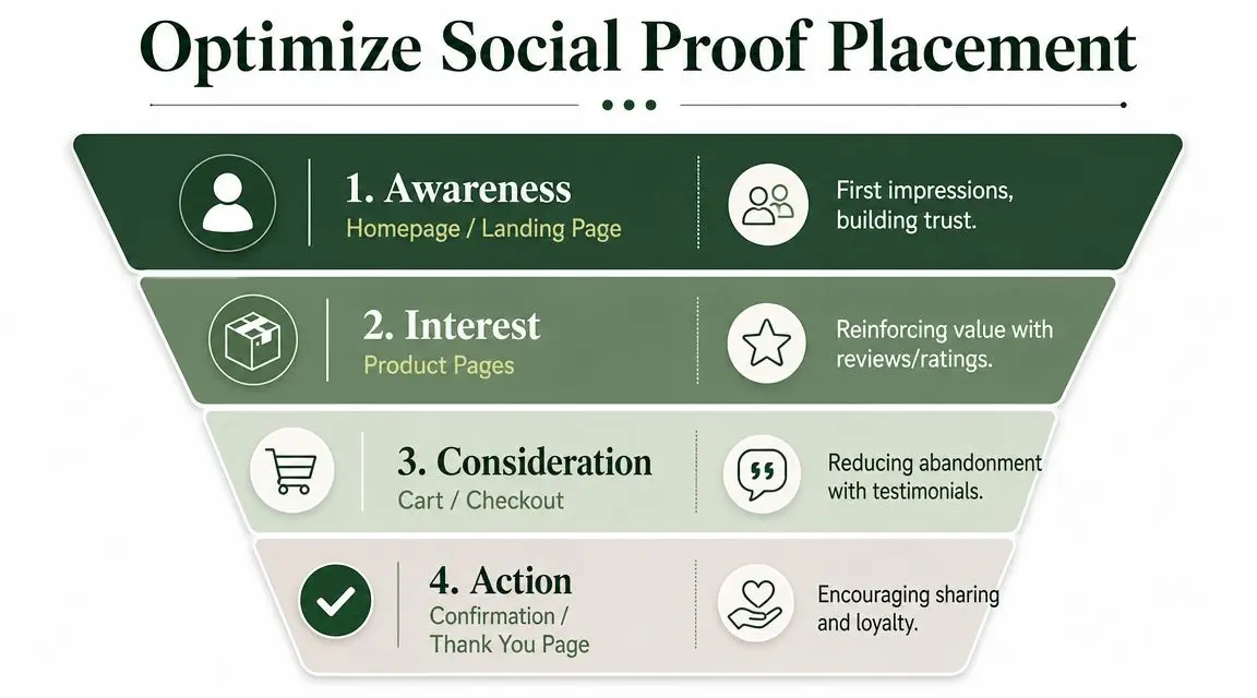
Homepage and landing pages
At the top of the funnel, visitors are deciding whether your brand deserves attention. Here, authority-oriented proof tends to outperform purchase popups.
Use the homepage for signals such as:
- Client or partner logos: Especially useful in B2B and high-trust categories.
- Press mentions or recognisable associations: Good for establishing legitimacy quickly.
- Bestseller labels on featured products: Helps direct attention without interrupting.
Avoid clutter. The homepage shouldn't become a noticeboard of every proof type you own.
Product pages
Product detail pages are where social proof earns most of its keep. This is the place for proof that reduces product-level hesitation.
Good placements include:
- Adjacent to the CTA: Real-time demand messaging, short review snippets, or trust cues.
- Below price or variant selectors: Reinforces confidence once the user starts configuring the item.
- Near reviews summary: Helps bridge scanning behaviour into deeper evaluation.
The common mistake is turning the page into a stack of competing nudges. If the user sees a review badge, a countdown, a popup, a sticky bar, and a low-stock label all at once, none of them feel trustworthy.
Put your highest-value proof next to the highest-friction decision.
Basket and checkout
By basket stage, the shopper has already shown intent. They don't need another popularity pitch. They need reassurance that checkout is safe, sensible, and worth completing.
That changes what belongs here:
- Short testimonials about delivery or product satisfaction can reduce final doubt.
- Trust signals such as payment reassurance or verified review references work well when kept subtle.
- Cross-sell proof can work, but only if it doesn't derail completion.
A noisy popup on checkout often does more harm than good. If users are trying to complete a purchase, every extra layer is another chance to distract them.
Mobile changes the rules
Desktop gives you space. Mobile punishes excess.
On smaller screens, social proof should feel integrated into the page flow, not layered on top of it. Floating notifications, slide-ins, and sticky elements can all interfere with taps, variant selection, or payment progression if they're handled carelessly.
The simplest mobile rule is also the most useful: if a proof element blocks an action, it's not helping conversion.
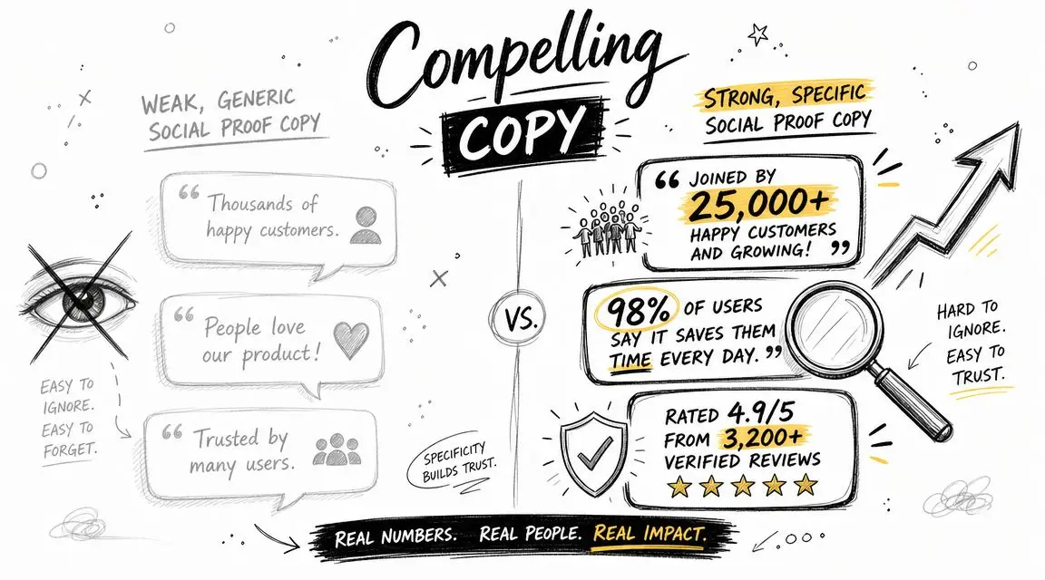
Writing Compelling Social Proof Copy
A lot of social proof underperforms because the copy is lazy. The message may be technically true, but it's too broad to influence anyone. “Popular product” and “customers love this” don't answer a real question in the visitor's mind.
What moves performance is copy with specificity, recency, and relevance.
Expert guidance on real-time social proof makes this distinction clearly. Messages such as “X people viewed this in the last hour” or “Y bought today” are stronger than static review copy because they communicate recency and specificity, which helps reduce purchase anxiety and makes scarcity cues feel more believable, according to Monetate's guidance on social proof.
Weak copy versus strong copy
Compare these side by side.
-
Weak: “Customers love this”
-
Stronger: “Recently purchased today”
-
Weak: “Popular with shoppers”
-
Stronger: “Viewed recently by shoppers on this product page”
-
Weak: “Highly rated”
-
Stronger: “Verified buyer: easy to set up and arrived quickly”
The stronger versions work because they imply evidence. They feel anchored in something observable.
The three traits that make copy believable
The first is recency. Old proof often feels stale, even when it's positive. Shoppers want signs that demand or satisfaction is current.
The second is specificity. Vague praise sounds like marketing. Concrete phrasing sounds like reporting.
The third is relevance. If the proof reflects the product, the category, or the buyer's likely concern, it lands harder.
A practical way to improve weak copy is to rewrite it using this filter:
- What happened
- Who did it
- When did it happen
- Why does it matter here
If the line can't answer at least two of those, it's probably too generic.
For drafting and iterating testable variants, a headline generator for message ideas is useful as a starting tool, especially when you need several options with different tones or levels of specificity.
A short explainer on message framing can also help teams align on copy direction before testing:
Copy should sound observed, not advertised
The best social proof copy doesn't read like a slogan. It reads like a factual cue surfaced at the right moment.
“This item is getting attention right now” is more persuasive than “Don't miss out”, because it signals demand instead of shouting urgency.
That difference matters. Visitors are good at spotting language that exists only to push them. If your proof feels like pressure, they'll resist it. If it feels like relevant context, they'll use it.
Measuring and A/B Testing Your Messaging
Many organizations can launch social proof messaging quickly. Far fewer can say which version improved the business metric they care about.
That's the line between implementation and optimisation. If you don't test the message, the placement, and the trigger conditions, you're decorating the funnel and hoping for the best.

Start with one hypothesis, not five ideas at once
A clean test begins with a single claim you can evaluate. For example:
- Placement hypothesis: Moving a recent-purchase message closer to the CTA will increase completed purchases.
- Copy hypothesis: A real-time message will outperform a generic popularity label.
- Design hypothesis: Inline proof will beat a floating notification on mobile.
That focus matters. If you change wording, colour, location, and trigger logic all at once, you won't know what caused the result.
Teams that want to go beyond simple A/B tests often benefit from understanding how MVT drives business growth, especially when several interacting page elements may shape the outcome. But for most social proof messaging experiments, starting with a disciplined A/B test is the cleaner move.
Measure the metric that matters
A common reporting mistake is celebrating engagement on the message itself. More clicks on a popup or more attention on a badge doesn't necessarily mean more money.
Track outcomes closer to commercial impact:
- Completed purchases if the page sits near transaction.
- Revenue per variant if average basket value may shift.
- Add-to-basket rate when testing earlier-stage PDP interventions.
- Checkout completion for basket and checkout proof.
If a message increases interaction but lowers purchase completion, it's not a winner.
A practical testing workflow
A straightforward process works well:
- Choose one page type: Don't spread the experiment across homepage, PDP, and checkout at the same time.
- Create a control: This is the current experience with no new proof element, or the existing version.
- Build one variant: Change one meaningful factor.
- Segment carefully: Device type often matters, especially for mobile overlays.
- Run long enough to observe stable behaviour: Don't stop because one day looked promising.
- Review downstream effects: Watch for signs that added friction offset any trust gain.
When planning the queue, it helps to use a framework for deciding what to A/B test so teams prioritise ideas by likely business impact rather than internal preference.
One tool option for running the test
If you need a lightweight way to run this kind of experiment, Otter A/B is one option. It supports traffic splitting, variant setup, and goal tracking for outcomes such as conversions, purchases, average order value, and revenue per variant, which is useful when social proof changes buyer behaviour in ways that aren't visible through click metrics alone.
Test social proof the same way you'd test pricing copy or checkout design. It can help, hurt, or do nothing. The site decides, not the brainstorming session.
The core discipline is simple. Treat social proof messaging as a measurable intervention. If it adds trust without adding friction, keep it. If it gets attention but slows action, remove it.
From Guesswork to Data-Driven Growth
Social proof messaging works when it feels credible, appears at the right moment, and supports the action the visitor is already considering. It fails when teams treat it as a universal overlay that belongs everywhere.
The practical path is narrower and better. Choose the proof type that matches the objection. Place it where doubt is highest. Write copy that sounds observed rather than inflated. Then test whether it improves the result that matters.
That approach becomes even more important on platforms where teams move fast and assumptions pile up. If you work in ecommerce, especially on Shopify, this broader guide to mastering conversion for Shopify is a useful companion because it places tactics like social proof inside a wider CRO system instead of treating them as isolated hacks.
Social proof shouldn't be guesswork. It should be a controlled input into conversion performance.
If you want to test social proof messaging without turning your site into a development project, Otter A/B gives teams a practical way to compare variants, measure conversion and revenue impact, and decide which message improves performance.
Ready to start testing?
Set up your first A/B test in under 5 minutes. No credit card required.