Optimize Conversion Funnel Ecommerce: A 2026 Guide
Unlock growth with our 2026 guide on conversion funnel ecommerce. Learn stages, key metrics, and A/B testing to fix drop-offs and boost revenue.
Most ecommerce teams look for gains at the checkout. That's often too late.
A better place to start is the gap between devices. In a UK benchmark based on the Office for National Statistics e-commerce measurement using InternetSales, mobile shoppers convert at 1.2% while desktop users convert at 1.9%, which means desktop performs about 58% better on a relative basis, as cited by Crazy Egg's summary of the ONS benchmark. That single comparison changes how you should think about a conversion funnel ecommerce programme. You're not managing one funnel. You're managing multiple journeys with different friction points, different user behaviour, and different failure modes.
That matters because the biggest leaks often sit before checkout. A shopper can lose confidence on the product page, hesitate when delivery isn't clear, or leave when the payment choice doesn't match expectations. If you only optimise button colours and form fields, you'll miss the more expensive problem.
Why Your Ecommerce Funnel Is Leaking Revenue
A conversion funnel ecommerce analysis is just a structured way to answer one question: where are shoppers dropping out before they buy?
Most new ecommerce managers look at total site conversion rate and stop there. That number is useful, but it hides the mechanism. It doesn't tell you whether the issue starts with poor traffic quality, weak product pages, delivery anxiety, or checkout friction. It only tells you the outcome.
The practical value of funnel work is diagnosis. You split the journey into stages, track movement between them, and find the precise handoff where intent breaks.
One funnel number hides multiple problems
If your mobile traffic is healthy but orders lag, the problem might not be “conversion” in the abstract. It could be mobile-specific friction such as cramped layouts, weak CTA visibility, unclear shipping messaging, or a payment flow that feels cumbersome on a small screen.
Desktop and mobile visitors also behave differently. Desktop users are often better positioned to compare products, read details, and complete multi-step forms. Mobile users are faster, more distracted, and less tolerant of ambiguity.
Practical rule: Don't ask “What is our conversion rate?” Ask “Where does each audience stop moving?”
That shift changes how teams prioritise work. Instead of debating homepage copy or chasing broad redesigns, you start with leak detection. Which stage is underperforming. Which device is suffering. Which page creates hesitation.
Revenue leaks are usually boring
In practice, the most damaging funnel leaks aren't glamorous. They come from things teams postpone because they seem operational rather than strategic:
- Delivery clarity: Shoppers can't tell when the order will arrive or what shipping will cost.
- Returns reassurance: The policy exists, but it's buried, vague, or written like legal copy.
- Payment fit: The checkout offers methods the business prefers, not the customer.
- Page continuity: Product promise, cart messaging, and checkout details don't align.
That's why funnel work is commercially useful. It forces the team to connect UX, merchandising, payments, operations, and analytics into one measurable system.
Mapping Your Ecommerce Conversion Funnel Stages
A clean way to understand the funnel is to think like a shop floor manager.
Awareness is the shop window. Consideration is the customer walking in and browsing. Conversion is the till. Retention is the reason they come back next month instead of buying elsewhere.
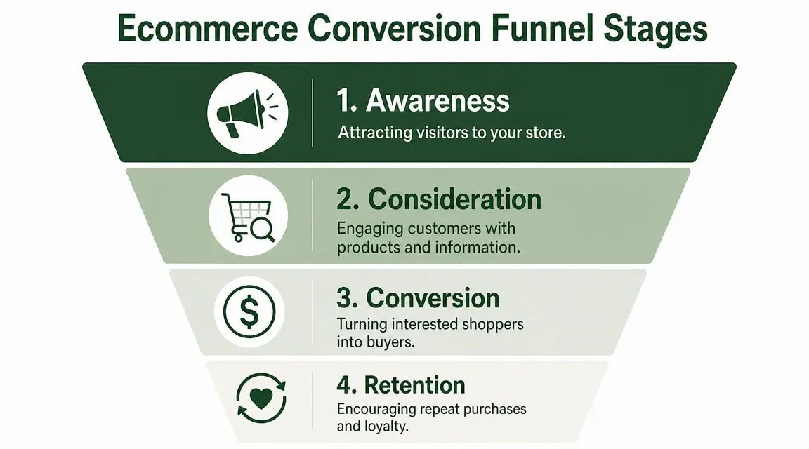
That framing keeps the funnel practical. It's not a slide-deck model. It's a customer journey with observable actions.
Awareness
Shoppers first encounter your brand, which might happen through Google Shopping, paid social, organic search, email, an affiliate mention, or a referral from an existing customer.
At this stage, the task isn't to close the sale immediately. It's to attract the right visitor with the right expectation. If the ad promises one thing and the landing page shows another, your funnel leak starts before the visitor even sees a product.
Consideration
Now the shopper is browsing. They land on a collection page, open product pages, compare options, zoom into images, scan reviews, and look for signals that the item is worth the price.
This stage usually determines whether your store feels trustworthy enough to continue. Clear product information matters. So do delivery cues, returns messaging, stock visibility, and payment confidence. Teams looking for a broader framing can compare this with an e-commerce sales funnel strategy to see how acquisition and on-site behaviour connect.
A useful exercise is to map this journey visually. These customer journey map examples can help your team identify touchpoints that analytics alone won't explain.
Conversion
This is the point where intent becomes action. The shopper adds to cart, reviews the basket, starts checkout, chooses payment, and confirms the order.
Many teams over-focus here because the leakage is visible. You can see abandoned baskets and incomplete checkouts. But checkout often exposes friction created earlier. If the first clear mention of delivery cost appears in the basket, the problem didn't begin in checkout. It began on the product page.
The cart often reveals objections that the product page failed to answer.
Retention
The funnel doesn't end at purchase. If the order arrives late, return instructions are awkward, or post-purchase communication is poor, the first sale may still be unprofitable in the long run.
Retention work includes repeat purchase behaviour, review generation, email reactivation, and loyalty mechanics. It also feeds the top of the funnel because satisfied customers refer others and lower future acquisition pressure.
The Key Metrics for Each Funnel Stage
A funnel is only useful if each stage has a metric tied to behaviour. Otherwise, teams end up arguing from screenshots, opinions, and isolated anecdotes.
You don't need a giant dashboard. You need a short set of metrics that tell you whether shoppers are progressing, hesitating, or leaving.
The metrics that matter
| Funnel Stage | Key Metric | What It Tells You |
|---|---|---|
| Awareness | Landing page sessions | Whether your acquisition channels are bringing visitors into the store experience |
| Awareness | Bounce behaviour on landing pages | Whether the first page matches visitor intent and sets a credible expectation |
| Consideration | Product page views | Whether visitors are engaging beyond the first click |
| Consideration | Add-to-cart rate | Whether product pages create enough confidence and urgency to move forward |
| Consideration | Exit rate on product pages | Whether shoppers are losing interest or hitting unanswered objections |
| Conversion | Cart-to-checkout progression | Whether basket pages support continued intent or introduce doubt |
| Conversion | Checkout completion rate | Whether payment, form flow, and trust signals support order completion |
| Conversion | Conversion rate | Whether the full purchase path is turning visits into orders |
| Retention | Repeat purchase behaviour | Whether the first order experience supports future revenue |
| Retention | Email re-engagement and customer return visits | Whether customers stay active after purchase |
How to read the pattern, not just the number
A strong metric in one stage and a weak metric in the next is where diagnosis starts.
If product page traffic is healthy but add-to-cart rate is weak, the issue usually sits in the offer presentation. Look at imagery, benefit clarity, delivery messaging, trust cues, and variant selection friction.
If add-to-cart activity looks healthy but progression to checkout is poor, the basket page is the likely leak. Common culprits include surprise costs, promo code distraction, poor mobile layout, or uncertainty about returns.
If checkout starts are healthy but completions lag, inspect payment options, form length, input errors, address flow, and confidence signals. That's where direct friction often becomes visible.
Use analytics to isolate the handoff
The best setups track the exact step where movement stops. In GA4, that usually means building a journey around key ecommerce events and then segmenting by device, source, landing page, and customer type.
If your team needs a cleaner implementation process, this guide to conversion tracking with Google Analytics is a practical reference for structuring the basics without overcomplicating reporting.
What to watch: Don't judge a page by traffic alone. Judge it by whether it advances the next action.
That's the core discipline in conversion funnel ecommerce work. Every metric should answer a movement question. Did the shopper continue, stall, or leave?
Diagnosing Leaks and Common Drop-Off Points
The default assumption in ecommerce is that checkout is where conversion is won or lost. Sometimes that's true. Often it isn't.
In the UK market, friction frequently appears earlier. Adobe's guidance on ecommerce funnel optimisation notes that unclear delivery costs, complex returns policies, and a lack of locally preferred payment options are major reasons shoppers abandon early in the journey. That means a visitor can decide not to buy long before they ever reach the checkout form.
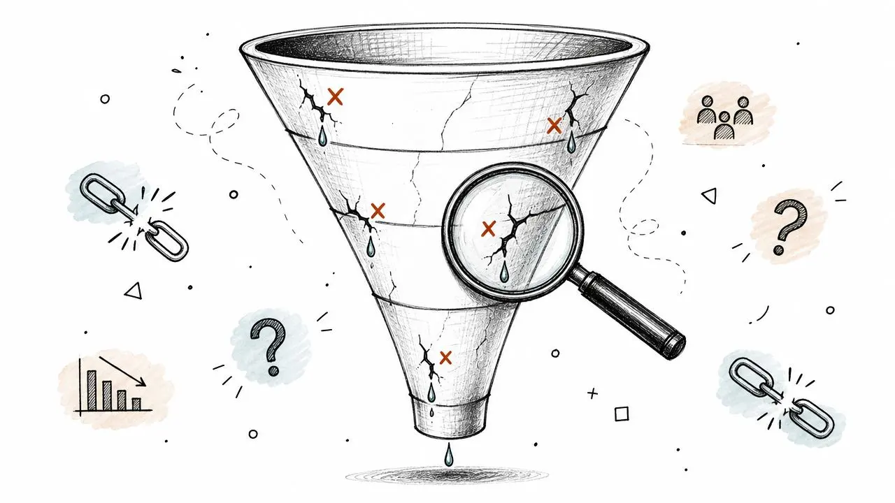
Pre-checkout leaks are usually trust leaks
When a product page leaves out delivery timing, shoppers start estimating risk. When returns are hard to find, they assume hassle. When the payment options feel limited, they question whether checkout will work the way they expect.
None of those issues look dramatic in a design review. All of them hurt progression.
Typical symptoms include:
- High product page exits: Interest exists, but confidence doesn't.
- Strong cart creation with weak checkout starts: The basket reveals costs or conditions too late.
- Mobile hesitation on key pages: The information may be present, but not visible enough where users need it.
- Repeated visits without purchase: Shoppers keep researching because the store hasn't resolved a practical objection.
What checkout leaks still look like
Checkout leaks still matter. They're just not the only game in town.
A checkout problem usually looks like this: shoppers begin the process, then stall on shipping selection, payment step, or form completion. Session recordings and error logs help here because they show where people get stuck, backtrack, or abandon.
This walkthrough is a useful reminder of how to inspect funnel friction with a critical eye:
Start with the biggest leak, not the most visible one
A lot of teams optimise the page they personally dislike most. That's rarely the right move.
Review your funnel in sequence and look for the largest behavioural break. If users never add to cart, don't start by redesigning checkout. If basket progression collapses when delivery is shown, test delivery presentation before rewriting form labels.
Find the earliest high-friction point. Fixing a later step won't recover users who already left.
Prioritised Optimisation Tactics for Funnel Leaks
Once you've found the leak, match the fix to the behaviour. Don't roll out generic “best practices” across the whole site. Most of them dilute focus and muddy your testing roadmap.
If product pages aren't moving shoppers forward
When traffic reaches product detail pages but progression is weak, improve the decision surface.
Start with the fundamentals:
- Stronger product communication: Lead with benefits shoppers can act on, not internal feature language.
- Better visual proof: Product images should remove uncertainty, not just look polished.
- Visible reassurance: Reviews, delivery details, returns summary, and payment cues need to sit near decision points.
- Cleaner option selection: Variant pickers, sizing, and availability should feel obvious on mobile.
If you run Shopify and want page-level ideas worth reviewing, this resource on how to Maximize Shopify conversions is useful because it stays close to merchandising reality rather than abstract CRO theory.
If the basket is where intent fades
A weak basket-to-checkout transition usually means the cart is introducing doubt.
Common fixes include:
- Show delivery information earlier and again in the basket. If shoppers only discover key shipping details after adding items, the surprise feels like a penalty.
- Reduce promo code distraction. A prominent discount box often tells users to leave and search for codes.
- Summarise returns clearly. One short line can do more than a hidden footer link.
- Keep totals understandable. If users need to interpret fees, they pause.
If the issue is payment confidence
Payment friction is often framed as a technical problem. It's usually a trust and expectation problem.
Make sure the payment methods shown on product pages, cart pages, and checkout are consistent. If locally preferred options matter to your audience, surface them before the final step. If trust badges are used, place them where they answer anxiety rather than decorating the page.
If mobile users struggle more than desktop users
Mobile optimisation needs more than responsive layout checks.
Audit the buying path manually on a real phone. Can shoppers see delivery details without hunting? Is the CTA fixed or easy to reach? Do accordion sections hide critical reassurance? Does the keypad switch correctly for fields like postcode and phone number? Are payment buttons obvious enough to reduce typing?
Good mobile UX doesn't feel compressed. It feels prioritised.
How to prioritise what to test first
Use a simple decision filter:
- Impact: Will this change affect a stage with meaningful drop-off?
- Confidence: Do analytics and user behaviour both point to the same issue?
- Ease: Can the team ship and measure the change without a long dependency chain?
That usually leads to smarter first tests than homepage redesigns or brand refreshes. In many stores, the highest-value work is small and operational. Shipping copy on the product page. Returns reassurance near the CTA. Payment visibility before checkout. Those changes aren't flashy, but they often remove the hesitation that blocks revenue.
Validate Your Changes with A/B Testing
Implementing a change without testing it is how teams turn opinions into permanent site decisions.
A redesign can look better and still perform worse. A new payment message can reduce confusion for one audience and create noise for another. A delivery banner can improve confidence on desktop while crowding the CTA on mobile. That's why A/B testing sits at the centre of serious conversion funnel ecommerce work.
A simple test example
Suppose your analysis suggests shoppers hesitate because delivery information is too hidden on the product page.
Your test could look like this:
- Hypothesis: Showing a concise delivery and returns summary near the add-to-cart button will increase progression because it reduces uncertainty before checkout.
- Control: Current product page layout.
- Variant: Product page with delivery timing, returns summary, and accepted payment icons positioned near the primary CTA.
- Primary metric: Add-to-cart rate.
- Secondary metrics: Cart-to-checkout progression, completed purchases, and device split.
This is a better test than “let's make the page cleaner” because it isolates a specific behavioural hypothesis.
What good test design looks like
Keep one principle in mind. Test the reason, not just the element.
Bad tests compare random cosmetic changes. Good tests compare competing answers to a real objection. If users worry about delivery, test delivery clarity. If they hesitate on payment, test payment visibility or ordering. If social proof is thin, test review placement or format.
A useful extension for brands that rely on creator-led product trust is to source stronger visual proof through tools like the JoinBrands creator platform, then test how that content performs on product pages versus standard brand assets.
Avoid the common testing mistakes
Three mistakes show up constantly:
- Changing too much at once: You won't know which element caused the result.
- Ending tests on instinct: Teams often call winners early because the variation “looks ahead”.
- Ignoring sample planning: If the test can't collect enough data, the result won't support a decision.
If your team needs help planning test volume, use this practical guide on how to calculate sample size before launch. It helps prevent the most common problem in experimentation: running a test that never had enough signal to begin with.
A/B testing isn't about proving your idea was smart. It's about learning whether customers behaved differently when the page changed.
That discipline is what separates optimisation from redesign churn.
Your Continuous Funnel Optimisation Checklist
Strong funnel management is repetitive by design. You map behaviour, find a leak, test a fix, keep the winner, and start again.
Use this checklist as your operating routine:
- Map the actual funnel: Define the key steps from landing page to repeat purchase.
- Track stage movement: Make sure each stage has a metric tied to shopper behaviour, not vanity reporting.
- Segment before diagnosing: Review by device, landing page type, channel, and customer type.
- Find the earliest important leak: Don't default to checkout if the problem begins on product or cart pages.
- Write one testable hypothesis: Tie the proposed change to a specific objection or friction point.
- Run an A/B test: Compare the existing experience against one meaningful variation.
- Judge the outcome commercially: Look past clicks. Check whether the change improved progression and purchase behaviour.
- Document and repeat: Winning tests should become part of how the team works, not isolated victories.
The biggest mindset shift is this: a conversion funnel ecommerce programme isn't a one-off project. It's an operating habit. Teams that improve consistently don't chase random ideas. They build a loop around evidence, prioritisation, and validation.
If you want a faster way to run that loop, Otter A/B helps ecommerce teams test headlines, CTAs, layouts, and funnel fixes without slowing the site down. It's a lightweight A/B testing platform built for quick setup, clear reporting, and revenue-focused decisions, so you can prove which changes improve your funnel before rolling them out.
Ready to start testing?
Set up your first A/B test in under 5 minutes. No credit card required.