A/B Test Result Reporting: The Complete Playbook
Master A/B test result reporting with this step-by-step guide. Learn to choose metrics, interpret significance, and build clear reports stakeholders trust.

You've run an experiment, the dashboard shows a difference, and the team is waiting for an answer. Instead, you're staring at a spreadsheet full of visits, conversions, confidence intervals, and notes that don't yet explain what anyone should do next. That gap is where useful experiments lose momentum.
Good test result reporting turns raw observations into a decision. It preserves statistical discipline, but it also gives each stakeholder the context, visual clarity, and next step they need. The report should answer four practical questions: what happened, how certain are we, why might it have happened, and what should we do now?
From Experiment to Actionable Insight
A well-designed experiment can still fail after the data is collected. I've seen teams run a clean headline test, reach a clear directional result, and then present it as a table with two conversion rates and a p-value. The meeting ends with “interesting”, which usually means nobody owns the implementation.
The problem isn't always the analysis. It's the missing narrative. A decision-maker needs to know whether the result is reliable, what changed in the user experience, which business outcome it affects, and whether the recommendation is to ship, continue testing, or stop.
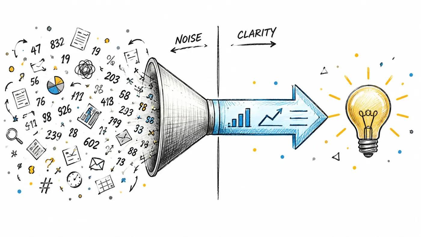
Start with the decision
Build the report around the decision, not around the analytics interface. A useful opening might say:
Recommendation: Implement the new checkout call to action because it produced more completed purchases without a concerning movement in the agreed guardrail metrics.
That sentence is only credible if the report then shows the evidence and its limitations. It also gives the audience a reason to read the detail instead of forcing them to infer the conclusion from a crowded chart.
A practical reporting sequence is:
- State the decision. Say whether the team should ship, keep testing, investigate, or revert.
- Describe the change. Explain what users saw in the control and variant.
- Show the primary outcome. Use the agreed denominator and make the comparison easy to scan.
- Explain uncertainty. Include the relevant significance result, confidence interval, and test limitations.
- Assign the next action. Name the owner, implementation step, and follow-up measurement.
The Otter A/B guide to reading experiment results is useful when analysts and non-analysts need a shared way to interpret a results screen. For teams testing organic pages rather than only interface changes, Crescade's guide to SEO split testing adds helpful context around experiment design and search-focused evaluation.
Make the narrative traceable
A persuasive report isn't a sales pitch. It should let a sceptical reader move from recommendation back to the underlying evidence without hunting through several tools. Keep the original hypothesis, audience definition, exposure rules, start and stop conditions, exclusions, and analysis date alongside the result.
Avoid language such as “the new version clearly resonates” unless the evidence supports a specific behavioural interpretation. Prefer: “The variant generated more completed checkouts among exposed users, and the result met the pre-agreed decision rule.” That wording is less dramatic, but it's easier to defend and act on.
Choosing Metrics and Interpreting Significance
The report can't rescue a poorly chosen metric. Before interpreting a result, confirm that the measurement answers the question the experiment was designed to test.
Select the measurement hierarchy
Choose one primary metric before launch. For a purchase journey, that might be completed purchase rate. For onboarding, it could be activation. The primary metric should represent the decision you'll make, not the event that happens to move most visibly.
Use secondary metrics to explain the path to the outcome. Click-through rate can show whether a message attracted attention, while revenue per visitor or average order value can reveal whether additional clicks translated into commercial value. Guardrails, such as error events or unsubscribe behaviour, help detect harm that a single conversion metric could hide.
The denominator matters. A conversion rate calculated from exposed users answers a different question from one calculated using all visitors, including people who never qualified for the experience. Define the eligible population, exposure event, conversion window, and treatment assignment before opening the results.
Read uncertainty without hiding behind jargon
A confidence threshold is a decision convention, not a guarantee that a variant is universally better. A result can meet a threshold and still have a practical effect too small to justify engineering effort. Conversely, a promising directional result may need more evidence before the team commits.
Write the interpretation in plain English:
- Direction: Which variant produced the stronger result?
- Magnitude: How large is the observed difference in the chosen metric?
- Precision: How wide is the confidence interval around that difference?
- Decision rule: What level of evidence did the team agree to use?
- Practical value: Would the result matter enough to justify implementation?
Don't repeatedly check the dashboard and stop the test the moment a favourable number appears. That behaviour inflates the risk of treating noise as a winner. Decide the stopping rule in advance, account for the intended test duration and traffic pattern, and document any deviation.
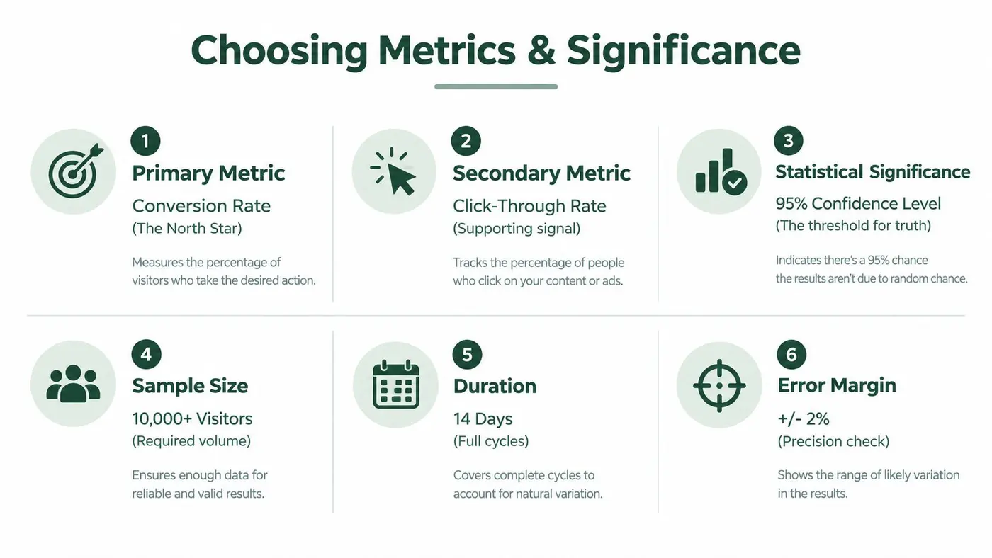
For a deeper explanation of the underlying concepts, the A/B testing statistical significance article is a useful reference for the report appendix or team onboarding. The main report should still translate the statistical output into a decision statement that a product manager, marketer, or engineer can understand.
Check the result before writing it up
Review the instrumentation, assignment logic, exposure count, missing events, duplicate conversions, and unusual traffic sources. Segment checks should diagnose a plausible mechanism, not provide a menu of subgroups from which to select the most flattering result.
If the primary outcome is inconclusive, say so. “No reliable difference detected” is a valid result. It may support keeping the current experience, refining the hypothesis, or running a better-controlled follow-up. Calling an inconclusive test a win teaches the organisation to distrust its own reporting.
Visualising Data and Writing Recommendations
A report's visual design should reduce interpretation time. The reader should see the primary outcome first, understand the comparison quickly, and find supporting detail without navigating a maze of charts.
Use a compact results block near the top. Include the control and variant labels, primary metric, absolute values, relative difference where appropriate, uncertainty, and decision status. A simple bar chart can work for a binary conversion outcome, while a line chart helps reveal whether performance changed sharply after launch or drifted across the test period.
| Element | Purpose |
|---|---|
| Primary metric card | Makes the decision outcome immediately visible |
| Variant comparison | Shows the control and treatment side by side |
| Confidence interval | Communicates precision around the observed difference |
| Trend chart | Reveals timing, instability, or unusual movement |
| Guardrail panel | Surfaces potential negative effects |
| Recommendation block | Converts evidence into an owned action |
Use visual hierarchy deliberately
Give the primary metric the strongest visual weight. Use a restrained colour system, label the control consistently, and avoid decorative 3D effects or dense legends. If the chart requires a long explanation before anyone can interpret it, simplify the chart.
Tables are valuable when stakeholders need exact values. Charts are valuable when they need to compare direction and scale. Use both only when they serve different purposes. A table that repeats every number already shown in a chart adds clutter rather than confidence.
Write the recommendation as an operating instruction
“Variant B won” is not a recommendation. It describes an outcome but leaves the business decision unresolved. A stronger summary identifies the change, audience, evidence, action, and caveat:
Decision: Ship the revised product-page layout to the tested audience. The primary purchase outcome favoured the variant, while the report found no approved guardrail requiring a rollback. Monitor post-release performance because an experiment result doesn't remove implementation risk.
The executive summary guidance for experiment analysis can help standardise this opening. Keep technical detail available below the summary, not in place of it. Executives usually need the consequence and confidence. Practitioners need the method, definitions, and diagnostics. A good report serves both without making either audience decode the other's language.
Tailoring Reports for Stakeholders
One report rarely works equally well for every reader. The same result has different implications for a growth marketer choosing the next hypothesis, an engineer estimating implementation work, and an executive deciding whether the result deserves investment.

Give each audience the right layer
For executives, lead with the business outcome, decision, risk, and owner. Don't open with the test method unless the method changes how much confidence they should place in the conclusion.
For growth teams, include the hypothesis, audience, behavioural interpretation, and follow-up ideas. They need to know whether the result supports a broader principle or only a narrow design change. A useful report distinguishes observed evidence from the next hypothesis, so speculation doesn't become presented as fact.
Product managers need product impact and trade-offs. Explain which stage of the journey changed, what users may experience after rollout, and whether the result affects adoption, retention, revenue, or support workload.
Engineers need implementation detail. Include exposure conditions, variant configuration, event names, edge cases, rollback requirements, dependencies, and the exact point at which the experiment can be removed. A statistically convincing result can still create operational risk if the report omits how the change will be shipped.
Keep one source of truth
Tailoring doesn't mean creating conflicting versions of the result. Store one canonical analysis with a shared metric definition and evidence trail, then adapt the summary, ordering, and depth for each audience. If a stakeholder asks a different question, add a clearly labelled view rather than changing the denominator or decision rule.
The video below offers a practical visual reference for teams reviewing experiment results together.
A useful test is whether each reader can answer three questions after scanning the report: what did we learn, why should I care, and what do I need to do? If the engineering reader can't find rollback guidance or the executive reader can't identify the decision, the report needs another pass.
Automating and Sharing Reports Efficiently
Manual reporting creates avoidable delay. Analysts copy figures between dashboards, rewrite the same explanation, forget a stakeholder, and introduce transcription errors. Automation won't fix a bad experiment, but it can make a sound process repeatable.
Build a reliable reporting flow
Start with the data contract. Define the event names, metric formulas, audience rules, ownership, and reporting cadence. Then connect the experiment platform to the destinations where decisions happen, such as email, Slack, a project tracker, or a shared knowledge base.
A practical workflow looks like this:
- Capture: Record exposures, conversions, revenue events, and exclusions in a consistent schema.
- Validate: Check that events arrive, variants receive the intended traffic, and the primary metric remains stable under review.
- Summarise: Generate a plain-English status such as ship, keep testing, investigate, or stop.
- Notify: Send milestone alerts to the channel responsible for the next action.
- Archive: Save the final report, decision, owner, and implementation date in a searchable location.
A lightweight platform such as Otter A/B can present a plain-English result summary, expose conversion and commercial outcome measures, export CSV or PDF results, and schedule report emails. That makes it suitable for teams that want an efficient reporting layer without building a bespoke analytics workflow.

Share access without losing control
Client and partner reporting needs more than a forwarded screenshot. Use brandable, password-protected reports where sensitive experiment details are involved, and make sure recipients can see the test scope, result status, and date of analysis.
For organisations combining product feedback with broader business dashboards, Formbricks BI features provide a useful comparison point when deciding how much reporting should live in an experimentation tool and how much belongs in a wider business-intelligence layer.
Automated delivery still needs human ownership. Assign someone to review failed data checks, explain unexpected alerts, and close the loop when a recommendation is implemented. A scheduled email that nobody acts on is only automated noise.
Common Pitfalls and Templates for Success
Weak reports usually fail through process, not mathematics. The most damaging habits are easy to recognise: changing the primary metric after seeing the data, stopping when the result looks favourable, treating every secondary metric as a discovery, and presenting a small or incomplete sample as a firm conclusion.
Protect the analysis from motivated reasoning
P-hacking can appear as repeated dashboard checking, selective date ranges, unplanned segments, or multiple outcome comparisons followed by emphasis on the most favourable one. Prevent it by recording the hypothesis, primary metric, audience, stopping rule, and intended analysis before the test runs.
Small samples create wide uncertainty and unstable patterns. Don't compensate by using confident language. Report the limitation, explain what evidence is missing, and decide whether a follow-up test is worthwhile.
Secondary metrics are diagnostic signals, not automatic winners. A higher click-through rate may coexist with no improvement in completed purchases. A change in average order value may reflect a small number of transactions rather than a dependable shift. Keep the primary decision anchored to the metric chosen before launch.
Watch the reporting handoffs
The NHS provides a useful operational precedent for thinking about reporting as a lifecycle rather than a final number. In England's NHS Test and Trace reporting, 94.8% of pillar 1 test results were made available within 24 hours of the laboratory receiving the test, while 93.8% of in-person test results were returned the next day after the test was taken, according to the government's NHS Test and Trace reporting. The lesson for experimentation is not to copy a clinical service target. It's to distinguish internal processing from end-to-end communication.
UK pathology guidance also describes reporting as a controlled process involving validation, authorisation, standardised release, identification, and routing. A UK laboratory quality guidance document notes that a primary care audit found no electronic-record evidence that blood-test results had been communicated in 47% of patients, illustrating how a correct result can still fail operationally when communication isn't recorded.
For experiment teams, the equivalent handoffs are exposure, event capture, analysis, decision, implementation, and post-release monitoring. Timestamp them where possible. Record who approved the conclusion and where the final report lives.
Use a repeatable report template
A practical template should include:
- Decision summary: Ship, keep testing, stop, or investigate.
- Hypothesis: The behaviour or mechanism the experiment was designed to test.
- Scope: Audience, eligibility, exposure conditions, dates, and exclusions.
- Metric definitions: Primary, secondary, guardrail, denominator, and conversion window.
- Results: Control and variant values, observed difference, uncertainty, and status.
- Diagnostics: Instrumentation checks, sample-quality issues, and relevant segments.
- Interpretation: What the data supports, what it doesn't establish, and plausible explanations.
- Recommendation: Action, owner, implementation requirement, and rollback condition.
- Follow-up: Post-release check, next hypothesis, or reason to stop.
- Evidence trail: Dashboard, exported file, analysis version, and decision record.
For teams improving the presentation layer, this UX report example with AI data offers ideas for structuring findings so that evidence and recommendations remain connected. Adapt the format to your experiment type, but keep the decision fields consistent across reports.
A final quality check should ask whether another analyst could reproduce the conclusion, whether a stakeholder knows what happens next, and whether the report clearly separates evidence from interpretation. If the answer is yes, test result reporting becomes part of the experimentation system rather than an administrative task.
Otter A/B helps teams turn experiment data into readable decisions with plain-English result summaries, outcome reporting, exports, scheduled delivery, and shareable reports. Visit Otter A/B to create a test, standardise the reporting workflow, and give stakeholders a clear next action without rebuilding every report by hand.
Stop guessing
Ready to start testing?
Set up your first A/B test in under five minutes. No credit card required.
- 14-day free trial
- No credit card required
- Cancel anytime