Value Proposition to Customer: How to Define and Test It
Learn what a value proposition to customer means, its core elements, and how to test and improve messaging that converts.
Why does a homepage that sounds confident still fail to change what a shopper does?
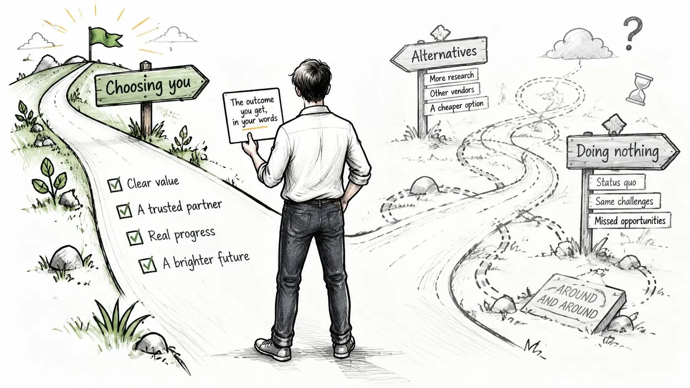
A value proposition to the customer is the specific outcome a buyer gets from choosing you, stated in their terms and set against the alternatives they would otherwise choose, including doing nothing. Many UK shoppers abandon a purchase when shipping, returns, or payment fall short of what they expected. A low price on the page does not repair that gap.
So why do so many homepages still lead with a slogan, a feature list, or a low price? Those lines can sound confident and still leave a shopper unsure what changes if they pick you. The single line in the window is the proposition. If it does not name an outcome, the shopper keeps walking, which is the same as choosing to do nothing.
Heated seats are a feature. Arriving warm on a cold morning, without an extra step, is the outcome. A slogan can be memorable and empty. A mission statement says what the company believes. Neither tells a buyer what they get, compared with the next tab, the high street, or waiting until next week.
Treat that line as a hypothesis about value, judged on completed purchases and revenue rather than clicks. The offer reaches past the sticker price into delivery, returns, trust, and whether the shop is accessible enough for the buyer to finish the job.
What a Customer Value Proposition Really Means
Say a parent is ordering school uniform the week before term. The page shouts "premium quality, unbeatable prices". That is a slogan plus a feature hint. It doesn't say the jumper will arrive in the right size before Monday, or that a wrong size can be exchanged without a fee. The parent is hiring the shop to remove a deadline and a return trip, which is the idea behind how customers hire products. Price is one input. The job is getting a child dressed on time.
UK shoppers already treat the offer as more than the product's price. PayPal's 2024 UK e-Commerce Index, based on 2,047 consumers and 623 businesses, found that 66% of consumers had abandoned a purchase or payment online, often because a card failed or checkout took too long. The same study found 74% were more likely to purchase when retailers offered free and express shipping together with clear returns policies. Among businesses that improved payments, 58% reported gaining new customers and 48% reported increased repeat purchases.
A proposition that only talks about the product is answering a question the shopper has already moved past.
Three questions sort a real claim from a tidy sentence.
- Who is it for? Name the buyer, not "everyone online".
- What changes for them? State the outcome in their words, including speed, risk, or effort.
- Why should they believe it? Point to proof they can check before they pay.
Read your homepage against those three. If one answer is missing, you have a line of copy, not a value proposition to customer you can test.
The Core Elements of a Strong Proposition
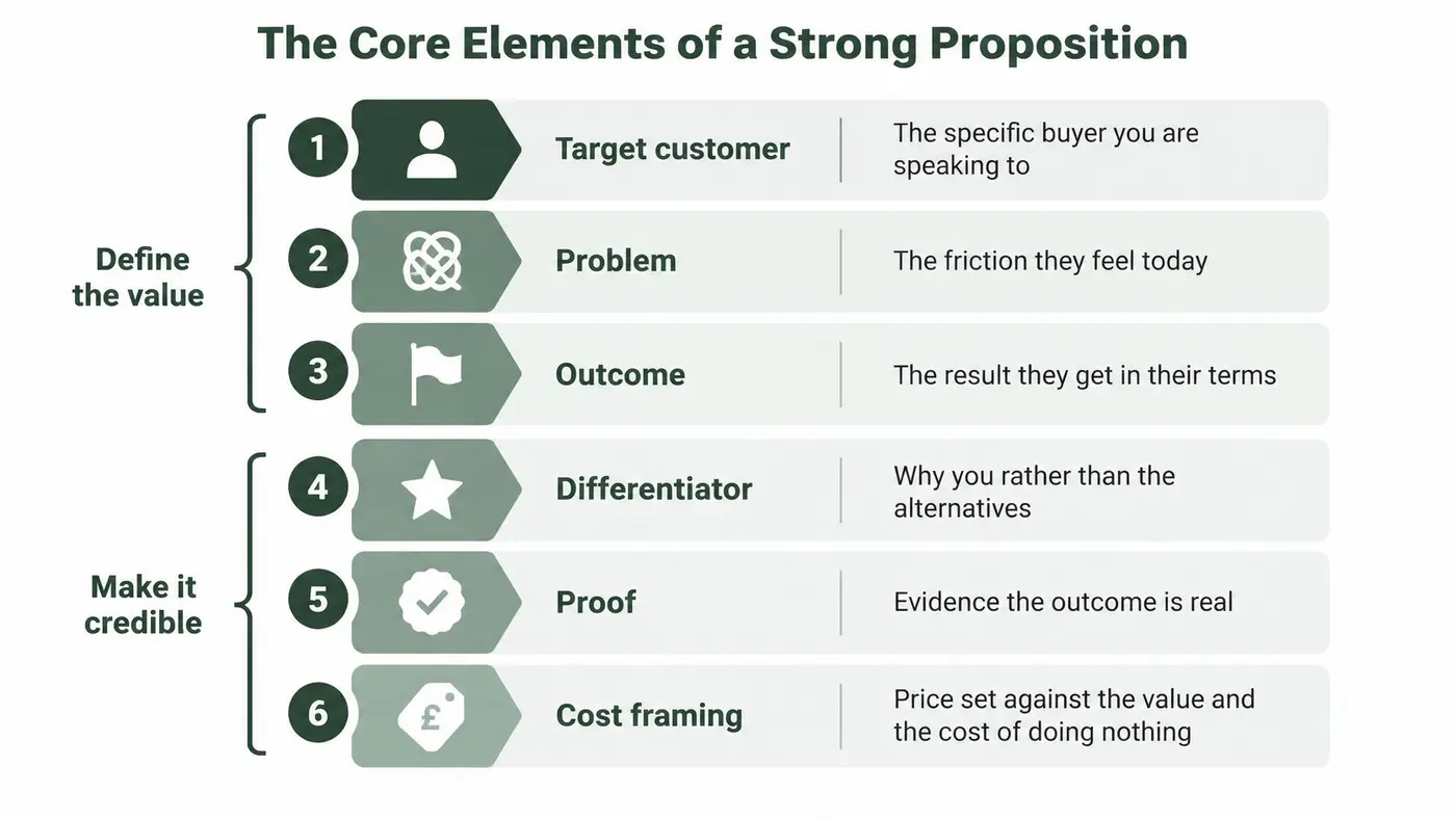
Six elements turn that definition into a sentence you can defend. The first three define the value. The last three make it believable and honest about what the customer gives up. Skip the named customer and the line is generic. Skip the outcome and you are back to a feature list.
How the parts lock together
Target customer, problem, and outcome do the heavy lifting. For those parents, the sentence starts as: the right size, first time, delivered before term starts, with a free exchange if it doesn't fit. That is already stronger than "quality uniform at great prices", because a reader can picture Monday morning.
Differentiator, proof, and cost framing stop the sentence from being a wish. A size guarantee only counts if rivals don't offer the same thing with the same evidence. Verified reviews and a returns policy the parent can open before paying are proof. Showing the price with delivery included answers the quiet question, "what will this cost me?" AmaJova's guide to irresistible offers is a useful companion when you are tightening that trade, because an offer falls apart when the give and the get are vague.
Two mistakes show up on almost every weak page. The first is listing features with no outcome: "organic cotton, eight colours, app tracking" doesn't say the child is dressed on time. The second is claiming a differentiator everyone else claims, such as fast delivery, with nothing behind it.
You usually need target, outcome, and proof before you add the rest. Write one sentence that uses all six, then mark the element you cannot support with evidence. If brand language and the offer are pulling in different directions, it helps to line the claim up with how you talk about the brand in digital marketing, so the homepage and the ads don't promise two different jobs.
Delivery, Returns and Trust as Part of the Offer
The line on a product page is only half the offer. Shoppers judge it against whether the parcel options, the returns desk, and the carrier feel reliable.
DHL's 2025 UK e-commerce research reported that 80% of British shoppers would abandon a purchase if their preferred delivery option were unavailable, and 75% would leave if the returns process did not meet expectations. The same report found that 75% would not buy from a retailer they did not trust to use a reliable delivery and returns provider. A related DHL UK country report found that 69% of UK shoppers had returned an item to an online retailer, and 91% of those who returned products had sent back up to 30% of their purchases. Returns are normal behaviour, not a rare complaint.
Four claims worth testing
Each statistic points at a message you can put in front of a control and judge on completed orders and revenue, not on clicks.
- Free delivery threshold: State the spend that removes the fee on the product page, not only in the basket.
- Delivery-choice messaging: Name the options, such as a pickup point or a named day, where the shopper is still deciding.
- Returns guarantee: Put the window and the cost in one short line near the price.
- Trust signals: Place the carrier or the returns promise beside the add-to-basket button, in the same spirit as social proof messaging that a buyer can verify.
A returns promise only helps if it is visible before checkout and matches what the process actually does. A broken promise damages trust faster than no promise.
The same standard applies off the site. If your delivery or returns wording differs between the shop, ads, and directory listings, shoppers treat the mismatch as a reason to doubt you. It is worth the time to avoid inconsistent startup directory profiles so the public record doesn't contradict the page.
List the three delivery or returns promises your store can keep every time. Check each one against your operation, including cut-off times, who pays postage, and how long a refund takes. If operations can't keep it on a busy Monday, don't put it in the proposition.
Weak and Stronger Proposition Rewrites Side by Side
A homepage line is a bet about why someone should buy. Put two versions of the same product next to each other and the difference is usually this: one version offers a compliment, the other offers a result you could be wrong about. The table below is illustrative, not taken from named brands. Read down the weak column first. Each line could sit on a homepage today and still give a buyer nothing to verify before they pay.
Product type Weak proposition Stronger proposition Value dimension Outdoor jacket Great quality jackets at low prices Waterproof jacket that stays dry on a two-hour commute, with a 30-day return if it does not Quality and risk reduction Accounting software Easy to use and powerful Close your month in one afternoon, without a finance background Time saved Meal kit Fresh, healthy food Five dinners for two in under 30 minutes, skip any week Convenience and flexibility Energy supplier Cheapest tariff around Fixed bill for 12 months, with no exit fee if you move Predictability and cost Online homeware shop Fast delivery Delivered on your chosen day, free returns within 28 days Speed, choice and returnsThree moves that do the work
Swap the adjective for a measurable outcome. "Easy" and "powerful" are compliments, not claims. "Close your month in one afternoon, without a finance background" names a result the buyer can hold against their own calendar. If the books still take a week, the line failed, the same way a recipe fails when dinner is not on the table.
Replace a bare price claim with the total cost and its terms. "Cheapest tariff around" loses the moment a rival is a pound lower. A fixed bill for 12 months, with no exit fee if you move, tells the household what they are really buying: a bill they can plan, and a door they can leave if they relocate.
Replace a generic promise with a time or a risk. "Fast delivery" is a phrase any rival can paste onto a banner. A chosen day, plus free returns within 28 days, is a timetable. The shopper can plan around it, and you can fail in public if the parcel arrives on Thursday instead.
Price is not the whole trade
British adults weigh more than the sticker. Ipsos found that in 2025 price was important to 93% of British adults, quality to 92%, and convenience to 88%. Environmental impact still mattered to 66%, while 50% wanted to act more sustainably but felt unable to afford it.
Price leads that list, and shoppers often move toward discount retailers or cheaper own-brand alternatives when the rest of the offer stays vague. A discount line can still be a poor hypothesis. It may pull the first click, thin the margin, and attract people who leave as soon as a cheaper tab appears. The rewrite earns its place when completed purchases, and the money those orders bring in, hold up.
Pick the value dimension your segment ranks highest: quality, time, convenience, predictability, or risk. Rewrite one weak line around that dimension only. One dimension, one sentence you could be wrong about.
Accessibility and Common Misconceptions to Avoid
Three assumptions keep weak propositions in circulation.
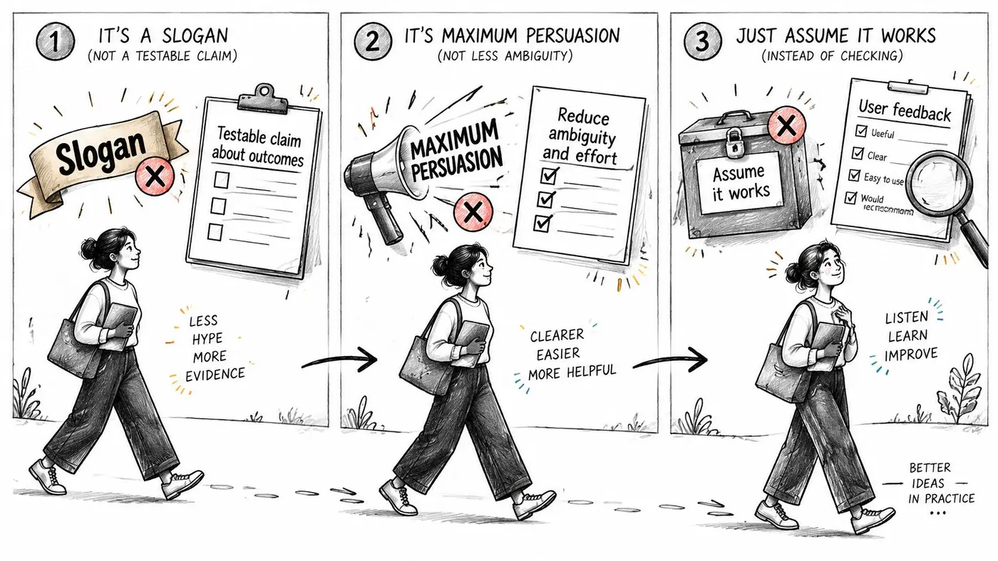
A proposition is not a slogan. A slogan can be catchy and still make no testable claim about an outcome. If you can't say what would count as the promise being kept, you can't learn from it.
Maximum persuasion doesn't always win. Louder urgency and heavier discounts can raise impulsive clicks while completion and trust fall. Cutting ambiguity and effort often produces fewer impulse clicks and more finished, higher-trust journeys. That is a better trade if you are paid on orders, not on taps.
One line doesn't suit every visitor. A parent buying uniform, a commuter buying a jacket, and a household fixing an energy bill are not weighing the same thing. Promoting one segment's reason to the whole site hides the others.
Accessibility is part of the offer
Accessibility is often filed under compliance. For the buyer it is whether the task can be finished. The UK government's 2025 inclusion monitoring report found that only 60% of surveyed services met WCAG 2.0 AA or higher, up from 54% in 2024, and 73% offered at least one listed accessibility tool, up from 65%. A handsome headline still fails someone using a keyboard, a screen reader, magnification, voice input, or a slow connection.
The practical benefits are faster task completion, fewer errors, an easier checkout, compatibility with assistive technology, and more confidence. Variants worth testing include plain-language copy, stated keyboard and screen-reader support, clearer pricing, and captions. Where it is lawful and ethical, measure completion rate, checkout errors, and support contacts by audience, not only the site-wide conversion rate.
Don't write "inclusive" as decoration. If you claim keyboard support or plain pricing, a disabled or older customer should be able to complete the offer without a workaround.
Audit the current line with four checks. Is the outcome specific? Is the proof visible? Could someone finish it with a keyboard or a screen reader? Would an older customer understand the price without a second read? Fail any one and the proposition isn't ready to test as a promise.
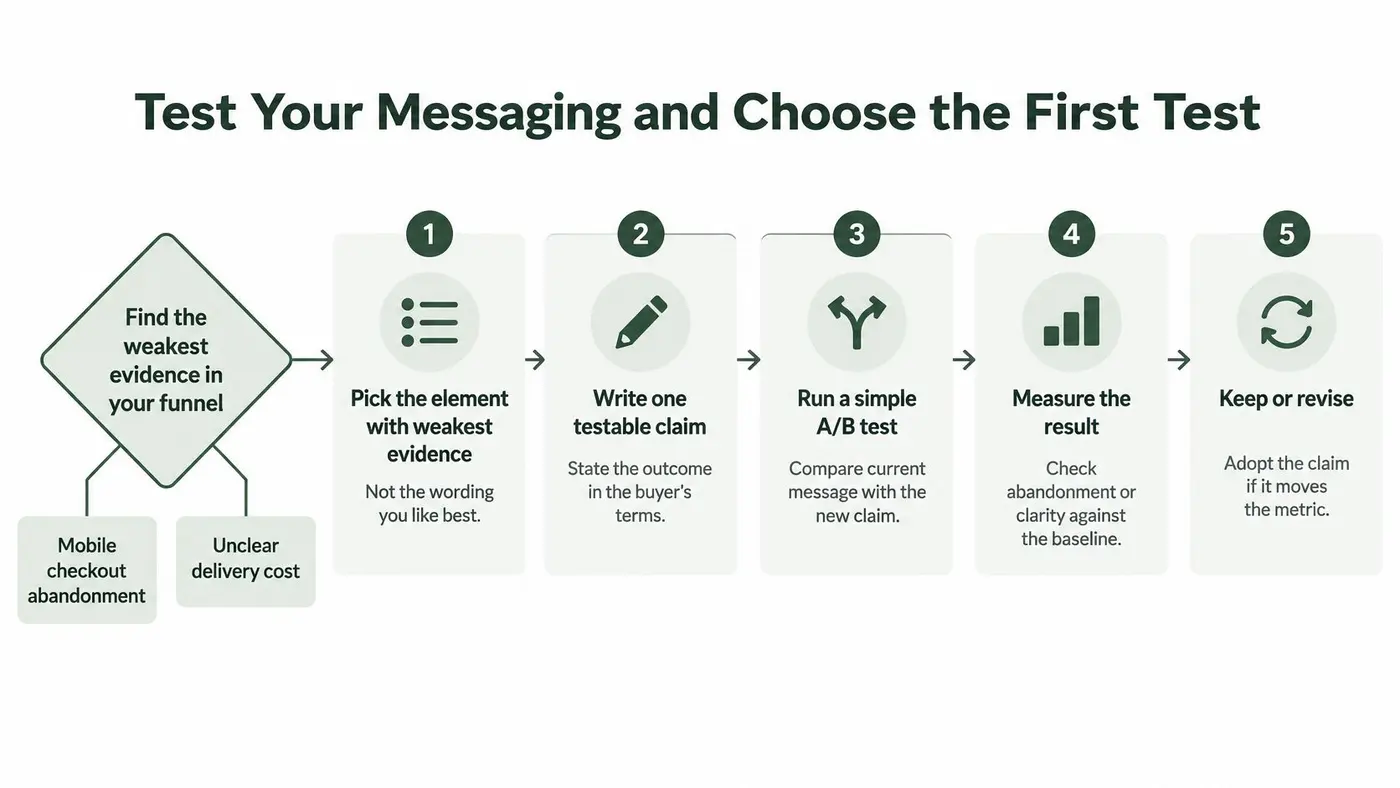
Test Your Messaging and Choose the First Test
Start with the element you cannot evidence, not the sentence you like. Mobile checkout abandonment and an unclear delivery cost are typical weak points. A wording tweak on a healthy desktop page won't tell you much.
A Leeds Beckett University Retail Institute study reports that 74% of UK baskets created in late 2024 did not become completed orders, rising to 76% on mobile versus 67% on computers, with recovery rates below 5%. That device gap is a cause-and-effect hypothesis, not a reason to change the whole site. Because so few abandoned baskets come back, a small rise in completed orders can be worth more than a bump in engagement.
Set the metrics before you write the variant
Metric What it shows Role in the test Completed purchases Whether the proposition turns visitors into buyers Primary goal Revenue per visitor Money earned per visitor in each variant Guardrail and decision metric Average order value Whether the message changes basket size Secondary metric Conversion rate Share of visitors who take the action Secondary metric, checked against revenue Mobile versus desktop completion Whether the proposition works on each device Segment cut Checkout abandonment Share of baskets not completed Diagnostic metricCompleted purchase is the primary goal. Revenue per visitor is the guardrail, so a click-led win can't hide a smaller basket. Conversion rate stays secondary. If it rises and revenue per visitor falls, you don't ship.
Run it in this order
- Write one hypothesis tied to one element. For example, stating the delivery cost before the basket will reduce mobile checkout abandonment.
- Keep a control, and split traffic so each visitor stays on one version. For a visual or split URL test, set purchases or revenue as the primary goal and preview each variant on the store before launch.
- Cut results by device. Ask whether mobile abandonment falls without desktop order value falling.
- Run until you reach 95% significance. Stopping because one variant leads on day two is the usual slip.
- If conversion rises and revenue per visitor falls, the tool should say the metrics disagree rather than declare a winner. Revise the proposition and retest.
- Confirm the uplift holds across mobile operating systems and traffic sources before you widen exposure. Headline changes are a clean first test, and a practical walk-through sits in this guide to headline A/B testing.
Otter A/B is built for that argument. We publish pricing on the site, so you can see the cost without a sales call, and the same test view holds conversion beside revenue instead of forcing a single winner.
A clear result has three parts: a higher completed-purchase rate, no fall in revenue per visitor, and an effect that still shows when you split by device and traffic source. Choose the one test you will run this month and write its hypothesis on a single line.
The short film below walks through how a buyer hears a promise and decides whether it is worth acting on. Use it as a briefing for the team writing the variant, then come back to the hypothesis you just wrote.
Otter A/B is a lightweight A/B testing platform that measures whether a value proposition to customer produces completed purchases, average order value, and revenue per visitor, not just more clicks. You can test headlines, proof, and delivery or returns claims with a control group and a 95% significance read, then ship only what pays. Visit Otter A/B and set up the one hypothesis you chose for this month.
Stop guessing
Ready to start testing?
Set up your first A/B test in under five minutes. No credit card required.
- 14-day free trial
- No credit card required
- Cancel anytime