Web Apps vs Websites: A Practical Decision Framework
Web apps vs websites explained with real trade-offs in performance, SEO, cost and conversion, plus a checklist to pick the right approach for your project.

Most advice about web apps vs websites starts with the wrong question. Teams ask which one is “better”, then ship a hybrid anyway, because the core product has a public acquisition surface, a logged-in task surface, and often a messy middle where the two meet.
That's the useful frame. A website is where people discover, trust, and share. A web app is where they sign in, configure, submit, and return. The mistake is forcing one label onto an architecture that already contains both behaviours.
| Layer | Best fit | What it optimises for |
|---|---|---|
| Public acquisition surface | Website behaviours | Search visibility, sharing, fast content access |
| Logged-in task surface | Web app behaviours | State, workflows, persistence, personalisation |
| Middle layer | Hybrid behaviour | Account continuity, checkout, booking, dashboards |
If you treat the whole product as one thing, you end up measuring it badly. If you split the job by behaviour, you can make sharper decisions about cost, SEO, performance, and conversion. That's the framework worth using.
Why the Web App vs Website Question Is Misleading
The binary framing falls apart the moment you look at how people use products. In UK practice, a website is usually the part that publishes information, while a web app is the part that lets users complete tasks in the browser, such as signing in, submitting forms, or managing data, which is the same distinction used in technical explainers and UK digital guidance around task-based journeys web app vs website overview.
The label hides the architecture
A public homepage, a pricing page, and a help centre are not the same problem as a checkout flow, account dashboard, or booking engine. The first set wants crawlability and easy sharing. The second set wants session state, validation, and reliable interactions.
Practical rule: if the user is mostly reading, you're in website territory. If the user is mostly changing data or completing a sequence of tasks, you're in web app territory.
That's why the same product can be both. A SaaS company can run a marketing site for acquisition and a logged-in application for the work itself. A marketplace can expose listings publicly, then move buyers and sellers into authenticated flows when the transaction begins.
The useful question isn't “site or app”. It's “which behaviours belong in which layer, and what do we pay when we move them?”. That answer affects search, analytics, engineering scope, and how you test the funnel.
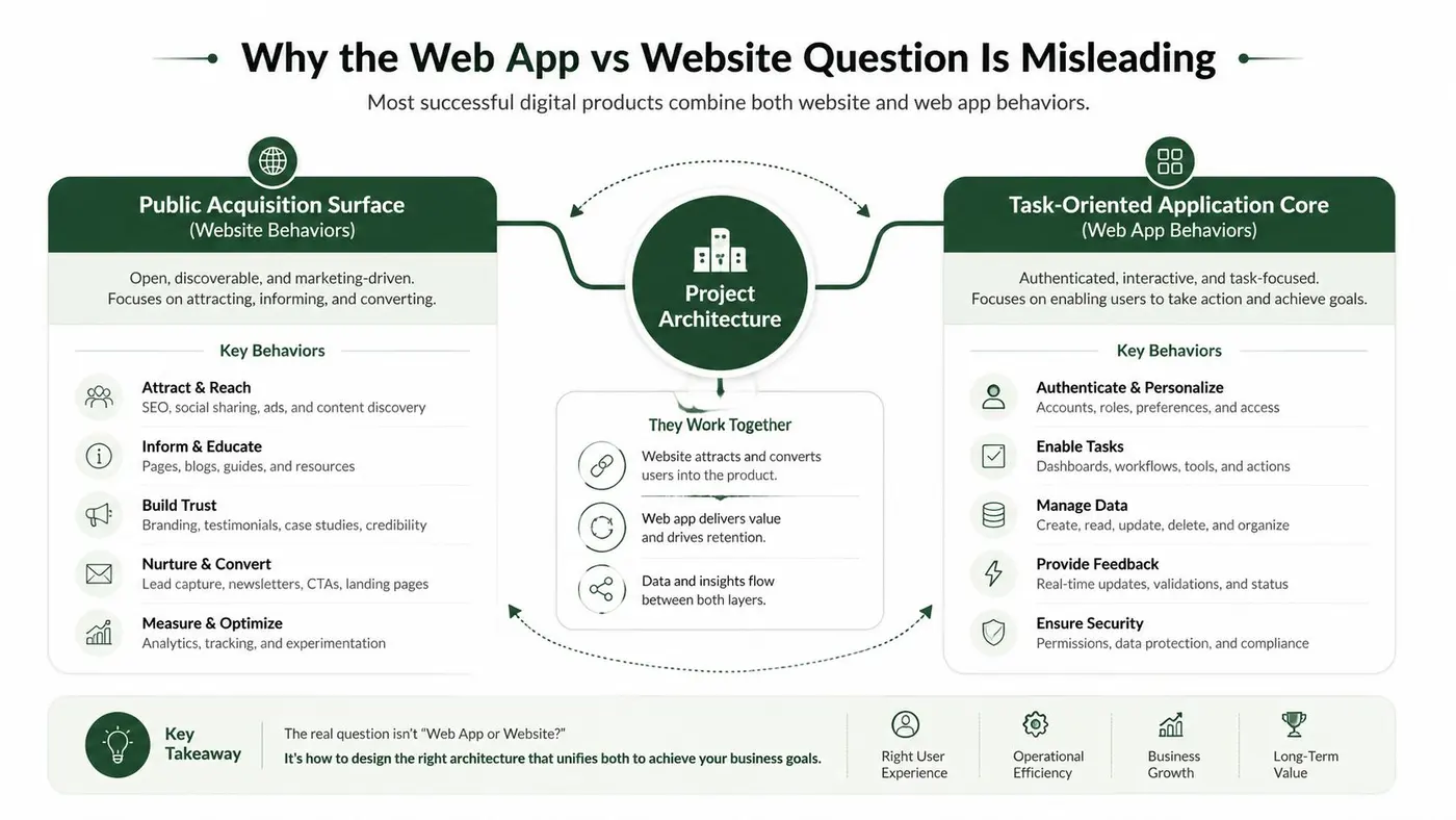
Defining Websites and Web Apps by User Behaviour
Definitions make sense when they follow user intent, not developer pride. A website delivers and organises information across pages. A web app is browser-based software designed around task completion, which means the user is not just consuming content, they're actively driving a workflow.
Websites publish, web apps process
The practical split is simple. If the user lands, reads, compares, and leaves, you're building a website experience. If the user lands, signs in, configures something, submits data, or tracks progress over time, you're building a web application experience.
That maps well to UK public-sector thinking, where digital teams have long been pushed towards task-based journeys rather than brochure-style pages task-based journey framing. The point is not that content doesn't matter. It's that content is only the entrance when the service itself lives behind it.
A good hybrid example is a public marketing site wrapped around a logged-in portal. The marketing site handles discovery, proof, and intent. The portal handles the actual service delivery. Calling that whole thing “just a website” undersells the engineering, and calling it “just a web app” ignores the acquisition layer that makes the app usable in the first place.
Clear boundary: content pages are for orientation, authenticated screens are for action.
That boundary matters because it tells you what to optimise. Public pages should be readable, indexable, and fast to scan. App surfaces should be resilient, stateful, and designed for repeat use. Mixing those goals blindly creates bloated pages that are bad at both jobs.
Technical Differences Side by Side
The technical distinction is less about frameworks and more about which runtime dominates. A website can get by with mostly server-rendered pages and modest client-side enhancement. A web app usually needs a stronger client runtime, persistent state, and a build pipeline that treats the browser more like an application shell than a document viewer.
Rendering and state change the shape of the build
On the website side, server-side rendering, static generation, and light hydration are common because they keep the first view simple and discoverable. On the web app side, client-side rendering and heavier hydration often appear because the UI must respond to user input without full-page reloads. That changes how you think about caching, bundle size, and navigation.
A Next.js marketing site and a React dashboard can live in the same company, but they do not want the same defaults. The marketing site should privilege initial render and shareability. The dashboard should privilege interaction speed, state continuity, and resilience under repeated use.
Routing, auth and hosting are different decisions
Routing is another giveaway. Websites often map cleanly to URL paths that correspond to pages and content sections. Web apps need routes that reflect workflows, nested state, permissions, and user-specific views. The path is not just a page address, it's part of the product model.
Authentication draws a harder line. Websites can often delay sign-in or avoid it altogether. Web apps usually need an auth boundary because the interface changes once the system knows who the user is. That has knock-on effects on hosting, session handling, deployment, and how you test failures.
| Axis | Website pattern | Web app pattern |
|---|---|---|
| Rendering | Server-rendered or mostly static pages | Client-heavy UI with hydration or SPA behaviour |
| State | Minimal or transient | Persistent, user-specific, workflow-driven |
| Routing | Page and content oriented | Workflow and permission oriented |
| Authentication | Optional or delayed | Core part of the product boundary |
| Hosting | CDN-friendly, content-first | App hosting with stronger backend dependency |
| Build pipeline | Simpler publishing flow | More aggressive bundling and deployment discipline |
The warning sign is simple. If your team starts debating session stores, route guards, and state persistence more than content structure, you're already past website thinking.
Performance, Core Web Vitals and the Cost of Interactivity
Interactivity is not free, and the closer a product gets to app behaviour, the more it has to be measured like one. For UK teams, the sensible baseline still runs through Google's Core Web Vitals, where LCP under 2.5 seconds, INP under 200 ms, and CLS under 0.1 are the accepted “good” thresholds. TTFB under 800 ms is considered good, and optimised cached responses often land in the 200-500 ms range Core Web Vitals thresholds.
What breaks first when the UI gets heavier
Perceived speed usually fails first. Large JavaScript bundles delay render, add input lag, and make the interface feel sticky even when the backend is healthy. Once the client does more work, the browser has more to parse, execute, and reconcile before the user sees a responsive screen.
Backend timing is the next bottleneck. On a content site, caching can hide slow origin responses for a while. In a web app, users keep poking the system, so backend and database latency surface directly in the interface. Page-load averages miss that problem.
Measure the system, not the landing page
If the product has app-like flows, test read and write paths, step-load and spike-load patterns, and track processor and memory usage alongside response time. That is the right way to benchmark transactional systems under bursts of traffic performance benchmark guidance. A marketing page can survive on shallow monitoring. A transactional product cannot.
For a clearer link between performance work and user experience, the site speed and UX insights piece from UPQODE is a useful companion. It helps teams connect speed work to how people use the interface instead of treating metrics as a scoreboard.
A web app that feels fast in staging but lags under real input is not fast. It is under-tested.
If you are deciding whether something has crossed into app territory, instrument the parts users feel. Track first input and interaction timing, server response time, database query latency, JavaScript payload weight, and stress behaviour under repeated user actions. For a practical explanation of the delay between a tap and the first response, the internal note on First Input Delay guidance is the right place to start. If you cannot measure these signals, you are not ready to call it an app.
PWAs and Where They Actually Close the Gap
Progressive Web Apps get oversold because people treat them like a universal middle ground. They're not. They close the gap in specific places, and they're only worth the complexity when those places matter to the business.
The features that change the experience
The features that matter are the ones users feel. Installable entry from the home screen changes repeat access. An offline shell changes reliability in poor connectivity. Push notifications change re-engagement. Those are real experience shifts, not checkbox items.
A PWA makes the most sense when your product needs app-like retention but you don't want to maintain separate native codebases. It also helps when you want a single browser-delivered product that behaves more like software than a static site. That's a real advantage for content-heavy products that still need strong repeat usage.
Don't use PWA language to hide product indecision
A PWA does not magically fix a weak product model. If the user doesn't need repeated access, background sync, or mobile-style re-entry, you're probably adding complexity for little gain. If the experience is mostly discovery, content reading, or one-off conversion, a traditional website is usually the cleaner choice.
The business case for app-like behaviour is stronger when attention lives in native apps, because cited UK-facing benchmarks say smartphone users spend about 4 hours per day on the internet, with 88% of that time in apps and only a small share in browsers. The same benchmark also says app users view 286% more products per session and overall app conversion rates are 157% higher than mobile websites mobile apps vs mobile websites. That doesn't mean every site should become a PWA. It means app-style interaction is where user attention often already is.
Rule of thumb. Use PWA features when repeat use, offline tolerance, and re-engagement are core to the product. Skip them when the public site's job is discovery, lead capture, or SEO-driven acquisition.
Business Trade-offs in Cost, SEO and Conversion
The choice is not really “web app or website.” It is where you draw the boundary between public discovery and transactional work. Push too much application logic into the public layer and you raise build cost, maintenance overhead, and measurement complexity. Keep that boundary clear, and you get a cleaner site that still drives conversions where it counts.
Cost and SEO pull in opposite directions
Public pages should live on the website side of the architecture. They need to be crawlable, easy to link to, and simple to share. That is how people find you through search, compare options, and come back from a shared link.
Transactional flows belong on the app side because they rely on state and personalisation. That usually means more infrastructure, more QA, and more operational discipline. The mistake is making the discovery layer carry the same complexity as the workflow layer.
If you are deciding how much marketing work belongs on a public page, start with marketing on a website. That is the right place to pressure-test whether your pages are doing enough to move users before they ever reach the app.
Conversion wins come from the boundary, not the label
The productive question is where interactivity helps. A homepage can stay mostly static. A pricing page may benefit from configurators, calculators, or comparison tools. A checkout flow may need richer application behaviour. Each layer has a different cost, and each can move a different metric.
That is why strong teams test the boundary instead of debating labels. Run an A/B test on a pricing page, onboarding step, or booking flow, then measure whether the more interactive version produces better qualified leads, more completed tasks, or fewer drop-offs. If you are planning that test, how to calculate sample size is the place to start before you change a high-traffic page.
Opinionated take: if extra interactivity does not improve a business metric, keep it off the public page.
Consent and tracking get harder as the client side gets richer. Personalisation, experimentation, and more browser-side behaviour all require a clearer setup for what runs in the page and why. That matters in practice because it affects how cleanly you can measure conversion, how much risk you take on with tracking, and how easy it is to explain the setup to legal and analytics teams.
A Practical Decision Checklist With an A/B Testing Example
Stop asking whether the product is a website or a web app in the abstract. Decide what the page has to do, then decide how much interactivity belongs in each layer.
Use four questions.
- Primary user intent: are people mainly reading, or are they completing a task?
- State requirement: does the experience need saved progress, persistent user data, or session continuity?
- Growth channel: does organic search drive most discovery, or do users arrive after they already know the product?
- Team capacity: can your team support the extra engineering, testing, and monitoring that a richer app surface needs?
If the answers lean toward reading and acquisition, keep the public layer simple and fast. If they lean toward task completion and repeat use, invest in the app layer. If they split across both, separate the layers by job, not by branding.
A strong public site does one job well, it turns visitors into qualified prospects. That is why Quikly's guide to high-converting sites is worth reading before you decide whether a page needs less friction or more interaction.
The cleanest way to settle the argument is an A/B test on a real business page. A SaaS team can keep one pricing page as a static marketing layout and test a second version with an interactive configurator. The question is not which version looks more modern. The question is which version produces better qualified leads, more completed tasks, or fewer drop-offs without hurting page experience.
Start the test with the right sample size, otherwise you will argue from noise instead of user behaviour. If you are setting up that experiment, how to calculate sample size for an A/B test should be the first step before you touch a high-traffic page.
The practical rule is simple. Add interactivity only where it improves conversion, qualification, or retention. Keep the rest of the surface light, legible, and easy to measure.
Migration Paths and Hybrid Architectures That Actually Work
Teams do not get a clean slate. They have a live site, existing traffic, and an app to ship without breaking search or sessions. The safest path is to ship the public site first, then layer the app behind it.
The patterns that hold up are boring in the best way. A static marketing site can link into a separate authenticated app. A single Next.js codebase can render different shells for public and logged-in routes. A micro-frontend can embed the app inside a broader marketing surface when the organisation needs stronger separation without losing continuity.
The first rule is simple. Don't sacrifice the public layer while you're making the app richer. The second rule is just as important. Keep session and analytics continuity intact, or you'll lose the ability to tell whether the migration helped.
Use lightweight experimentation on each step rather than launching blind. Validate the public-to-app handoff, then validate the logged-in experience, then validate the conversion boundary. That way you're not arguing over architecture in the abstract, you're reading the behaviour of real users in the product you shipped.
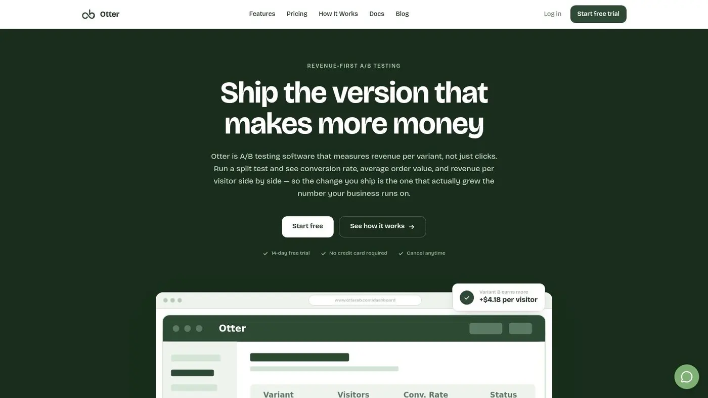
If you're deciding where the website ends and the web app begins, use Otter A/B to test the boundary instead of debating it in a roadmap meeting. It's built for fast experiments on headlines, CTAs, and layouts, so you can see whether a more interactive page or a simpler one wins. Visit Otter A/B and start measuring the conversion impact of your architecture choices.
Stop guessing
Ready to start testing?
Set up your first A/B test in under five minutes. No credit card required.
- 14-day free trial
- No credit card required
- Cancel anytime