Web Optimised Images: A UK Guide to Formats and Speed
Learn how to make web optimised images smaller and faster: formats, compression, responsive sizing, lazy loading and Core Web Vitals impact.

A 2025 sample of six UK cultural organisation homepages reported an average page weight of 12.9 MB, with individual pages ranging from 2.7 MB to 51.6 MB, according to Arts Professional's report on reducing digital carbon footprints. That spread is rarely caused by code alone. It's usually caused by photographs published at print size, cropped by the browser, and compressed only if someone remembers.
Web optimised images aren't the smallest files you can produce. They're the smallest files that still do their job for every visitor, including someone zooming in on a product, using a screen reader, or loading your page on a patchy mobile connection. If compression removes the detail a shopper needs to decide, you've saved bytes and lost the sale. Optimise for successful decisions first, then for speed.
Web Optimised Image Settings at a Glance
Format Best for Typical saving versus JPEG Watch out for JPEG Photographs with smooth gradients Reference (0%) Lossy, no transparency, visible artefacts at high compression PNG Screenshots and flat graphics needing transparency Larger than JPEG for photographs Heavy for photographs; use only when lossless or transparency is needed WebP Most photographs and general images About 25–35% smaller Keep a JPEG or PNG fallback for very old clients AVIF Photographs where the smallest file matters most Often more than 50% smaller Slower to encode and less universally supported, so keep a fallback SVG Logos, icons, diagrams and charts Size follows path complexity, not pixel dimensions Not suitable for photographs; sanitise any embedded scriptsRead the saving column as a comparison against an equivalent JPEG, not as a promise for every file. A guide to image compression for the web notes that WebP typically reduces photographic image payloads by approximately 25–35% compared with equivalent JPEG files, while AVIF can reduce them further, often by more than 50% compared with JPEG, although AVIF encoding is slower and browser support is less universal. The same guide reports that the median mobile homepage transfers about 911 KB of images, making images the largest major resource category in the page payload.
How to Read the Table Without Misusing It
JPEG remains your reference file because everything can display it. You'll still need it as a fallback, even if most visitors never download it. PNG looks safe because it's lossless, but that safety is expensive for photographs. Use it when you need crisp edges, flat colour, or transparency, and not as a default for product photography.
WebP is the sensible default for most photographs and general images. AVIF goes further when file size matters most and your pipeline can tolerate slower encoding. SVG works differently because it stores shapes rather than pixels, so a logo or chart stays sharp when someone magnifies the page. Don't force a photograph into SVG, and don't rasterise a simple logo into a large PNG if a clean vector exists.
The practical pattern is a <picture> element with AVIF first, WebP second, and a JPEG or PNG fallback, combined with srcset and sizes. That order gives capable browsers the smallest suitable file while older clients still get an image. A format swap on its own isn't enough.
A modern format can't remove pixels the screen never shows.
Resizing comes before encoding. If a product card renders at 400 pixels wide, serving a 2,400 pixel AVIF still wastes transfer, however efficient the codec is. Preserve the original master, generate breakpoint specific derivatives from it, and encode those derivatives automatically.
Apply three checks to any page today. First, does each image use the format that suits its content? Second, is there a fallback for clients that can't use AVIF or WebP? Third, does the file's pixel width match the size it's displayed at, allowing sensibly for high density screens? If the third answer is no, fix sizing before you debate quality settings.
Why Image Weight Decides Your Page Speed
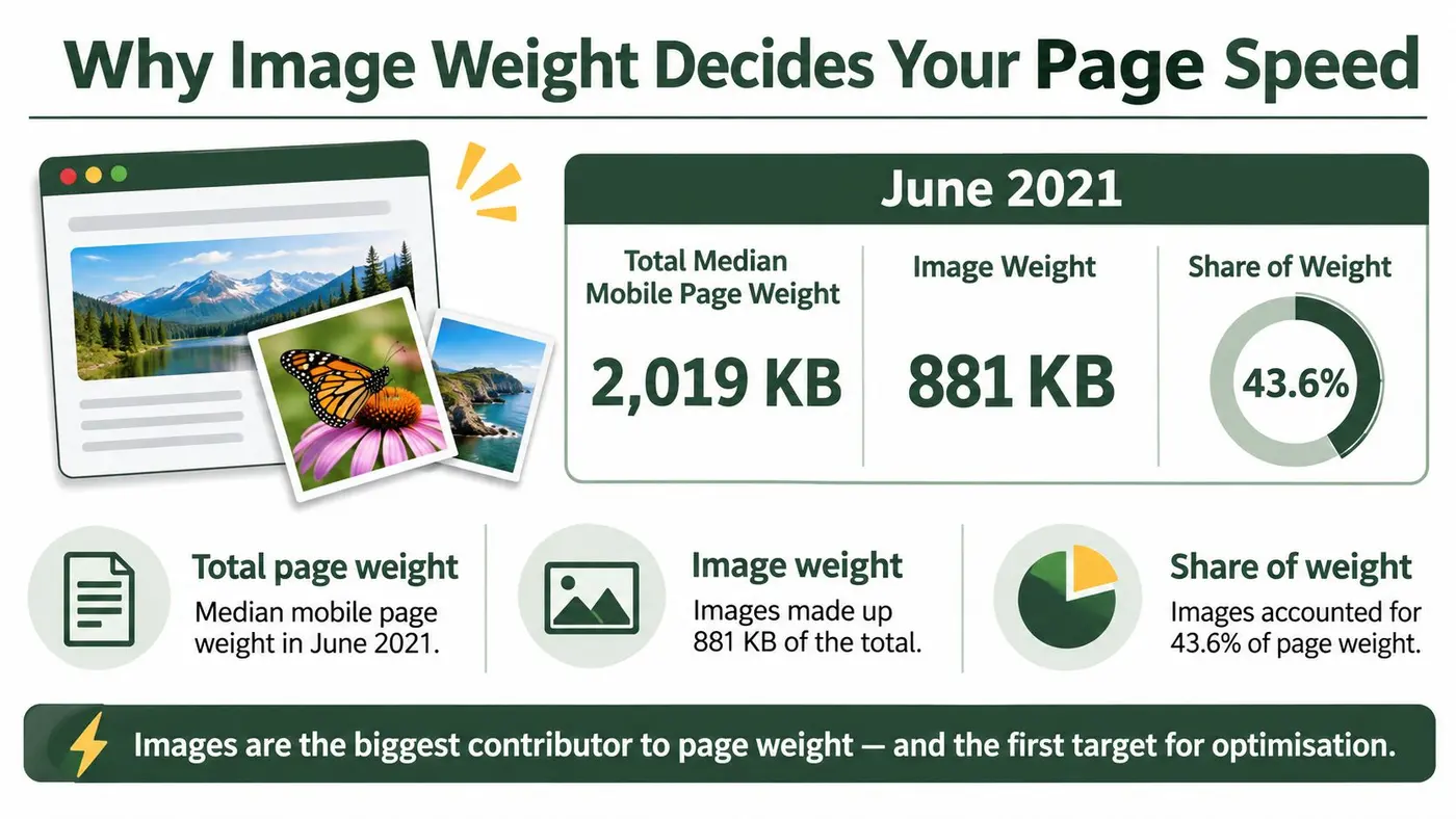
The HTTP Archive's 2022 Web Almanac media chapter reported that in June 2021 the median mobile webpage weighed 2,019 KB in total, of which 881 KB, approximately 43.6%, were images. Those images alone exceeded the combined 660 KB total for HTML at 30 KB, CSS at 72 KB, JavaScript at 461 KB, and fonts at 97 KB. Images were also the most impactful resource on 70% of mobile pages and 80% of desktop pages.
Think of a parcel that's far bigger than its contents. The courier still has to carry all the packaging before anyone can unwrap what's inside. A browser faces the same problem. It can't finish rendering a large visible image until the bytes arrive and the device decodes them, and that wait grows on slower connections and less powerful phones.
Where the Waste Hides
Most pages in that analysis contained at least one image larger than 100 KB, while the heaviest 10% of pages had at least one image approaching 1 MB or more, according to the same Almanac chapter. Responsive markup creates another quiet leak. Approximately one quarter of desktop pages loaded more than 83 KB of unnecessary image data because of incorrect sizes attributes, and 10% of desktop pages using sizes loaded more than 500 KB of excess image data.
Those figures come from a global dataset, not a UK only sample, so don't present them as a measurement of your own audience. Use them as a baseline. Open your highest traffic template, total its image transfer, and compare the image share with 43.6%. If images account for half your page, further shaving a small stylesheet won't change how the page feels.
- Measure image bytes separately: Page weight alone hides which resource type is driving the wait.
- Sort images by transferred size: The largest few files usually reveal incorrect dimensions, not a subtle compression problem.
-
Check
sizesagainst the layout: A value copied from another template can make the browser choose a file far wider than the slot. - Repeat the measurement after releases: Learn how to monitor website performance over time so a new campaign banner doesn't undo earlier work.
Start where the bytes are. For most UK sites, that means the hero, product media, and any image uploaded directly from a camera or design tool without a resizing step.
How to Size and Compress Images Step by Step
Work in this order: master, dimensions, derivatives, formats, compression, then layout space. Reversing the order creates rework because each later decision depends on the rendered size you establish early.
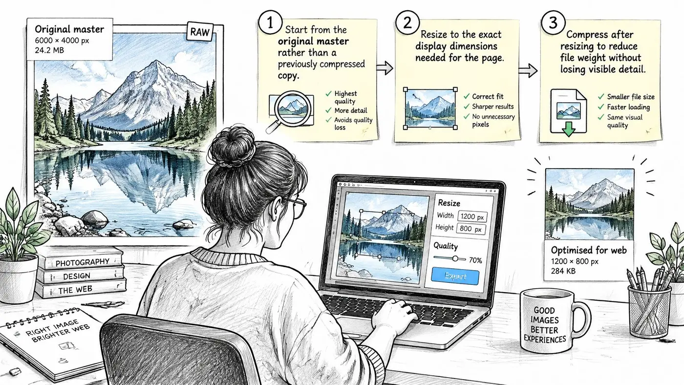
- Start from the original master. Keep the unedited camera file, design export, or supplier asset outside the publishing workflow. Every derivative should come from that master, not from a JPEG that has already been compressed, cropped, and compressed again.
- Find the rendered size. Inspect the layout at mobile and desktop widths and note how wide the image appears. Consider whether a high density version is justified for that slot, especially for product detail, rather than applying a blanket multiplier to decorative media.
- Resize before encoding. A photograph that's 3,000 pixels wide but displayed at 600 pixels carries pixels no visitor sees. Resize it to the required width first, and if you need a refresher on doing this cleanly, preserve image detail with RevelRaw.
-
Generate breakpoint specific versions. Produce the widths your layout uses, then describe them with
srcset. Writesizesfrom the CSS, including sidebars, grids, and maximum container widths, because the browser uses that value to choose a candidate before layout finishes. -
Encode modern formats with a fallback. Generate AVIF and WebP automatically in your build, CMS, or image service. Place them as sources inside
<picture>, with JPEG or PNG in the finalimgelement for clients that don't support the newer formats. - Compress with a visual check. Start at a mid range quality setting, view the result at 100% zoom and at its rendered size, then step down gradually. Inspect edges, faces, skin tones, fabric texture, gradients, and any small labels. Stop before blocky artefacts, colour banding, or lost detail appear.
-
Reserve the layout space. Add explicit
widthandheightattributes that match the image's aspect ratio. The browser can then hold the correct space while the file loads, so text and buttons don't jump as images arrive.
A Markup Pattern You Can Copy
This example offers three widths and tells the browser that the image fills the viewport on small screens but takes half the viewport on larger ones. Adapt both parts to your own layout. Copied numbers are a starting point, not a responsive strategy.
<picture><source type="image/avif" srcset="image-480.avif 480w, image-960.avif 960w, image-1600.avif 1600w" sizes="(max-width: 600px) 100vw, 50vw"><source type="image/webp" srcset="image-480.webp 480w, image-960.webp 960w, image-1600.webp 1600w" sizes="(max-width: 600px) 100vw, 50vw"><img src="image-960.jpg" srcset="image-480.jpg 480w, image-960.jpg 960w, image-1600.jpg 1600w" sizes="(max-width: 600px) 100vw, 50vw" width="960" height="640" alt="Describe the image if it conveys information"></picture>
Notice what the pattern doesn't do. It doesn't ask phones to download a desktop asset and shrink it. It doesn't strand older browsers without an image. It also leaves the img element in place for dimensions, fallback source, and alternative text.
Quality floor: If a shopper can't distinguish colour, texture, or a variant detail after compression, the setting is too aggressive for that image, whatever the byte saving says.
Run the process on one sample page before you automate it everywhere. You can use our free image compressor for a quick before and after comparison on individual files, then record the result in a simple checklist.
- Resized: Pixel dimensions match the rendered slot.
- Formats served: AVIF and WebP exist where the pipeline supports them.
- Fallback present: JPEG or PNG remains available.
-
sizeschecked: The value matches mobile and desktop CSS. - Dimensions set: Width and height reserve the right aspect ratio.
- Detail checked: Edges, text, gradients, and product features survive at full size.
That final check matters commercially. A category thumbnail can tolerate more compression than the enlarged view someone opens to inspect stitching, ingredients, or a control panel. Set the quality floor by task, not by a single number applied blindly to the whole media library.
Which Images Should Load First and Which Can Wait
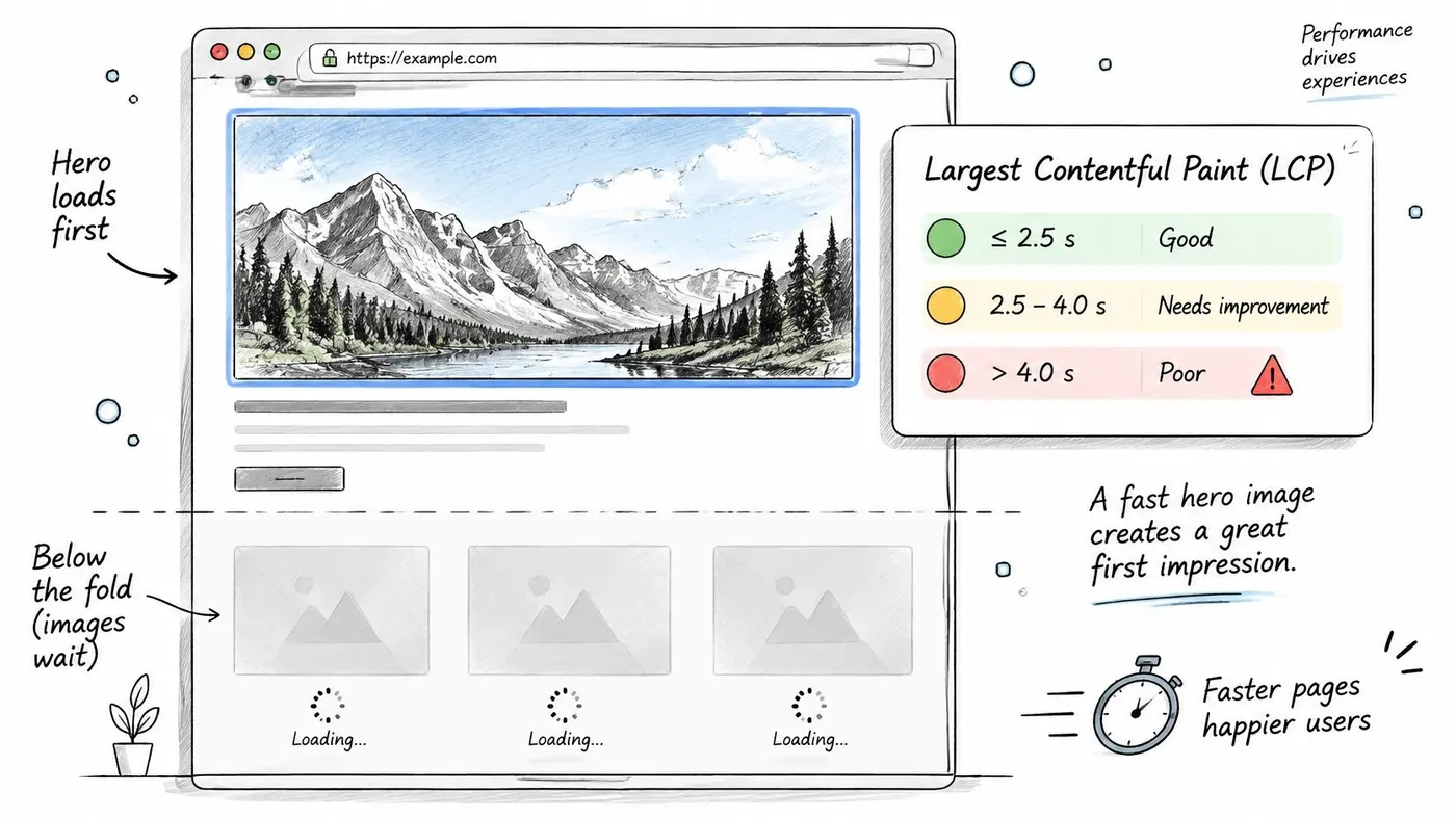
LCP at 75th percentile (mobile) Rating First action for the hero image 2.5 seconds or less Good Keep the image discoverable early and check its bytes stay low 2.5 to 4 seconds Needs improvement Resize, compress and prioritise the hero image Above 4 seconds Poor Remove lazy loading from the LCP image and cut its bytes firstA guide to optimising images from Hostinger UK classifies Largest Contentful Paint at 2.5 seconds or less as good, 2.5 to 4 seconds as needing improvement, and above 4 seconds as poor. It also recommends testing the 75th percentile mobile LCP against the 2.5 second threshold. That percentile matters because an average can hide the slower quarter of visits.
This illustration shows why the largest above the fold element deserves different treatment from everything further down the page.
Why the Hero Controls the Clock
Largest Contentful Paint, or LCP, measures when the largest visible element renders. On many homepages, campaign pages, and product pages, that element is an image. An oversized hero increases network transfer and decode work, so the browser can't paint it until both finish. Compressing a file that remains far larger than its slot only solves part of that chain.
Make the likely LCP image easy to discover. Put it in the HTML where practical, avoid lazy loading it, and give it explicit dimensions. If it's referenced late through CSS or a template pattern, a preload hint can help the browser start earlier, but preload only the genuine hero. Preloading several large images recreates the congestion you're trying to remove.
Sites built around portfolios have the same constraint, which is why UK photography website specialists still need a priority order rather than treating every picture as equally urgent. The first image earns bandwidth. The rest queue behind it.
What Should Wait
Gallery thumbnails below the fold, review avatars, recommendation rails, and footer imagery can use native loading="lazy". They don't need to compete with the hero, product title, price, and primary call to action during the first render. Our guide to lazy loading implementation covers the mechanics, but the decision rule is simple. If delaying the image delays the main content, don't lazy load it. If the visitor may never scroll to it, let it wait.
The walkthrough below shows the loading sequence in practice, including how request timing changes when priority is explicit.
Compare image bytes, request start time, and LCP before and after each change. Use field data from real UK mobile visits alongside laboratory tests, because a fast test on office broadband doesn't prove the experience improved on the train. When you test a lighter hero as a variant, our verify_variant tool observes control and challenger rendering on desktop and mobile, which helps you confirm the intended image renders in both contexts.
Accessibility Rules for Optimised Images
A fast image can still be a poor web asset. If its meaning disappears for a screen reader user, vanishes when images fail, or becomes unreadable under magnification, optimisation has solved only the transfer problem.
The UK government's accessibility monitoring of public sector websites and mobile apps from 2022 to 2024 tested 1,203 websites and 21 mobile applications from January 2022 to September 2024, and overall compliance reached 70%, up from 59% in the previous monitoring period. The same report notes that automated checkers are estimated to detect only about 30–40% of accessibility issues. Manual review therefore isn't an optional polish after compression. It's part of publishing the image.
Image type Alt text approach Best format Key note Product photo Name the product and the detail that matters to buyers WebP or AVIF with JPEG fallback Test zoomed detail at full size before compressing Logo Brand name, or the link purpose if the logo is a link SVG where available Keep essential words in HTML rather than in the logo file Icon used as a link Describe the action, such as Basket SVG An unlabelled icon conveys nothing to a screen reader user Hero image Describe only if it conveys information; otherwise use empty alt text AVIF or WebP Put key messages in real text, not inside the picture Chart or diagram Short summary of the finding SVG Pair with the underlying data or a data table Decorative background Empty alt text WebP or AVIF Set as a CSS background where the image adds no meaningDecide What Each Image Is For
Informative images need meaningful alternative text that carries the information a sighted visitor gets from the picture. A product alt such as "blue waterproof walking boot with deep tread, side view" helps a buyer. "IMG_4821" and "product image" don't.
Decorative images need empty alt text, written as alt="", so assistive technology can skip them. Don't leave the attribute out and hope the browser guesses. Silence is the correct announcement when an image adds atmosphere but no information.
Functional images need the action named. If a basket icon is a link, its accessible name should say "Basket", not describe the drawing style. If a logo links home, the accessible name needs to communicate the brand and destination clearly in context.
Complex images need more than a short alt attribute can sensibly carry. Give a chart a concise summary of the finding, then provide the underlying data or a nearby explanation. SVG helps because lines and labels remain legible when magnified, but a scalable chart still needs its data available as text.
Never make an image the only place where a price, offer, warning, label, or instruction exists.
Put essential words in HTML. Real text can be read aloud, translated, searched, copied, resized, and styled for contrast. Text baked into a banner does none of those things reliably. It also becomes blurry when the banner is compressed or scaled.
Before publishing, check four things. Has someone reviewed the alt text in context? Is essential information available outside the image? Does any text or meaningful graphic have sufficient contrast? Is chart data available nearby? Read the page with images disabled as a final sense check. If the offer, product difference, or next action disappears, the image is carrying content that belongs in the page itself.
What UK Sites Saved When They Optimised Images
The University of Edinburgh's homepage case study reported that optimising image sizes reduced its homepage weight by 85%, from 7.14 MB to 1.06 MB, between June 2024 and 2025. That's a before and after story about dimensions, not a magic quality setting. The team stopped asking visitors to download images far larger than the homepage displayed.
Picture the original state. A homepage carries a hero and several editorial images uploaded at source size. Each one looks correct after the browser scales it down, so nobody notices the waste during visual review. The transferred bytes tell a different story. Once each image is sized for its slot and encoded appropriately, the page can look substantially the same while weighing far less.
The Same Pattern on a Product Grid
Say an ecommerce category page shows twenty products in a grid. Each thumbnail appears as a small card, but the template serves the full product photograph for every card. A shopper on mobile downloads twenty large files to see twenty small pictures, and the browser spends time decoding detail that the grid can't display.
A better arrangement serves each thumbnail at its displayed size in WebP or AVIF, with a fallback where needed. The larger file loads only when the shopper opens the product page or zoom view, where the extra detail supports a decision. Lazy load cards below the initial viewport, but keep the first visible products prompt.
Measure that change properly:
- Before release: Record total image bytes, median thumbnail width, page weight, and mobile LCP for the category template.
- After release: Record the same measures on the same products and viewport.
- Visual check: Compare colour, edges, and variant detail in the grid and zoom view separately.
- Commercial check: Watch product clicks and conversion, because a lighter grid that makes products harder to judge isn't an improvement.
Implementation doesn't have to be tied to a rebuild. Our snippet works with any website, CMS, or framework and requires no build step, so a team can test an image change on an existing template rather than waiting for a platform project.
Treat the Edinburgh result as evidence that image sizing can remove a large share of page weight on a specific homepage, not as a forecast for yours. Your saving depends on how oversized the current files are, how many images the template loads, and how much detail each image must preserve. Measure your own heaviest template first, then quote your own before and after numbers.
Confirm the Savings Before You Ship Your Images
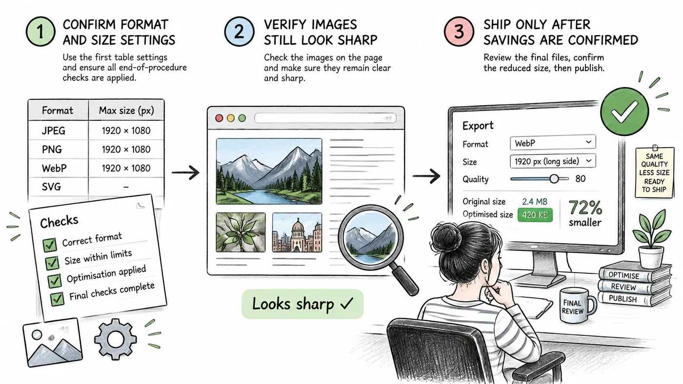
Don't ship a sitewide compression change because the files look smaller in a folder. Confirm the change in order: settings, field performance, accessibility, then user behaviour.
An Ordered Release Check
First, apply the settings to high traffic pages. Check format, rendered dimensions, srcset, sizes, fallback, width, and height on the homepage, main landing pages, category pages, and product template. A perfect policy that only covers a low traffic blog post won't move the experience most visitors receive.
Second, measure image bytes and LCP in the field. Compare the optimised version with the current version on UK mobile visits, and keep laboratory tests for diagnosis. Our Core Web Vitals optimisation guide explains how image work fits the wider metrics, but your release decision needs the actual transfer and rendering change on the pages you altered.
Third, run the accessibility checks before launch. Review alt text by image type, look for essential text trapped inside graphics, test charts with their data, and check magnified detail. It's cheaper to correct a banner in staging than to discover after launch that the offer only exists as pixels.
Fourth, test behaviour, not just bytes. Run a simple A/B test between current images and optimised images on a suitable template. Track conversion, product engagement, and revenue measures alongside LCP. If lighter images load faster and shoppers act the same or better, ship them. If zoom use or conversion falls, inspect the quality floor before blaming the format.
Otter offers free tools including a Sample Size Calculator, Significance Calculator, Duration Calculator, Conversion Rate Calculator, Image Compressor and Hypothesis Generator, so you can prepare the files and plan the test without guessing how long it should run. During review, the preview bar lets users view the live site as any test variant, emulate devices, and watch goals fire in real time, with drafts included and results untouched. Anti-flicker is on by default in Otter and hides the page until the variant is ready, which reduces the chance that visitors judge a test by a visual jump rather than the image itself.
The release question isn't "Did we save kilobytes?" It's "Did the page render sooner while the image still helped people complete the task?"
Start today with the three heaviest images on your site. Record each file's bytes and dimensions, compress and resize it, then record the new bytes and check the detail that matters. That small sample will show whether your biggest problem is format, dimensions, compression, loading priority, or all four.
Compress your three heaviest images, record the bytes before and after, then use Otter A/B to test the optimised versions against the originals on a high traffic page. You'll see whether faster rendering preserves product engagement and conversion before you roll the change across the site.
Stop guessing
Ready to start testing?
Set up your first A/B test in under five minutes. No credit card required.
- 14-day free trial
- No credit card required
- Cancel anytime