What Is a Call to Action: A Complete Guide for 2026
What is a call to action? Explore types, writing tips, and A/B testing to boost conversions in 2026.
You've got the traffic. The page looks polished. The copy reads well enough. Yet the visitor still leaves without clicking, signing up, or buying, and the problem isn't always the headline or the hero image. It's often the missing signal that tells them what to do next.
A call to action, or CTA, is that signal. In practical terms, it's the point where a page stops informing and starts directing, and that shift matters because a page without direction leaves people to decide for themselves, which usually means they do nothing. In the UK, that decision point also sits inside a compliance frame, because the Competition and Markets Authority treats CTA clarity as part of how online pricing and choice architecture should be presented clearly before purchase, not hidden or confusing. A CTA is therefore not just a button label. It's part of the journey, the interface, and the outcome.
The Visitor Who Left Without a Trace
A product manager opens the analytics dashboard on Monday morning and sees the same quiet pattern again. People landed on the page, scrolled, read, and disappeared. No booking request. No basket addition. No newsletter sign-up. Just a clean line of exits and a page that never told them what mattered most.
That's the hidden cost of a weak CTA. Teams spend time on traffic acquisition, positioning, and visual polish, then let the final decision moment go vague. If the page doesn't clearly point to the next step, the visitor has to work it out alone, and every extra moment of uncertainty makes action less likely.
Practical rule: if a page has a goal, the page needs a visible, understandable route to that goal.
Many teams get caught here. They think the CTA is the button text, when the issue is navigation. The CTA is the prompt that moves someone from attention to action, so the question isn't only whether a button says “Buy now” or “Sign up”, it's whether the whole page makes that choice feel obvious, timely, and safe.
In UK-facing journeys, that clarity carries more weight because the interface itself can be judged against regulatory expectations. If users can't find the next step, or if the step feels misleading, the page isn't just underperforming, it's doing the wrong job.
What a Call to Action Actually Is
A CTA is a short, imperative prompt that asks for an immediate response. In digital channels, it usually appears as a button, a link, or a brief command such as “Sign Up” or “Buy Now”, and its job is simple, reduce hesitation and tell the visitor exactly what to do next. The clearer the instruction, the less room there is for confusion.
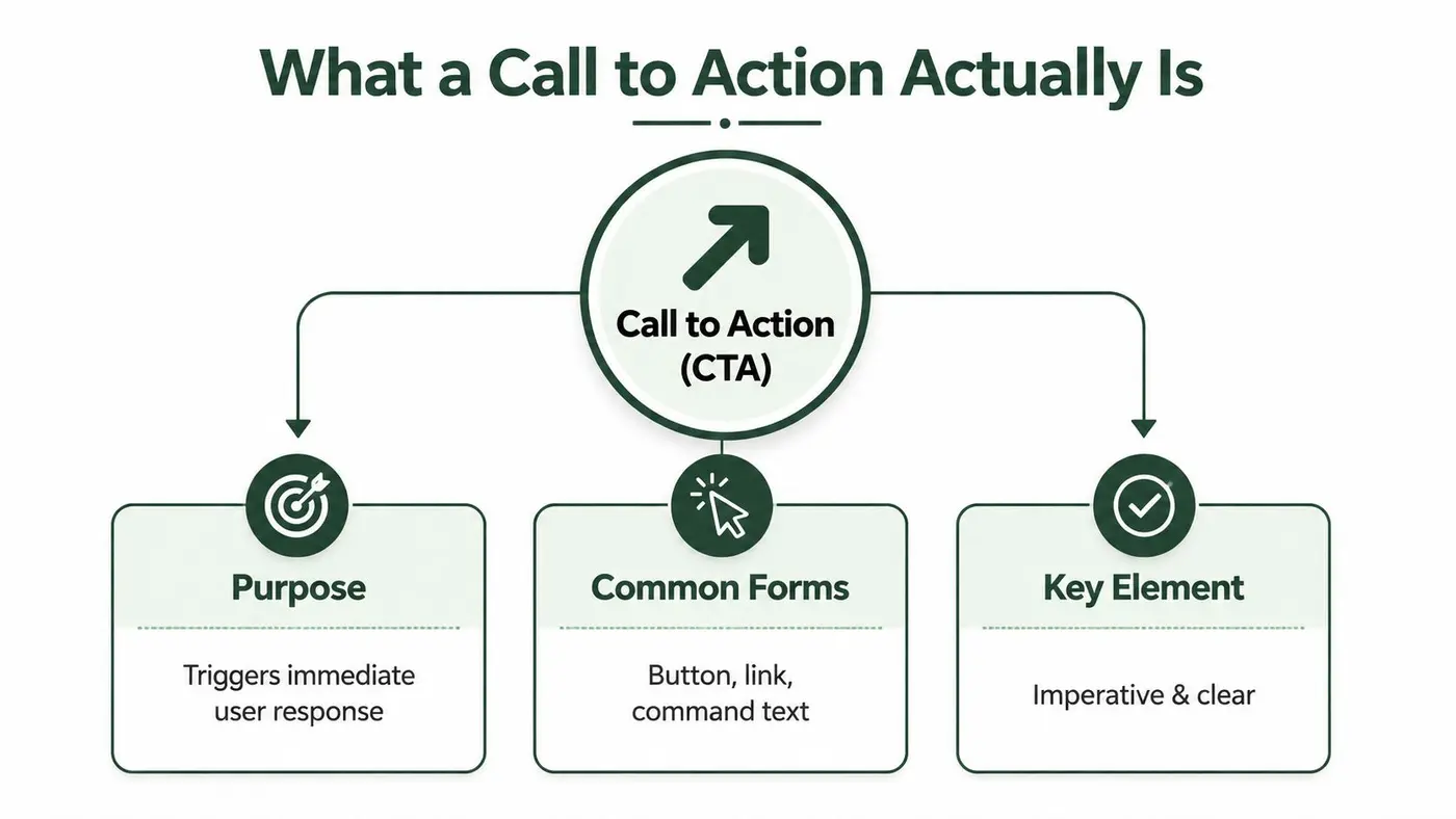
A CTA is more than a button
It helps to think of a CTA like the exit sign in a building. The sign doesn't replace the building, and it doesn't redesign the corridor, but it tells people where to go when they're ready to move. A CTA does the same thing inside a page or app flow, it gives the user a clear next step once they've taken in the information.
That's why calling a CTA “just button copy” misses the point. The label matters, but so does the placement, surrounding context, and level of commitment the action asks for. “Download the guide” and “Request a demo” are both CTAs, but they signal very different degrees of intent.
The common misconception
Many teams over-focus on persuasive wording and under-focus on decision structure. They'll debate “Start free trial” versus “Try it free” for an hour, while ignoring whether the page is even ready to ask for a trial. A CTA works best when it matches the user's readiness and the page's purpose.
UK compliance makes this even sharper. Under UK GDPR, consent needs a clear affirmative act, so the CTA isn't just persuasive, it's the legal point where the user actively signals permission or acceptance. Pre-ticked boxes and passive inactivity don't count, which means the action itself has to be unambiguous.
The compliance angle matters
The safest CTA is not always the flashiest one. In consumer journeys, the prompt needs to be easy to find, easy to understand, and not misleading, because clarity supports both conversion and compliance. That's especially true when the CTA appears in checkout flows, subscriptions, consent prompts, or regulated sectors where the wording and the surrounding interface both carry risk.
Common Types of Calls to Action and When to Use Them
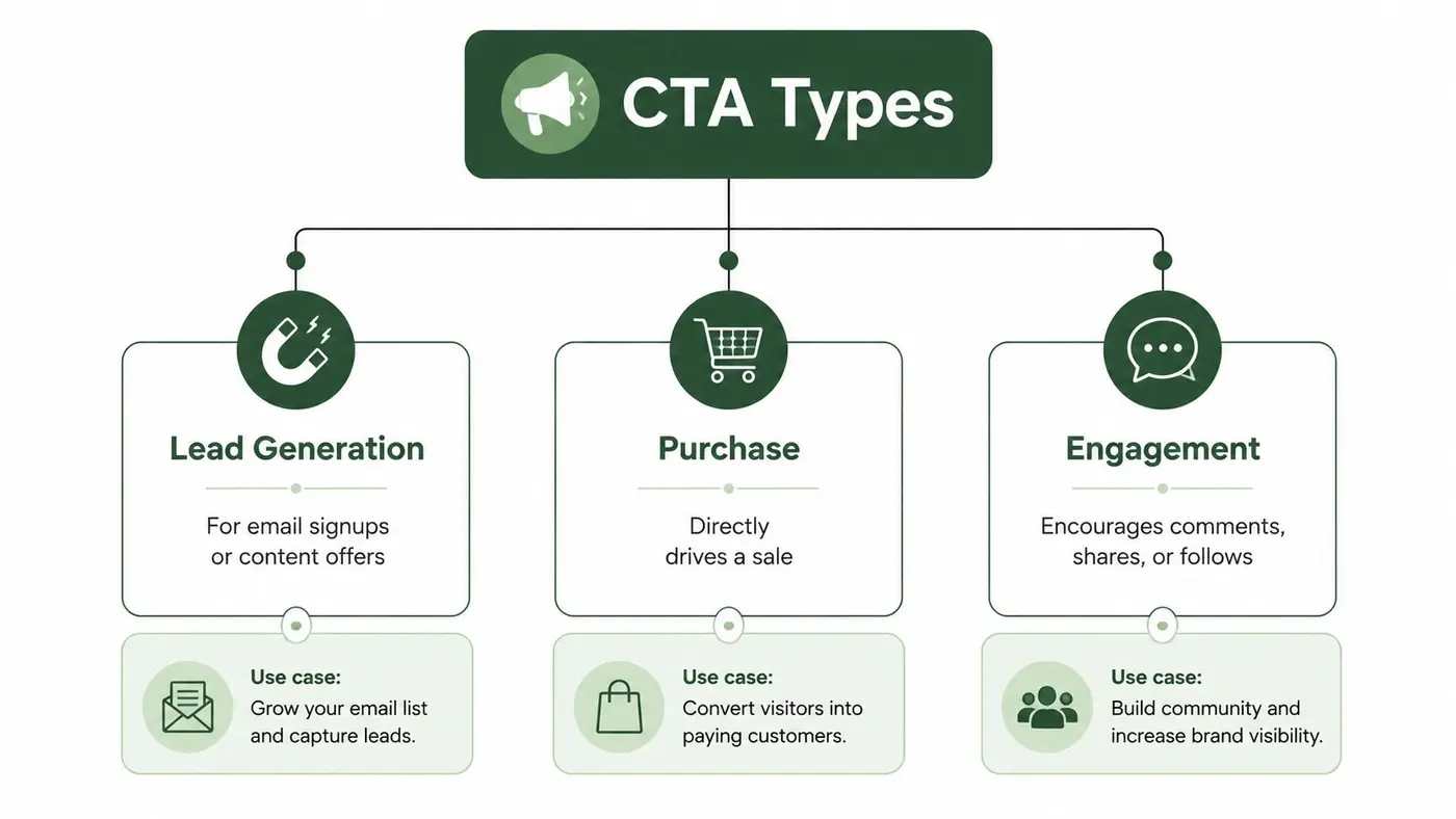
Not every CTA should push for the sale. A visitor reading a comparison page, a new prospect on a homepage, and a returning shopper near checkout all need different prompts, because their intent is different. The mistake is to treat every page like a closing page.
Lead generation
Lead generation CTAs collect contact details or move someone into a nurture sequence. “Get the guide”, “Book a call”, and “Join the mailing list” all fit here, but they don't all belong in the same place. A person who's still evaluating a category may respond well to a lower-commitment offer, while a warmer prospect may be ready for a direct contact request.
Purchase
Purchase CTAs are the ones that point straight at revenue, such as “Add to basket”, “Checkout”, or “Buy now”. These belong where the visitor has enough confidence to act, usually after product detail, pricing, reassurance, and any obvious objections have been addressed. If you ask too early, you create friction. If you ask too late, you make people hunt for the action.
Engagement
Engagement CTAs keep the session moving without forcing a hard commitment. “Read the reviews”, “Compare plans”, and “See how it works” are useful when the user still needs context. They're often the right choice for awareness-stage content, editorial pages, or complex offers where the next step is learning rather than buying.
A useful example for UK teams is a service page with both a primary and a secondary prompt. The primary CTA might move toward enquiry or checkout, while the secondary CTA helps people compare options or explore details. The question isn't which CTA is more aggressive, it's which one best fits the next decision the visitor is ready to make.
The CXL discussion of CTA intent makes this gap very clear, because generic “best phrase” advice doesn't answer the more practical question of what the page is trying to achieve revenue-focused landing page guide. That's the primary decision filter, not the verb alone.
A page with multiple goals often needs one dominant CTA and one support path, not five competing invitations.
Why CTAs Matter for Conversion
A visitor can read half a page and still leave unsure about what to do next. That hesitation is usually the primary problem, not a lack of interest. A CTA matters because it turns that uncertainty into a clear next step, and the clearer that step is, the easier it is to measure whether the page is doing its job.
The psychology is simple
People avoid ambiguity. If a page presents several possible exits, or none that feel obviously right, the usual response is inaction. A strong CTA reduces that friction by narrowing the choice to one sensible move, which is why the prompt itself can matter as much as the surrounding copy.
CTAs also act as trust signals. A business that asks for the next step clearly looks more organised and more credible than one that hides the action or leaves readers to hunt for it in dense content. In practice, the strongest CTA is usually the one that matches the visitor's intent, not the one with the loudest wording.
Intent beats slogans
A visitor in discovery mode does not need the same prompt as someone ready to convert. That sounds obvious, yet teams still waste time testing slogans before deciding which action belongs on the page. If the page is built to educate, a hard sell can feel premature. If the page is built to close, a vague “Learn more” can feel evasive.
For teams looking for a landing page framing that connects prompts to business outcomes, the revenue-focused landing page guide is useful because it treats the CTA as part of the page's overall job, not just a button label.
A small nudge, a bigger outcome
A CTA works like a navigation signal with commercial consequences. It turns passive reading into active movement, and it gives the business a measurable moment to optimise. If the page is doing its job, the CTA should feel like the natural next step, not a demand dropped in from nowhere.
That is why CTA work has to account for more than wording and colour. Funnel stage, user intent, accessibility, and compliance all shape whether the prompt helps or hinders conversion. A button that is visually strong but unclear to screen readers, or a claim that creates legal risk, can reduce trust even if it looks persuasive on the surface.
For teams that need a second pass on layout and placement, this landing page design guide is useful because it looks at how many prompts a page can support before attention starts to fragment.
The video below reinforces that idea with a practical look at how prompts shape user movement through a page.
Copy and Design Best Practices for High-Converting CTAs
Good CTA copy does one thing well, it makes the next action obvious. Good design does the same thing visually. When both work together, the visitor does not need to interpret the page, they can move with confidence.
A CTA is also a navigation signal. It tells people where they are in the funnel and what kind of action fits their intent at that moment. A visitor comparing options needs different guidance from someone ready to book, download, or buy. When the prompt matches that stage, the page feels clearer and the conversion path becomes easier to follow.
Start with action, then add clarity
Strong CTA copy begins with an action verb. “Get your free audit” is clearer than “Learn more” because it tells the visitor what happens next. “Start your 14-day free trial” also sets expectations better than “Try it now”, because it explains the commitment and the reward.
Specificity helps too. A CTA that names the outcome, the offer, or the next step feels less vague and more trustworthy. If you're asking for an email address, say so. If the click leads to a demo booking flow, make that plain.
Design should guide the eye, not fight the page
Contrast matters because the CTA needs to stand out from the surrounding content without looking like an ad grafted on at the end. Size, whitespace, and colour all contribute to that effect, but none of them should override readability or brand consistency. If the page is visually busy, the CTA often needs more breathing room rather than more decoration.
Placement matters just as much. Put the CTA where the reader naturally pauses to decide, not where the layout is most convenient for the designer. On longer pages, that often means repeating the action after a meaningful block of proof, detail, or comparison rather than waiting until the footer.
Practical rule: place the CTA after the user has enough information to make a yes or no decision, not before.
Accessibility and compliance are part of performance
For UK audiences, CTA quality also means inclusivity. Action prompts need to be readable on mobile, easy to activate with a finger, and understandable to assistive technologies. If the wording is vague, the contrast is weak, or the button is too small to tap comfortably, the CTA underperforms for reasons that are not just visual.
That same standard matters in compliance-sensitive sectors. Finance, healthcare, and regulated retail all need language that is clear enough to support informed action, not just create urgency. If consent is involved, the wording and the surrounding interface must make the purpose unmistakable.
If you are deciding how many prompts a page should carry, this practical CTA density discussion can help you think about the problem in terms of page clarity rather than button count alone. Too many calls to action can fragment attention, but too few can leave users stranded.
For teams that want to connect CTA changes to measurable uplift, how SelfServe boosts conversion rates is a useful example of how better page structure and clearer prompts work together in practice.
How to Measure CTA Performance
A CTA without measurement is just opinion dressed up as design. If you want to know whether the prompt works, you need to track what people do after they see it, click it, and move through the rest of the journey.
Start with the right metrics
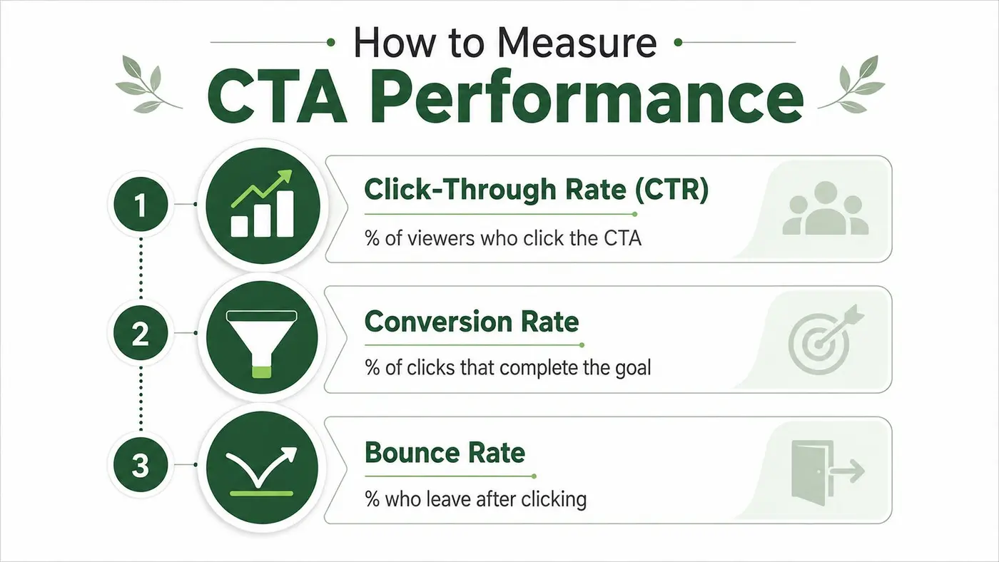
The most immediate metric is click-through rate, which shows how many viewers click the CTA. That tells you whether the prompt is attracting attention and motivating action at the first decision point. But a high click rate doesn't automatically mean a good CTA, because the click still needs to lead to the right outcome.
Downstream conversion rate matters because it shows how many of those clicks complete the goal, whether that's a purchase, sign-up, or download. For ecommerce teams, revenue per variant is useful because a CTA that attracts more clicks but weaker buyers can look good on the surface and underperform in commercial terms.
Read the numbers together
A healthy CTA can still be misleading if you read only one metric. A button may get clicks but produce weak completion, which points to a mismatch between the promise and the destination. Or it may get fewer clicks but stronger revenue, which suggests the prompt is filtering for more committed visitors.
That's where optimisation teams need discipline. The goal isn't to maximise clicks at any cost, it's to maximise the right action for the page's purpose. If the CTA drives a micro-conversion, measure the quality of that micro-conversion. If it drives a sale, watch revenue, not just interaction.
Don't ignore the post-click experience
The CTA is only the start of the measurement story. If the landing experience is confusing, slow, or inconsistent with the button promise, the CTA will look weak even when the copy is fine. That's why teams often pair CTA testing with page-level analysis, because the prompt and the destination work as one system.
For a practical angle on conversion-focused instrumentation, this how SelfServe boosts conversion rates resource is useful for thinking about how measurement and funnel clarity fit together. In experimentation, the main lesson is straightforward, measure the click, measure the outcome, and don't confuse the two.
A Practical Guide to A/B Testing Your CTAs
The fastest way to stop guessing is to test. A/B testing lets you compare two or more CTA versions under real traffic conditions, then use the data to decide which prompt improves the goal you care about. The key is to test one meaningful change at a time so you can understand why a winner won.
Build the test around a hypothesis
Start with a clear statement. For example, a team might expect that changing the button copy from “Learn more” to “Get pricing” will improve qualified clicks because the new wording matches visitor intent better. A strong hypothesis is specific enough to prove or disprove, not just “we think this will do better”.
Once the hypothesis is set, decide what changes. Copy, colour, placement, and surrounding context can all matter, but don't test everything at once if you want a readable result. Small, controlled experiments are easier to trust than big redesigns with mixed causes.
Run the experiment with discipline
Teams using a platform like Otter A/B can create variants, split traffic, and assign goals such as clicks or custom events. That matters because CTA testing shouldn't stop at the click itself, it should tie back to what happens after the click and whether the variant creates better business outcomes. If a button gets more clicks but fewer purchases, it's the wrong winner.
For teams who want a wider view of testing methodology, the Divimode A/B testing tips guide is a useful companion, especially when you're deciding what to isolate first. Good testing is mostly about restraint, clear hypotheses, clean variants, and patience long enough to trust the result.
Read the result in context
A winning CTA isn't always the one with the most clicks. Sometimes the best prompt produces fewer but better-qualified actions, which is more valuable for sales teams, e-commerce teams, and product teams alike. That's why you should look at downstream conversion, revenue, and any relevant quality signals before declaring success.
If you use Otter A/B's landing page testing approach, keep the page and the CTA aligned so you're learning about the prompt, not about unrelated noise in the layout. The cleanest tests are the ones that let the CTA speak for itself.
If you want to stop guessing which CTA will move visitors forward, Otter A/B gives you a lightweight way to test buttons, headlines, and page variants against real goals. It's built for teams that want clearer conversion decisions without slowing down the site or muddying the user experience.
Stop guessing
Ready to start testing?
Set up your first A/B test in under five minutes. No credit card required.
- 14-day free trial
- No credit card required
- Cancel anytime