Below the Fold: A Complete Guide for CRO
Master below the fold optimization with actionable strategies. Learn measurement techniques, prioritization frameworks, and proven tactics to boost conversions.
Nielsen Norman Group's eye-tracking research found 80.3% of viewing time above the fold and 19.7% below it. That doesn't mean below-the-fold content can't convert, it means it must earn attention, and disciplined experimentation shows which messages deserve that space.
The fold is a visibility boundary, not a conversion boundary. A visitor who scrolls has shown intent, but intent alone doesn't guarantee engagement with every section underneath the hero. The practical question is therefore not whether people scroll, but which content they need next, when they need it, and whether it moves them towards a valuable action.
For CRO teams, this changes the job. Above-the-fold content must communicate relevance quickly. Below-the-fold content must remove doubt, build confidence, explain complexity, and make the next decision easier. Treating both areas as if they serve the same purpose leads to crowded heroes, weak proof sections, and tests based on design folklore rather than user behaviour.
Why Below the Fold Still Matters in 2026
Nielsen Norman Group's original eye-tracking study recorded 80.3% of viewing time above the fold and 19.7% below it. That split makes prioritisation necessary, not deletion. Lower-page content must earn attention through clear relevance, useful structure, and cues that show visitors why continuing is worthwhile. The original eye-tracking research supports a testing principle: concentrate the opening view on the main decision, then make each later section justify its place.
A hero and a proof section serve different jobs. The hero establishes the offer and available action. Subsequent sections can address pricing concerns, explain delivery, compare options, present evidence, or answer objections that make an immediate click premature.
Scrolling is an intentional behaviour
ClickTale research cited in UK web-design guidance found that 91% of web pages use vertical scrolling and over 76% of web users scroll to some extent. The UK discussion of scrolling behaviour also notes that the fold varies with screen size, browser controls, toolbars, and font settings. Scrolling is common, yet exposure remains uneven.
Reaching a comparison table or FAQ provides a stronger signal than merely viewing the opening screen. The visitor may be checking fit, evaluating risk, or searching for information the hero did not provide. Serve that intent with evidence and detail, rather than repeating the opening pitch in a different layout.
Practical rule: Put the page's main promise and first action where visitors can find them quickly. Put evidence and detail where motivated visitors can use them.
Replace the myth with a testable question
The right below-the-fold structure depends on page intent. A low-friction lead form may need a short route to action. A specialist service page may need detailed proof before a visitor enquires. Product, subscription, and editorial landing pages each create different reasons to continue scrolling.
Use Otter A/B to test the relationship between the initial message and the content that follows. Compare proof placement, section order, scroll cues, and repeated calls to action, then judge results by meaningful actions rather than scroll depth alone. Guidance on choosing effective hero images for websites can inform the opening design, but the image should support the decision path instead of taking space needed for clarity.
Below-the-fold content is conditional real estate. Visitors engage with it when the page gives them a reason to continue, and controlled experiments show which reasons support conversion.
The Evolution of Below the Fold Thinking
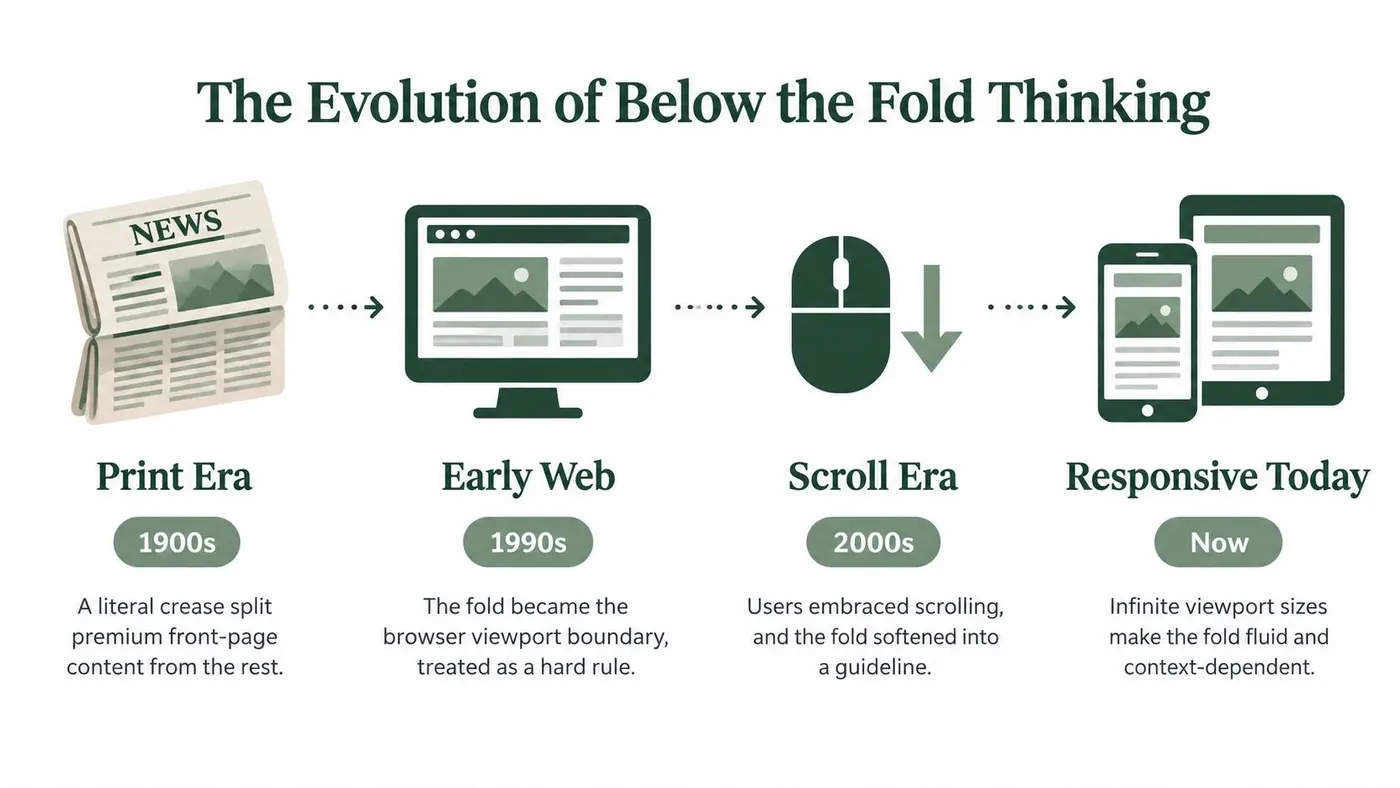
The fold began as a literal crease in a newspaper. Publishers put the strongest headline, image, or offer on the upper half because passers-by could see that portion before buying or opening the paper. Early web design carried that logic into the browser, treating the viewport as a digital newsstand boundary.
That inheritance created useful discipline, but it also produced rigid advice. UK design commentary often referred to research from 2010 and summaries from 2015 to 2016, reinforcing the idea that primary headlines, offers, and calls to action belonged high on the page. The underlying lesson was about limited attention. It was never evidence that content lower down had no value.
The fold became a moving threshold
A webpage has no universal fold. The visible boundary changes with device dimensions, browser controls, toolbar count, zoom, and font settings. On a 1024×768 display, historical estimates placed the fold around 570 to 610 pixels, depending on browser and toolbar configuration, as reported in historical UK web-design guidance on scrolling and screen conditions.
Responsive design made the newspaper comparison less reliable. A desktop layout may place a headline, image, and CTA within the opening viewport, while the same CTA sits much lower on a phone. Larger text, accessibility settings, cookie notices, and browser UI can shift the starting point further.
The concept still matters, but it is now a context-dependent prioritisation problem. Teams must decide what visitors should see first across layouts, rather than design around one fixed measurement.
Design for progression, not compression
A fluid fold does not justify squeezing every persuasive element into the first screen. Dense heroes can weaken comprehension, hide the main action, and create a poor mobile experience. A stronger layout presents a clear opening proposition, then gives interested visitors an obvious route to useful detail.
Performance belongs in that decision. Long pages can create layout shifts, delayed media, and unnecessary rendering work when every asset loads without priority. Responsive structure, stable dimensions, sensible loading, and controlled testing provide a better foundation.
The practical shift is from visibility rules to evidence. Use Otter A/B to test whether proof, comparisons, objections, or a later CTA earns attention and supports action. The fold still concentrates early attention, while the content below it can build persuasion for visitors willing to continue. That trade-off should be measured, not settled by an outdated myth.
Understanding Attention Patterns Below the Fold
Attention doesn't stop at the first viewport. It changes character. Above the fold, visitors often scan for relevance, brand recognition, and an obvious next step. Below the fold, visitors who continue are more likely to inspect information that helps them decide whether the proposition is credible and suitable.
UK publisher guidance reports that 45% of new visitors to foxybingo.com did not scroll below the fold, which shows why placement still matters for key messages. The guidance on above-the-fold visibility and scroll depth supports a practical conclusion: important information shouldn't be buried on the assumption that every visitor will explore.

Attention distribution
A lower section needs a reason to exist and a reason to be noticed. Strong headings, concise introductions, meaningful contrast, and appropriate spacing help visitors understand what they've reached. A wall of similarly weighted sections makes valuable information indistinguishable from background copy.
Scroll depth alone isn't a conversion metric. A visitor can reach the bottom without reading the page or completing the desired action. Pair scroll behaviour with clicks, form starts, completed forms, purchases, revenue, or another outcome that reflects business value.
Trust-building potential
Below-the-fold space often performs its best work after interest has been established. A testimonial near the point of doubt can answer, “Can I trust this provider?” A transparent pricing explanation can answer, “Is this within my budget?” An FAQ can answer, “What happens if this doesn't suit my situation?”
The placement should follow the objection, not a template. If visitors need technical reassurance before requesting a demo, put the relevant explanation before the form. If they need delivery or returns information before purchasing, make those details easy to find near the product decision.
Content lower on the page shouldn't repeat the hero. It should resolve the hesitation the hero creates.
Device behaviour
Mobile and desktop visitors don't encounter the same page. Viewport height, input method, connection quality, text size, and context all influence how far someone continues and how much information they can process at once. The fold is especially fluid on mobile, so a desktop scroll map shouldn't dictate mobile sequencing without validation.
Performance affects the experience throughout the page. Lazy loading can reduce unnecessary initial work, but it shouldn't leave a visitor staring at empty space when they've reached an important section. Reserve space for media, keep transitions stable, and load content according to likely interaction rather than a one-size-fits-all rule. A useful audit asks whether each lower section appears quickly enough at the moment a visitor needs it.
Measuring and Prioritizing Below the Fold Content
Optimisation starts with visibility. Before changing a section, establish whether visitors reach it, interact with it, and convert after seeing it. Scroll tracking in an analytics platform can provide directional evidence, but it should sit alongside event tracking and outcome data rather than acting as a substitute for either.
Start with a page-level baseline. Record the main conversion, key interaction events, scroll milestones, device category, traffic source, and page template. The purpose isn't to collect every possible event. It's to understand whether the content path supports the action the business values.
A practical measurement sequence
Use a simple sequence to move from observation to prioritisation:
- Map the page: List every section below the initial viewport, including proof, features, pricing, forms, FAQs, recommendations, and repeated CTAs.
- Check reach: Compare how often visitors reach each section with how often they interact with it. A section that many people see but few use may have a relevance or presentation problem.
- Segment behaviour: Review mobile and desktop separately, then compare meaningful traffic sources or audiences where the sample supports a useful comparison.
- Connect actions: Examine whether section views or interactions precede form completion, purchase, enquiry, or another primary outcome.
- Rank opportunities: Prioritise sections with a clear user job, plausible conversion influence, and a change you can implement cleanly.
A heatmap can help identify attention clusters, missed controls, and abrupt drop-offs, while session recordings can reveal confusion or repeated searching. Heat maps on websites are most valuable when they answer a specific question, such as whether visitors notice the proof module or whether a comparison control is being ignored.
Decide what deserves a test
Not every weak section needs an A/B test. Fix a broken interaction, unclear label, missing heading, or unstable layout directly. Test a meaningful hypothesis when the choice involves trade-offs, such as moving proof earlier, changing the order of objections, shortening a section, or repeating a CTA.
Write the hypothesis before designing the variant: “If we move evidence closer to the decision point, more qualified visitors will complete the primary action.” Define the primary outcome, relevant guardrails, and the audience in advance. Don't declare a winner because a section received more clicks if completed enquiries declined.
Best Practices for Below the Fold Optimization
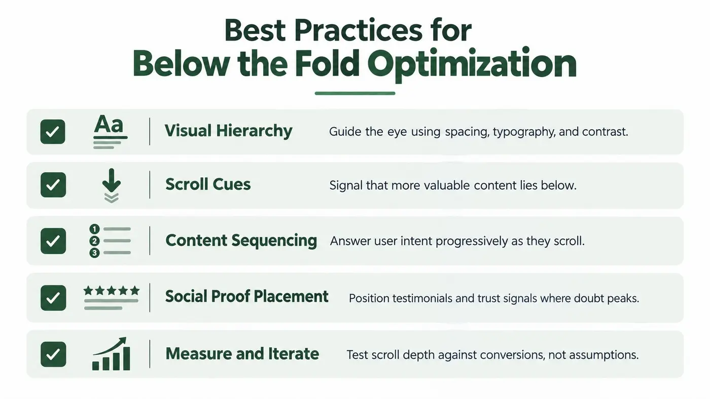
Good below-the-fold design creates momentum without forcing every visitor through the same persuasion sequence. The page should feel easy to scan, yet substantial enough for people who need more information. That balance comes from hierarchy and sequencing, not from a universal instruction to shorten or lengthen the page.
Build a visible content path
Use section headings that describe the visitor's question, not internal marketing categories. “How delivery works” is more useful than “Our process” when a buyer is assessing fulfilment. Spacing, type scale, and contrast should distinguish a new idea from supporting detail, while a subtle continuation cue can prevent the page from appearing to end prematurely.
Progressive disclosure helps control cognitive load. Present the essential answer first, then allow visitors to inspect specifications, exclusions, comparisons, or FAQs when those details become relevant. Accordions can reduce visual length, but don't hide information users need to compare options or make an informed decision.
Match calls to action to consideration
A CTA above the fold is convenient for visitors who already understand the offer. A CTA lower on the page can be more persuasive for visitors who need proof or explanation first. Repeating the same action can work when each repetition follows a distinct decision milestone, but repeated buttons with no new context can make the page feel insistent.
Use evidence to decide. Test CTA wording, placement, surrounding proof, and the amount of information immediately before the action. Resources on design strategies for online revenue can provide broader layout context, but your own customer journey should determine which principle applies.
Protect performance as the page grows
Below-the-fold content still contributes to the experience even when it isn't immediately visible. Optimise images, reserve media dimensions to reduce layout movement, and defer non-essential assets where appropriate. Don't delay content that a visitor is likely to reach soon, especially on a short page.
Teams implementing deferred media should review lazy-loading implementation techniques alongside their performance measurements. The objective isn't the lowest possible initial payload at any cost. It's a stable, responsive page that reveals useful content when the visitor asks for it.
Real-World Examples of Effective Below the Fold Design
A specialist consultancy landing page often has two distinct audiences. Some visitors arrive ready to enquire and need a clear opening CTA. Others need to understand the approach, see relevant proof, and assess whether the consultancy has handled problems like theirs. A strong page gives the first group a short route to action, while the lower sections support the second group with case evidence, process detail, and answers to practical objections.
The test should measure completed enquiries, not just interaction with a testimonial carousel. If moving proof higher increases engagement but reduces qualified submissions, the variant may have made the page more interesting without making it more persuasive.
Product pages
An ecommerce product page can sequence information around purchase anxiety. The opening area establishes the product and purchase action. Further down, reviews address confidence, comparison information clarifies alternatives, and delivery, returns, or care details reduce practical risk.
Each module earns its place by answering a question that appears later in the decision. A review block may be more useful after the product benefits than before them. An FAQ may work best near the final CTA, where unresolved questions would otherwise interrupt checkout.
SaaS pages
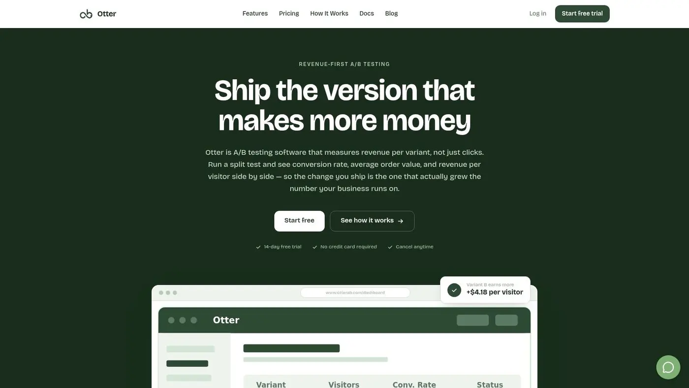
A SaaS page often needs to explain a proposition that isn't self-evident from a headline. A lower section can show how the workflow operates, distinguish plans, explain integrations, and address implementation concerns. Pricing belongs where it supports a decision, not automatically at the top or bottom.
The useful experiment might compare feature order, pricing visibility, or the position of the demo form. Keep the outcome tied to the business goal, such as qualified demo completion, rather than treating time on page as success.
These examples share a principle: lower content works when it appears at the point where the visitor needs it. The right question isn't “How far down is this section?” It's “What uncertainty does this section remove, and what should happen after it?”
Your Next Steps for Below the Fold Testing
Start with four practical actions:
- Track reach and outcomes: Add scroll and interaction events, then connect them to your primary conversion.
- Audit the page: Identify sections that explain, prove, compare, or remove objections.
- Choose one hypothesis: Test a meaningful change in sequence, message, proof placement, or CTA context.
- Review by device: Don't assume desktop behaviour predicts mobile behaviour.
Below-the-fold content deserves neither blind trust nor automatic deletion. Treat it as a sequence of decisions, measure what visitors do, and improve the sections that support the outcome you care about. Lightweight experimentation makes that process repeatable, provided performance and measurement quality remain part of every test.
Otter A/B lets you test headlines, CTAs, layouts, and below-the-fold content without adding unnecessary friction to the browsing experience. Visit Otter A/B to launch evidence-based experiments, measure meaningful outcomes, and turn page layout decisions into a continuous CRO practice.
Stop guessing
Ready to start testing?
Set up your first A/B test in under five minutes. No credit card required.
- 14-day free trial
- No credit card required
- Cancel anytime