10 User Onboarding Best Practices That Convert
Apply user onboarding best practices across SaaS, e-commerce and CMS journeys, with funnel metrics, A/B test ideas and practical Otter A/B examples.
Most onboarding advice still treats the first session like a product tour. That's the wrong job. New users rarely need a guided explanation of every menu, setting, and feature. They need momentum. They need one meaningful outcome that proves signing up was worth it.
That changes how strong user onboarding best practices work in practice. Instead of asking, “How do we explain the product?”, ask, “What is the first value event, and how do we get users there with the least possible effort?” For a SaaS trial, that might be launching a first workflow or test. For an e-commerce journey, it might be adding a product to basket and feeling confident enough to continue. For a CMS, it might be publishing or previewing a first page without getting stuck in setup.
UK guidance supports this lower-friction approach. A Visa-backed onboarding guide recommends keeping the journey under 10 minutes, asking for each piece of data only once, and letting customers complete onboarding in a single session from interest to usage, while using concise copy, visible progress, and minimal manual entry in the process (Visa UK onboarding guide). That principle applies well beyond finance.
I'd frame onboarding as an activation system. Identify the activation event. Diagnose funnel friction. Reveal complexity progressively. Then validate every change with behavioural and business metrics, not taste or internal preference. If you publish research and experimentation thinking regularly, a good companion read is this privacy-first AI blog.
1. Reduce Time-to-First-Value and Track Activation Properly
The fastest way to improve onboarding is to stop treating “account created” as success. It isn't. A new user has only started paperwork. Real success is the first moment they experience value.
For an experimentation product, that usually means launching a first test or seeing a first useful result. For Shopify, it might be reaching a live storefront state. For a CMS such as WordPress or Webflow, it might be publishing a page that matches the user's intended outcome. The metric is simple in concept: how long it takes users to get from signup to that first meaningful win.
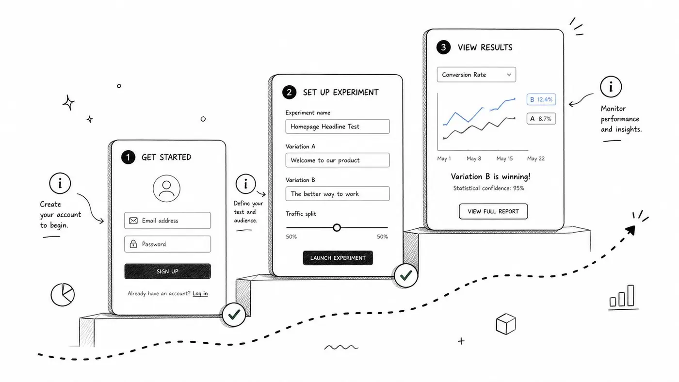
UK onboarding data gives a useful operational guardrail here. Visa Consulting & Analytics found that users abandon applications after an average of 14 minutes and 20 seconds, that 55% leave once the journey goes beyond that threshold, and that abandonment rises to 70% at 20 minutes (Visa digital onboarding whitepaper). Even if your product isn't an application flow, the design lesson is hard to miss: long setup kills momentum.
What to measure first
Don't start with a dozen onboarding metrics. Start with four:
- Activation event: Define one action that proves value, such as first test launched, first product published, or first order placed.
- Median completion time: Track the typical path, not just averages.
- Tail latency: Watch slow cohorts separately because they often contain your most fixable friction.
- Abandonment before activation: Segment users who signed up but never reached value.
A useful supporting framework is to map these into broader website KPI definitions so activation doesn't drift away from commercial outcomes.
What works and what usually fails
Templates, sample data, preselected defaults, and fewer required fields usually help. Blank dashboards, premature setup questions, and “tell us about your company” forms usually don't.
Practical rule: If a field doesn't change the user's next action immediately, ask for it later.
For SaaS trials, celebrate the first win inside the product and again by email. For e-commerce, move account creation after intent is established if possible. For CMS tools, let users create before asking them to configure everything.
2. Run Friction Audits on the Real Funnel
Teams often know onboarding is underperforming, but they don't know where. A friction audit fixes that by turning onboarding into a visible funnel rather than a vague feeling.
Start with a minimum path. For a SaaS product, that might be signup, dashboard view, first project created, first action launched, first return visit. For e-commerce, use landing page, product view, add to basket, checkout start, purchase. For a CMS, use signup, template or page selection, content edit, preview, publish.
The point isn't to create a perfect map. It's to expose the step where users stall.
Where UK teams should look hardest
A UK-focused onboarding assessment from Arkwright found the UK performing below peer averages on onboarding ratings, with user journey scores averaging around 50% and UX averaging 71% across assessed criteria. In related UK research, Experian found only 23% of organisations believed they offered a friction-free new-customer experience, while 51% of customers cited lengthy processes as a major frustration and 35% gave up because they were bored or confused (Arkwright digital onboarding assessment).
Those figures point to a familiar mistake. Teams add more explanation when they should remove more effort.
A friction audit workflow
Use a recurring review, not a one-off exercise.
- Map each step: Write the smallest possible sequence to first value.
- Tag each failure mode: Confusion, delay, trust concern, technical breakage, or motivation loss.
- Review evidence together: Product, design, support, and growth should look at the same funnel.
- Fix one bottleneck first: The weakest step usually matters more than polishing everything else.
If you're testing fixes, a practical reference point is this guide to friction reduction in conversion flows.
Most onboarding drop-off isn't caused by missing information. It's caused by badly timed requests.
A good friction audit also includes support logs, live chat transcripts, and recordings. If users repeatedly ask the same setup question, don't just answer it faster. Remove the reason they had to ask.
3. Segment Onboarding by Intent, Not Just Persona
Role-based onboarding helps, but intent-based onboarding helps more. A marketer exploring campaign uplift doesn't need the same first-run path as an agency setting up client reporting. A merchant comparing variants on a product page doesn't need the same prompts as a CMS team testing homepage modules.
That's why one-size-fits-all onboarding underperforms. It assumes every new user should see the same checklist in the same order.
UK guidance increasingly points in a different direction. Recent UK coverage highlights welcome messages, progressive disclosure, immediate value demonstration, measurable milestones, mobile-first flows, visible progress indicators, and instant support access. It also surfaces a harder strategic question: which users should skip steps, which should see them, and how to segment by goal, device, or acquisition source (UK onboarding automation perspective).
A practical segmentation model
Keep the first version simple. Three dimensions are usually enough:
- Intent: What job are they trying to do first?
- Context: What platform, device, or store setup are they working with?
- Acquisition source: What promise brought them in?
For Otter A/B, a Webflow user testing hero copy and a Shopify merchant testing product-page CTAs may both want experimentation, but their setup path and examples should differ. That's where personalisation in onboarding and CRO becomes operational rather than cosmetic.
What to ask early
Don't turn segmentation into a survey marathon. Ask one or two questions that change the experience immediately. Then let behaviour refine the path.
Good onboarding branches might include:
- SaaS trial path: “I want to launch my first test quickly.”
- E-commerce path: “I want to improve product or checkout conversion.”
- CMS path: “I want to test content layouts or messaging on key pages.”
When segmentation is weak, users get irrelevant tours. When it's too aggressive, users get trapped in the wrong path. Always make it easy to switch.
4. Use Progressive Disclosure Instead of Feature Dumping
Complex products don't become easier when you explain them all at once. They become heavier. Progressive disclosure works because it respects the order in which users need information.
That means showing basic setup before advanced controls, and advanced controls only when users are ready to use them. In experimentation products, users usually need to know how to create and launch a test before they need a lesson on reporting nuance. In e-commerce tools, merchants need to change a live element before they need deep analytics interpretation. In CMS products, publishing confidence comes before optimisation sophistication.
Sequence by readiness
A strong staged path often looks like this:
- Stage one: Reach the first useful action.
- Stage two: Confirm the action worked.
- Stage three: Expand to the next adjacent capability.
- Stage four: Introduce optimisation and deeper controls.
Many checklists fail. They're built around feature inventory, not user readiness.
For hybrid and remote settings, UK guidance also points to the value of lower-friction execution over more content. Public UK-facing advice stresses pre-day-one setup, clear first-week agendas, working access from home, role-specific training, mobile-friendly forms, smoother cross-tool handoffs, and AI help for repeated questions, while leaving a gap around which steps matter most for activation and retention (Careerminds UK onboarding practices). The same lesson transfers to software onboarding. Don't add a tutorial if removing a setup dependency will do more.
The best staged onboarding doesn't hide capability. It delays complexity until the user has earned a reason to care.
Power users should always be able to skip ahead. Novices should never be forced to absorb advanced options before they've completed the basics.
5. Make Product Tours Short, Interactive, and Disposable
Long tours fail for a simple reason. They explain the product before the user has done anything worth explaining.
Onboarding works better when a tour is treated as a temporary activation aid, not a permanent layer of narration. Its job is narrow: remove enough uncertainty for the user to complete one meaningful action in the live product, then disappear. If it keeps talking after that point, it starts competing with the task.
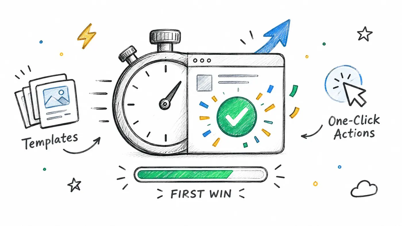
The practical test is specific. Can a new user finish the first-value action with three to five guided interactions and no passive slideshow?
That action changes by product type. In a SaaS trial, it may be launching a first experiment. In e-commerce, it may be previewing a live merchandising change on an actual product page. In a CMS, it may be publishing a safe first update without breaking layout or workflow. Build the tour around that job only.
A good tour usually includes four design constraints:
- One outcome, not a product overview
- Real clicks or field entries inside the interface
- Immediate dismissal or skip for confident users
- Automatic removal after completion
Teams often resist the last point. They spent time building the tour, so they keep it around for everyone. That choice creates drag for returning users and power users. Disposable guidance performs better because it respects competence. Once the user has completed the target action, retire the tour and switch to lighter cues, such as a checklist state change, a confirmation message, or a prompt for the next adjacent action.
An external production reference can help when launch readiness depends on assets outside the app, such as variant creation and approval. A tool like iterative ad creative workflow tool can support that handoff without turning the product tour into a project manager.
Video has a place, but later and selectively. Use it for tasks that are hard to explain with a hotspot and one sentence, not as the default first-run experience.
Treat the tour like any other activation intervention. Define the target action, measure completion rate, and compare guided versus unguided paths. Otter A/B is useful here when you want to test a shorter path against a fuller walkthrough, or compare click-to-advance guidance with a checklist-only flow. Keep the winner only if it raises activation, not because it looks polished.
6. Put Help Inside the Workflow, Not in a Separate Universe
Documentation is necessary. Leaving the product to read documentation during setup usually isn't.
Contextual help works because it answers the question at the point of hesitation. A short line under a field, a tooltip beside an unfamiliar concept, or a tiny “why this matters” note near a configuration choice often prevents abandonment more effectively than a polished knowledge base article.
Where inline help earns its keep
Inline help matters most in places where users can't safely guess:
- Technical setup steps: Snippets, integrations, verification states.
- Decision-heavy fields: Audience rules, attribution choices, publishing options.
- Analytical concepts: Terms that affect confidence in results or next actions.
For an A/B testing workflow, terms like significance, traffic split, or goal setup can produce silent confusion. The right move isn't to add a glossary everywhere. It's to attach a short explanation exactly where the user hesitates.
Keep help honest and compact
Good inline help does three things. It explains the term in plain language, tells the user why it matters, and links out only if the deeper answer is needed.
Poor inline help does the opposite. It repeats the label, introduces more jargon, or becomes a mini article inside a tooltip.
A useful pattern is to test whether a simple explanation outperforms a technical one for first-run users, while preserving deeper detail for advanced users. If the same help item gets clicked constantly, treat that as a design signal. The feature may need a clearer UI, not better documentation.
7. Trigger Guidance from Behaviour, Not from a Clock
Timed onboarding is easy to ship and hard to trust. A tooltip that appears after 30 seconds treats every delay as confusion, even when the user is reading, comparing options, or waiting for someone else to approve a step. That creates noise, not activation.
Behaviour-based guidance works better because it reacts to friction you can observe. The job is to map a few high-signal moments in the path to first value, then attach the smallest useful intervention to each one.
A practical way to set this up is to work backwards from stalled activation events:
User starts but does not finish a core setup step. Show a short prompt with one next action, or save their place and offer to resume.
User returns to the same decision point several times. Change the message. Repeated visits often point to weak value clarity, unclear prerequisites, or approval friction rather than missing instructions.
User jumps ahead in the workflow. If someone opens reports before creating anything to measure, route them back with context and a direct path to setup.
User goes quiet after an intent signal. A visit to the editor, integration page, or pricing area tells you more than elapsed time alone.
The pattern matters more than the channel. In a SaaS trial, a user who opens reporting before configuration likely needs a setup shortcut. In e-commerce, repeated previewing without publishing usually signals fear of making a visible mistake. In a CMS, multiple visits to template settings without a live page often mean the user understands the controls but not the publishing sequence.
That distinction changes the fix.
If the barrier is confusion, add guidance. If the barrier is risk, add reassurance, preview states, undo language, or a safer default. If the barrier is missing data or permissions, stop prompting and explain the dependency.
Teams often overbuild this. Start with three to five trigger rules tied to activation drop-offs, then test the copy, timing window, and format with Otter A/B. A modal may beat a tooltip for one stuck step and hurt performance everywhere else. Controlled experiments keep trigger design tied to progression, not opinion.
Respect also matters here. Cap how often prompts appear, suppress repeats after dismissal, and end the message once the user completes the target action. Guidance should behave like a recovery system, not a background ad unit.
8. Use Email to Restart Momentum Between Sessions
Welcome tours end in a minute. Activation rarely does.
Email earns its place after the session ends because onboarding is a system, not a single in-app path. If a user leaves before completing the next setup task, the job of email is simple: restore context, reduce recall effort, and bring them back to one action that moves them closer to first value.
That changes how the program should be built. A good onboarding email sequence is closer to a re-entry workflow than a nurture campaign. Each message should answer three operational questions: what did the user already do, what blocked progress, and what is the shortest useful return path?
A workable setup looks like this:
- Send the first email from the activation milestone, not from signup alone.
- Use the unfinished task as the subject and CTA destination.
- Return the user to the exact page, draft, integration step, or editor state they left.
- Change the message after activation. Stop selling setup to users who already completed it.
- Suppress reminders when the blocker is external, such as missing permissions, delayed approvals, or unavailable data.
For SaaS trials, this often means sending a reminder tied to incomplete configuration, first data arrival, or an unlaunched workflow. For e-commerce, the highest-performing emails usually bring merchants back to a product page, theme edit, or unpublished change they can finish in minutes. For CMS products, email works best when it restores publishing momentum by reopening the draft, preview, or template context the user abandoned.
The copy should stay narrow. One message. One job. “Finish connecting your store” outperforms a summary of everything the platform can do because it lowers decision load at the exact moment attention is scarce.
This visual can help teams map where email supports the larger conversion journey.
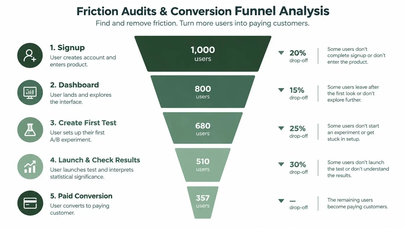
Email timing is where trade-offs show up. Send too early and the message feels impatient. Send too late and the user forgets what they were trying to do. Start with a few state-based emails tied to activation drop-offs, then test subject framing, send window, and destination page with Otter A/B. The winner is not the email with more opens. It is the one that gets more users back into the product and through the next milestone.
9. Use Visual Learning for High-Friction Tasks Only
Video is useful when a task is easier to show than explain. It's not useful when it replaces a simple action with passive watching.
That trade-off matters because teams often produce video for the wrong moments. They record a broad overview when users really need a specific answer, such as how to install a snippet on Shopify, how to create a variant in Webflow, or how to preview a CMS change safely before publishing.
Where video helps most
Video earns its place when the task has motion, sequencing, or visual verification:
- Interface navigation: Where users must move between panels or screens.
- Technical implementation: Where one missed step breaks setup.
- Result interpretation: Where users need to recognise what “correct” looks like.
For SaaS onboarding, short clips work best when embedded at the exact moment of need rather than buried in a resource library. For e-commerce, a merchant adding a first experiment may need a quick visual cue about which page elements can be changed. For CMS teams, a fast walkthrough can reduce hesitation around templates, drafts, and preview states.
Keep videos subordinate to action
If the user can complete the task faster than they can watch the video, don't lead with video. Lead with the action and offer the clip as support.
Captions and transcripts help because people often scan before they commit. Segment-specific videos also outperform generic walkthroughs in practice because they preserve relevance. A clip for agencies will often need different examples from one aimed at in-house growth teams.
The rule is simple. Show, don't tour. And when a screenshot or tooltip does the job, skip the video.
10. Optimise Trial and Freemium Onboarding Differently
Trial onboarding and freemium onboarding look similar on the surface, but they create different user behaviour.
A trial has a deadline. That means onboarding should compress value quickly and help the user experience enough depth before time runs out. Freemium has no fixed end, so the job is different. It should build habitual usage, reveal natural limits, and introduce upgrade prompts when the user has reached meaningful constraints.
Match onboarding to the commercial model
For trials, the first path should be aggressively focused. Remove optional setup. Highlight what must happen in the first session and first few days. If a user needs integrations or approvals, surface them immediately so they don't discover blockers too late.
For freemium, don't rush users into every premium feature. Let them complete a useful workflow with the free tier, then place upgrade messaging at moments where expanded access would help them continue.
Examples by platform make this clearer:
- SaaS trial: Push users to launch and evaluate a first live use case quickly.
- E-commerce freemium: Let merchants run a limited set of experiments or edits, then show the next level when they hit a usage ceiling.
- CMS freemium: Allow publishing or testing within a narrower scope, then prompt upgrade when the team needs collaboration, scale, or more variants.
What to test
Trial and freemium onboarding both benefit from controlled experimentation, but the questions differ.
For trials, test expectation-setting, setup order, and urgency messaging near the end of the period. For freemium, test where upgrade prompts appear, what capability they emphasise, and whether usage-based prompts outperform feature-based prompts.
A bad trial onboarding flow hides the deadline until it feels punitive. A bad freemium flow blocks value so early that users never build intent to upgrade. The balance is different, but the activation principle stays the same.
Top 10 User Onboarding Practices Comparison
| Approach | Implementation complexity 🔄 | Resource requirements ⚡ | Expected outcomes 📊⭐ | Ideal use cases 💡 | Key advantages ⭐ |
|---|---|---|---|---|---|
| Reduced Time-to-First-Value (TTFV) & Activation Metrics | Medium, redesign flows & instrumentation 🔄 | Medium, product, analytics, UX ⚡ | High, faster activation, higher retention 📊⭐ | Improve early retention and free-trial conversion | Rapid user momentum; clear activation metric |
| Friction Audits & Conversion Funnel Analysis | Medium–High, full funnel instrumentation 🔄 | High, analytics tools, data engineering ⚡ | High, identifies top-impact leaks, prioritization 📊⭐ | When drop-offs are unknown or conversion stalls | Objective prioritization; directs engineering ROI |
| Onboarding Segmentation & User Profiling | High, segmentation logic and branching 🔄 | High, user data, personalization systems ⚡ | High, tailored activation and better LTV 📊⭐ | Diverse user personas (roles, industries, agencies) | Increased relevance and feature adoption |
| Progressive Disclosure & Staged Onboarding | Medium, sequencing and conditional UI 🔄 | Medium, UX flows, conditional logic ⚡ | Medium–High, lower cognitive load, better discovery 📊⭐ | Complex products with many features | Reduces overwhelm; staged learning increases adoption |
| Interactive Product Tours & In‑App Guidance | Medium, tour tooling or integration 🔄 | Medium, content creation and updates ⚡ | High, faster task completion and engagement 📊⭐ | New users needing step-by-step walkthroughs | Hands-on guidance; immediate contextual action |
| Contextual Help & Inline Documentation | Low–Medium, tooltips & links implementation 🔄 | Low–Medium, content writing & small engineering ⚡ | Medium, fewer support tickets, better comprehension 📊⭐ | Complex terminology or feature explanations | Answers in-context without breaking flow |
| Behavioral Triggers & Smart Timing | High, rule engine + robust event tracking 🔄 | High, analytics, engineering, tuning ⚡ | High, timely, personalized nudges that boost completion 📊⭐ | Preventing abandonment; behavior-driven guidance | Guidance when most relevant; personalized timing |
| Onboarding Emails & Drip Campaigns | Low, sequence setup and automation 🔄 | Low, email platform and copywriting ⚡ | Medium–High, cost-effective re-engagement & conversions 📊⭐ | Trial nurturing and out-of-app prompts | Scalable, measurable, good ROI |
| Interactive Video Tutorials & Visual Learning | Medium, production and embedding workflows 🔄 | Medium–High, video production resources ⚡ | Medium, improved comprehension for visual learners 📊⭐ | Complex workflows best shown, not described | Demonstrates exact steps; strong for visual learners |
| Free Trial Optimization & Freemium Onboarding | Medium, trial rules + tracking & messaging 🔄 | Medium, product, marketing coordination ⚡ | High, can increase conversion via urgency or upgrade paths 📊⭐ | SaaS growth strategies (trial-to-paid, freemium funnels) | Drives urgency or broad adoption; A/B testable |
Turn the Roundup Into an Experiment Roadmap
Many teams already know the broad principles behind user onboarding best practices. The gap is execution. They've heard “reduce friction”, “personalise the flow”, and “use tooltips” before. What they haven't done is turn onboarding into a prioritised system with clear success criteria and a testing cadence.
Start with the first-value event. That's the anchor for everything else. If you can't name the exact action that proves value for a new user, your onboarding will drift into education, brand theatre, and internal wish lists. A SaaS trial might define first value as a launched test. An e-commerce store might define it as a completed purchase journey or a published on-site change tied to conversion intent. A CMS product might define it as publishing or previewing a page successfully without support.
Then instrument the funnel around that event. Don't overcomplicate it. Track each required step from signup to activation, and make the path visible across product, growth, and support. UK public-sector guidance has reinforced this user-centred approach since at least 2016 by telling teams to identify relevant user types before research and to plan research promptly after sessions, which is a useful reminder that onboarding should be designed around observed user needs rather than internal assumptions (GOV.UK user research guidance).
Once the funnel is visible, fix the largest drop-off first. Don't redesign everything at once. Remove one field, shorten one step, clarify one decision, or prefill one setup state. Then measure what changed. If the team adds five onboarding ideas at the same time, nobody knows which one helped and which one added clutter.
The next layer is guidance, but only at the moment it's needed. Add a checklist if users need directional structure. Add inline help where terms cause hesitation. Add a short tour when users must complete a multi-step action in the interface. Add email when users frequently drop between sessions. Add video only when a task is easier to show than explain. Guidance should support action, not compete with it.
A compact implementation sequence works well across product types:
- For SaaS trials: Define the activation event, shorten setup, segment by intent, guide the first launch, then test path variations and trial messaging.
- For e-commerce stores: Reduce account and setup friction, move users toward a confident first purchase or first live change, and test copy, layout, and reassurance at key decision points.
- For CMS products: Remove blank-state paralysis, use templates and staged guidance, support preview and publish confidence, and trigger help around editing and workflow friction.
Track outcomes that tie onboarding to real business performance. Useful measures include activation, time-to-first-value, stage completion, retention, purchases, average order value, revenue per variant, and paid conversion. Those metrics make trade-offs clearer. A shorter path that increases activation but lowers purchase quality needs scrutiny. A longer path that produces stronger downstream conversion might be worth keeping if the added friction is justified.
If you need a practical way to validate changes, experimentation belongs inside the onboarding programme itself. Otter A/B is one option for testing headlines, CTAs, layouts, and onboarding paths across supported platforms, with results visible through its dashboard and reports. Keep the roadmap simple: define the first win, instrument the path, remove the biggest obstacle, then test one meaningful change at a time. Even your notes and hypotheses become easier to manage when teams use a clear planning space such as a spatial idea organization tool.
Otter A/B helps teams test the onboarding decisions that most affect activation, from signup copy and checklist order to CTAs, layouts, and page variants. If you want to validate onboarding changes against conversion, purchases, and revenue instead of opinion, visit Otter A/B.
Stop guessing
Ready to start testing?
Set up your first A/B test in under five minutes. No credit card required.
- 14-day free trial
- No credit card required
- Cancel anytime